Do you want to create a perfect poster?
Many are struggling to design one that engages the audience.
In this tutorial, we’ll see how to design a quality poster in minutes that turn heads.
Hang on till the end and I’m gonna share 5 actionable tips that will add more value to your next poster design.
Event Advertisement Poster
Sign up or sign in to Picmaker – DIY design software that lets you create graphic designs in minutes.
This is the dashboard where you can get your design started.
Use the search bar to quickly find the required design categories.
In this case, we need poster designs.
Type “Poster” and the search bar suggests the right design category with the dimensions.
The days are gone when you need to memorize all these dimensions to create a perfect design.
Click on it and it’s taking us to the templates page.
The templates page is filled with colorful and perfectly designed posters that cater to all your needs.
Be it a self-defense class poster, moto race event poster, or music event poster, we have everything here.
Choose one that serves your purpose.
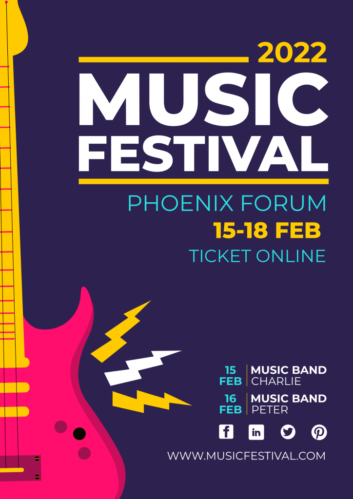
I’m going to pick up this Music Festival poster.
This is the workspace where we can customize our poster.
Let’s begin by changing the year.
Double click on a text to edit.
Let’s customize the other information like the date and website.
You can also change the color scheme and the objects in the design in just a couple of clicks.
On the right, you’ll notice the MAD button.
It is built with AI to suggest different designs in a few clicks.
Let’s click on the MAD all button.
As you can see the design is completely changed.
Click on the MAD button repeatedly until you get your desired design.
The other MAD buttons are to change the font and color respectively.
Now that our design is ready it’s time to download.
Click on the download button at the top right.
You can download the design in jpeg, png, and pdf.
Isn’t it easy to design an event poster with Picmaker?
Come on! Let’s move on to the next poster design.
Wanted Poster
Enough being serious.
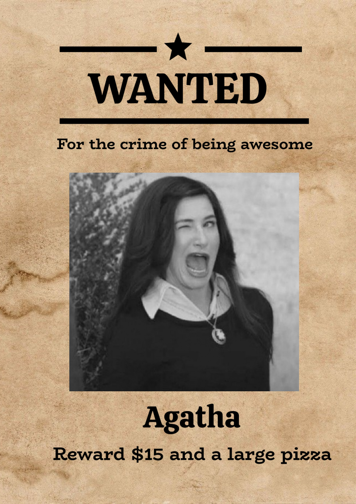
Let’s create a funny wanted poster for your friend.
On the dashboard, you’ll notice the design categories below the search bar.
Find “Poster” and click on it.
Here, in the workspace, we’ve got an empty slide.
Yes, we are going to design a wanted poster from scratch.
Don’t worry. You are not going to break a sweat.
It’s time to start with the background.
Click on “background” in the sidebar.
Search “Paper”.
This torn paper texture looks good.
Once you click, it will be applied to the slide.
Let’s play with text now.
Click on “text” in the sidebar.
Add the heading.
As we know, double-click on the text to customize.
Find a relevant font that suits the poster.
Add some icons to spice it up.
You can duplicate a shape by clicking on this icon here.
Add the secondary font which is similar to the existing font in the slide.
Change the font size from the drop-down menu at the top.
Let’s add a funny picture of your friend.
You can upload the picture under the uploads section in the sidebar.
For this color scheme, a black and white picture would be perfect.
It’s easy to change a color picture to black and white in Picmaker.
Click on “filters” at the top and choose “greyscale”.
That’s it.
As you can see, it matches perfectly with the color scheme of the poster.
Next, add your friend’s name.
Use the same font above to create an appealing design.
Scale it down for a good hierarchy.
Okay. What are we missing now?
Yes, the reward.
I’ll leave this to you. It can be creative and funny.
Yes, designing a poster can be fun.
Let’s switch back to the serious mode and design a missing poster.
Missing Poster
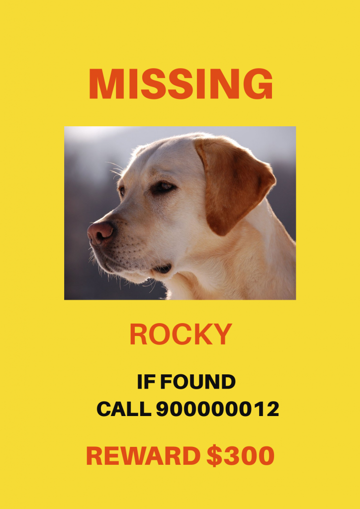
Just like the wanted poster, we are going to design the missing poster from scratch.
You know the drill.
Click on the poster design category on the dashboard.
Here we have an empty slide.
You can add the background from the backgrounds section in the sidebar.
But if you are planning to print the post in black-and-white, adding a background is not recommended.
Let’s start with the text.
Click on “text” in the sidebar and add a heading.
Double click on the text to customize.
You can change the font from the drop-down menu at the top.
Red is the preferred color as it catches more eyes.
Upload the image in the upload section.
Add another text for the name.
You need to add a call to action.
A call to action is basically what do you want the people to do if you have seen the person in the poster.
You can also add a reward at the bottom.
Once the design is ready, download it by clicking on the download button at the top right.
In no time, you can design a missing poster effortlessly.
Let’s move on to the next poster design.
Festival Posters
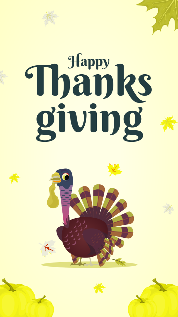
Sharing is caring.
Sharing a festival poster with your friends and family shows how much you care about them.
And designing a festival poster is not a hard nut to crack.
Hop on to the Picmaker dashboard.
Type festival in the search bar.
Picmaker lists down all the festival posters which are created by professional designers.
To filter a particular festival, you can use the same search bar at the top.
As you can see, we have all the thanksgiving designs here.
Click on a template that interests you.
You can customize the design by changing the font and color as you wish.
Download the design by clicking on the download button at the top right.
As you know, you can download it in 3 different file formats.
Phew! We covered 4 poster designs as of now.
And yes, you can create your own in a matter of minutes.
As promised at the beginning of the video, here are the tips to add more value to your next poster design.
Tips to design an eye-catching poster
- The text on the poster should be readable from a distance. Nobody cares to come closer and read it. It would be awkward. So, choose legible typography with fairly big font size.
- Add a clear call to action. Call to action is what your audience should do after consuming your poster. You need to pay more attention to it since it yields the desired outcome.
- Use attention-grabbing images. Next to text, images play a major role in turning heads. An intriguing image would do the job perfectly.
- Use colors to your advance to stand out from the crowd. Some colors like yellow and orange attract eyeballs. Understand the color psychology to design an engaging poster.
- Know where the poster will be located. Customizing the poster content based on the location helps you to sync with your audience.
Hopefully, this tutorial will help you start designing an engaging poster.
Also, checkout the below tutorials
How to design Instagram Quotes in 2 Minutes

