Imagine you're participating in a trade show, and you'd like to get as many people as possible to your booth. One good way to do it is by using flyers. But, how do you create a business flyer that attracts the right audience?
Would you use a catchy headline, a focal point that engages the target audience, or a strong call-to-action?
Not just our users, but, people in the design community want to explore our features too!
Each of them plays a significant role in driving desired actions.
In this tutorial, we’ll show you how to design a business flyer that converts.
4 Essentials of a well-designed flyer
Grab Attention
A flyer needs to hook in people and make them want to read and understand what’s in it for them.
Provide direction
On seeing and consuming the information on a flyer, the audience must know what is being advertised and where and how they can know more.
Be targeted
The flyer must speak directly to the target audience.
Convince the audience
The flyer must convince people to take the desired action.
6 Tips to design a perfect business flyer
Whether it is a business flyer or one that’s being created for a different purpose and audience, each flyer must have the following elements.
Clear Message
This is a non-negotiable when it comes to any flyer.
Whether you’re a business owner, an advertiser, or a marketer, you must ensure you don’t cram too much information into a single flyer.
That will end up diluting the message and leave the audience with no direction about what they must do next.
Color consistency
The color palette must be clearly defined and used consistently in flyers.
This is to ensure the audience recognizes your brand easily.
Right Fonts
Just like color, font is a crucial element in a flyer.
You need to select a primary, secondary, and tertiary font.
Scalability
What do we mean by scalability?
Let's consider a Picmaker flyer template as an example.
Take a good look at the flyer and you'll understand how each text is scaled in the design.
Each piece of text has its role to play in your design.
You should scale the text based on its importance and function in the design.
Design for the target audience
A design that attracts and converts contemporary business owners might not make an impact on travel-hungry retirees, new parents, and others.
It is important to define the audience you’re trying to reach and appeal to, before designing a flyer.
Call-To-Action
Whether you want your target audience to sign up for a webinar or avail a free consultation, the flyer must drive the necessary action with the help of a call-to-action.
A clear CTA in a flyer will yield the desired result.
Design a Business Flyer in 3 Steps
We have understood the need for a flyer, why flyers remain a prominent marketing and advertising tool, the key elements of a flyer, and the different dimensions.
Let’s now use Picmaker to design a business flyer.
We’ll take you through a step-by-step process, starting with template selection up to downloading the flyer.
Choose a Flyer Template
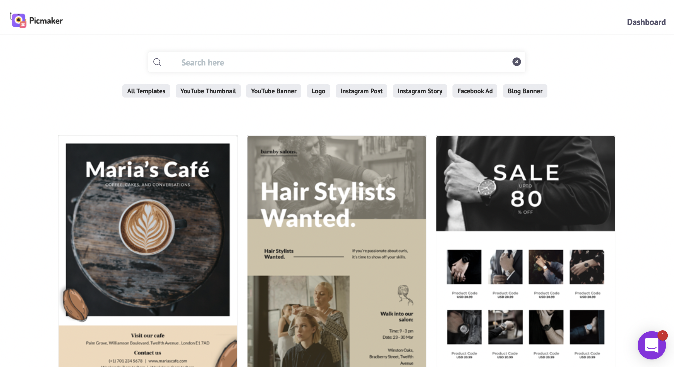
Picmaker has tens of thousands of flyer templates catering to businesses across sectors.
You can either click on the ‘Flyer’ tag under the search bar or type in the word ‘flyer’ onto the search bar.
On the templates page, you can browse through different flyer templates.
Once you find a template that interests you, click on it.
Customise the flyer
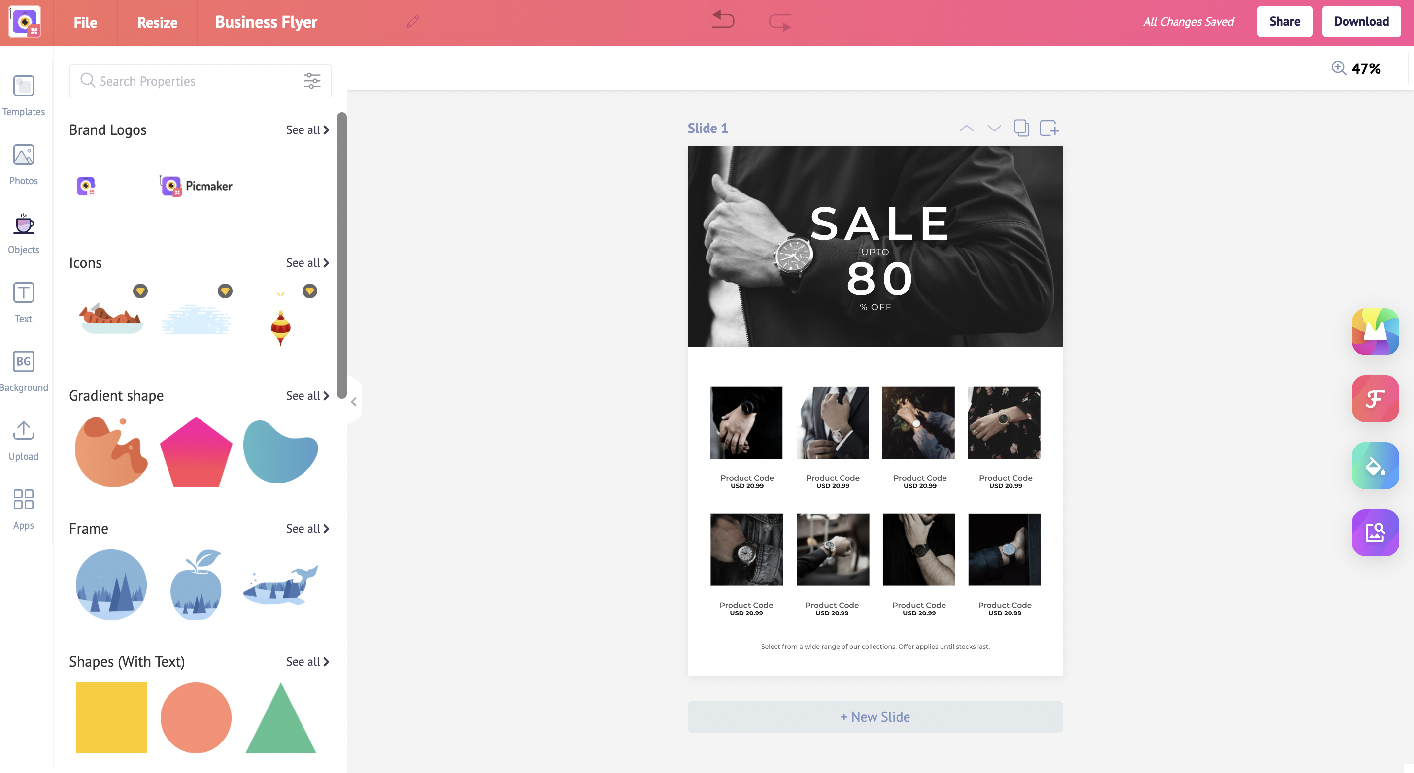
Now, let’s customize the flyer.
Double click on a text to edit.
To change the font, select the text and click on the drop-down at the top.
Choose your brand front.
You can also change the font color to match the color in the design or choose your brand color.
The flyer in the video already has a good call to action.
Let’s customize it a little.
We’re gonna pick up a diamond shape from the objects section in the sidebar.
To change the color of the shape, click on the color at the top and choose one that matches the flyer.
Let’s bring down the transparency to match the existing shapes.
Now, we’ll copy the existing text in the design and paste it into the shape to maintain font consistency.
You can also change the color of the CTA, just like how we did previously for the year.
The flyer template has been customized.
But we still need to ensure the text is well-aligned and the flyer is free from grammatical and spelling errors.
Revisiting the customized flyer could help make the copy more precise and to the point.
Download the Flyer
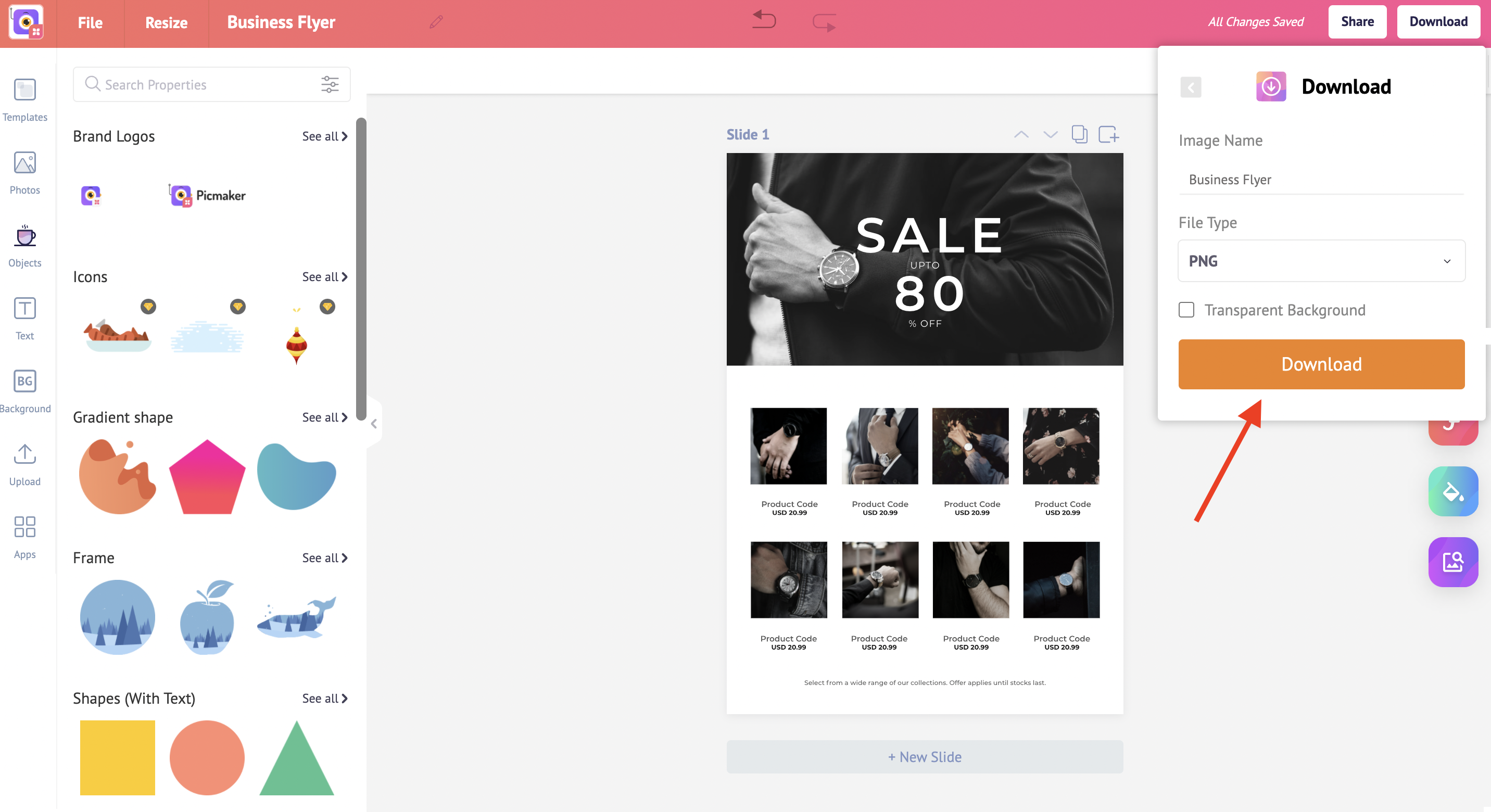
We’re almost done with designing the business flyer.
It is now ready for download.
Click on the download button at the top right.
You can download it in either PNG, PDF, or JPEG format for use.
Design a perfect flyer
Designing a business flyer that grabs the attention of people, keeps them hooked, and driving them with a solid call-to-action doesn't have to be hard.
With the help of Picmaker and its collection of beautiful, easy-to-customize templates, you can create a high-converting, effective business flyer.
Also, check out the below tutorials
How to design a flyer that converts

