Why your designs are not working out to boost your product sales?
In this tutorial, we are sharing 4 tips to level up your design that can drive your product sales.
Dimensions
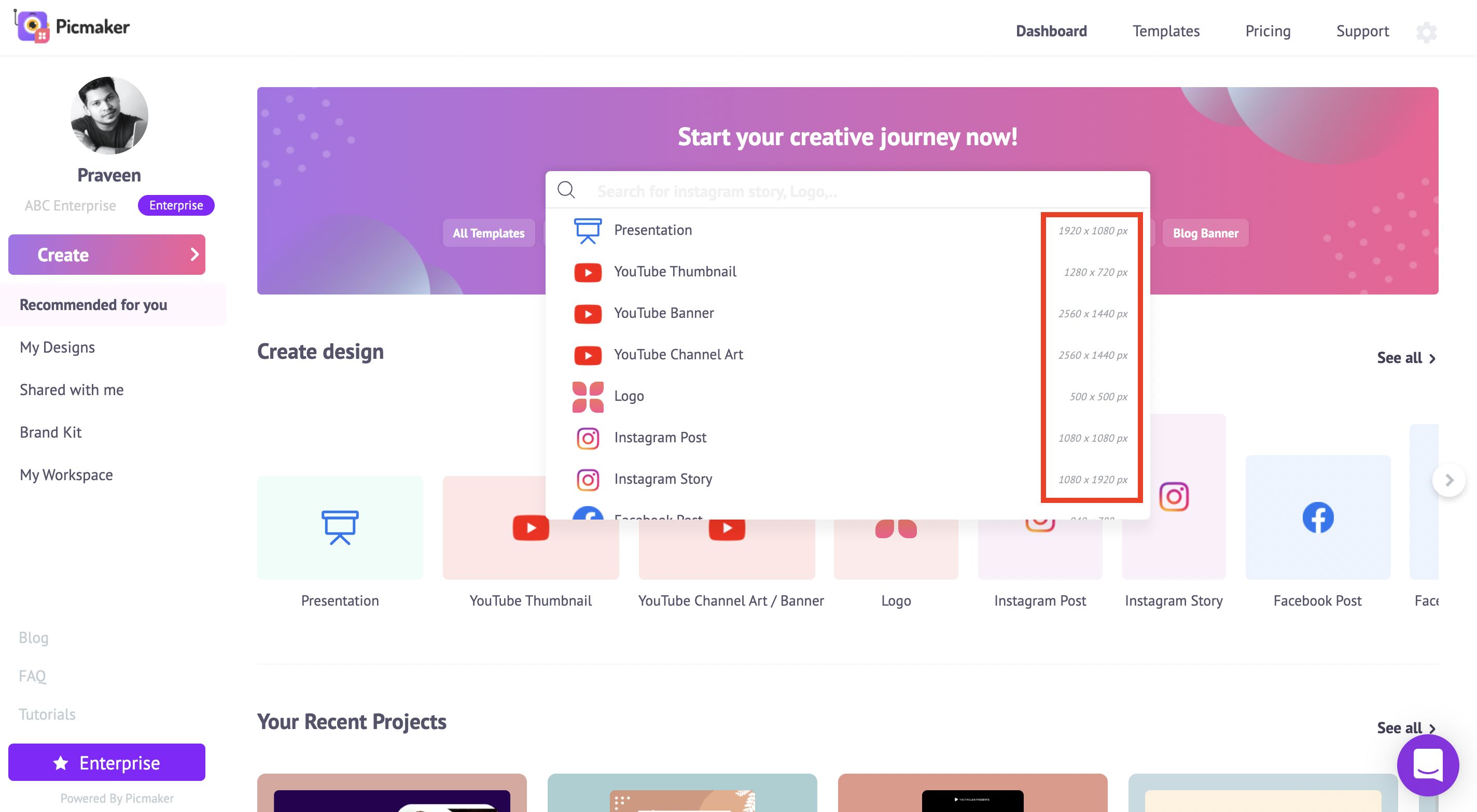
The dimension of your design depends on the purpose of your design.
The search bar is the easiest way to find different templates of different dimensions.
Whether you need it to design social media graphics or advertisement banners, it is the right place to find professional templates.
It comes with the right dimension, so you don't have to worry about the size of your design.
Let's say you wanna create a flyer to announce a discount for your product, I'll just type “flyer” and it takes me to the templates page.
On the templates page, you can browse through thousands of templates, free to use as well.
Once you find a template that interests you, click on it, it will take you to the workspace.
All the elements of the template are completely customizable.
You can change the discount percentage, the rate, and the color of your background.
One-click resize
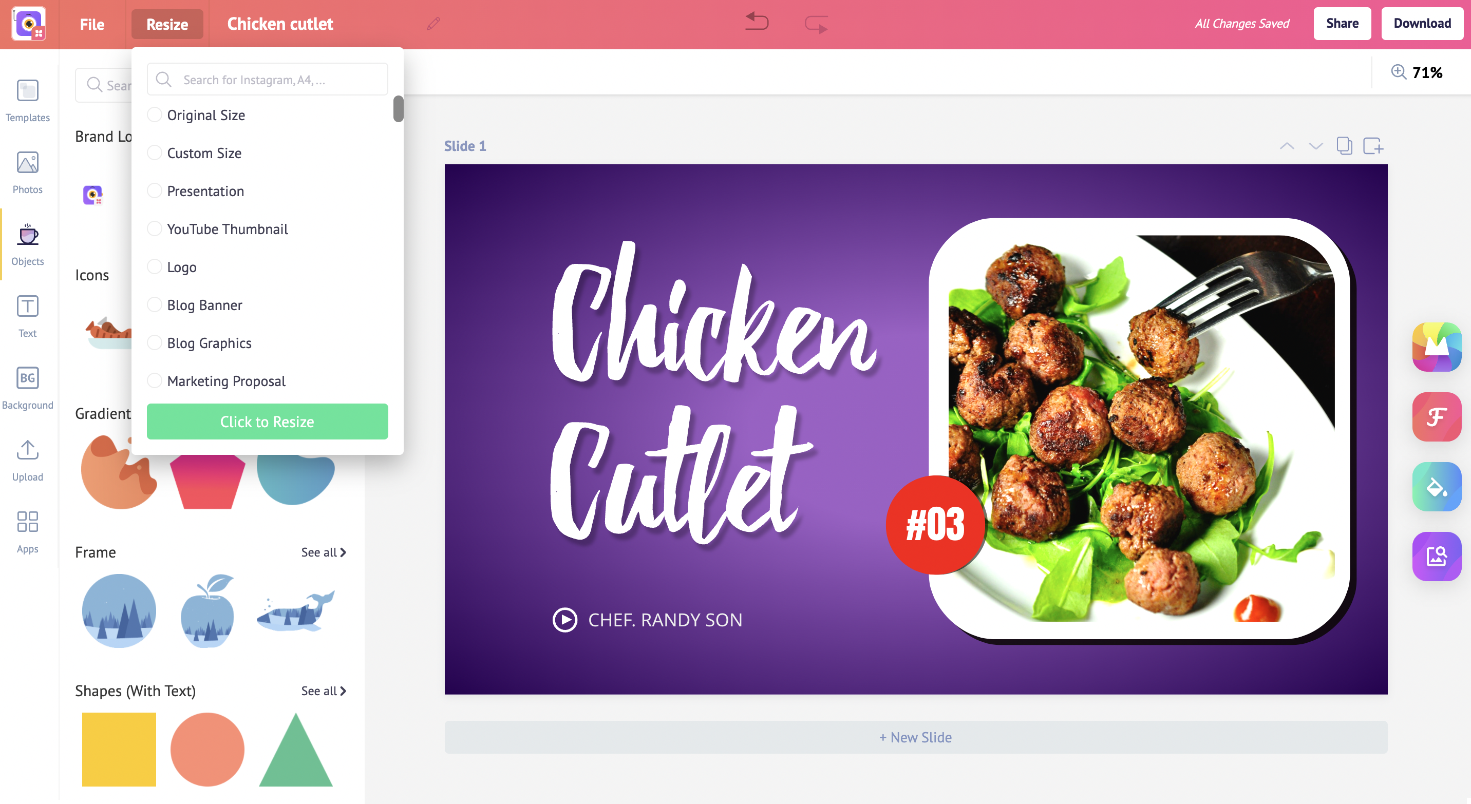
If you are creating different graphics for different purposes, you can use the resize option.
With that, you can take one design and transform it into different dimensions.
For instance, if you want to resize a youtube thumbnail into a Twitter post, head to resize, type Twitter in the search bar and click to resize.
Colors
Your brain uses colors to recognize traits about products.
If you want your products to stand out, you should be wise in choosing colors.
The challenge lies in harnessing color psychology to communicate with your buyers.
You probably know the basics of colors, like red represents passion and white means cleanliness.
But this is just the basic of the complex colors theory.
We'll go color by color to give you a deep insight into the best situations to use specific colors for your product advertising.
Blue
Blue is known for its trust and dependability. It typically evokes emotions of professionalism.
To represent peace, relaxation, and to invoke a refreshing mood, use Blue.
Green
Green is known to lower blood pressure and heart rate in viewers.
If you have products related to health, growth, and wealth, then you can use this color on your product listings and social media graphics.
Purple
Purple is not a color we see often in nature. It is mystical.
You can use this color to promote your royalty and spiritual products.
Red
Red is vibrant and attention-grabbing.
If your product radiates love, passion, and high energy, red is the best color for you.
Yellow
Buyers tend to associate affordability and optimism with yellow. It has the perk of being both light and bold at the same time.
If you want to show that your product is affordable and cheerful, you can use Yellow.
Orange
Orange is a combination of yellow and red. It is considered an energetic color. It invokes excitement and warmth.
If your product beams happiness, you can use the orange color.
Pink
Just like how blue is for boys, pink is a lot more for girls.
It can be used to show romantic, sweet, and fun products.
Black
Black is a powerful and bold color. It can be associated with luxury, power, and elegance.
How to maintain color consistency?
To stay consistent in your brand colors, you can use the brand kit feature in Picmaker.
On the left side of the dashboard, you will notice the brand kit.
Here you can add your logo, choose different color palettes, pick your brand fonts for heading, subheading, and body text so that they will be readily available while you design.
Let's focus on color palettes now.
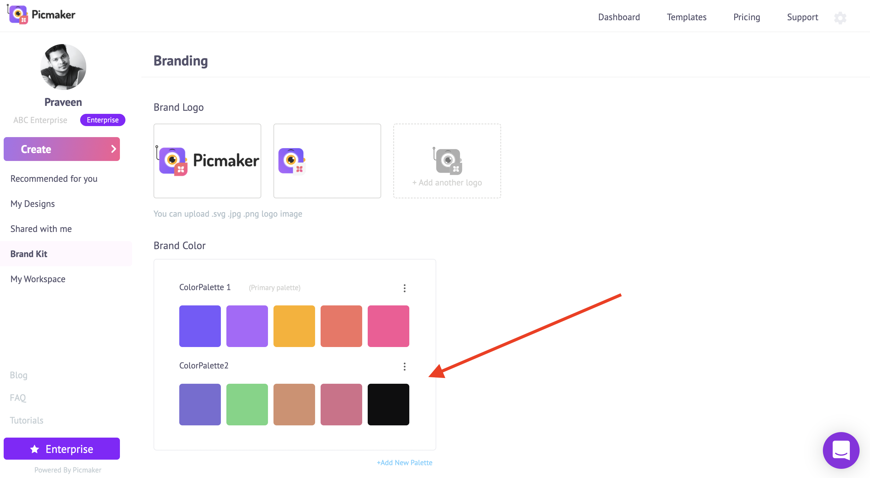
You can have different color palettes. To add a new color palette, click on “new palette”.
By clicking the + icon, you can add your hex code.
So how can you use this while designing?
To change the background color, click on the color at the top. Your color palettes, show up on the left side.
Choose a color that you'd like to add. You can also add your brand color to fonts.
Click on the color at the top and choose a color that interests you.
Maintain Hierarchy
You need to maintain the right balance of information in your design.
Let’s consider a Picmaker product template as an example.
The product name is followed by a short description.
It allows the buyer to understand what the design is about.
The discount percentage is followed by the call to action.
All the elements are scaled based on their importance and function in the design.
Call-To-Actions
A call to action is a text that invites a buyer to take a particular action.
It depends on what you want your buyers to do at a particular moment in their journey to discover your product.
Before jumping into what makes a good call-to-action, we wanna show you what makes a bad call-to-action.
Click here
Click here doesn't communicate what you want the customer to do.
Yes, you want them to click. But, where will that click lead them? Will they learn about the product, shop it directly, or share it with their friends?
The call-to-action "click here" doesn't give this information. Now let's see some good call-to-action.
Shop now
Shop now is pretty straight now. It lets the buyers know what's their next action.
Buy now
Buy now is just a slightly modified version of "shop now". Adding a discount percentage can help the buyers' to take decisions.
Grab it today
Grab it today invokes a sense of urgency and impulse. It pushes the buyer to take action right away.
Save Big
For some buyers, the discount is as important as the product itself. The CTA "save big" creates a sense of achievement in a big discount discovered.
Claim my discount
Adding the word "my" to the call-to-action makes it personal. The buyer feels attached and tends to click.
How to add call-to-action to your design?
The product templates in Picmaker come with call-to-action buttons. You can customize it based on your interest.
To design a CTA button from scratch, head to object. Click on "see all" under shapes with text.
Find a shape that you'd like to add. Once you click on it, it will be added to the slide.
Resize and place it in the right position.
To change the color click on the color at the top. The colors in the design are listed on the sidebar. You can either use it or choose one from your color palettes.
Add your CTA and you are done.
Once you are done, click on the download button. You can either share it on social media, present it to your team or download it in 3 different file types.
Boost your product sales
Product photos that you're adding to your eCommerce site and sharing on social platforms can be powerful to boost your sales.
Also, check out the below tutorials
8 Reasons to Upgrade to Picmaker Starter and Pro Plans

