Your speech may be perfect.
But have you ever find hard to connect with your audience.
If yes, you need to take a second look at your presentation.
In this video, we’ll share with you 21 design hacks that will help you ace your next presentation.
Stay with me till the end, because a bonus is waiting for you.
So let’s jump into the first hack right away.
Illustrations to turn heads
Your audience can grasp meaning and context in a split second by looking at an illustration.
This power can be used to communicate better.
Most presentations are boring and people tend to lose interest.
In that case, illustrations like these work like an anchor and a compass.

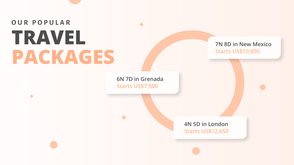
Show Numbers
Some presentations involve the need to present numerical data.
Others are just vague information.
Even monotonous information can be transformed into meaningful numerical data.
Add numbers to your presentation, so that it will make sense and easily digestible.
Visualize with Photos
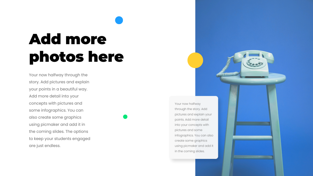
Just like illustrations, photos add meaning to your presentation.
Use high-quality photos that turn heads.
Don’t worry about the copyright implications.
Picmaker offers millions of premium as well as free stock photos to spice up your presentation.
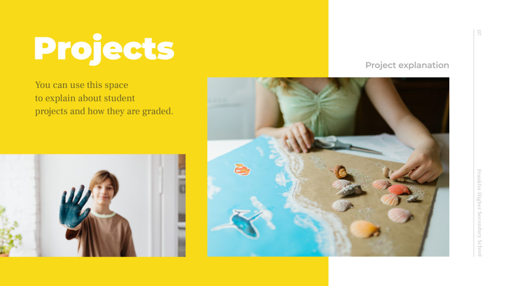
Split Color Effect
While using colors is a pro tip to attract your audience, how to use the colors is something you need to know as a pro designer.
Yes, adding a single color to your slide is fun.
What’s more, fun is, playing with split colors.
It gives an appealing look to your presentation.
Alternative color slides
Just imagine.
All the slides in your presentation are in the same color.
It’s boring, right?
Anything that lacks variation is boring.
Choose a max of 3 colors for your presentation.
Use them in your alternative slides and witness the difference.


Circles Everywhere
If you get a chance to take a look at presentation templates, you’ll notice something common.
Most presentations use circle shapes.
Why?
Because circles are flexible to use for backgrounds.
It can be a normal circle or a concentric one.
Use circles for better backgrounds.

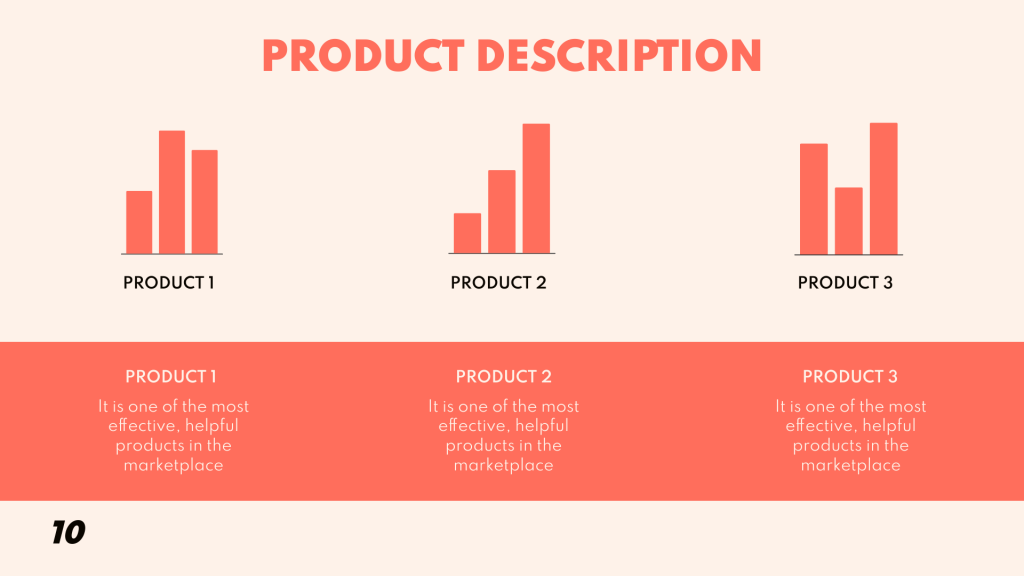
Data Visualization
As I said, numbers grab attention.
What if you need to feature tons of numbers?
Data visualization is the only solution.
Add graphical elements to your presentation, to visualize the numbers in a better way.
Create for your target audience
Before designing any presentation, define your target audience.
Your presentation can be for children, teens, or for a corporate company.
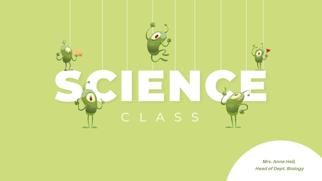
Customize your design based on who you are presenting it to.

This helps your audience to connect with you easily.
Link it
Another hack to make your presentation interactive is by adding links.
Don’t struggle to find the right source of information in the middle of your presentation.
Just add the link to the respective words.
That’s not all.
With Picmaker, you can link your slides in a snap of a second.
Power of Call-to-Action
So what is a call to action?
A call to action drives your audience to take your desired action.
What do you want your audience to do after consuming your presentation?
Do you want them to contact you?
Or visit your website?
Just invite them to do the relevant action.
It’s that easy!

Play with Transparency
This is a small design hack but a powerful one.
When you add a text, play with its transparency.
It gives an overlay effect to your slide and adds a modern touch.
All Caps
In case you want to emphasize a word or a heading, use UPPERCASE.
It draws attention to the text and makes the audience understand what’s important.
So next time when you want to stress a word in your presentation, all caps will help.

Contrasting Colors
Sometimes contrasting colors add uniqueness to a presentation.
Most contrasting colors are dark.
And people not just like dark mode, but love it.
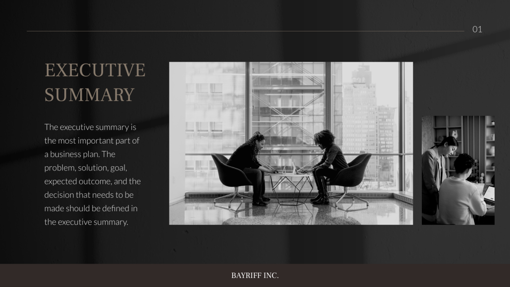
You can use this psychology to make a splash on stage.

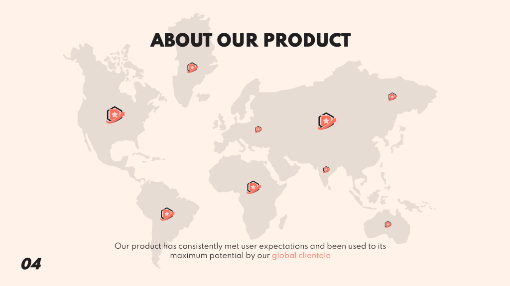
Show, don’t tell - Maps
A wise man once said, “Show, don’t tell”.
No matter who told this, but, it applies perfectly to your presentation.
When you mention a location, show them where on the map.
This allows your audience to experience your story through graphics.
Good-looking Tables
Table is again a type of low-key data visualization technique.
When you can put your data on table, do it.
What’s fun in adding paragraphs to all your slides?
Patterns in your data can be easily showcased with tables.
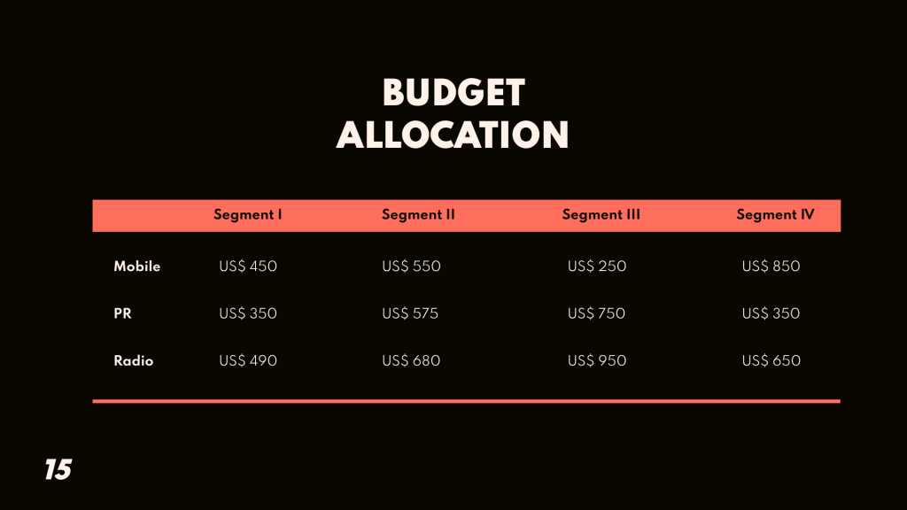
Table of Contents
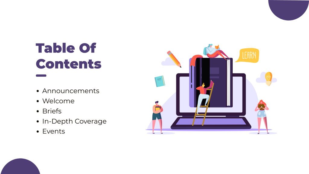
It’s paramount that your audience must know what your presentation is all about.
If they have no clue about what’s coming next, they’ll be blindfolded and lose patience.
Especially, when your presentation is long, adding a table of contents is highly recommended.
Look at these examples to know how to add your topics in one slide.
Ask Questions
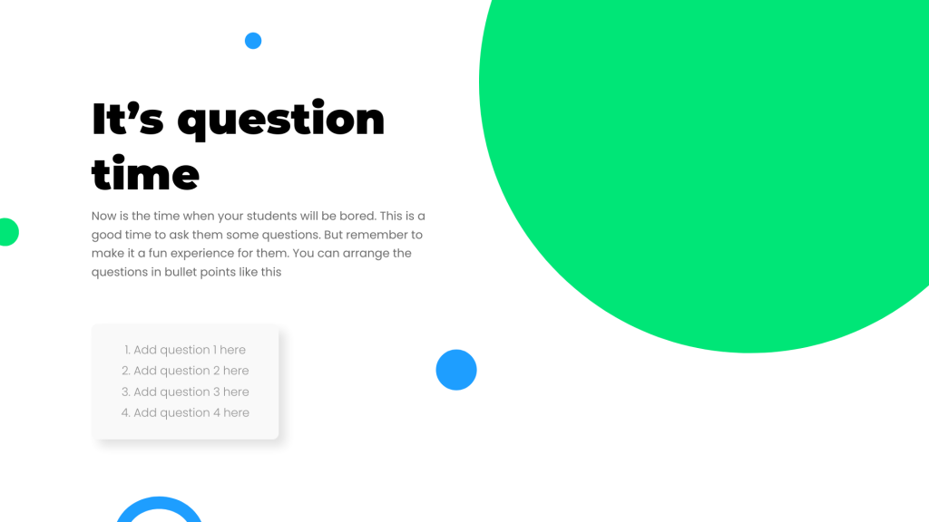
One simple way to maximize your audience engagement is by asking questions.
The art of asking does the job.
It is that easy.
Ask open questions about your presentation.
Or create a poll to see how people understand your presentation so far.
Background Removed Photos
Take a look at these slides.
You know what’s unique here?
Yes. The background removed photos.
How do you do that?
With Picmaker.
In just a couple of clicks, you can remove your background effortlessly.
Check it out.

Testimonials
Testimonials are a great way to build credibility.
It creates trust and strengthens your brand.
Specifically, if the deck is a sales pitch, testimonials will definitely contribute to the closure.
So what are you waiting for?

Connect well with Icons
People connect well with Icons.
Take a look at your mobile screen and laptop.
Icons are everywhere.
So to connect to your audience, icons can help you tremendously.
Introduce People
Adding a human touch to your presentation is another pro tip.
Introduce your team or your leaders to gain trust.
If you have a business, showcasing the people behind it is a great idea to get close to your audience.

Check out the below tutorials

