Contents
Here are 7 awesome YouTube banner examples that teach us a ton of lessons
Neil Patel's YouTube banner example
Justin Brown's YouTube banner example
Josh Ryan's YouTube channel art example
Salma Jaffri’s YouTube banner example
Alex Toby’s YouTube banner example
Hubspot's YouTube banner example
Let’s design our own YouTube banner now
How do you upload the banner and the links to your YouTube channel?
[2022] YouTube banner examples (ft. Neil Patel, Justin Brown, and HubSpot)
Designing a good-looking YouTube banner example is similar to pushing a heavy rock uphill. The average time spent by individuals on video streaming apps has increased by 140%. Adding the right banner can help you retain all this audience for the long term.
It looks like the result of creating a good YouTube banner is worth the pain.
In this blog, we've completely broken down 7 famous YouTube banner examples, to help you create the perfect YouTube banner.
We have also written a step-by-step approach to help you create your own 2048 x 1152 YouTube banner from scratch. Feel free to check that out too!
You can also check out this free guide for creating YouTube banners in 2560 x 1440 pixels.
If you’re all in to create the perfect banners, these YouTube channel art examples are for you.
Here are 7 awesome YouTube banner examples that teach us a ton of lessons
We had a ton of people to start this countdown with.
But we wanted to do it with someone who’s been killing it in the digital marketing space on YouTube. Moreover, he's also got a terrific Youtube banner example to feature in this blog post.
Neil Patel's YouTube banner example
Neil Patel is the all-knowing guru in the digital marketing space. He has been consistently posting fresh content on his Youtube channel for the last 2 years now. With most of his videos successfully crossing the 200k views mark, you can say that it’s a wildly successful channel.
With that history lesson out of the way, let’s take a look at what makes Neil’s Youtube banner special.
1. Add your face and name to your Youtube channel art example
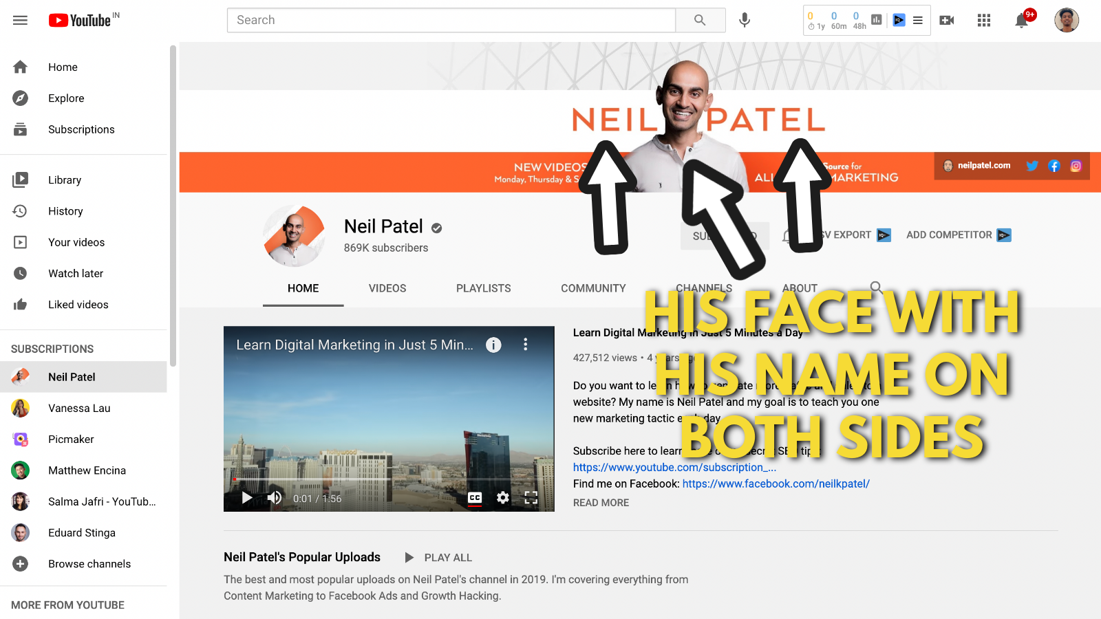
Neil Patel has focused on bringing up his personal brand over the years. His business is built upon his personal brand “Neil Patel”. In that way, it makes perfect sense for him to add his face to his marketing materials.
On the banner, he has perfectly placed his face and his name. This way each visitor remembers Neil Patel for who he is.
Scientific research proves that "People can remember faces more accurately than objects." So don’t blame yourself if you cannot forget that face you saw on a video months ago.
Faces will always win over objects and logos!
2. Maintain a consistent colour theme on your banner
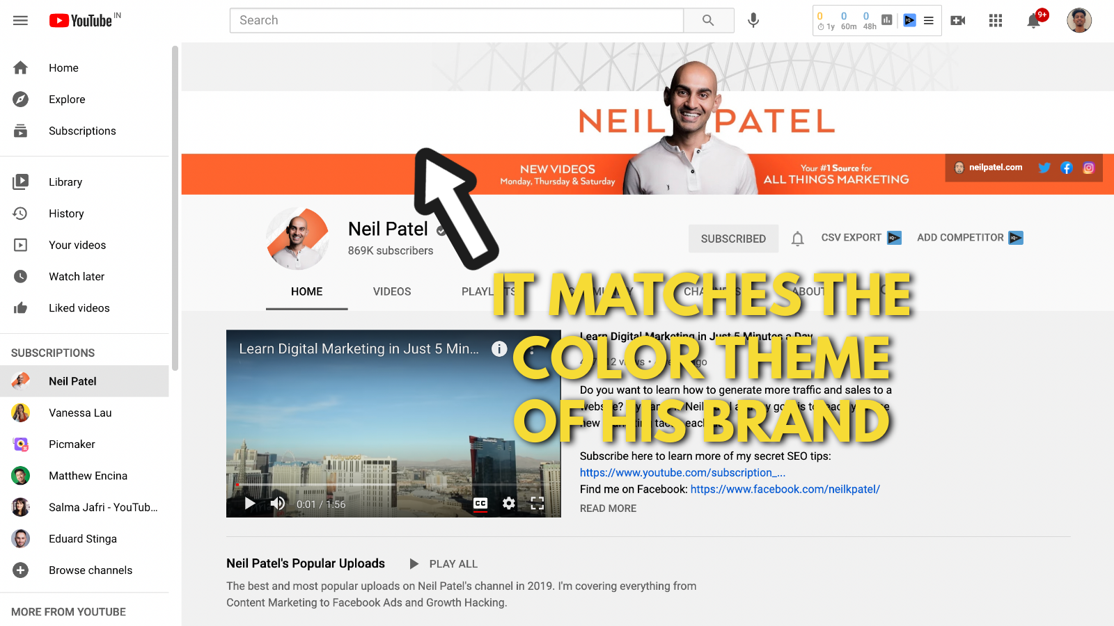
Neil Patel has a standard color theme of orange and white on his youtube channel. This color theme is consistent on his website and all his marketing materials. Numerous studies have been done to prove the importance of consistent colors in marketing.
This guide explains how different colors have different effects on your audience. This will help you understand the importance of colours in marketing.
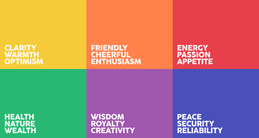
In that sense, Neil Patel has got everything right about his colours on his banner. This is one of the main reasons we included it in this Youtube banner examples list.
If you're looking to learn more about color psychology in marketing, here's the most extensive guide we've come across.
3. Mention what your channel is all about
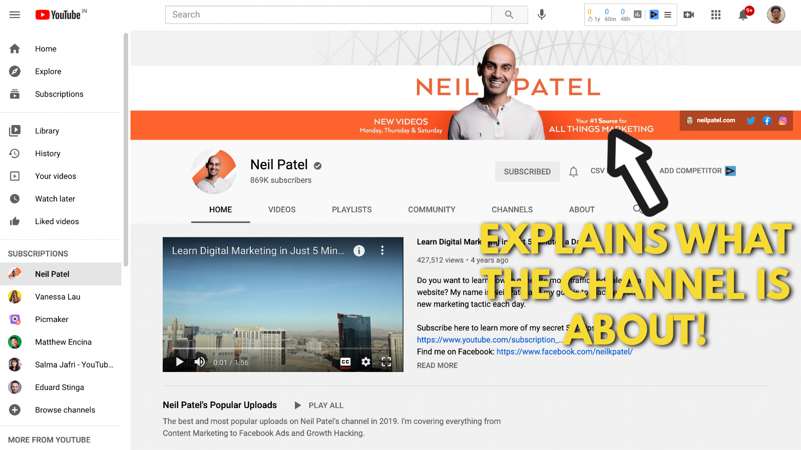
If you’re just hopped onto Neil Patel’s channel, one look at the YouTube channel art is all you need to figure out what he's about. He explains that this channel is your “#1 source for all things marketing”.
He stands true to that fact and delivers content that just focuses on marketing. This is an important takeaway from all the YouTube channel art examples we'll mention in this list.
Make sure you include small explainer sentences like this on your Bio. The last thing you want to do is confuse your audience on what you're about.
4. Mention your upload frequency (if you have one)
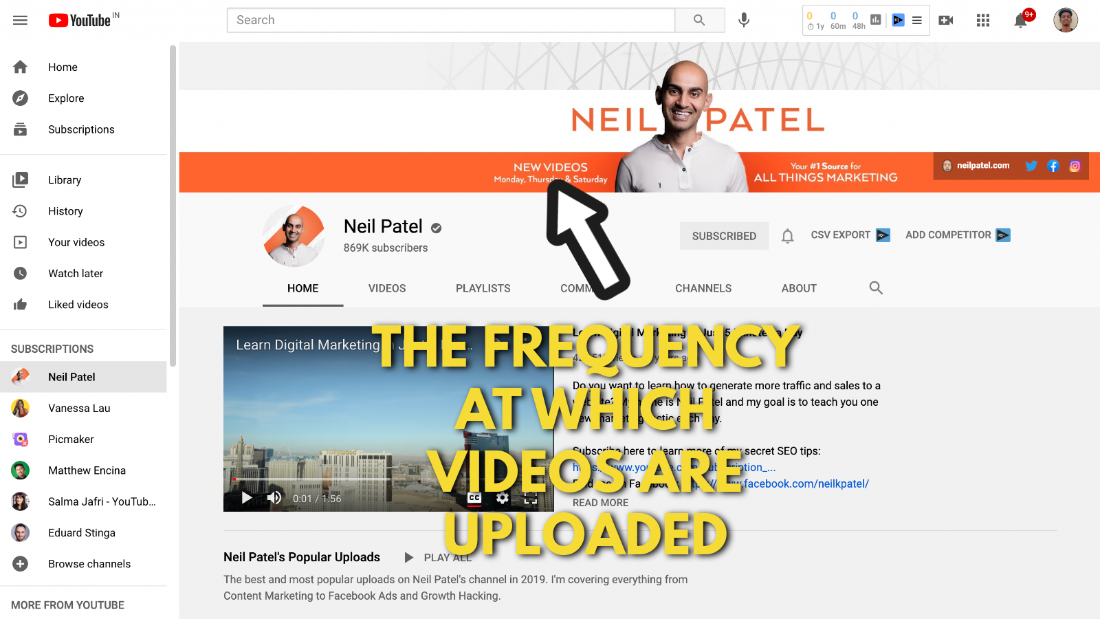
Neil Patel has also included the days on which he will be releasing a new video on his channel.
After scrolling down and taking a closer look at his videos, you realize that he releases three new videos/ week. It’s mind-blowing to know that he puts out three videos a week. It’s even mind-blowing to know that he has maintained this schedule for months now.
5. Add outbound links to your website and social media channels
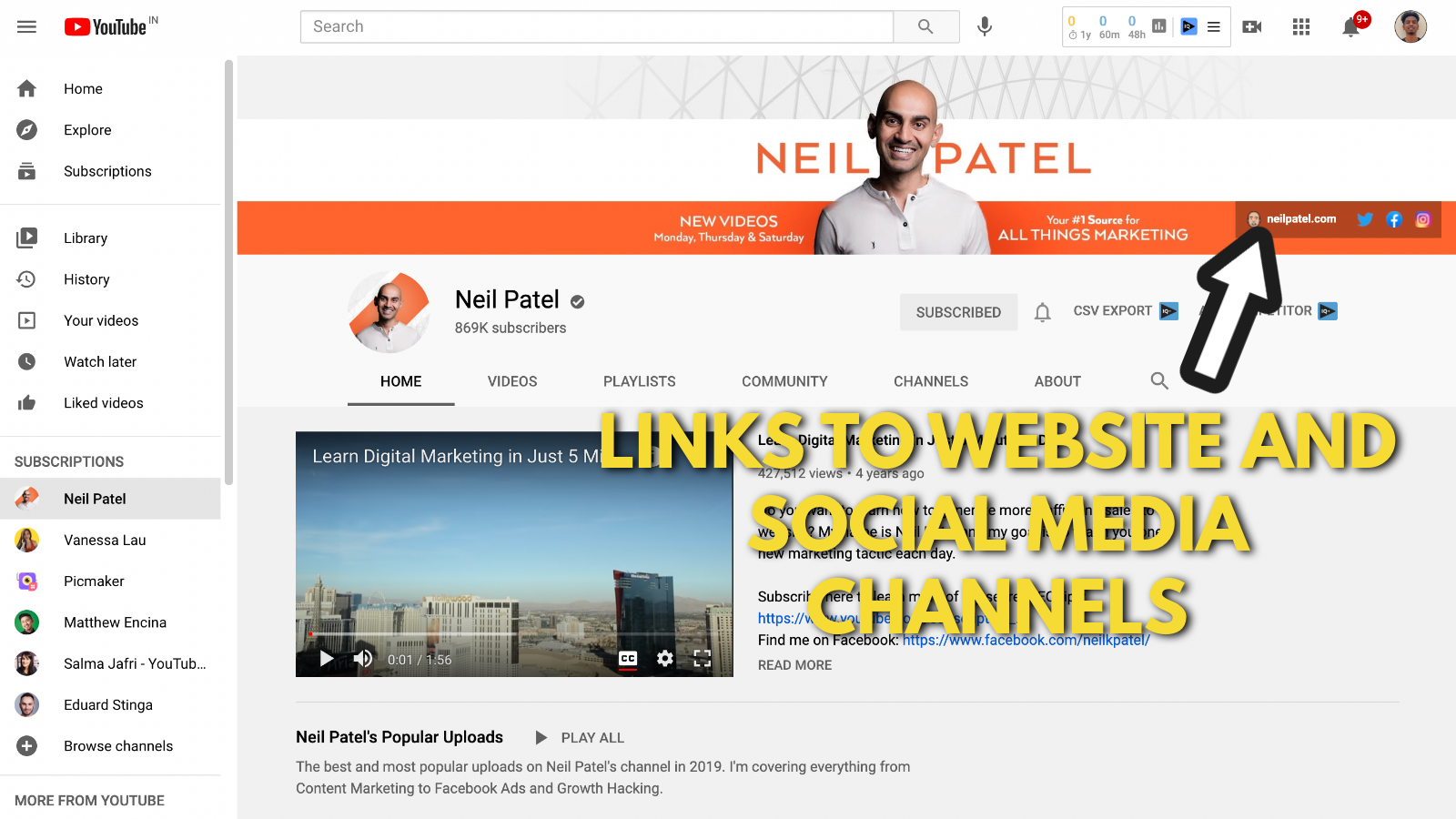
Finally, Neil Patel has added four outbound links on his banner. Out of the four links, three-point to his social media channel (Facebook, Instagram, and Twitter) and one points to his website.
Neil, being the clever marketer he is, links to his website as a primary link. That way, it occupies more real estate and gets more clicks.
This guide from Rebrandly explains how links can be added to your YouTube banner.
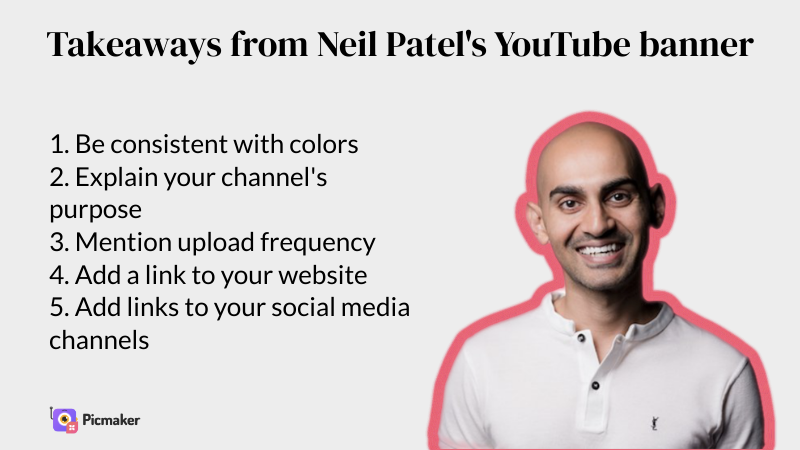
Takeaways from Neil Patel’s YouTube channel art example
Justin Brown's YouTube banner example
Up next, we have Justin Brown to teach us about creating a YouTube banner. Justin Brown has a very detailed YouTube channel art example. He and his brother Mike are top experts in video marketing.
Now let’s dive into his Youtube channel and break down Primal video’s Youtube banner.
1. Add pictures of the core people in your channel
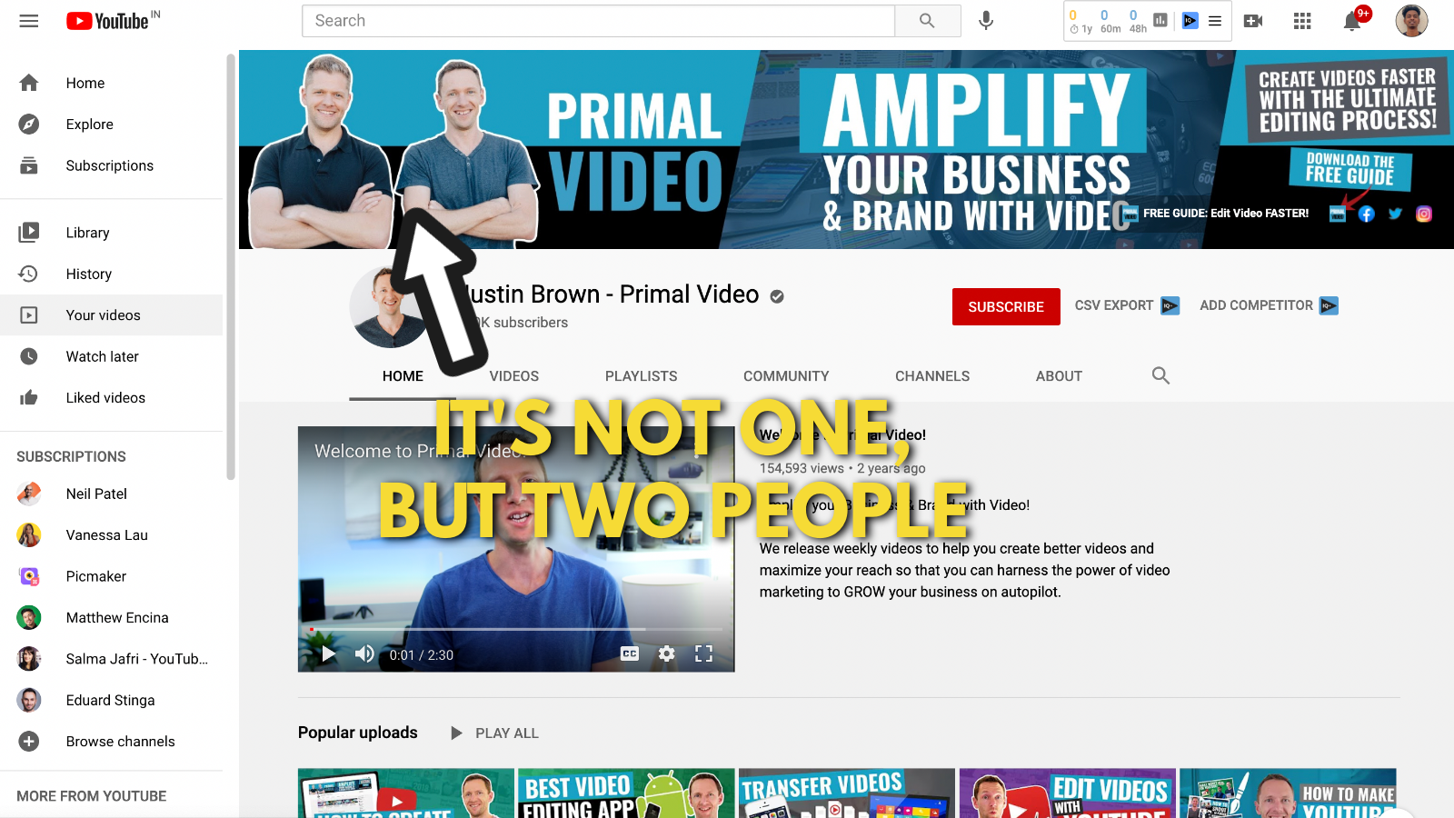
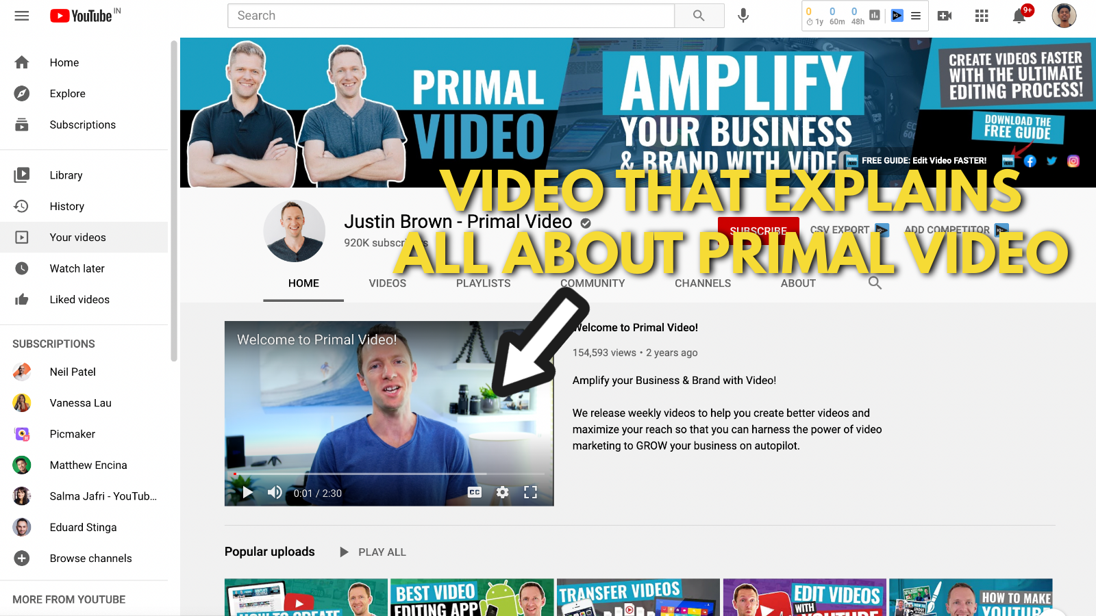
Right from the Banner to their about section, the brothers are very clear that this channel is not just made by Justin Brown. Primal video consists of two people, which is Justin and his brother, Mike. They go to great lengths to explain that point in detail.
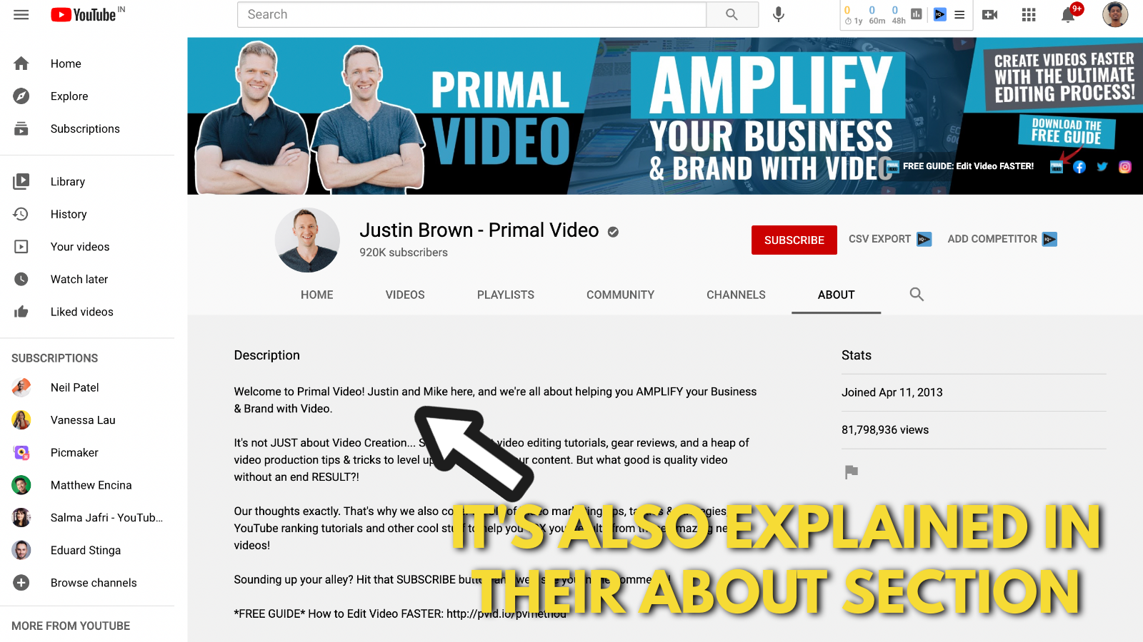
The brothers even have an explainer video to state their journey and how Primal Video came into being.
So if your YouTube channel involves more than one person, go ahead and explain it. Small points like this humanize your channel and allow your viewers to connect with you.
2. Always stay consistent with your brand colours
In our previous example, we saw Neil Patel’s channel with the orange and white theme. The guys at Primal Video have created this blue, black, and white theme for their banner.
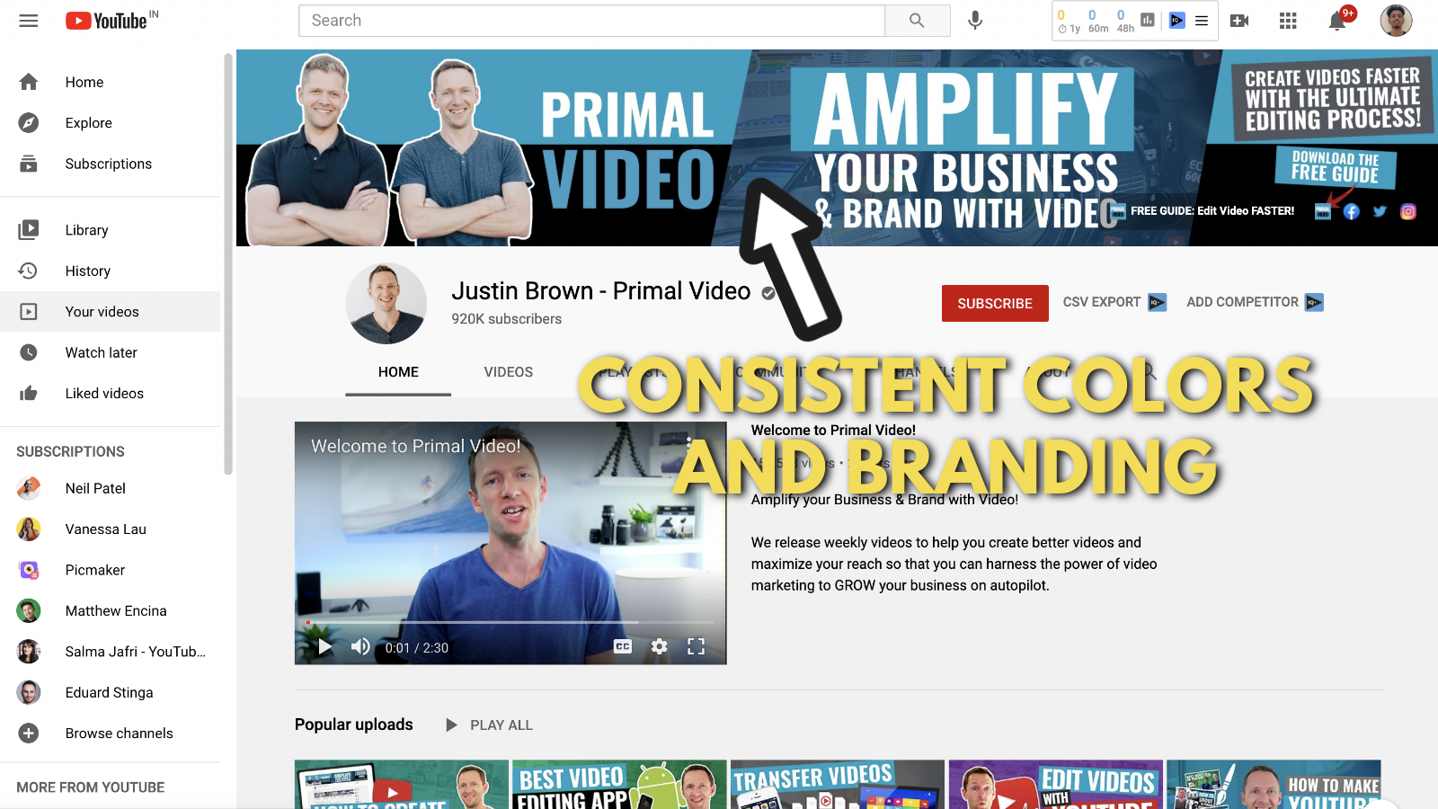
It’s also consistent on their website and logo. It shows that they are maintaining a consistent color theme in all their marketing materials.
Consistency is a big factor in brand building. That's exactly why we push the idea of color consistency in all our YouTube channel art examples.
3. Explain how your visitors can benefit from your channel
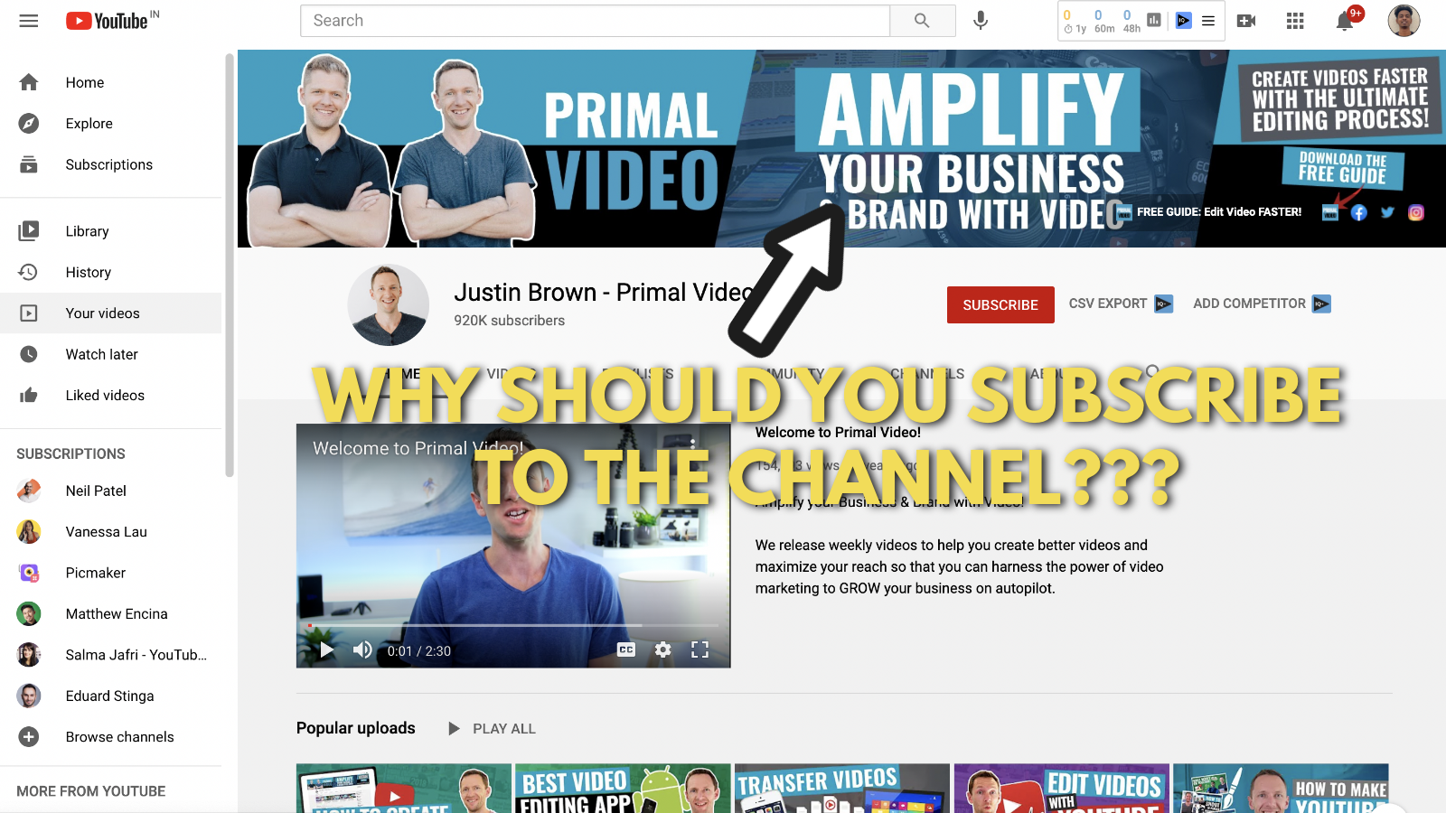
“Amplify your business and brand with Video”
It’s that simple.
That’s exactly how you will benefit after watching the videos made by Justin and Mike. Their videos will help you amplify your business and brand with video. If you’re a business owner or a marketer looking to explore videos, we recommend you subscribe to their YouTube channel.
4. Add a CTA to your website/ landing page on your YouTube channel art
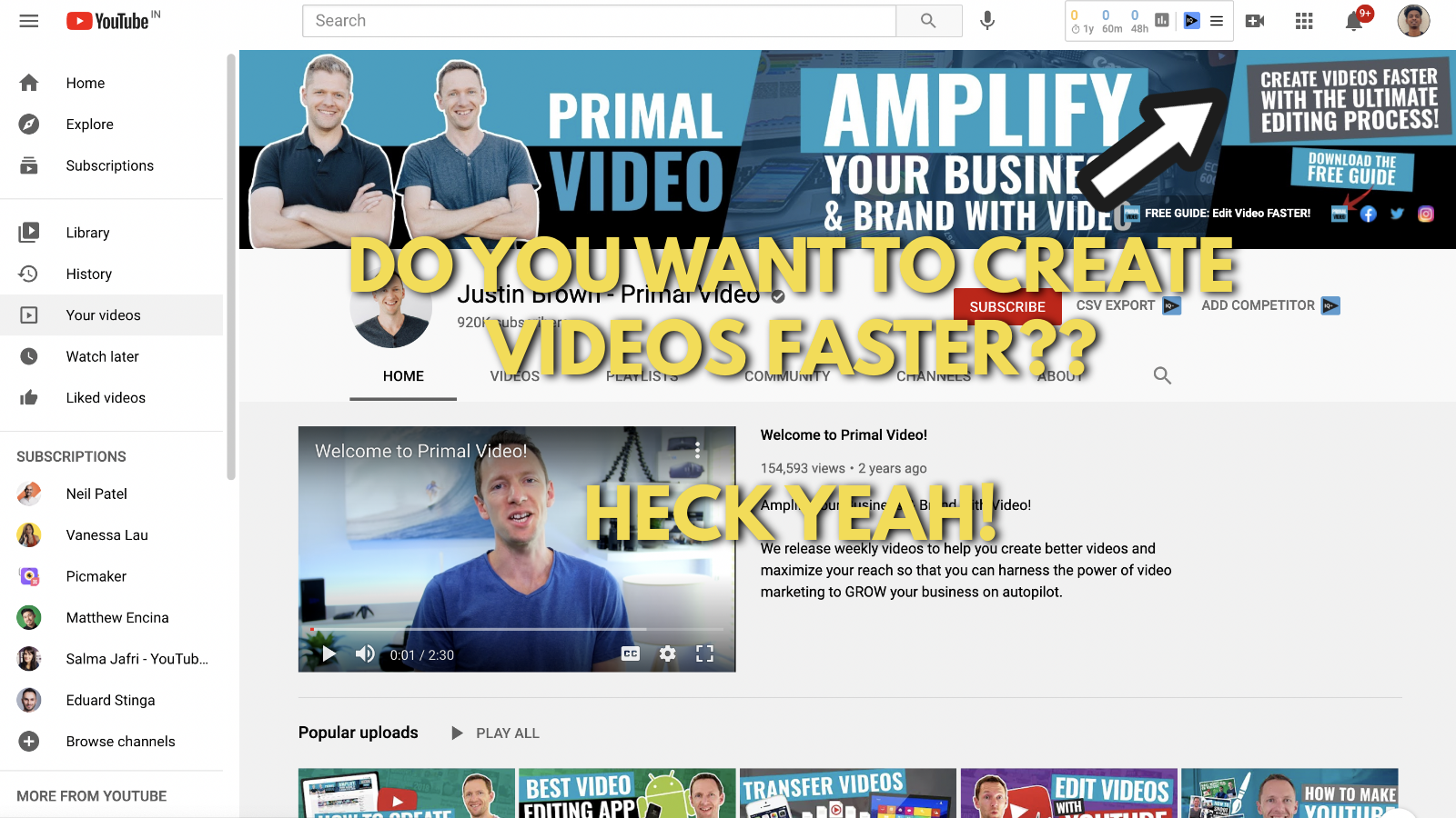
Here’s the most fascinating thing about Primal Videos’ YouTube channel - their CTA. Their outbound link points to a landing page that lets you download their free video editing guide. But in exchange for that, you need to submit your name and email address.
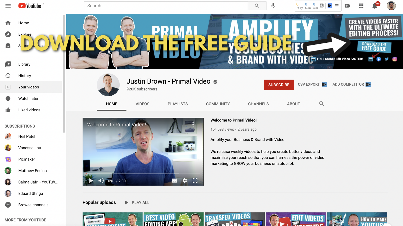
Here’s the best part about this process. With this CTA, these guys are not just converting YouTube visitors into website visitors.
Once you click on that link, you're taken to their landing page.
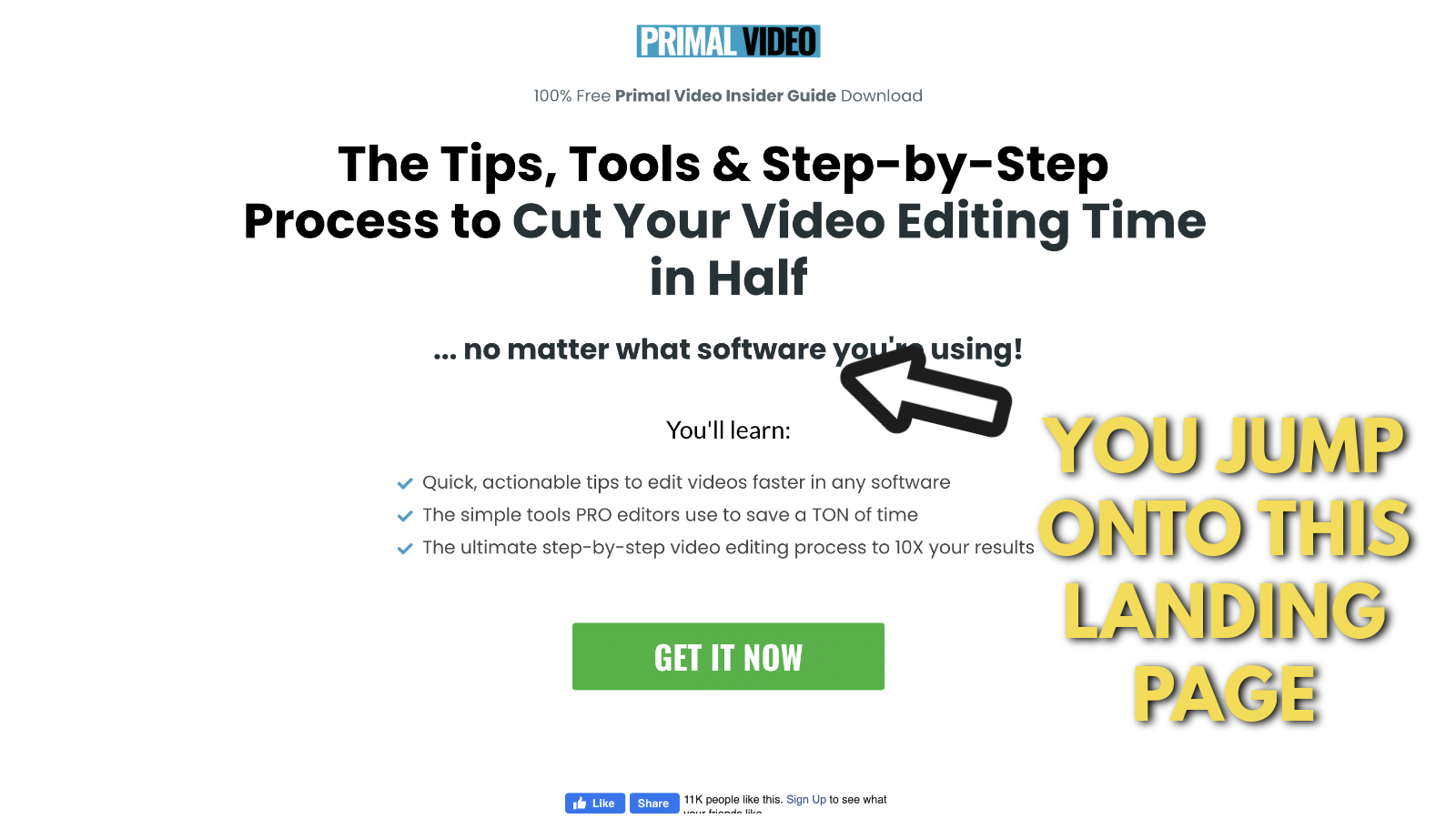
Once you click on "Get it now", you're prompted to enter your name and email ID.
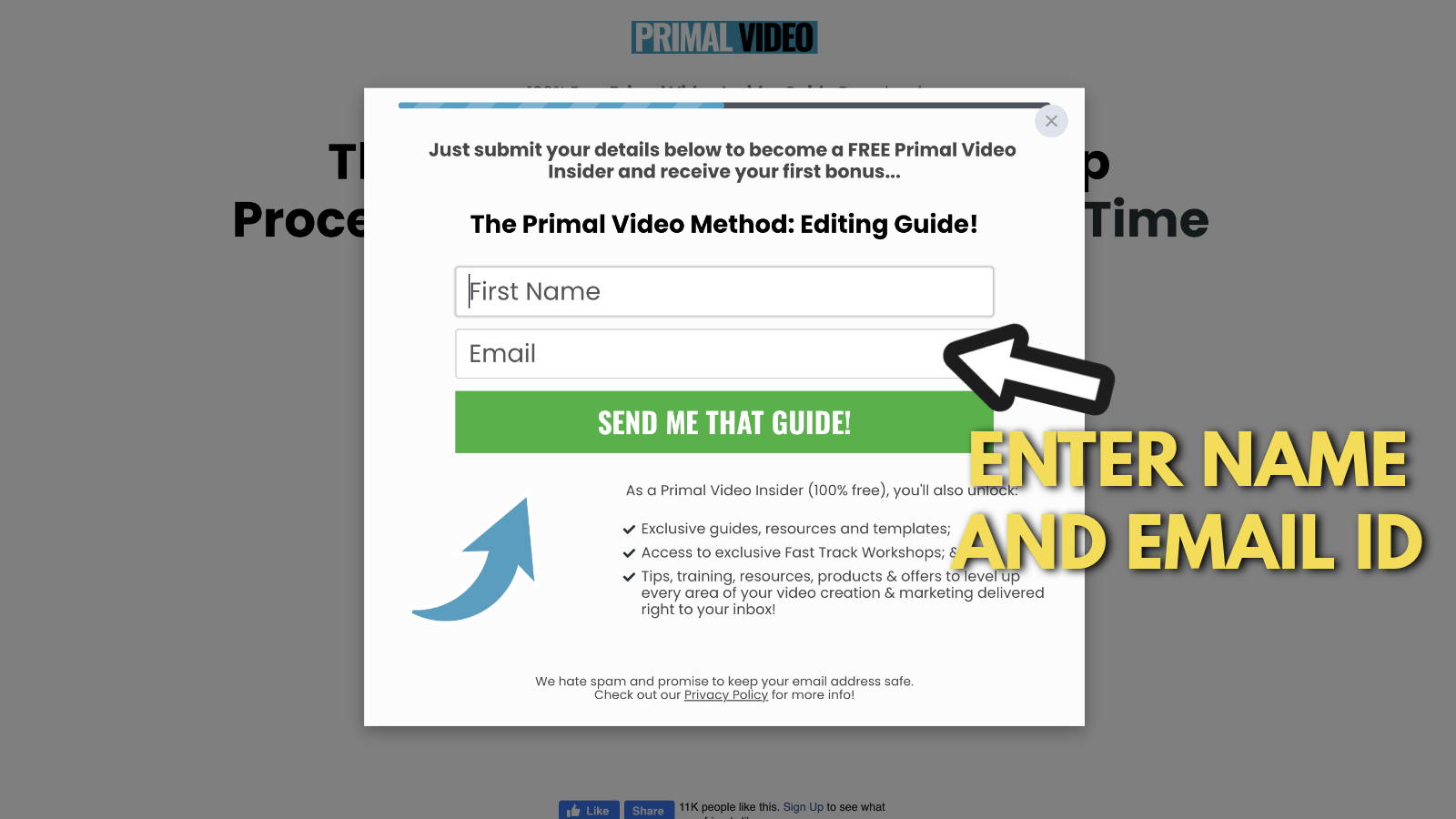
They are converting YouTube visitors into leads for their business. By collecting their email IDs, they can send emails and eventually convert you into one of their customers. This is what we call a funnel in marketing terms.
After entering your email and name, you will receive an automated email from Justin Brown.
Now you can download the guide and use it to create videos quicker. On the other hand, the brothers at Primal Video can send emails and eventually convert you into a paying customer.
Wouldn't you call that a smart move?
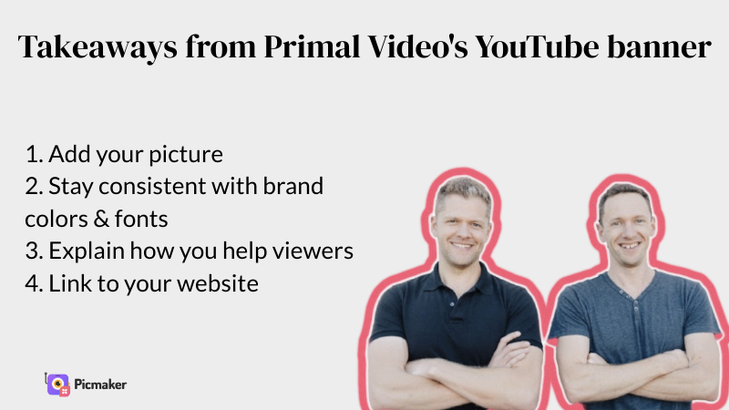
Takeaways from Justin Brown’s YouTube banner example
Josh Ryan's YouTube channel art example
Josh Ryan is another platform-focused digital marketer. While Justin Brown's channel focuses on video marketing, Josh’s channel focuses on Instagram Marketing. All his videos help you become a better Instagram marketer.
If you want to learn more about Instagram marketing, check out the interview I conducted with Haris Aboobacker. This guy failed in 16 different businesses before he started his highly successful digital marketing agency.
Now let’s dive into Josh Ryan’s Youtube banner example and use this to create your very own YouTube banner.
1. Add your photo, name and your profession
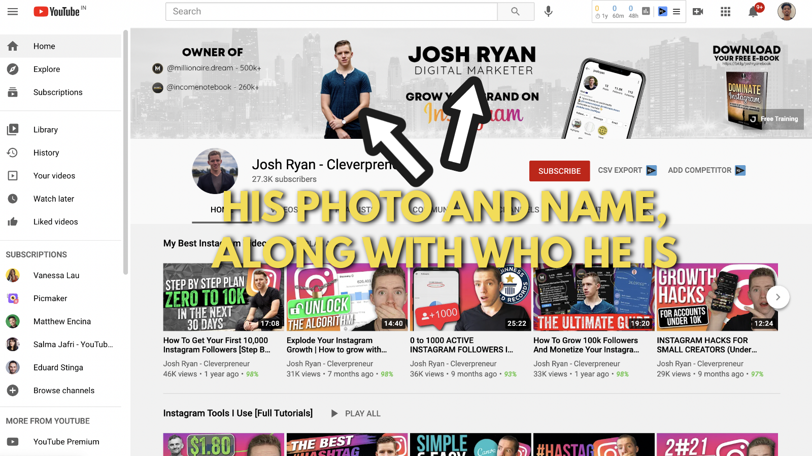
Just like Justin Brown and Neil Patel, Josh’s channel is also based on his own personal brand as a digital marketer. So he uses his photo and his name on the banner. Referring to the scientific study we mentioned earlier, people remember a face better than they remember objects.
So there’s 100 points for Josh right there.
The next clever thing he does is state his name and profession at the center of the banner. It’s the subtle way of saying “I’m Josh Ryan and I'm a digital marketer."
These are small points that stick in your audience's mind.
2. Take this chance to show proof of what you've accomplished
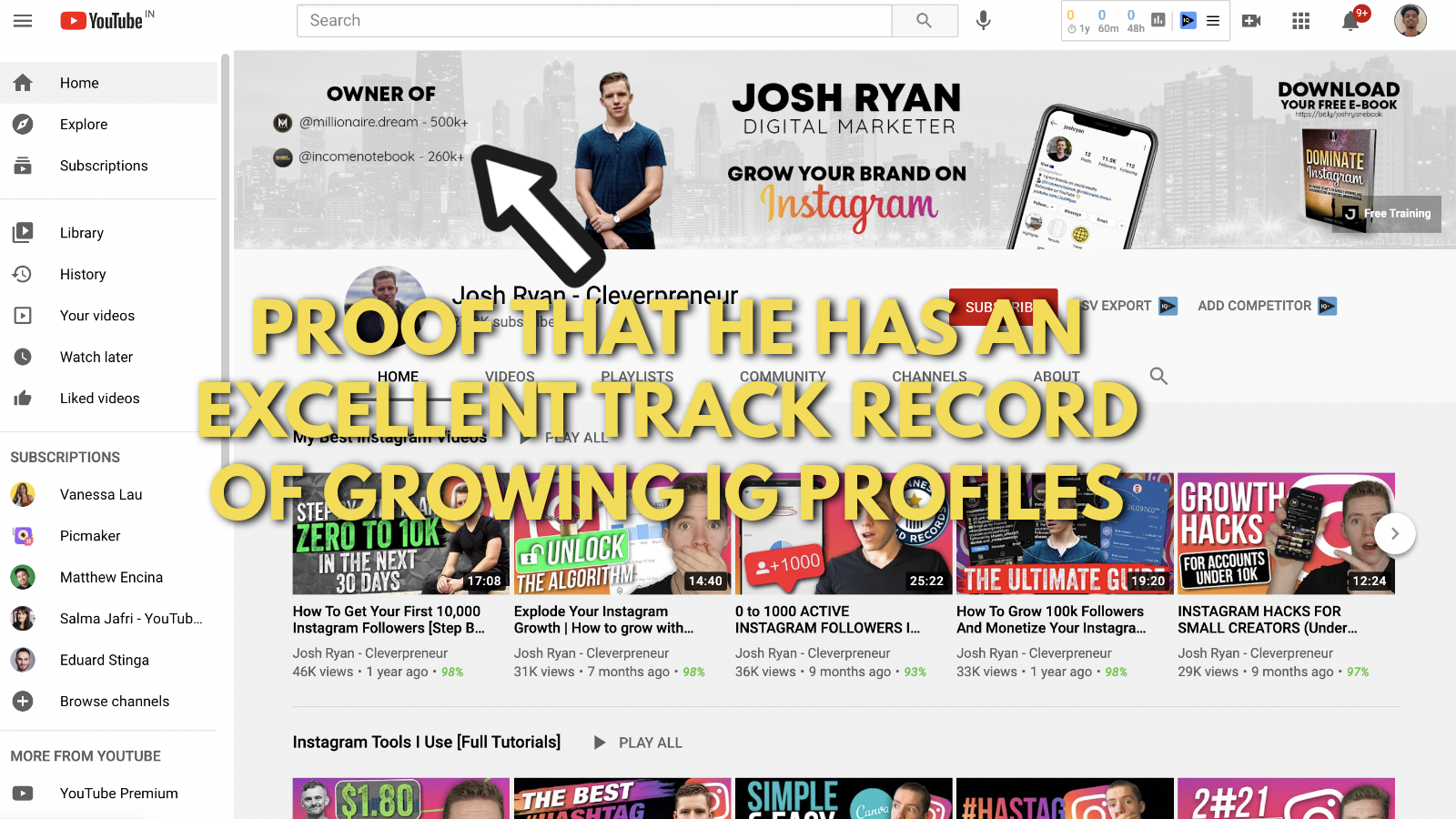
The left side of Josh's banner is dedicated to explaining the amazing work he has done with his Instagram profiles in the past.
Take a look at Millionaire.dream with more than 500,000 followers.
Now that’s awesome.
Take a look at Incomenotebook with 260,000+ followers. Now that’s even better.
These are small points that show social proof. Your brain subconsciously takes these cues and judges Josh. You begin to think, "Wow, this guy sure knows what he’s doing with Instagram marketing”.
These small points are what our brain uses to convince us that Josh Ryan truly understands Instagram marketing.
3. Showcase screenshots of your social media profiles
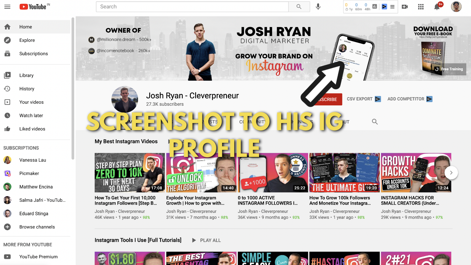
Josh Ryan showcases a screenshot of his Instagram profile on his banner.
It’s nothing special, but it’s definitely not something you see out there every day.
You can clearly see that he has 10,000+ followers on his Instagram profile. This adds to his authority and shows him as an expert in your eyes. This is yet another social proof for your subconscious brain to think and act on.
4. Add an outbound link to your lead magnet
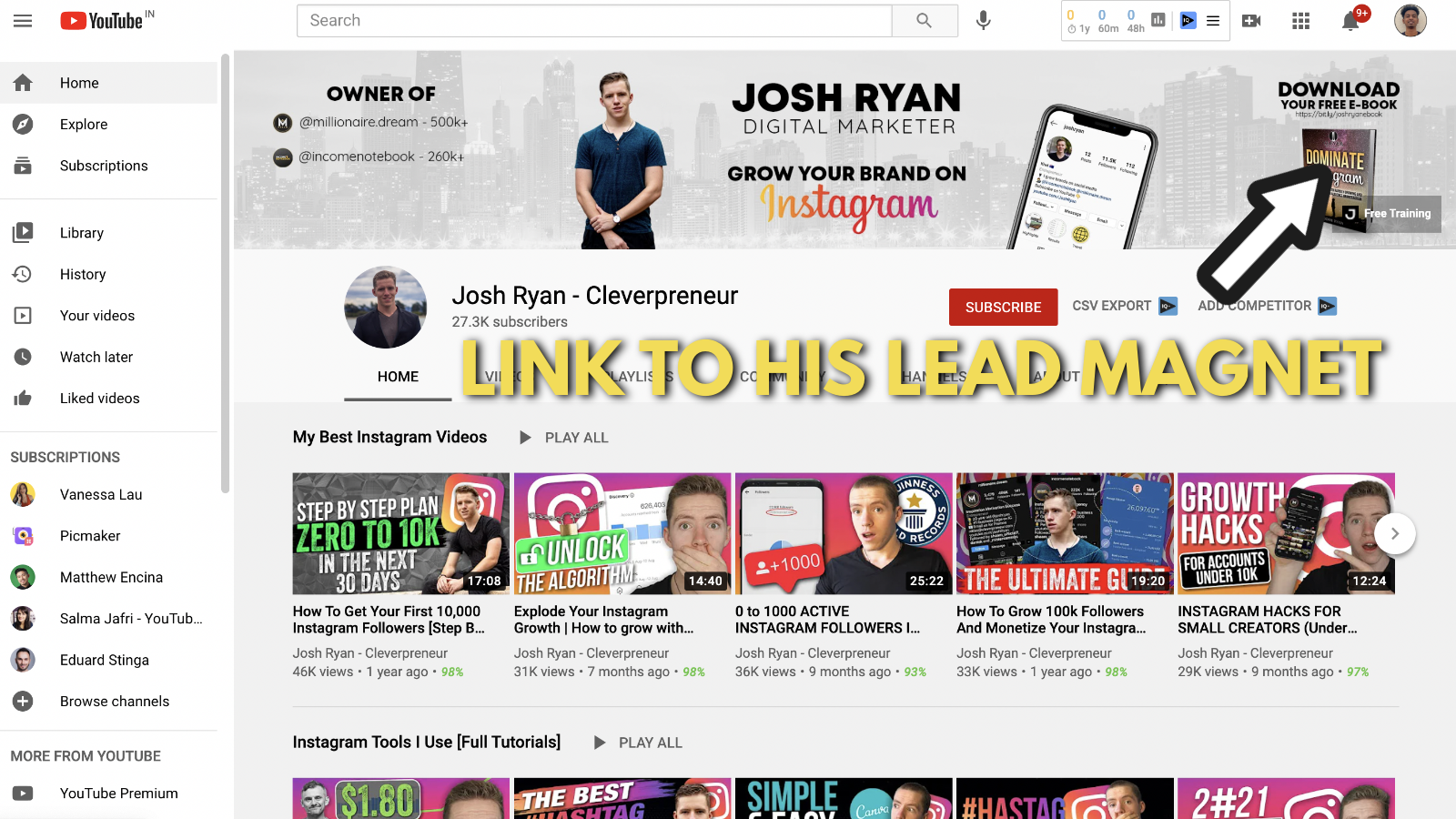
We previously saw that Justin Brown used a lead magnet to his landing page. But he had a ton of other links on his Youtube banner.
But Josh has just one link on his YouTube banner. This directly links to one of his landing pages.
While the others have multiple links on their banner, Ryan on the other hand keeps it focused by just adding one link to the banner.
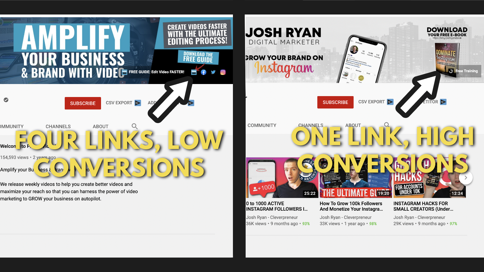
This way he can keep the conversion rates high on his website. If you have no clue about conversion rates, this guide from Wordstream can help you with it.
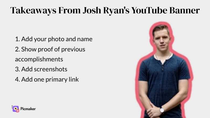
Takeaways from Josh Ryan’s YouTube banner example
Related reading for Youtube banner examples:
Salma Jaffri’s YouTube banner example
Salma Jaffri is a YouTube influencer who focuses on video marketing. One look at her YouTube channel art example and you can figure out that she’s all about that youtube and video marketing.
After reading a bit through her 'About' section and binge-watching some of her videos, we found three key things about her:
- Salma Jaffri is always on point
- She doesn’t just help you create better videos, she also helps you become confident in front of the camera
- All her advice is based on practical experience (none of that reading a couple of blog posts and regurgitating information to sound like an expert)
Let's break down Salam Jaffri’s Youtube banner example.
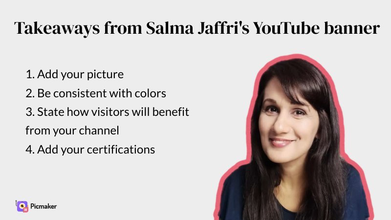
1. Add your picture on your YouTube banner
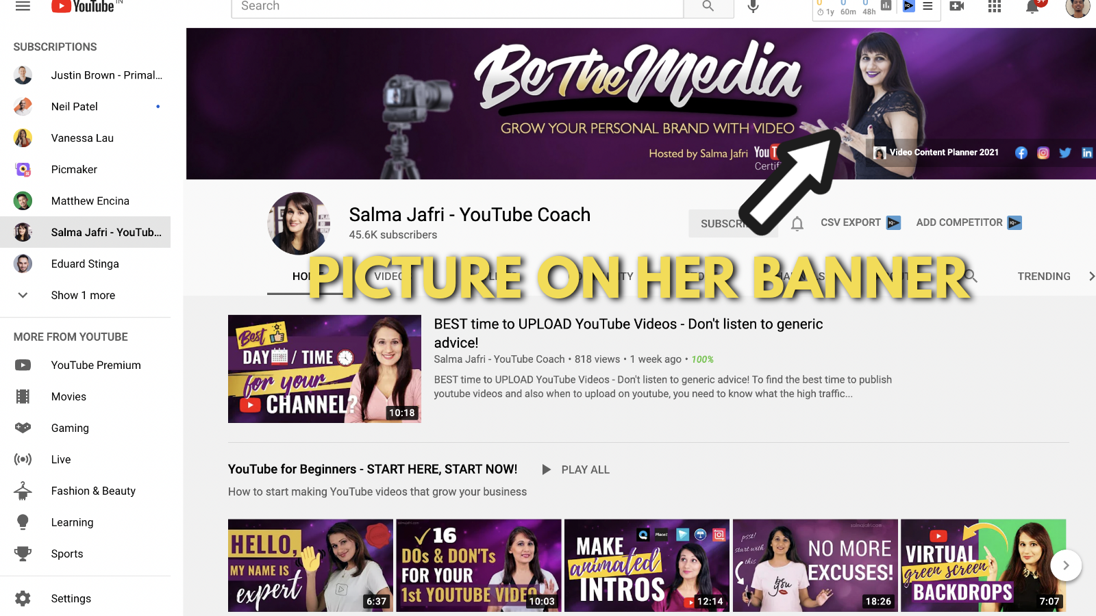
Just like all our examples listed above, Salma Jaffri has added her picture to her YouTube banner. As her channel is powered by her personal brand, this is helpful in branding herself as the youtube coach.
Like we said before, people remember a face more than they remember an object or a logo
2. Stay consistent with your colour theme
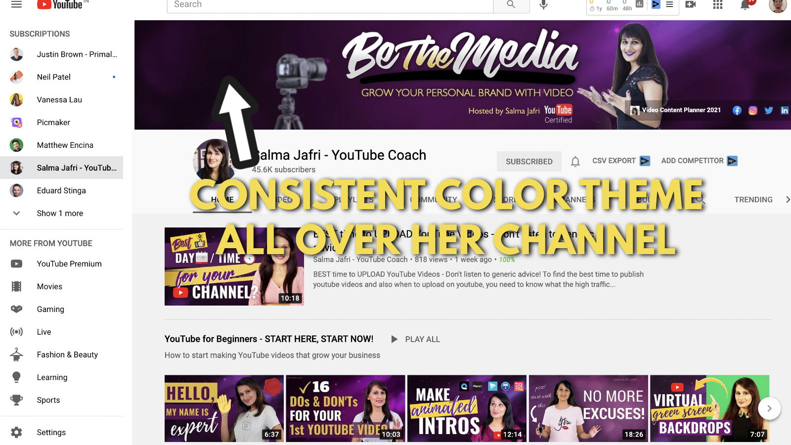
Her banner has a purple color that she uses all over her channel.
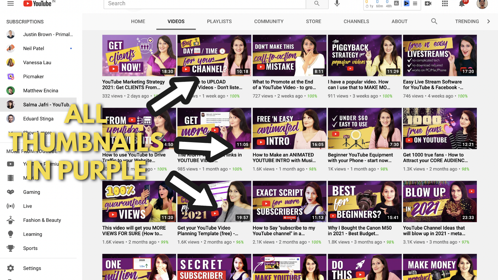
Even all her YouTube thumbnails are based on the purple theme, giving a consistent theme to her channel. Yet again, you can see colour consistency playing a big role in another YouTub channel art example.
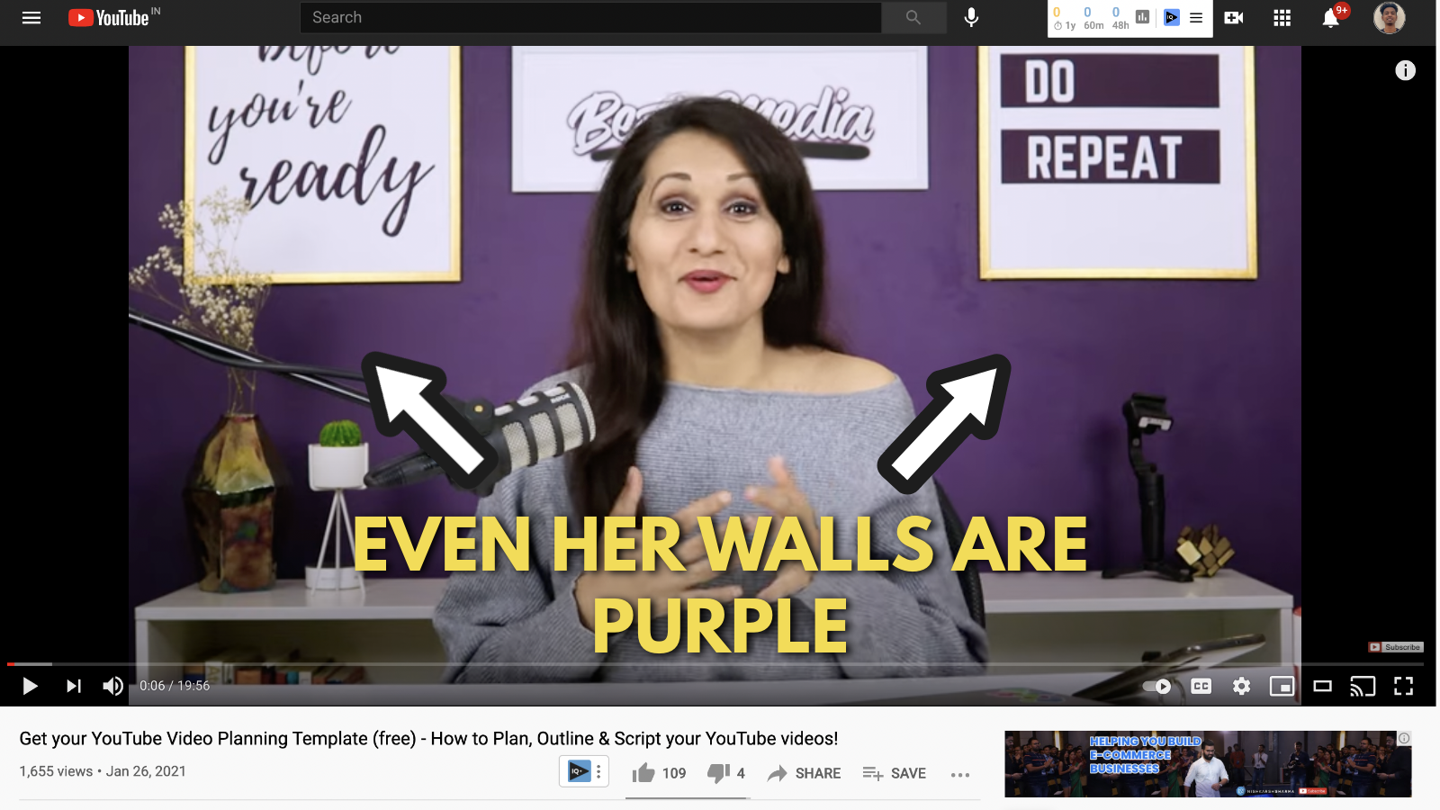
When you take a look at her videos, you will notice that one of her walls has also been painted purple in her videos. Talk about going the distance to maintain consistency.
3. Explain how your visitors can benefit from your channel
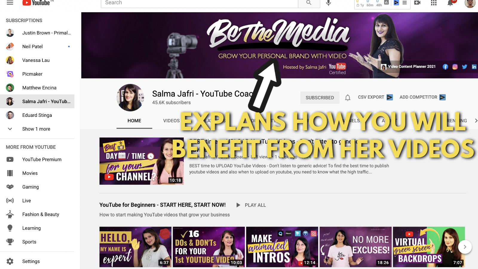
Salma also mentions the tagline of her YouTube banner as “Be The Media”. We don't know what that means, but there is something below that phrase that is really important.
She mentions the sentence, “Grow your personal brand with video”. There are two things you will understand as a viewer from this message.
What does Salma do?
- She helps people develop their personal brands
How does she help them do that?
- She helps them do that with the power of video marketing.
It’s a simple sentence that goes a long way in explaining what she can do for you.
4. Show off your certifications
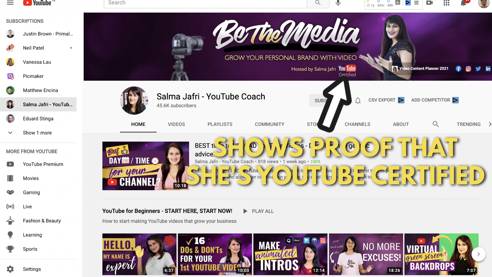
Okay, now this one is different from all the other takeaways on the other YouTube channel art examples.
Being a YouTube-certified coach adds so much volume to her credibility meter. As we said before, this is a tiny detail that can make a big difference on your YouTube banner.
Just putting up the small label as 'YouTube-certified,' makes her credible and authoritative in your eyes.
5. Add outbound links to social media and your website
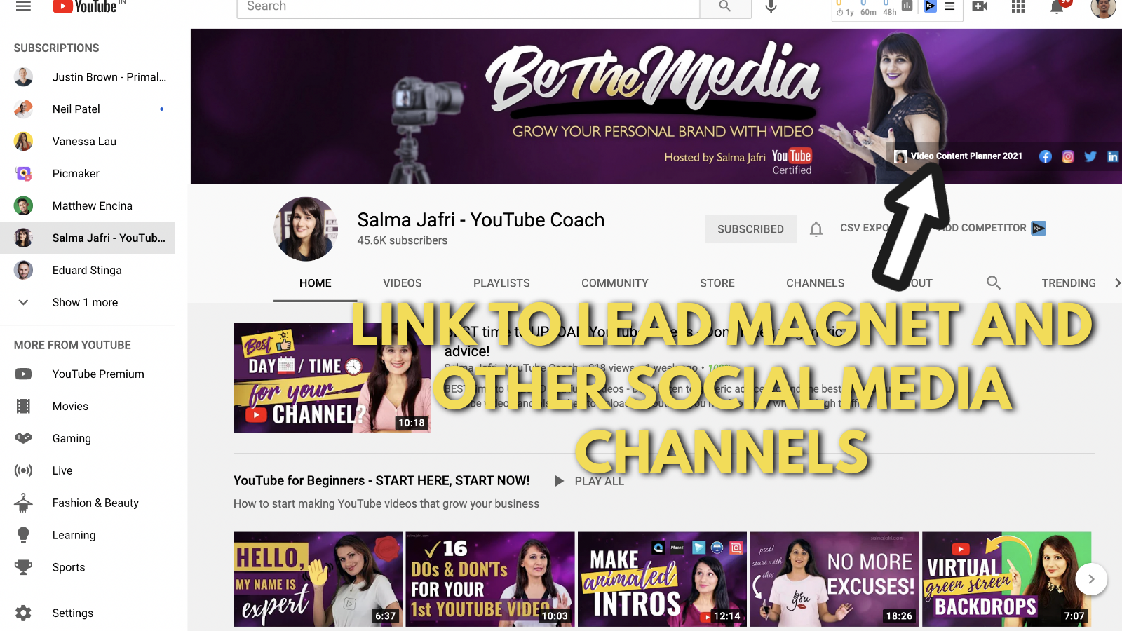
And, finally, her YouTube banner has outbound links to all her social media channels and her video content planner. This allows her to get the maximum benefit out of her custom YouTube banner.
Her primary link points to her Video content planner landing page. Once you enter your email , you will get full access to her video content planner.
Once you enter your email address, you will receive an automated email from Salma.
You can download the word document from her email by clicking on any one of the two links.
Takeaways from Salma Jaffri’s YouTube banner example
Related reading for YouTube banner examples:
Alex Toby’s YouTube banner example
Alex Toby has gained a massive niche following with just 48 videos (the count may increase by the time you read this blog). But the number of videos to subscribers isn’t the only thing that’s peculiar about her channel.
She also has created a YouTube banner that is simple without including a ton of details. In all ways, this YouTube banner is different from all others we’ve seen out there.
Let’s look closely at Alex Toby’s YouTube channel art example.
1. Add your name and photo on your YouTube banner
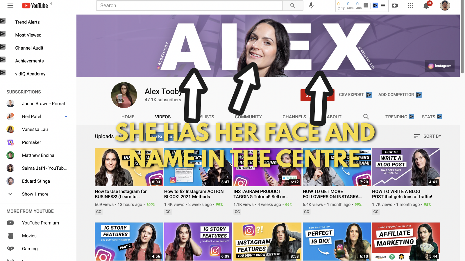
Alex Toby is a personal brand and she portrays the same on her Youtube channel. Her banner has her name and picture at the center. Just like everyone you’ve seen in this list, she understands the importance of a personal brand and focuses on getting that.
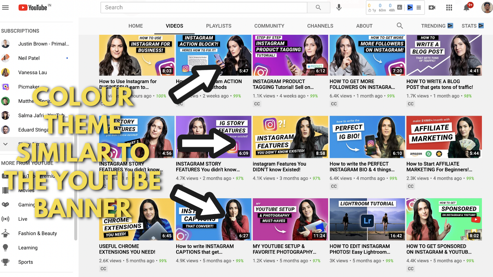
2. Keep your theme simple
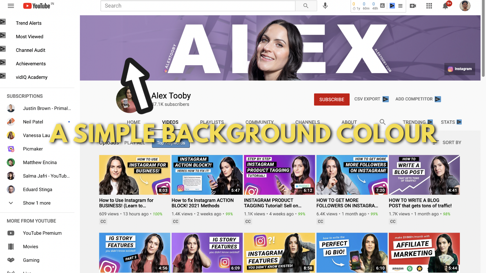
Her YouTube banner consists of a very casual purple. This purple theme is much similar to the thumbnails of all her videos. They all have one color with the text and a photo of Alex in the middle.
3. It's okay if you just want to have one link on the banner
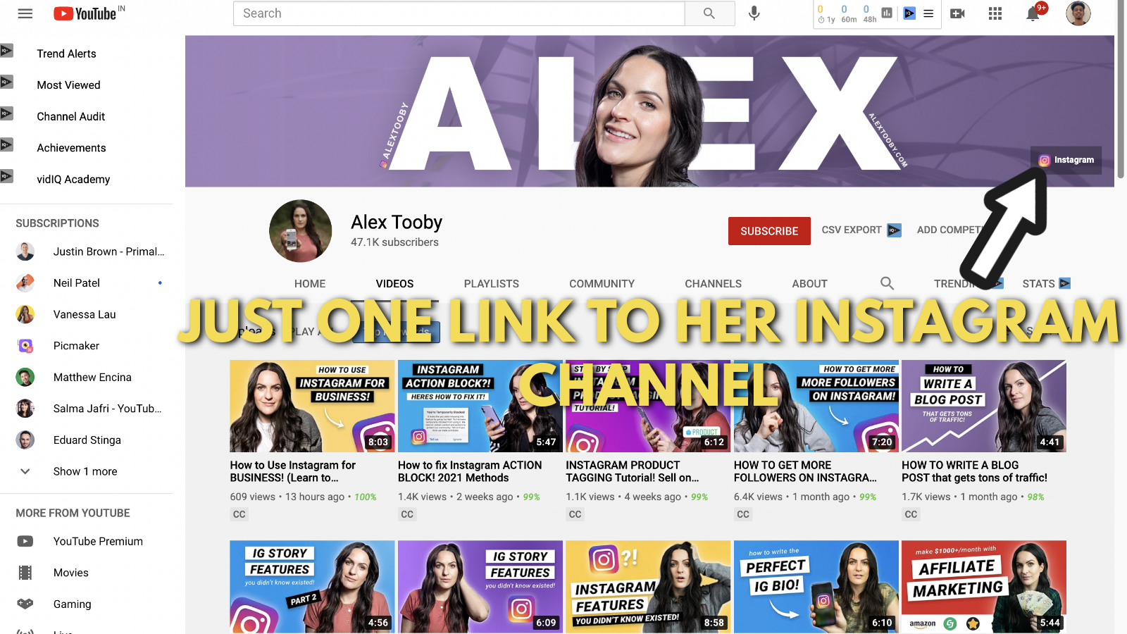
Alex uses a focused link to her Instagram account. Unlike the other influencers on this list, she doesn’t push people to a landing page or a website. She uses her Instagram channel as her foundation.
Alex uses her Instagram account to nurture followers and eventually convert them into long-term customers.
The biggest takeaway from Alex’s YouTube channel art example is that - there’s no one way to convert more YouTube channel visitors into customers.
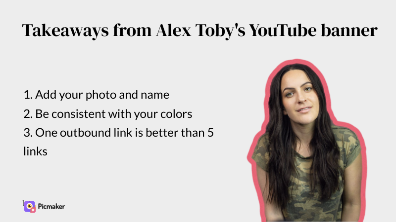
Takeaways from Alex Toby’s YouTube banner example
Ahrefs YouTube banner example
Let us now focus on a few brands/companies that have terrific YouTuber banner examples.
We’re big fans of content marketing and content experience, i.e., how is content experienced by a consumer. And, marketers at Ahrefs know how to package their content for better consumption.
If you’re not someone into online marketing, here’s a short explainer about Ahrefs. Ahrefs is an organization that has a SaaS tool for online marketers.
It helps you identify flaws in your website as well as potential keywords opportunities for your website. It can also help you spy on competitors and understand how they’re doing better than you.
But that’s just the beginning of what Ahrefs can do as a tool. If you want to learn more, visit their website.
Let's break down Ahrefs’s Youtube banner example now.
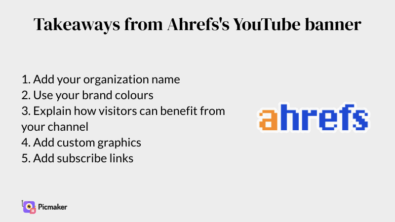
1. Add your name in the middle position of your banner
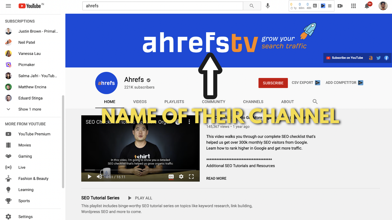
You might have noticed that their name is mentioned as AhrefsTV and not Ahrefs. We don't know why. But whatever be the reason, their name appears at the center of their YouTube banner.
Even though it's not important to place your name inside your YouTube banner, it can improve your brand recall. Especially when you're a new organization and you're just starting out.
2. A themed background
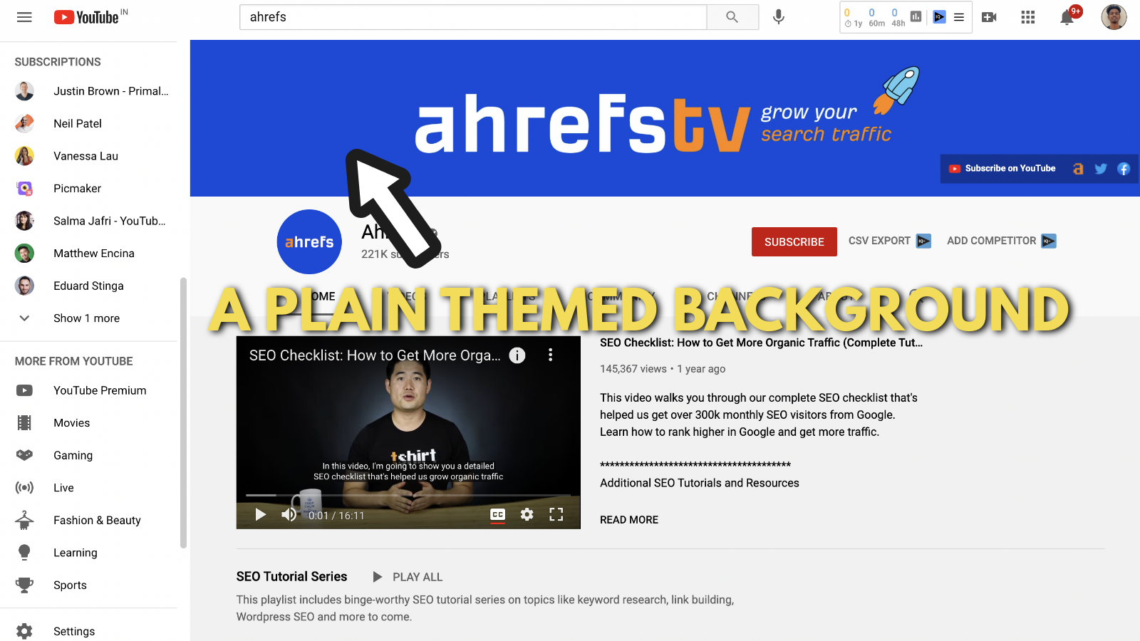
Ahrefs rebranded their websites and all social media channels to fit the new theme. This was done last year and ever since they have stuck with the blue theme and the slick looking font. They created the banner with the original theme in the background.
3. Explain what your channel is all about
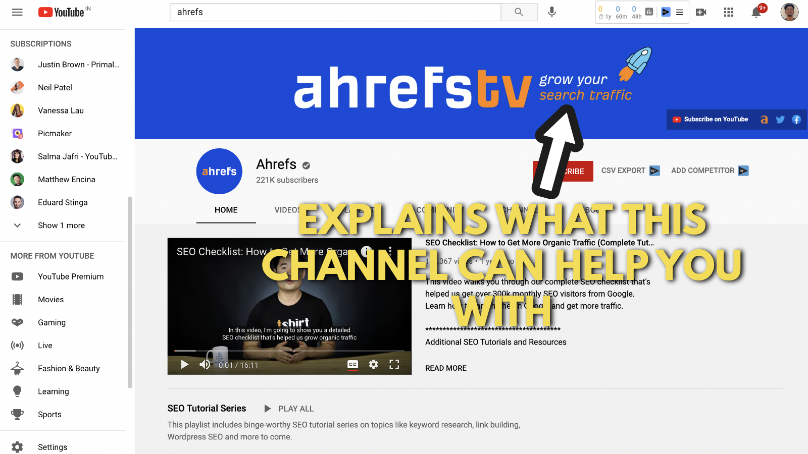
“Grow your search traffic,” - That’s all they say after their name on the banner. Their videos will help you grow your search traffic, and that’s why you should subscribe to their YouTube channel.
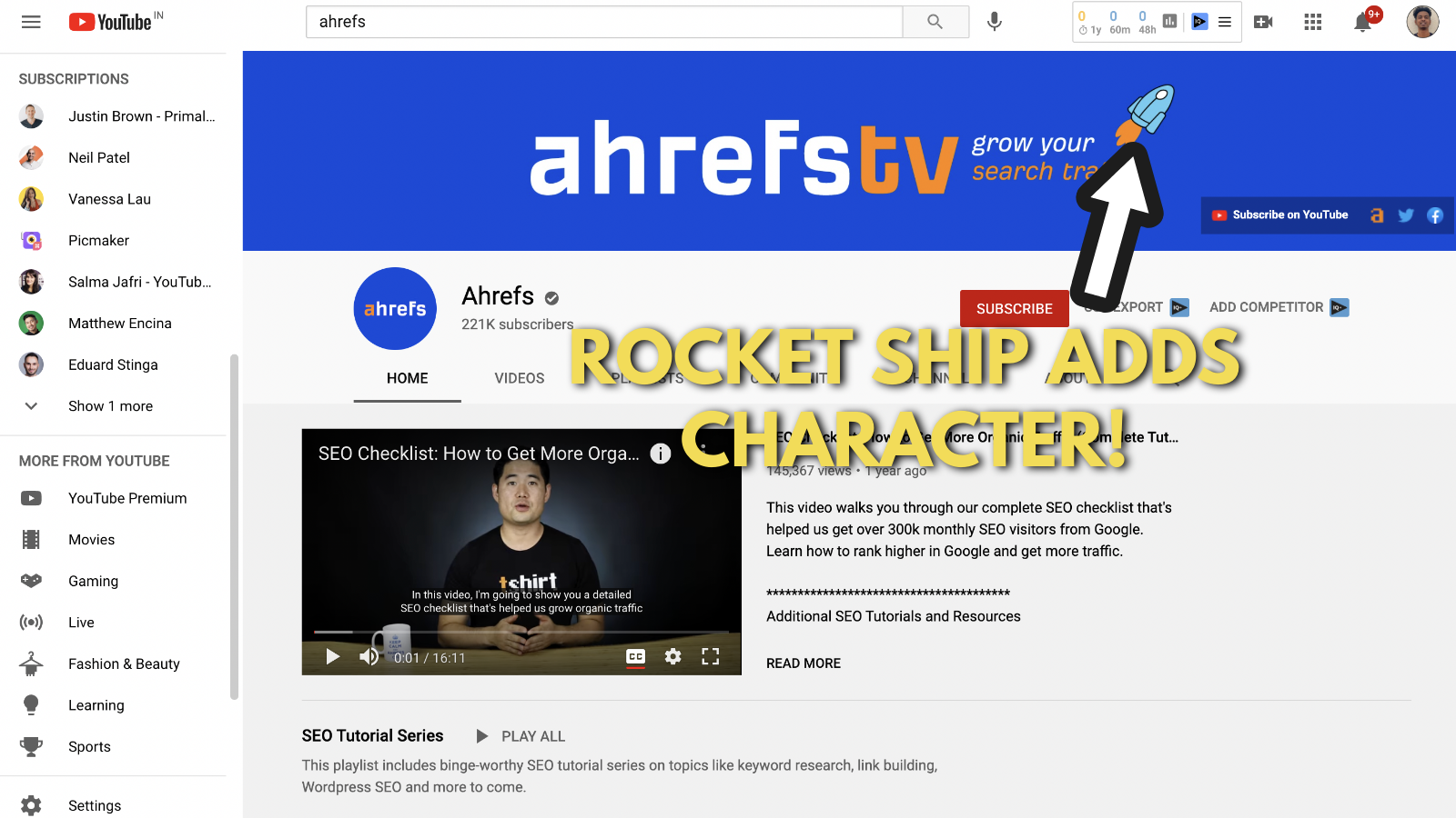
4. Add graphic elements to show your personality
We're big fans of adding graphics to our YouTube banner. Picmaker has tons of free graphics and we add them to all our designs.
But that’s not the point here.
The small rocket symbol shows that you can grow your search traffic fast with Ahrefs. At least, that’s what we make out of their design.
Adding such graphics makes your YouTube banners look interesting.
5. They have outbound links, but the primary link stands out
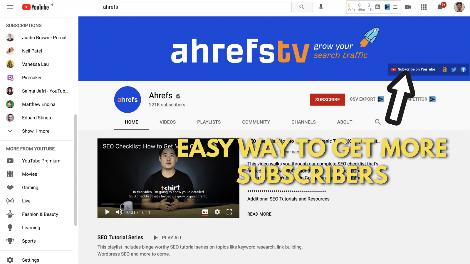
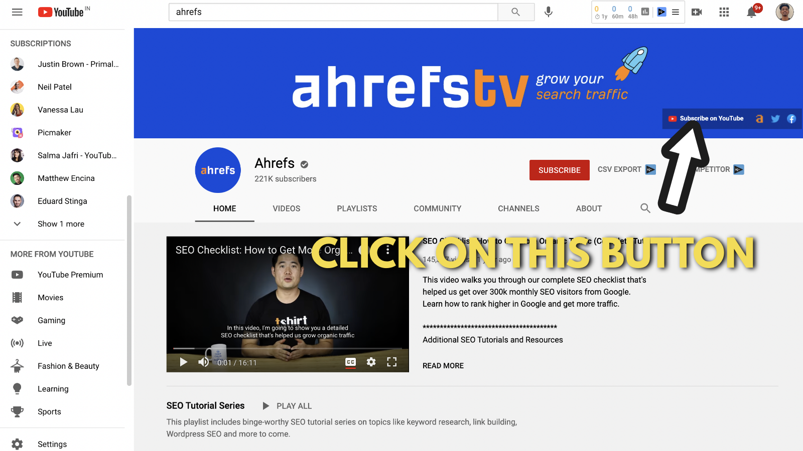
They have outbound links to their website and social media channels. But the link that captured our attention was the 'Subscribe' button. You can also add a 'Subscribe' button on your YouTube channel, by going through the steps mentioned in this blog.
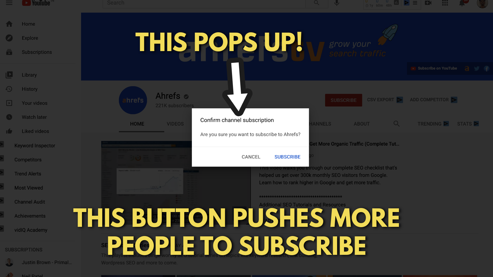
Here's exactly how this button can get more subscribers for Ahrefs's YouTube channel.
Once you click on that button, a pop-up appears.
Takeaways from Ahrefs’s YouTube channel example
Hubspot's YouTube banner example
Hubspot is a big CRM company. Lately, they have also been venturing into the sales and customer service space. Just like Ahrefs, HubSpot is another organization that’s big on content marketing.
We could go on and on about Hubspot, but you can definitely learn more about them with a Google search. There is going to be a bunch of information, even HubSpot to google sheets via Coupler.io, which is a very interesting one as well.
In the meantime, let’s break down HubsSpot’s YouTube channel art example.
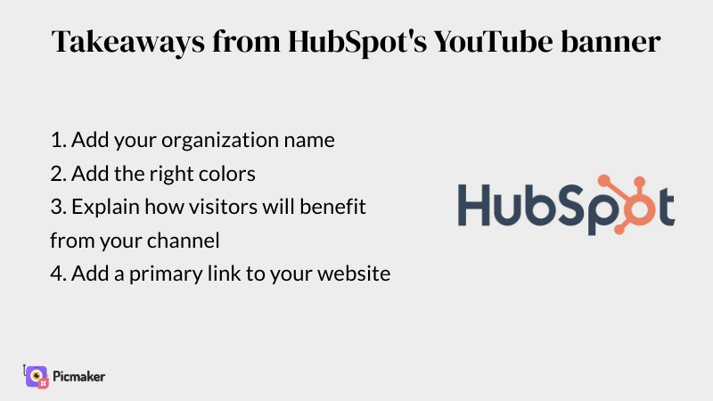
1. Add the name and color theme of your brand
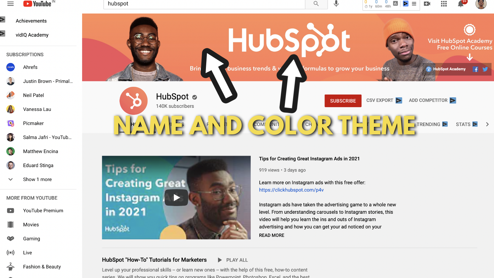
The first thing you need to pay attention is to their color theme. HubSpot has maintained time. Ask anyone in the digital marketing space about a brand that’s closely associated with orange and you’ll get two names.
One is HubSpot and the other is Neil Patel.
2. The prime presenters on HubSpot's YouTube banner
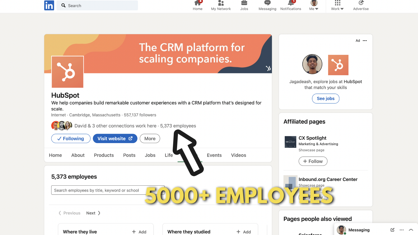
Hubspot has 5000+ employees in branches located all over the world. I’m serious about this fact. Here’s a look at their company page to verify that detail.
Even with 5000+ employees in their organization, they have decided to feature their top two presenters on their channel. The reason behind this concept is simple - people remember faces more than they remember logos and objects.
Featuring their presenters on their YouTube banner allows their audience to connect with their content on a deeper level.
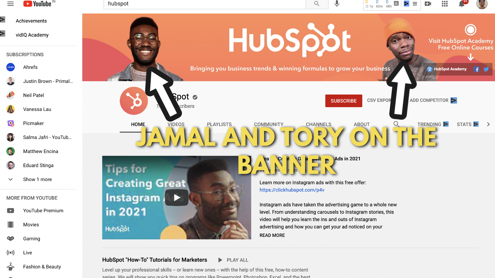
So they have decided to feature their two presenters, Jamal and Tory on their banner. Kudos to HubSpot's marketers who came up with this brilliant idea.
3. Explain what your channel is all about
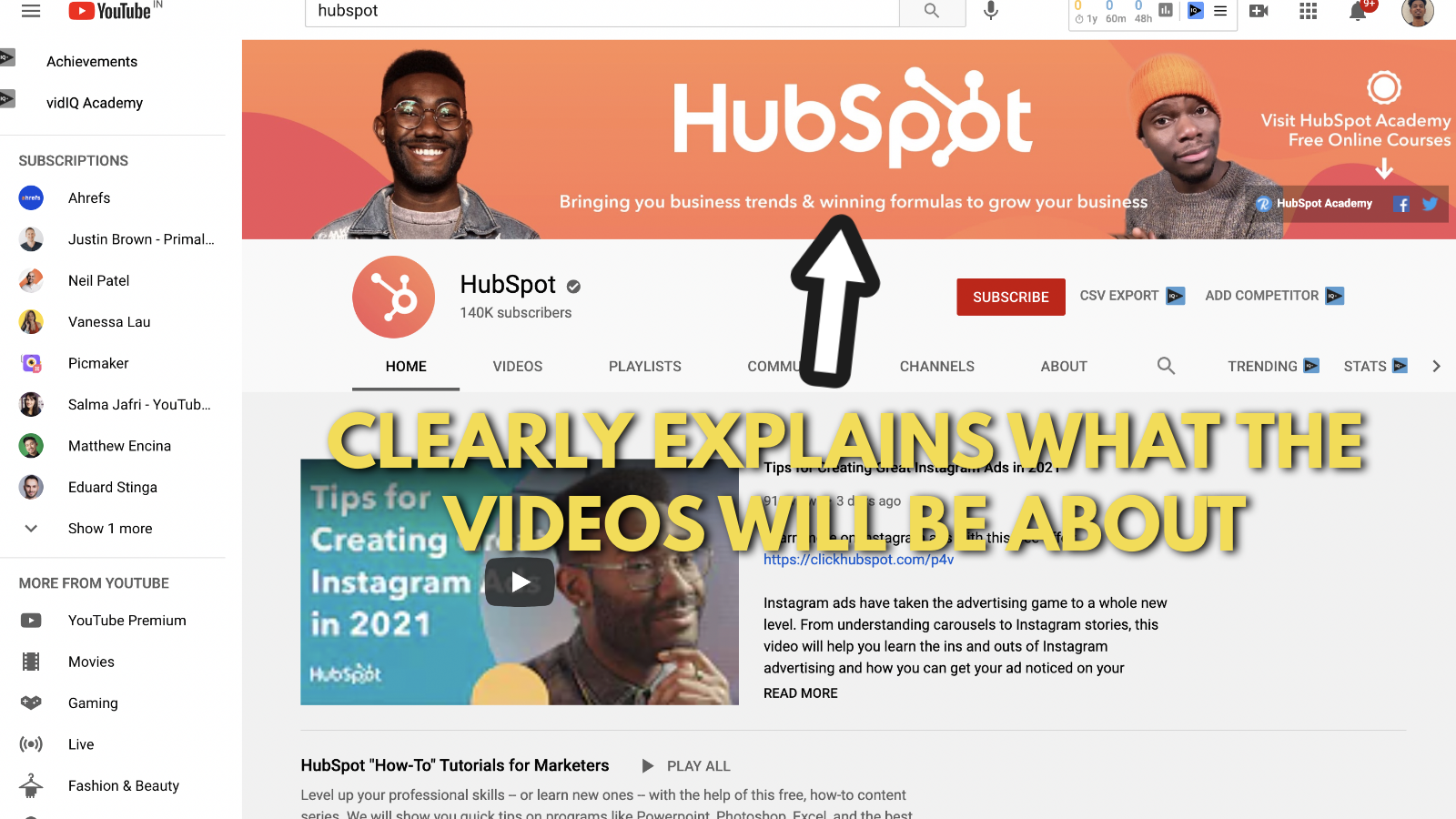
They clearly explain what the channel will be all about with a simple proposition.
“Business trends and winning formulas to grow your business."
This allows you to understand what the channel is all about. This is a small detail that goes a long way in a Youtube banner.
3. Add outbound links, with a primary link to your website
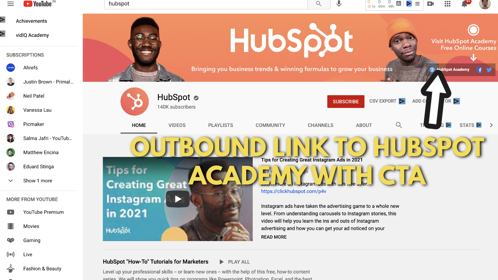
Apart from links to their Facebook and Twitter accounts, HubSpot has created one primary link for their Academy page.
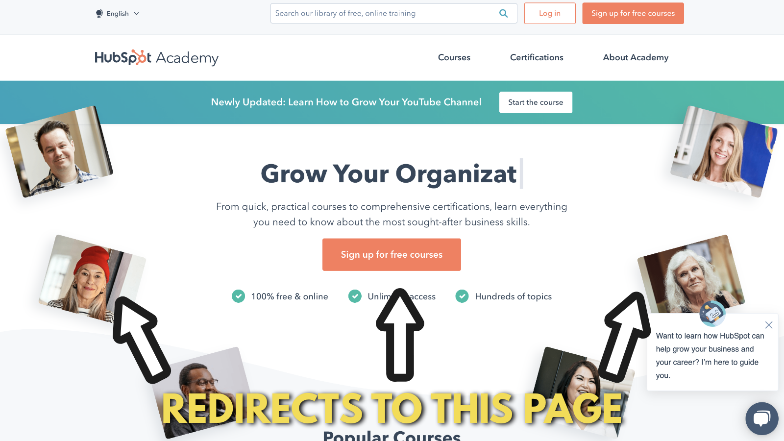
Hubspot academy offers courses and certifications on everything from social media, online marketing, and customer success.
Most of their certifications and courses are free. So if you’re looking to upskill, that can be a great place to start.
Takeaways from HubSpot’s YouTube banner
Related reading for YouTube channel art examples:
Let’s design our own YouTube banner now
Now, we will design a custom YouTube banner with our photos from our smartphone.
If you're looking for a detailed step-by-step guide for creating your YouTube banner, check out this detailed guide we put together.
We created a YouTube banner for an older blog and we will use as a reference for the custom banner in this post. We create all our YouTube banners using our free online YouTube banner maker.
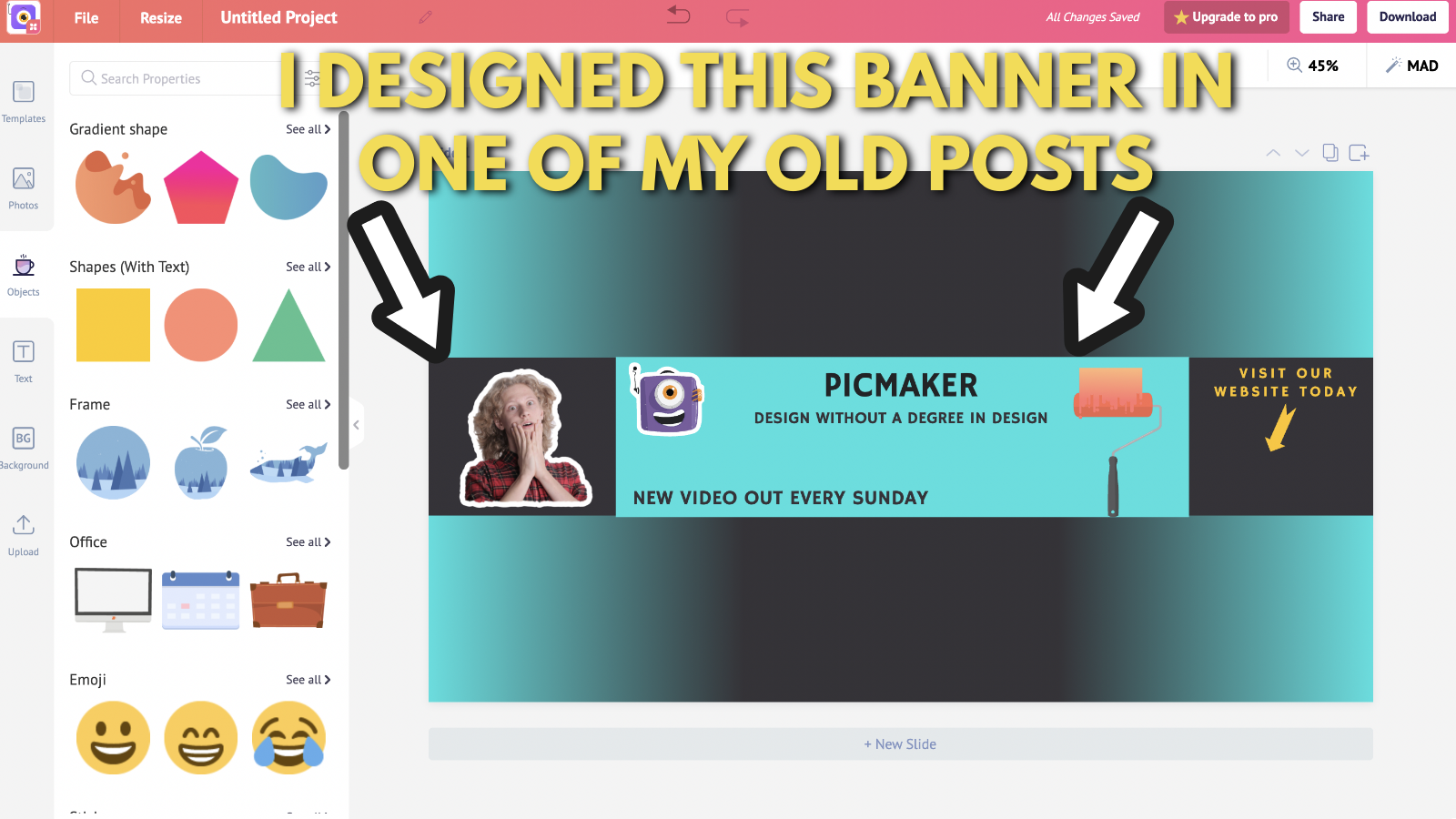
I am going to click on the stock picture and hit the ‘delete’ icon in the dropdown toolbar.
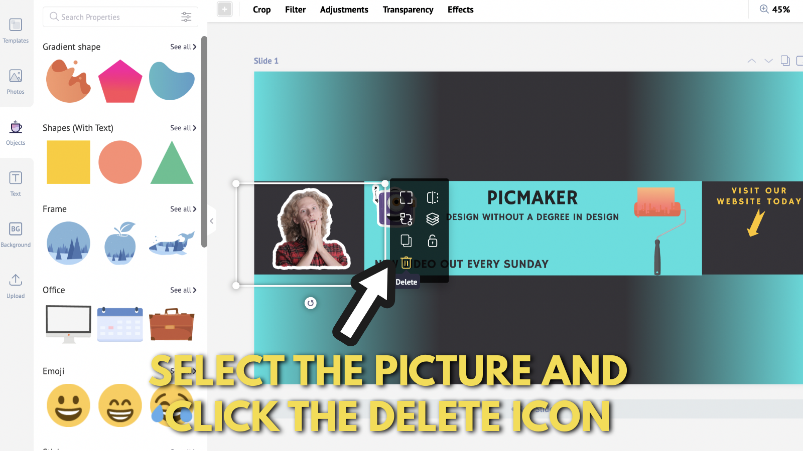
Click on the 'bin' shaped button to delete from your canvas.
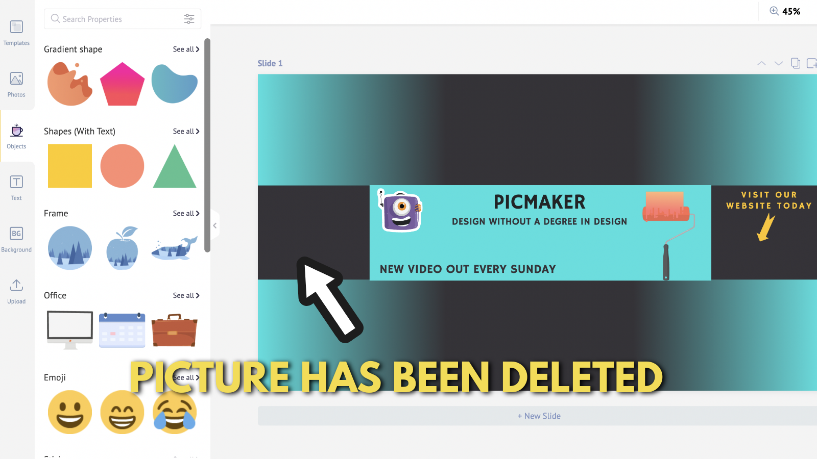
Now I am going to upload a picture of my own ugly self.
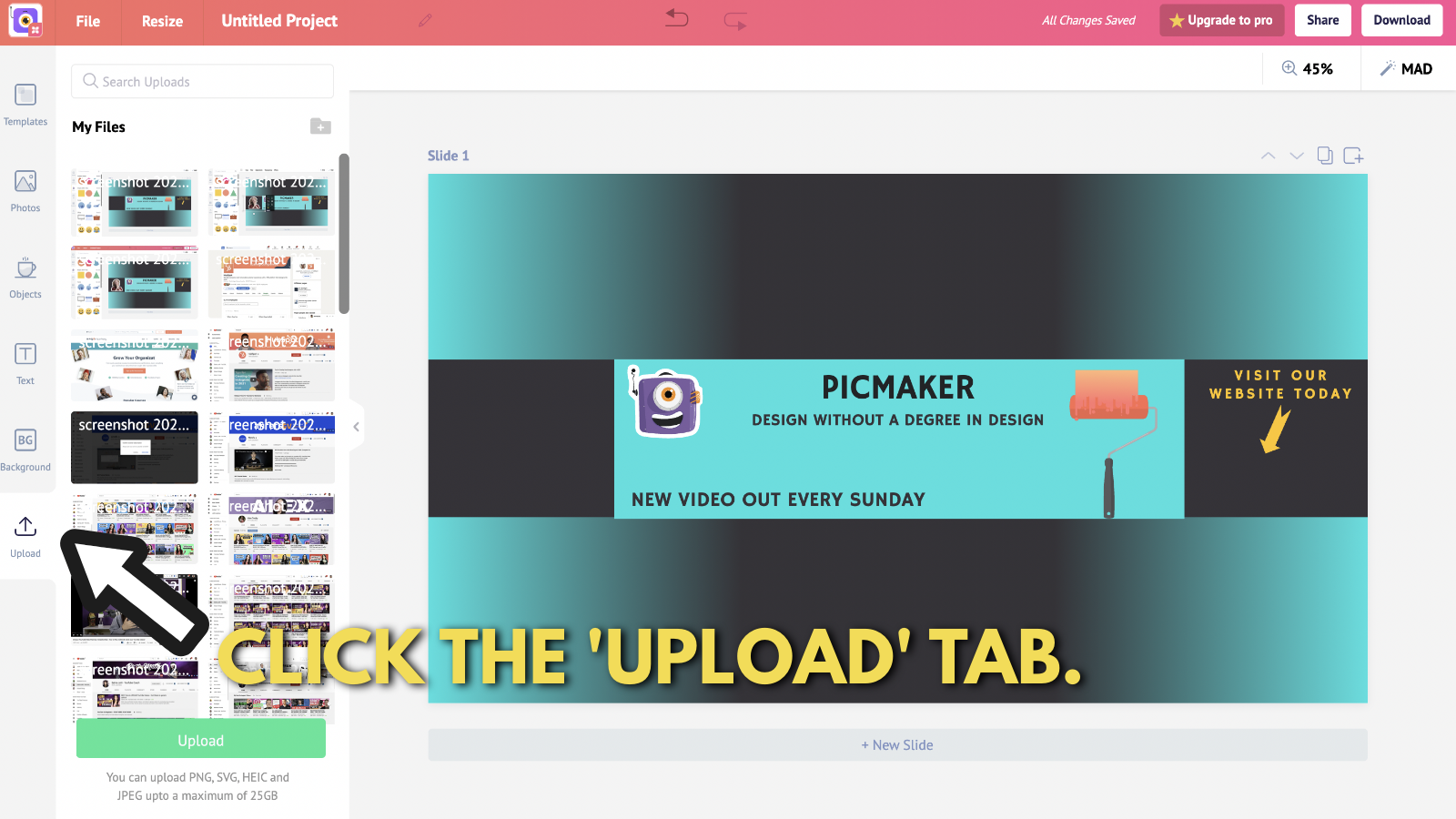
On the Upload tab. I can upload my picture by clicking the 'upload' button.
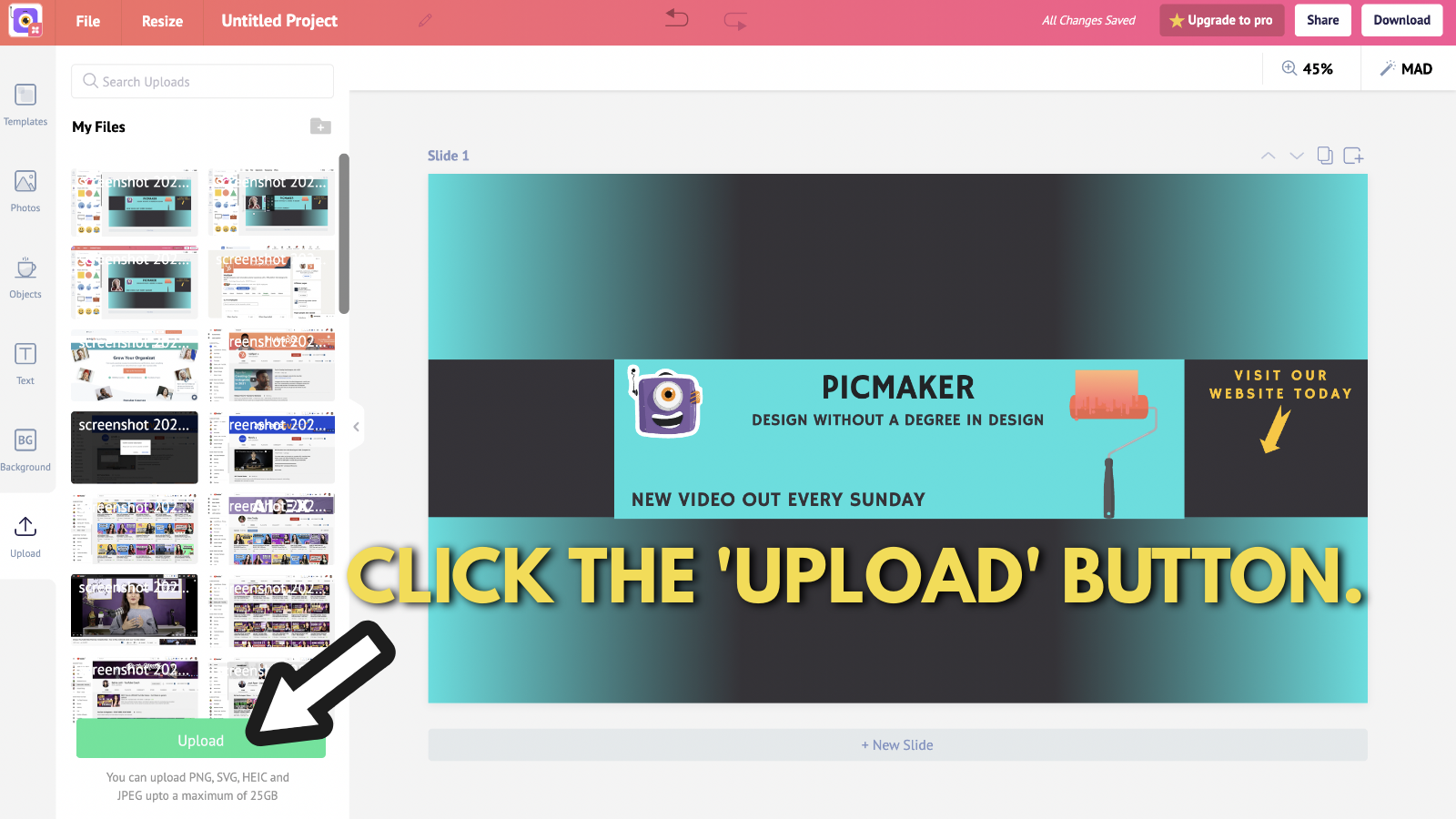
Once the picture has been uploaded, drag and drop it onto your canvas.
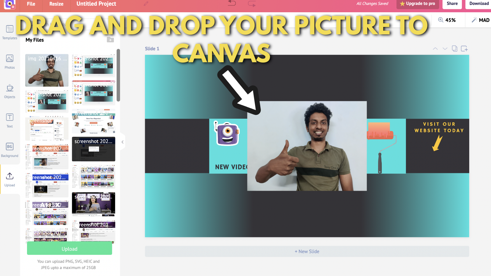
Now, you'll need to remove the background from that image.
Don't you worry about that though!
At Picmaker, we have created a free "background remover" for that purpose.
Here's a quick video of how to remove backgrounds from your images in Picmaker.
All you need to do is click on 'Effects.'
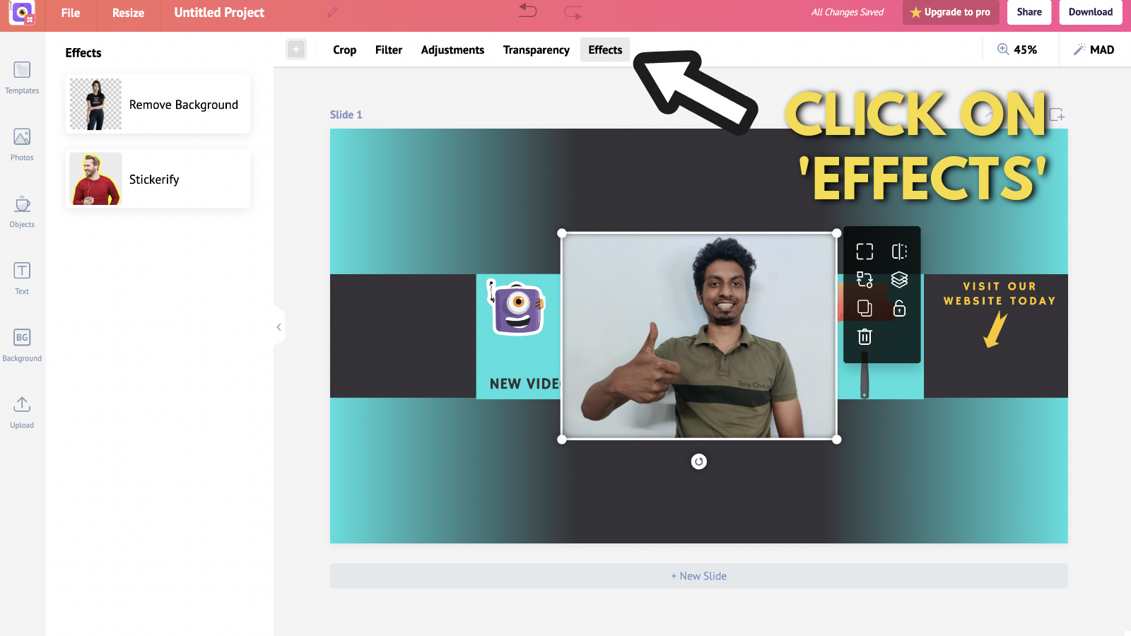
and select "Remove background."
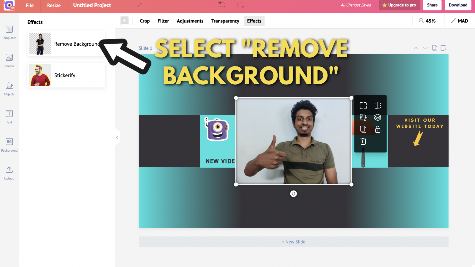
Now a pop-up will appear with all the shaded areas to be removed.
You can select and unselect areas in this pop-up to remove your backgrounds.
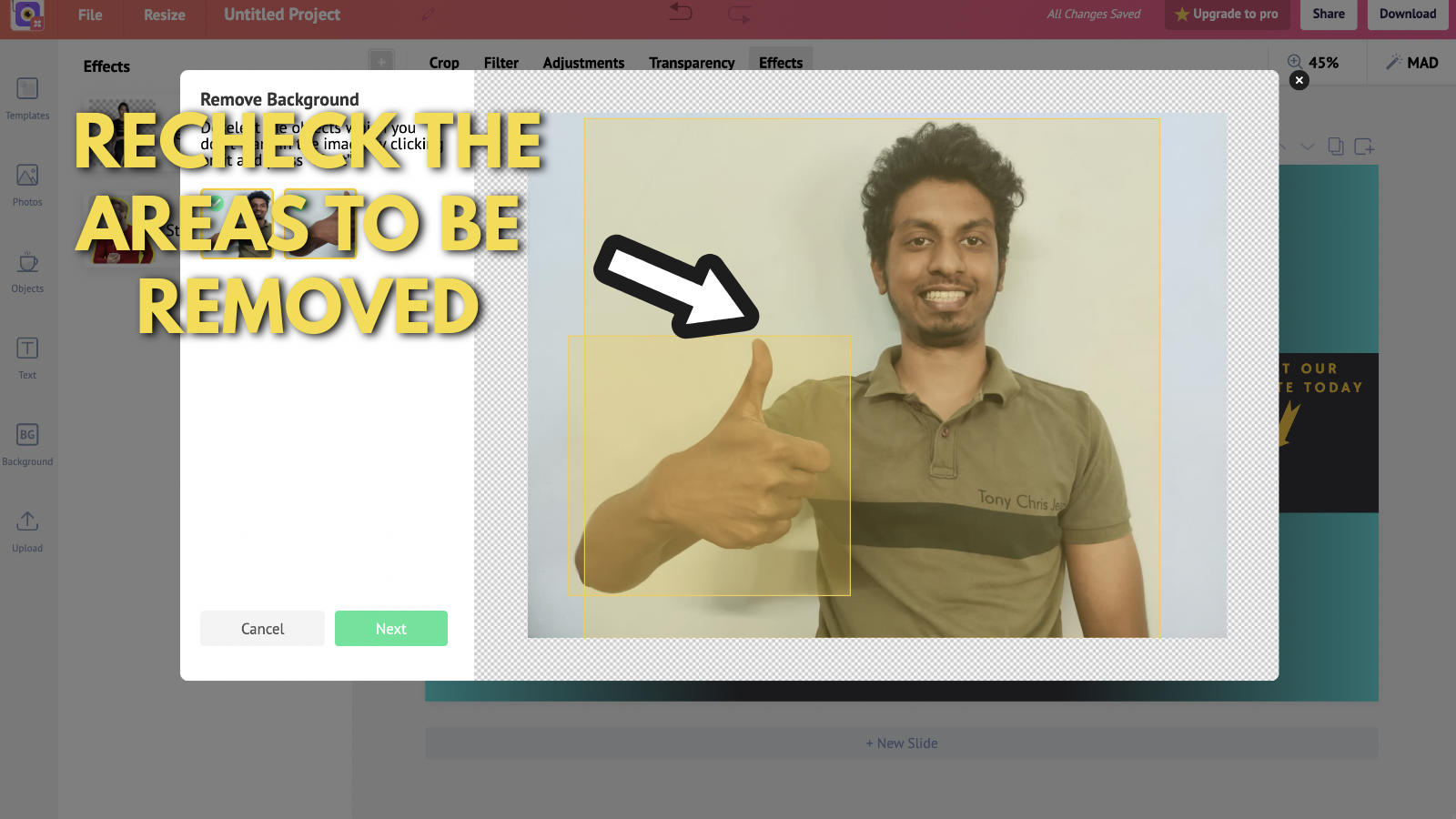
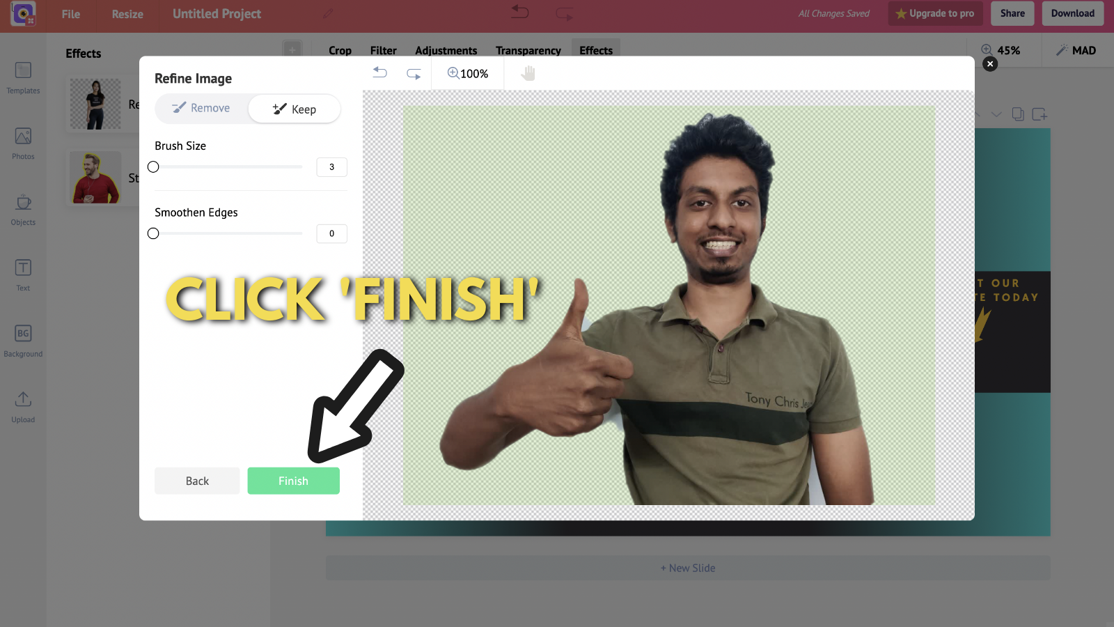
If you're cool with the selected areas, click on 'next'. You will be provided with an image where the background has been removed.
If you're satisfied with the output, click on 'Finish'.
However, if you feel that some more areas can be removed or added, use the brush to refine your image.
The possibilities are just endless with Picmaker's online background remover.
Readjust the image to fit your YouTube banner.
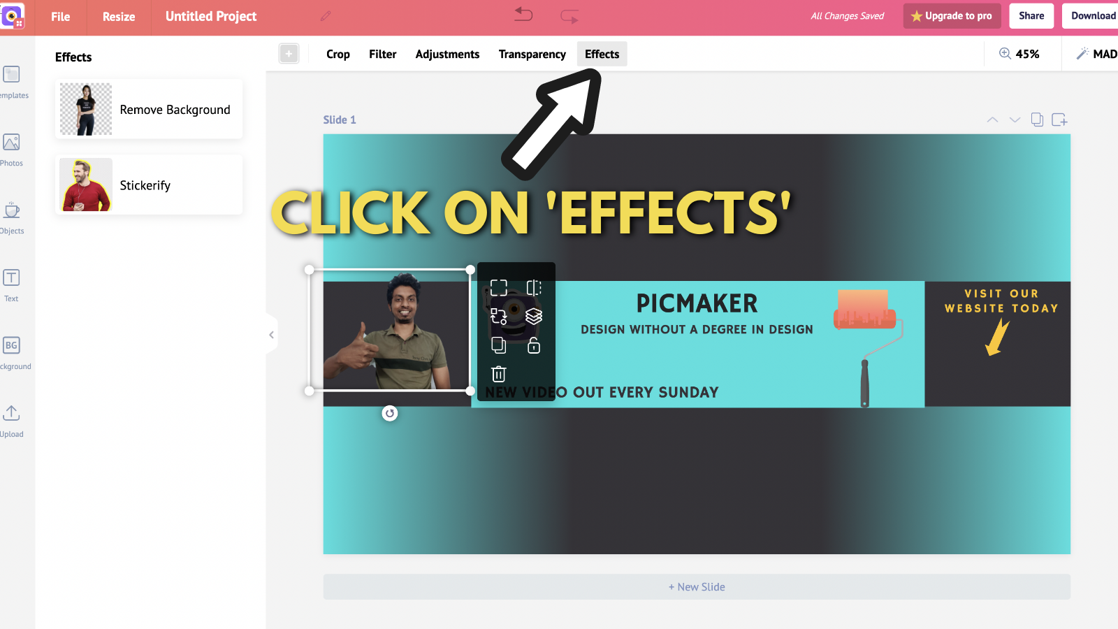
We think that this could be a whole lot better.
So, we'll add a cool outline to this image with Picmaker's 'Stickerify' tool.
Here's a quick video for those of you who'd like to know how it works.
For those of you who'd like to know how to add outlines to images, with screenshots, read along with us.
Click on 'Effects,' and then click on 'Stickerify.'
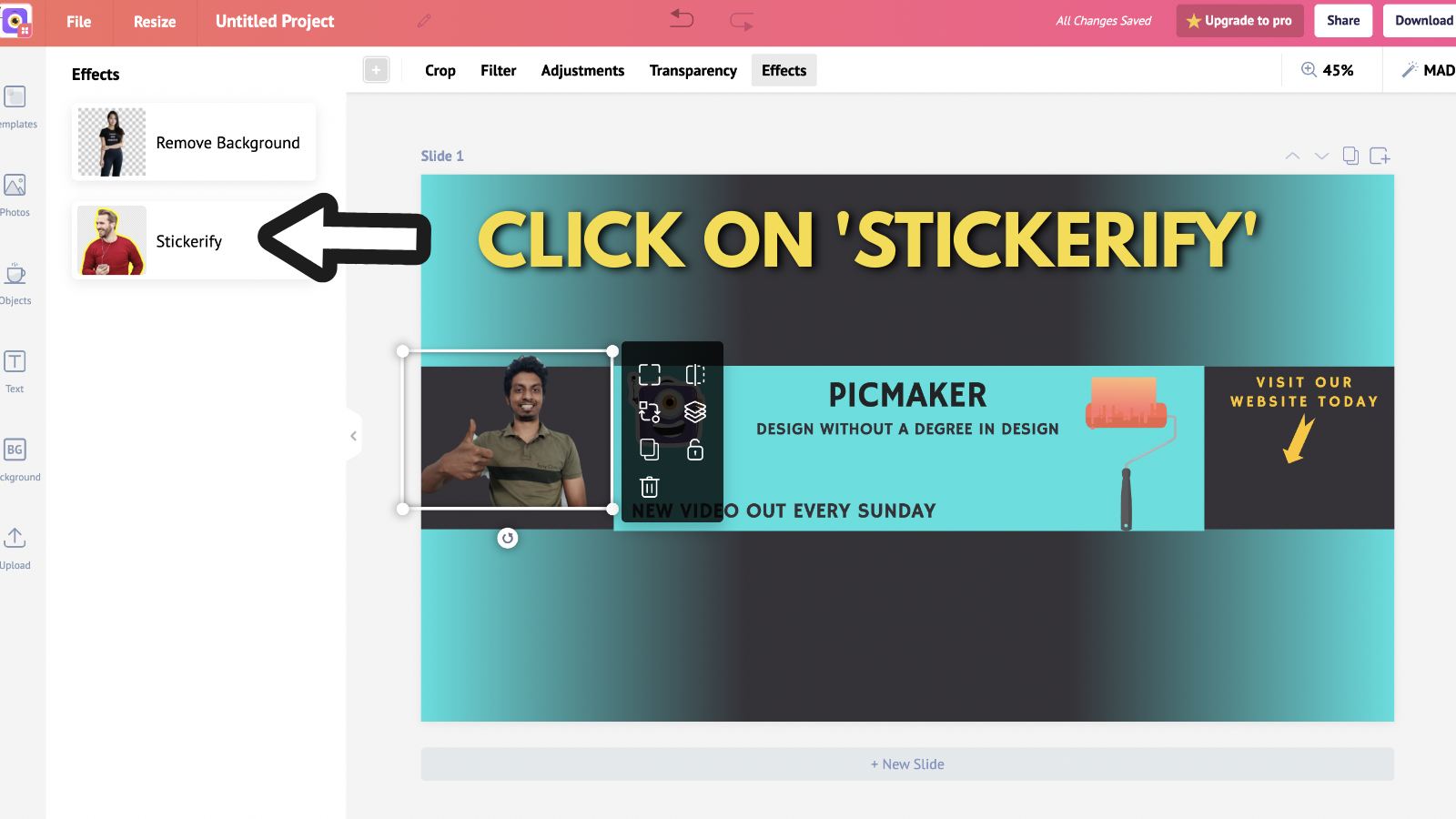
Adjust the size and color of the stroke.
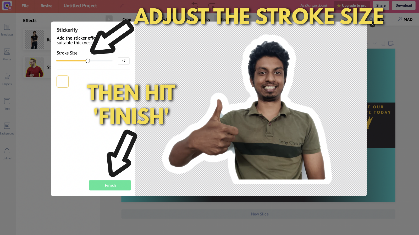
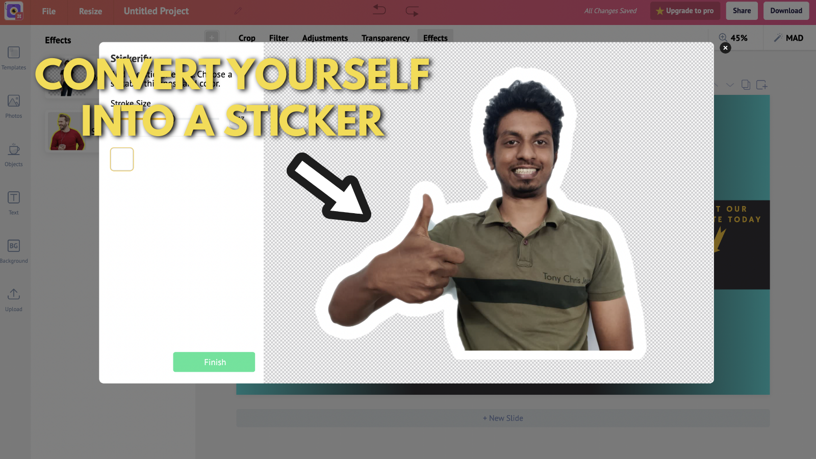
Congratulations, you have now converted yourself into a sticker. How cool is that?
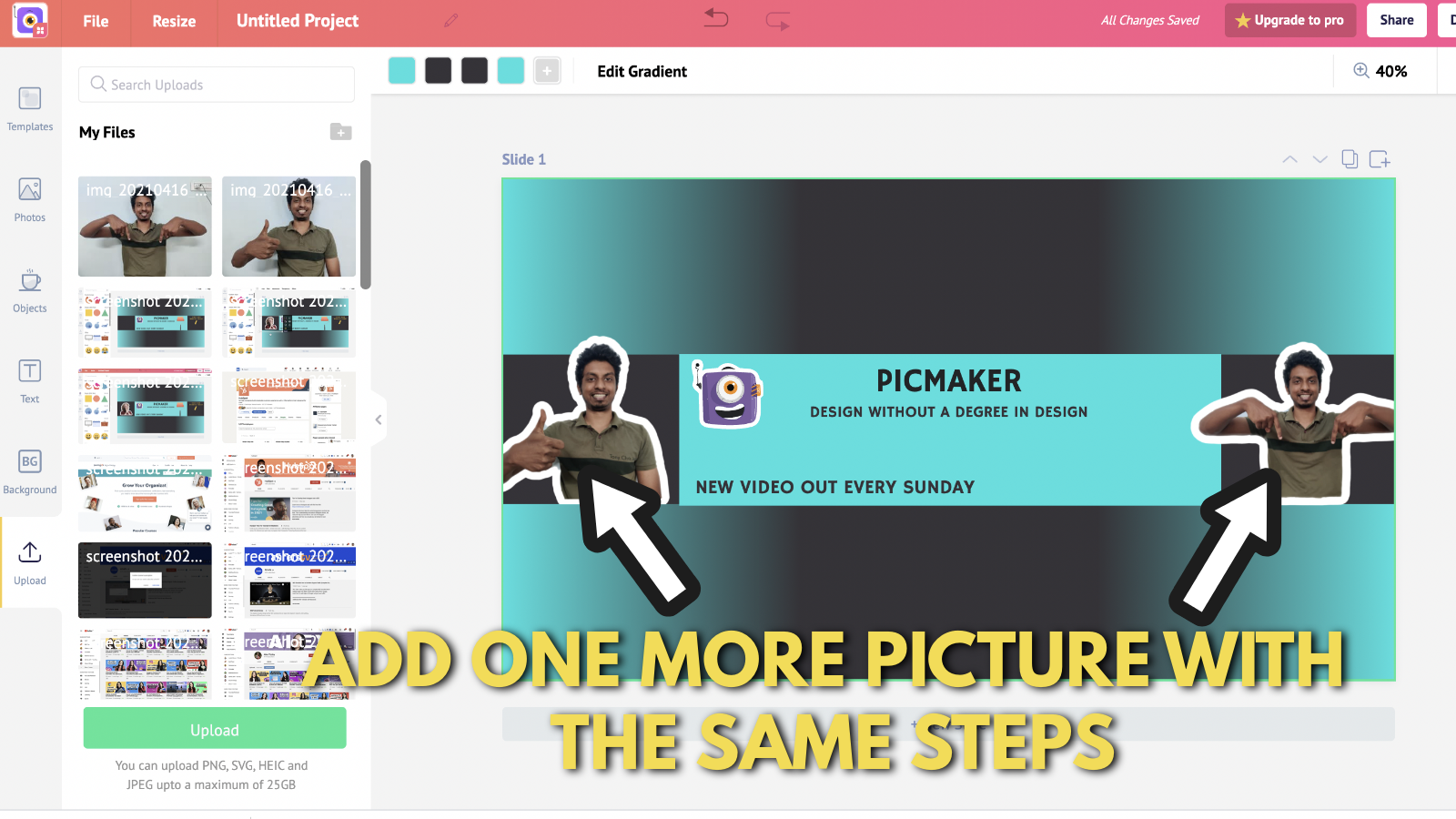
Now you can add more pictures using the same procedure.
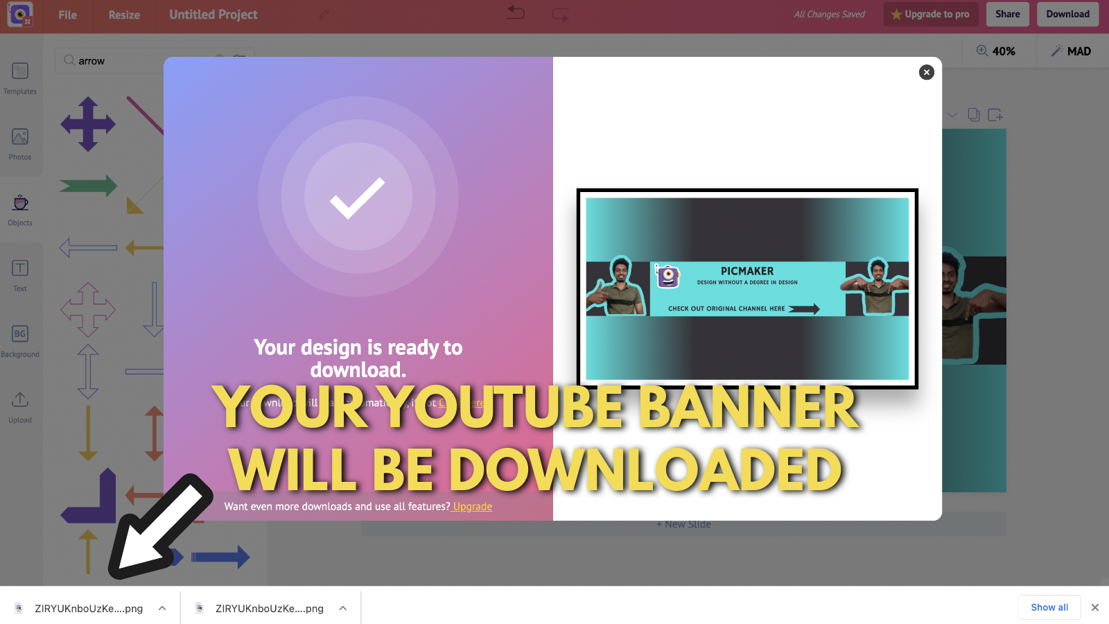
Once you're happy with all the adjustments, colors and placements - hit 'Download'.
It's time to download your custom YouTube banner.
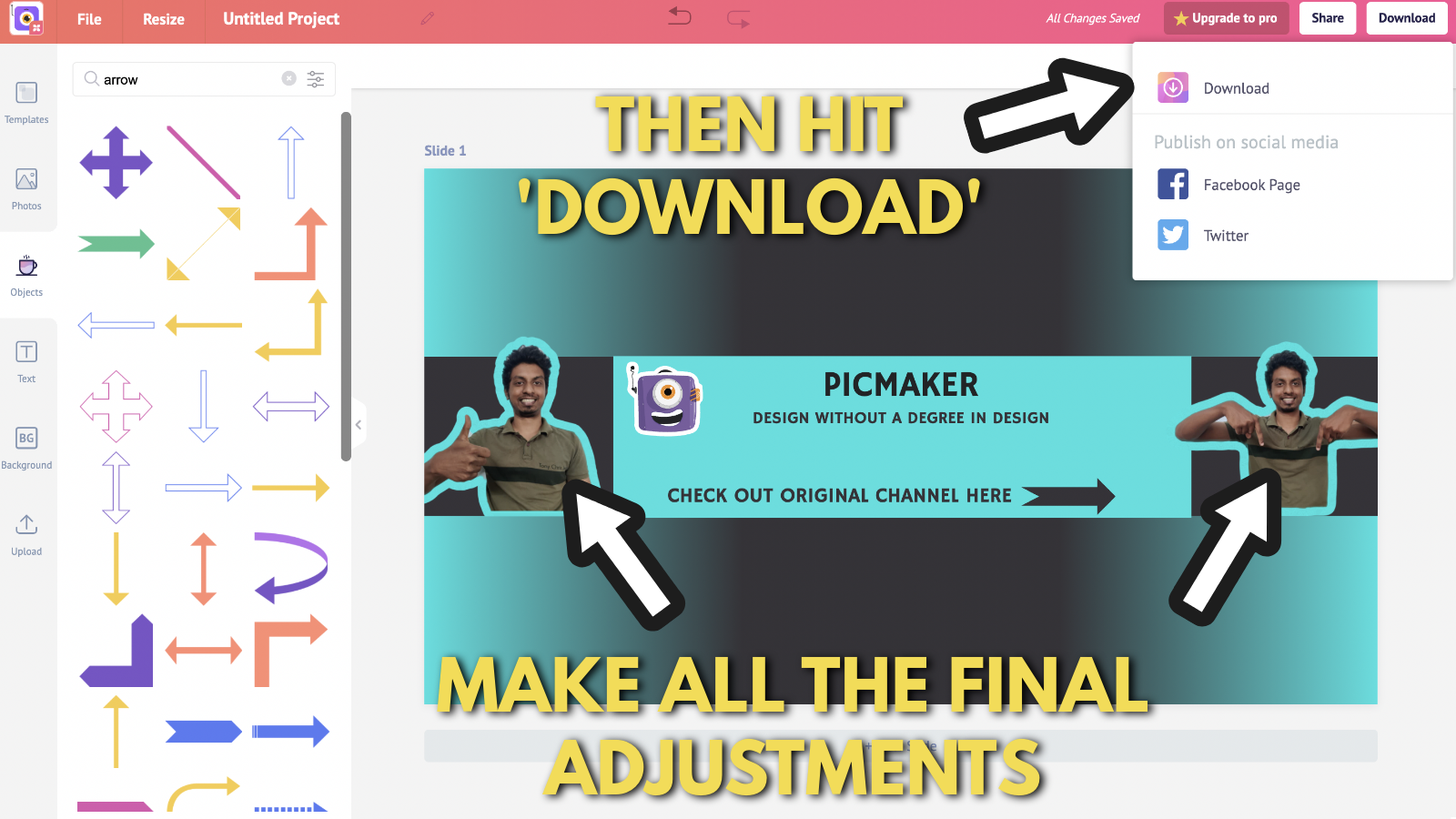
Your sweet custom YouTube banner is ready for service!
How do you upload the banner and the links to your YouTube channel?
Before uploading our new banner, let's take a look at an old YouTube banner we created.
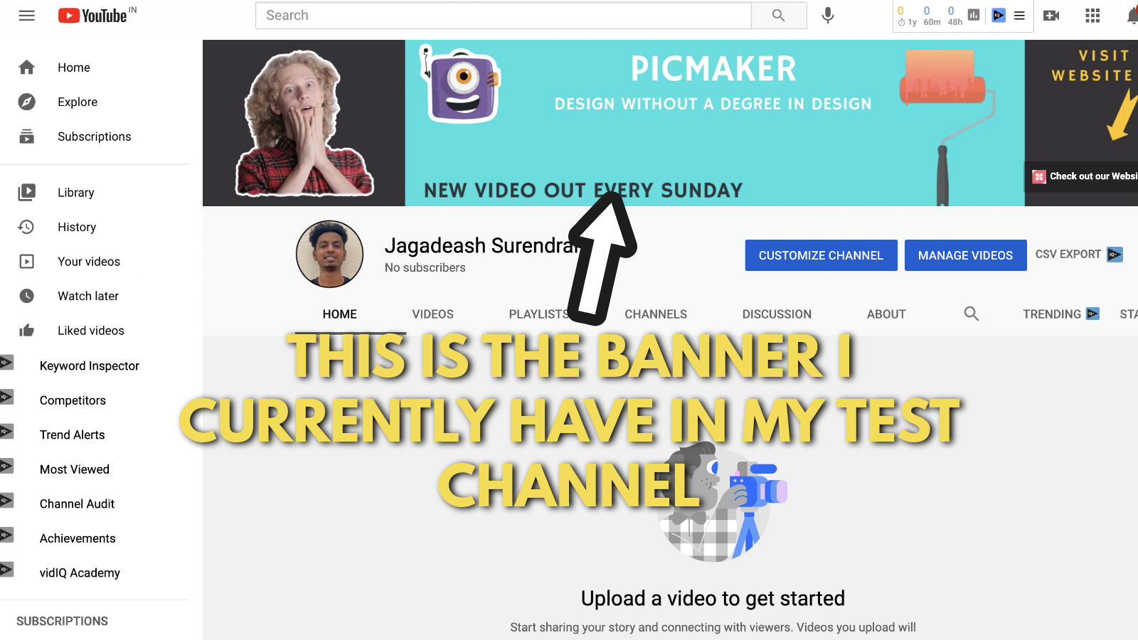
We'll go step-by-step on this with you.
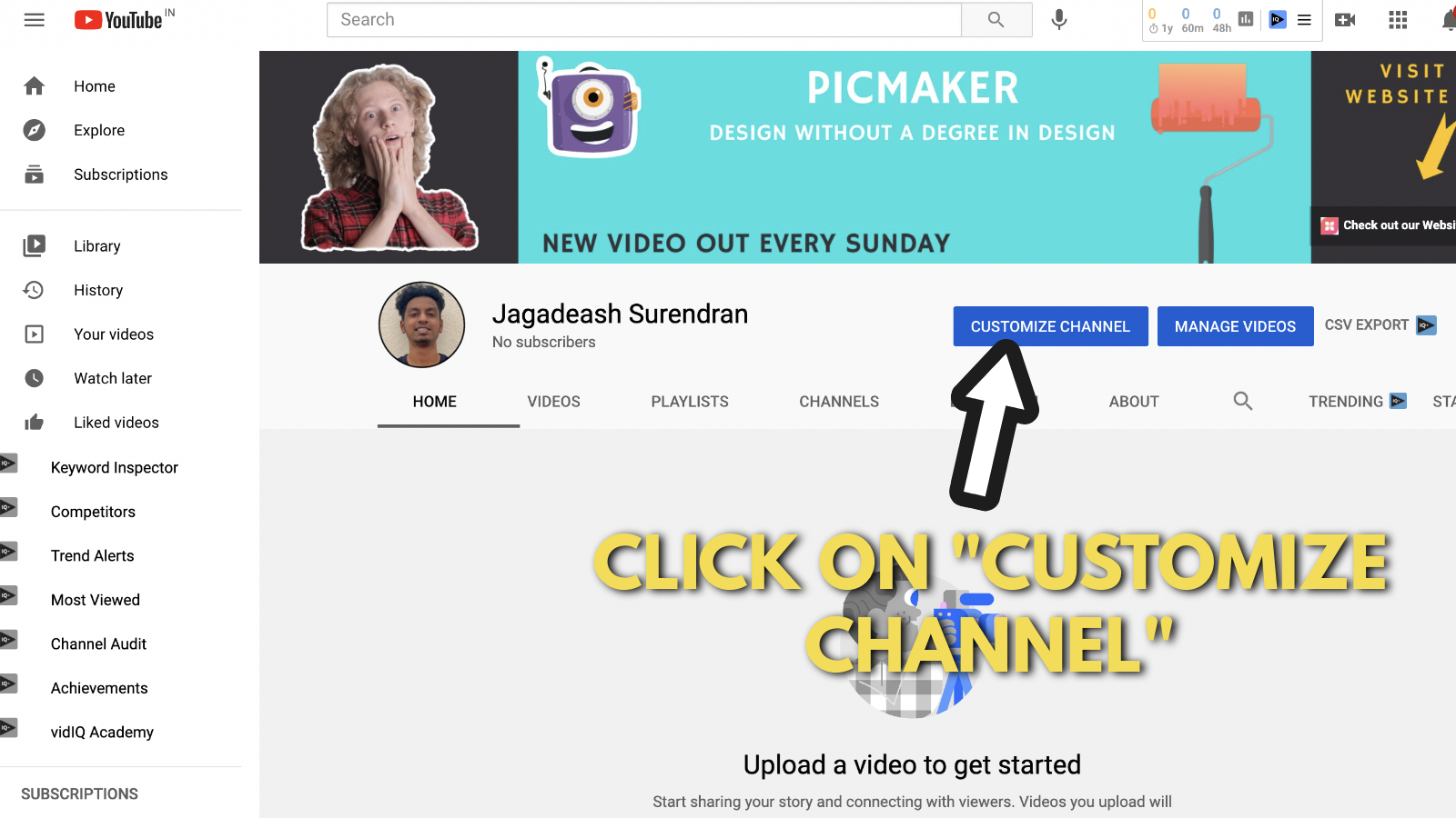
You can start by clicking on the "Customize channel" button on your dashboard.
if you don't own a YouTube channel yet, now might be the best time to create one for yourself.
Our friends at Buffer, have put together this super cool guide to getting started. Check it out.
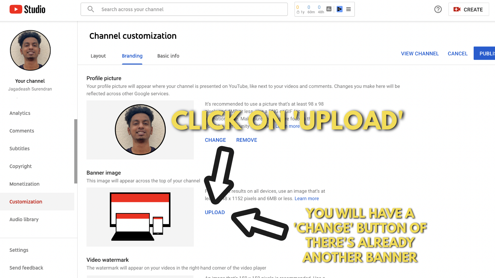
You'll land on the channel customization menu.
On this menu, you need to find out "banner image" under the 'Branding' tab.
Click on 'Upload' if you don't have a banner already.
If you do have a banner, this button will be replaced by the 'Change' button. So you need to click that instead.
Select your custom YouTube banner from your download list and upload it onto your channel.
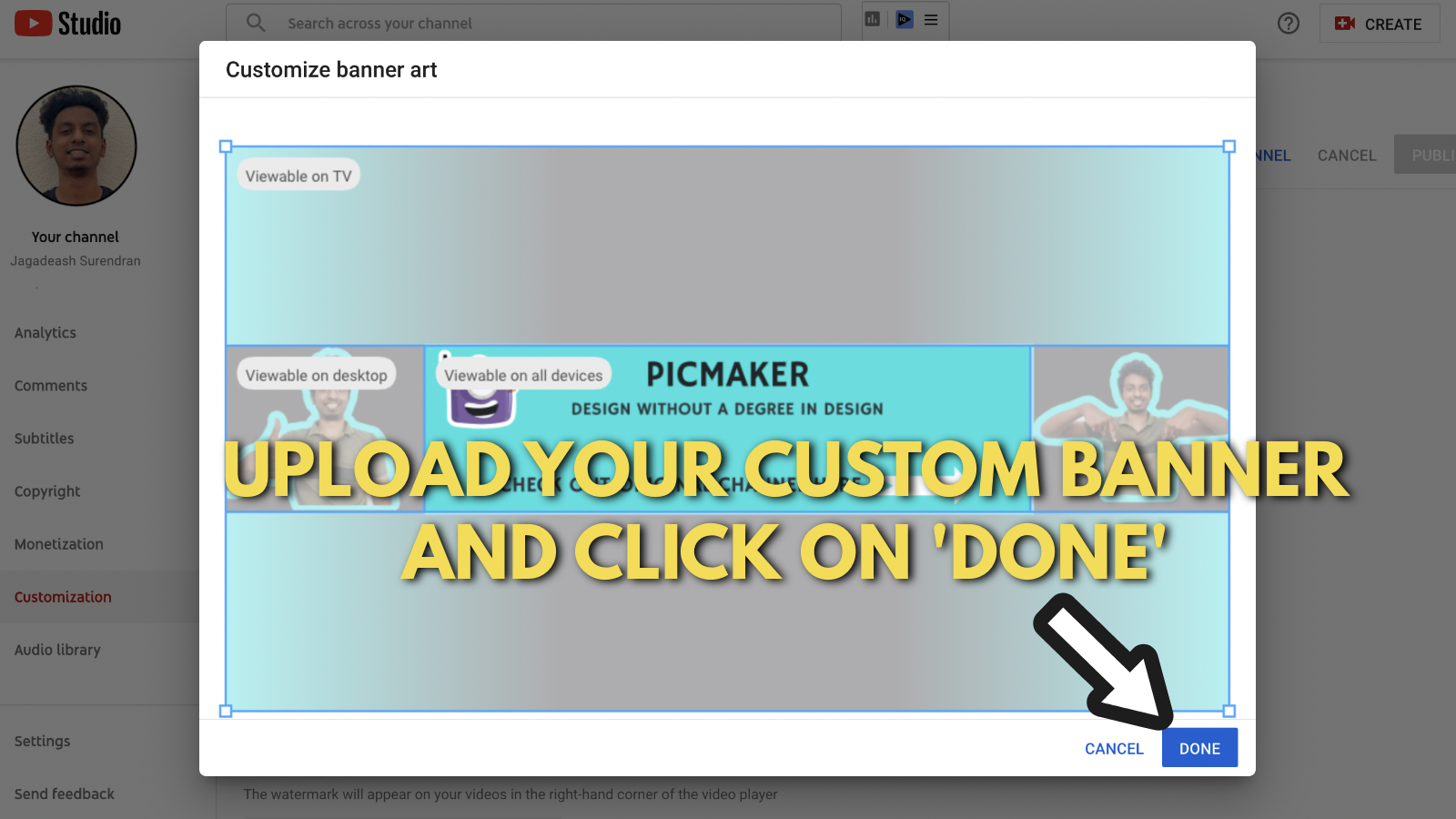
Now we need to work on those links and add some that point to your websites and lead magnets (if any).
Click on the "Basic info" tab.
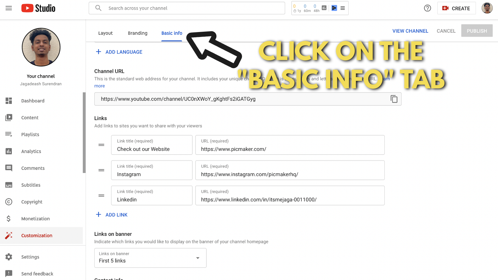
This page will show you the list of outbound links that are present on your YouTube channel.
You can update your bio and find your channel URL too.
We'll leave all the exploring to you. Remember that you can add upto 5 outbound link for your channel.
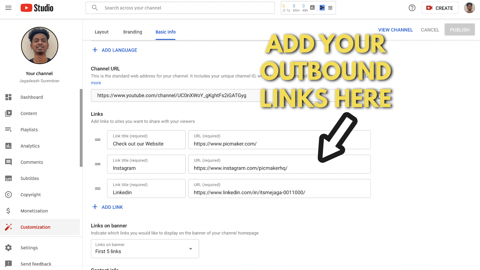
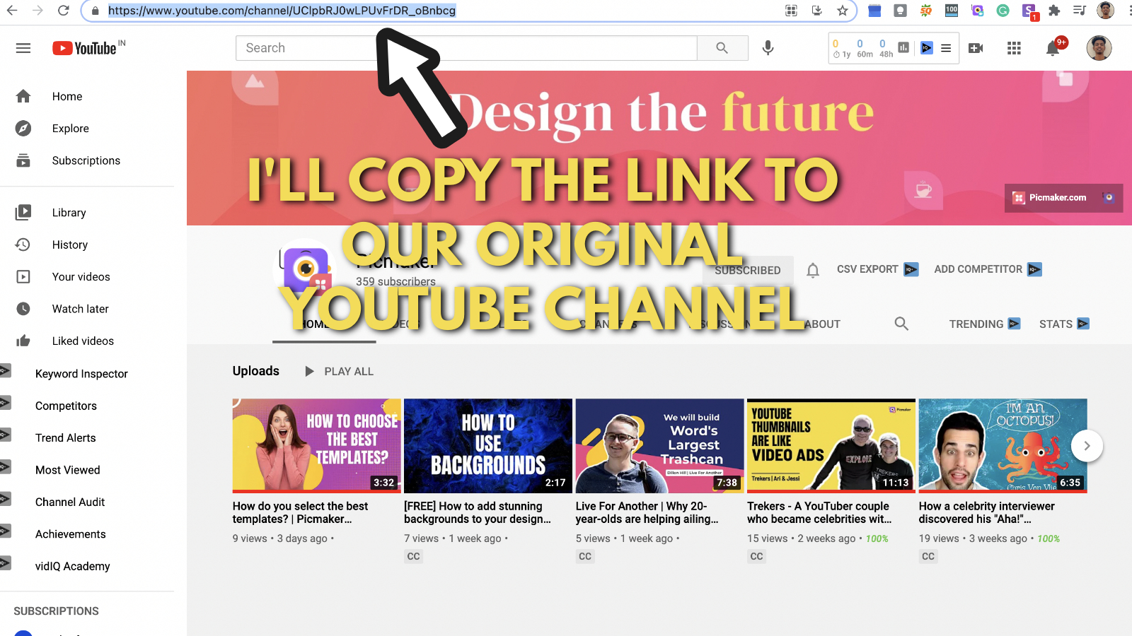
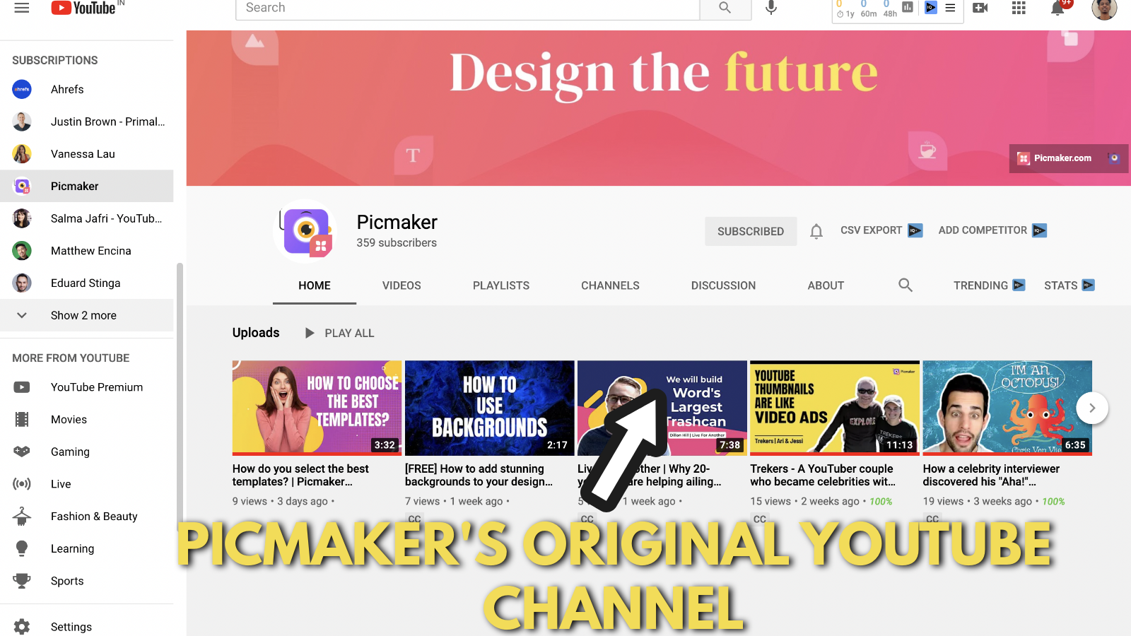
For this banner, we will add a link to Picmaker's original YouTube channel.
Let us copy the URL from our channel's homepage.
And, paste the copied URL onto our experimental YouTube channel.
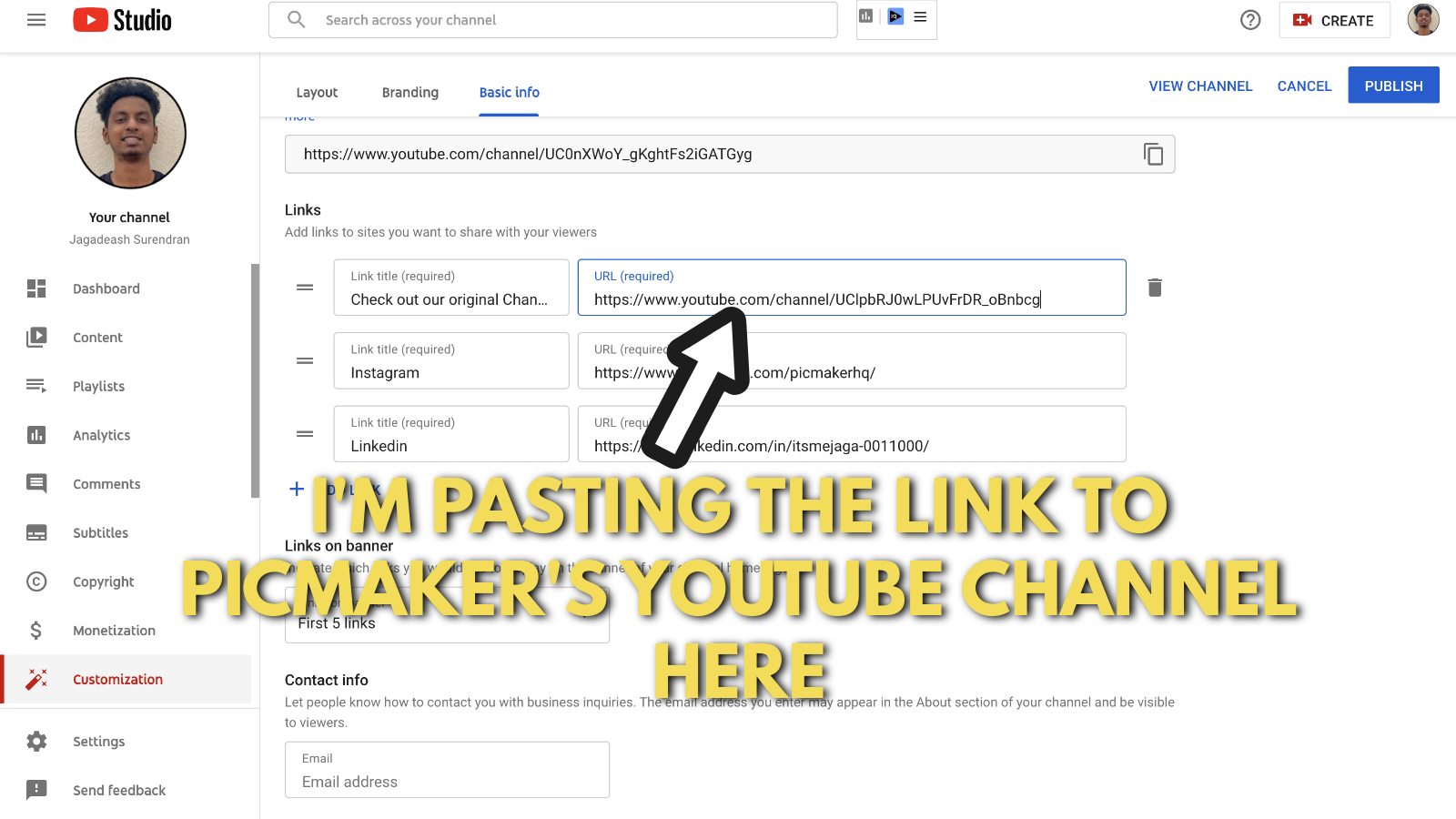
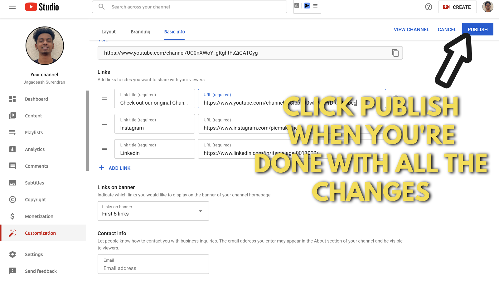
Once you have updated all your banners and links, just go ahead and click 'Publish.'
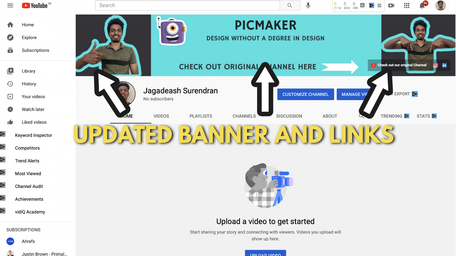
Check if the banner and all your links are updated.
Click the links to verify if they point to the right destination pages.
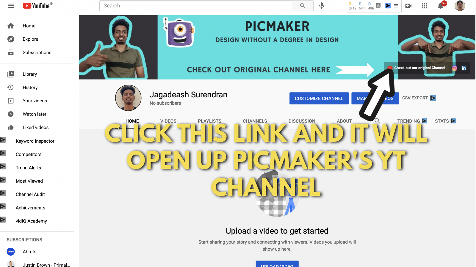
After clicking the link on our channel, it takes us to Picmaker's YouTube channel.
Here's a link to our experimental YouTube channel - Click Here. Thanks for taking the time to read through this blog post.
You can always use our free online Youtube banner maker to create a kickass banner for yourself.
Comment your doubts below, and we will get back to you as soon as we can.
Loved this FREE guide? Awesome! If you're looking to start your Youtube journey, remember that it begins with the perfect YouTube banner. Here're the best YouTube banner ideas for your channel.
Besides, here's a detailed guide to creating awesome YouTube thumbnails that attract tons of subscribers.
Moreover, don't forget to check out this free guide we created on graphic design tips for beginners.
Happy reading!


