Contents
What you need to know about social media design
Steps involved in creating a social media design
How to Use Social Media Design to Attract and Delight Your audience
It shapes brand perception, influences customers’ buying decisions. And it is, arguably, the most powerful platform (when used wisely and strategically) for brands and customers alike. Yes, we are indeed referring to social media. Social media design is key to shaping your audience’s perception and convincing them to buy from you, but we’ll get to that later.
A few decades ago, social media was not much more than a fad. It was another medium that enabled people to connect with those they knew, share images, exchange chat messages, and so on. It was not a vehicle for social movements. Marketers had to play by trial and error to learn what strategies worked on social channels. But the upside was they could generate significant organic reach at a time when algorithms were still evolving.
DID YOU KNOW: Facebook didn’t open to those aged 13 and above until September 2006, when anyone with a valid email address could access the platform.
READ: 7 Most Popular Social Media Advertising Types You Need to Know
Social media assumed greater significance following the events of 2020 and 2021: the onset of a global pandemic (COVID-19) and the discourse around the ever-evolving climate change. Brands that adapted their strategies to meet evolving customer demands thrived during this phase as marketing budgets increased manifold.
This is substantiated by a report, too. It states that “Social media marketing constitutes more than 50% of a brand’s digital spends for direct-to-consumer brands,” with the potential for it to shoot up to 75%.
While budgets are a big part of any digital strategy, brands must also understand their customers’ thought processes and how they consume content on social platforms.
Psychology and social media
Understanding human psychology is an intrinsic part of marketing (or so it should be!). When it comes to social media, you must know:
- What prompts people to share content?
- Why visual content drives higher engagement than text-based content?
- How color influences audience behavior?
- How to gain audience trust?
- Why do people react to FOMO offers?
As per a New York Times study, people’s motivations for sharing are:
- To build relationships
- To delight others with useful and entertaining content
- For self-fulfillment
- To spread the word about key issues, brands and products
Likewise, a 2014 study by Current Health Sciences Journal states that 65% of the general population are visual learners. The remaining 35% are auditory learners (30%) and kinesthetic learners (5%).
Brands that prioritize visual content as part of their digital marketing strategy get more viewers, generate more leads and acquire more customers. And should we say it? They also generate more revenue.
User behavior on social channels continues to evolve as platforms introduce new tools and enhance existing features to attract and engage new audiences. It is estimated that an average person spends close to two hours per day (about 116 minutes) on social media. With this number expected to keep increasing, brands have great potential to engage with their target audience and gain their trust and loyalty.
What you need to know about social media design
Social media design is the process of planning and creating visual content to aid a company’s digital marketing efforts, especially on social channels.
Visual content is particularly important on Instagram, TikTok, and Snapchat, where videos and photos are the primary forms of content. Brands must, however, ensure their designs and messaging are consistent across all their social accounts to connect and build trust with their audience.
Steps involved in creating a social media design
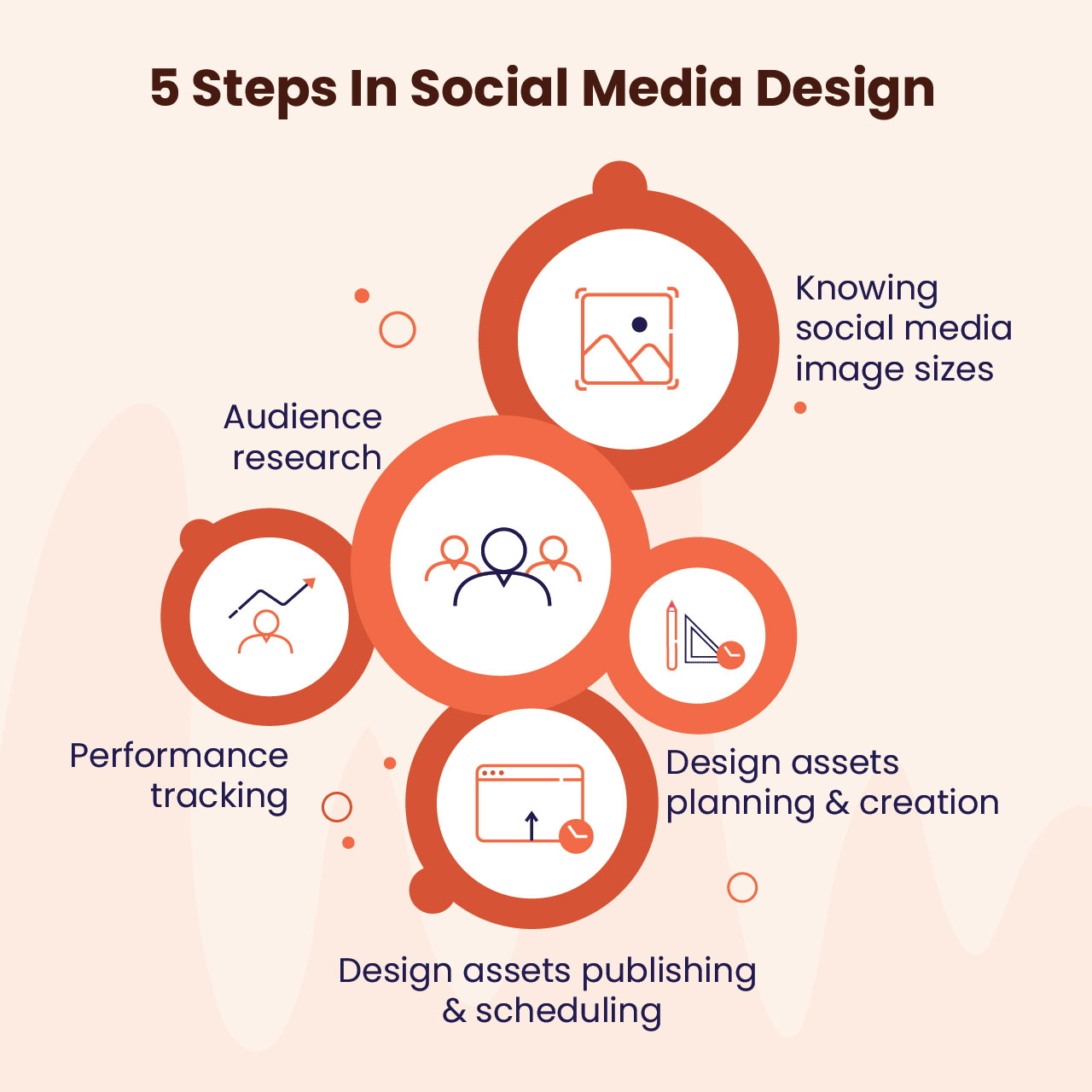
- Audience research
- Know social media image sizes
- Plan and build your design assets
- Publish and schedule your design assets
- Track performance
Audience research
You might have designed your comprehensive branding strategy based on target audience research. However, the audience you want to reach on social media is likely a segment or a subset of your overall audience.
To ensure your content is targeted for this specific group, do your research to understand your audience demographics. You can conduct surveys, interviews or use the analytics of each social media platform to know the age, language preferences, geographic locations, and more such details.
Subsequently, use this data to build user personas that form the basis for your social content strategy.
ALSO READ: 10 Logo Design Tips for Anyone Who Wants to Create a Unique Logo
As you conduct your social media audience research, you must understand the dynamics of each social platform and evaluate the ones best for your brand. This would depend on the products you sell and the audience you are trying to reach. For example, LinkedIn is best for brands in the B2B space. So it might not be the ideal platform for those that primarily cater to school children.
Once you have identified the best social platform(s), you are one step closer to creating the content strategy for that platform. If Instagram and TikTok are the most suitable platforms, images, videos and memes will form a significant chunk of your social media content. In the case of Twitter, you need to create bite-sized messages and short videos to engage your target audience. Facebook gives you the flexibility to create text-based and visual content.
Bonus tip: Perform competitor analysis to understand what your competitors are posting to generate likes, shares, comments, and more.
Know social media image sizes
It’s essential to be aware of the dimensions and content sizes for each platform. The infographic below provides you with accurate dimensions.
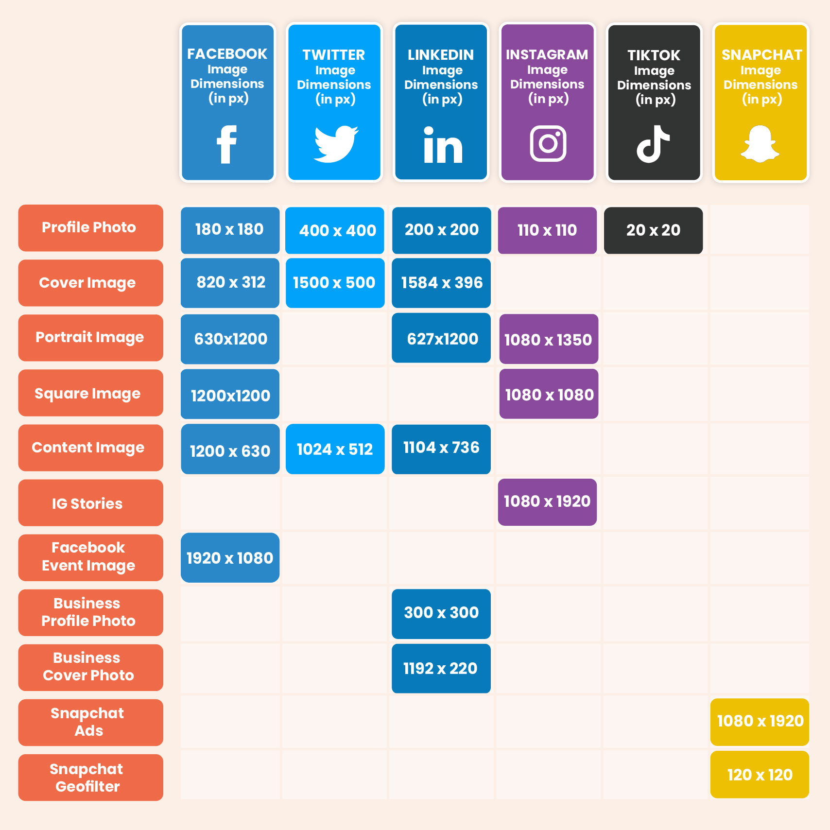
In addition, if you’re creating YouTube graphics, the dimensions for profile photos are 800 x 800 pixels, the cover image is 2560 x 1440 pixels, and the thumbnail image is 1280 x 720 pixels.
Having these image dimensions handy will allow designers to quickly adapt the canvas size and design images.
Plan and build your design assets
We’ve understood the importance of knowing your social media audience and having the content sizes handy when outlining your social media design. Now, it’s time to plan and create design assets for your target social media platforms.
At this stage, you need to have a content calendar that’s aligned with your digital marketing goals. While this depends largely on the audience you want to reach and the brand perception you want to foster in them, your content calendar may also include:
- Festival days content
- Product updates
- Festival giveaways
- Offer announcements
- Customer testimonials
- Company podcasts
- Case studies and success stories
- Media coverage
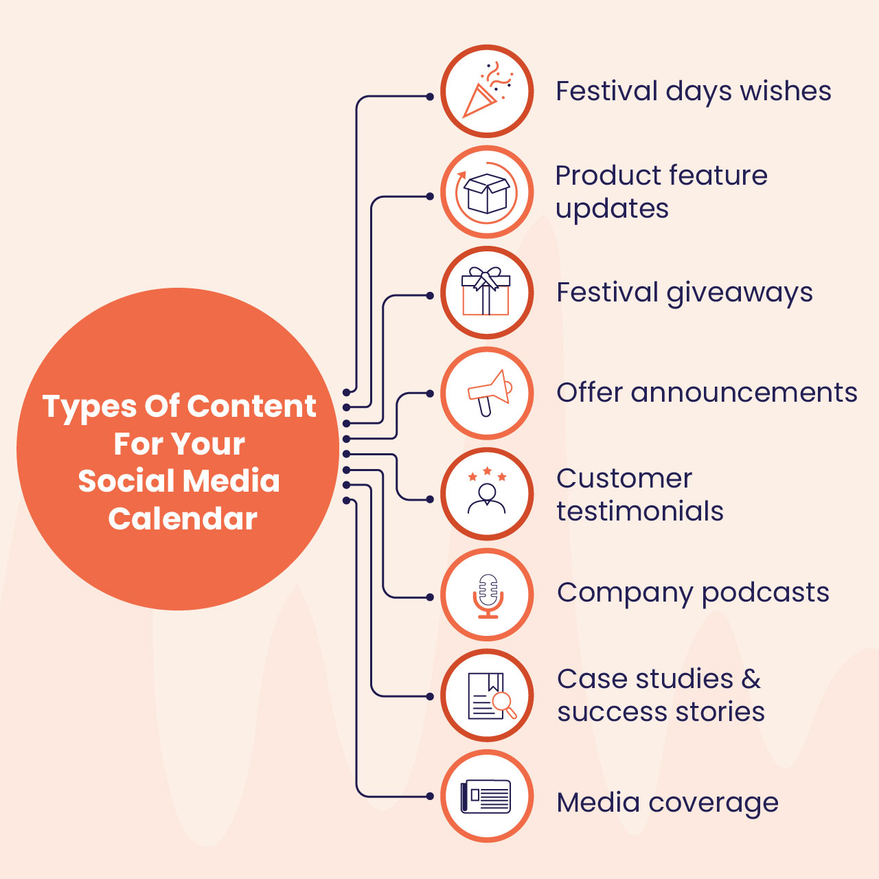
For example, customer testimonials help brands to establish credibility and reliability. Offer announcements are a great way to generate social media buzz and direct people to not just your brand pages but also to your offline store, website, mobile app, and more.
The content calendar then needs to be shared with the design team. They should also be briefed about ideas that came from the competitor analysis, the target audience, whether the designs need to be a combination of text and images, and so on.
Your design assets must include:
- Illustrations
- Charts and infographics
- Text-heavy graphics
- Custom GIFs
It goes without saying that while creating your design assets, ensure you are following your brand guidelines, including brand colors, custom fonts, and more.
Publish and schedule your design assets
You can either use social media management software or use native tools such as Facebook publishing tools to share your content on social media.
Ensure your designs are high-res, carry the brand logo, and have the correct file format (PNG and JPEG, and not PSD, TIFF, et cetera).
It’s always better to schedule your posts that have been planned for the next day or the weekend. Thus you will not be in a hurry to meet deadlines and posting schedules, alleviating the chances of something going amiss.
On occasions when you must live blog an organization event or seminar, make sure you have the right designs created prior to the event. You can also do a dry run of your social media publishing activity to prepare yourself for the rigor of posting in real-time… without committing errors.
Track performance
To analyze and improve your social media marketing performance, you must stay on top of metrics almost on a daily basis.
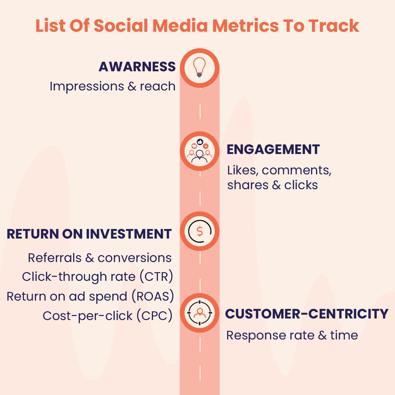
Following are some metrics you must track:
- Awareness
- Impressions and reach
- Engagement
- Likes, comments, shares and clicks
- Return on investment (ROI)
- Referrals and conversions
- Click-through rate (CTR)
- Cost-per-click (CPC)
- Return on ad spend (ROAS)
- Customer-centricity
- Response rate and time
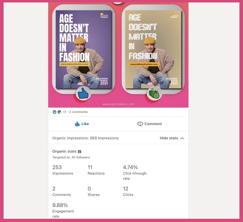
The above screenshot is an example of the performance metrics on LinkedIn that you can track for each post you publish. These metrics are self-explanatory; they help understand how your audience is reacting to the post - by commenting, by viewing and scrolling past it (in which case, it still counts as an impression), the percentage of people who've seen the post and engaged with it (which is nothing but engagement rate) by liking or commenting on it, and so on.
RELATED: 12 Game-Changing Email Design Best Practices for Boosting Conversion Rates
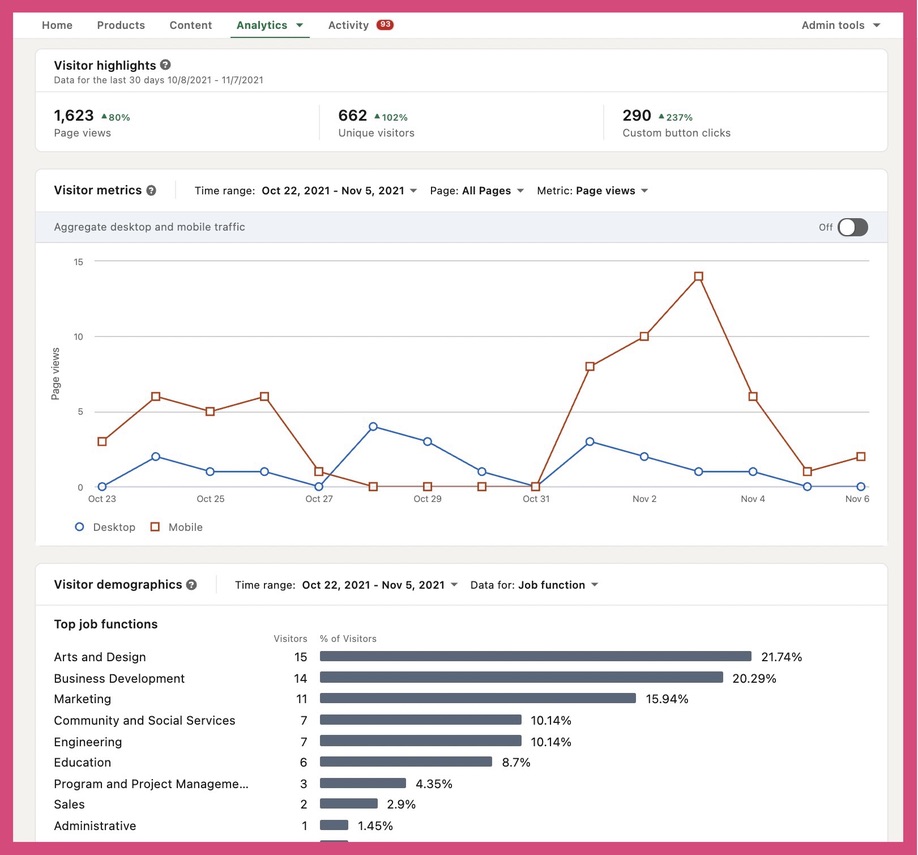
Brand accounts also have a more comprehensive way to track followers, visitors to their profiles, profile page views, visitor demographics, et cetera, along with overall impressions, button clicks, and more. Below is a screenshot of the metrics that can be tracked by brands by clicking the "Analytics" tab on their LinkedIn brand accounts.
Return on ad spend is a metric that helps quantify the revenue generated for every dollar spent on advertising.
Return on ad spend = (Revenue-cost)/cost is the formula for calculating ROAS. Let's say you generated $400 from spending $100 on Facebook ads. Your ROAS will be 3.
Social media design tips to WOW your audience
You’ve created a social media content strategy based on your audience, your campaign goals and the products you sell.
Now it’s about understanding and implementing social media design best practices to all your company pages.
Remember, your company’s Facebook or Twitter page is often the first interaction your audience has with your brand. Your page will have the “follow” and “like” buttons, and you want your audience to click on them to showcase their interest in viewing (and potentially engaging with) your content.
READ: Infographics Marketing: 10 Stellar Ways to Use Infographics in your Marketing Strategy
Your profile’s design is key to persuading your audience to follow or like your profile page.
The objective of your company’s profile page is to inform people about your brand. Use your profile’s bio section to describe your brand. Your profile and cover photos are the visual elements that need to be aligned with your brand identity. As mentioned above, ensure that your profile bio and images are consistent on all platforms.
Tip #1: Choosing your profile photo
This is Picmaker’s Twitter profile page.
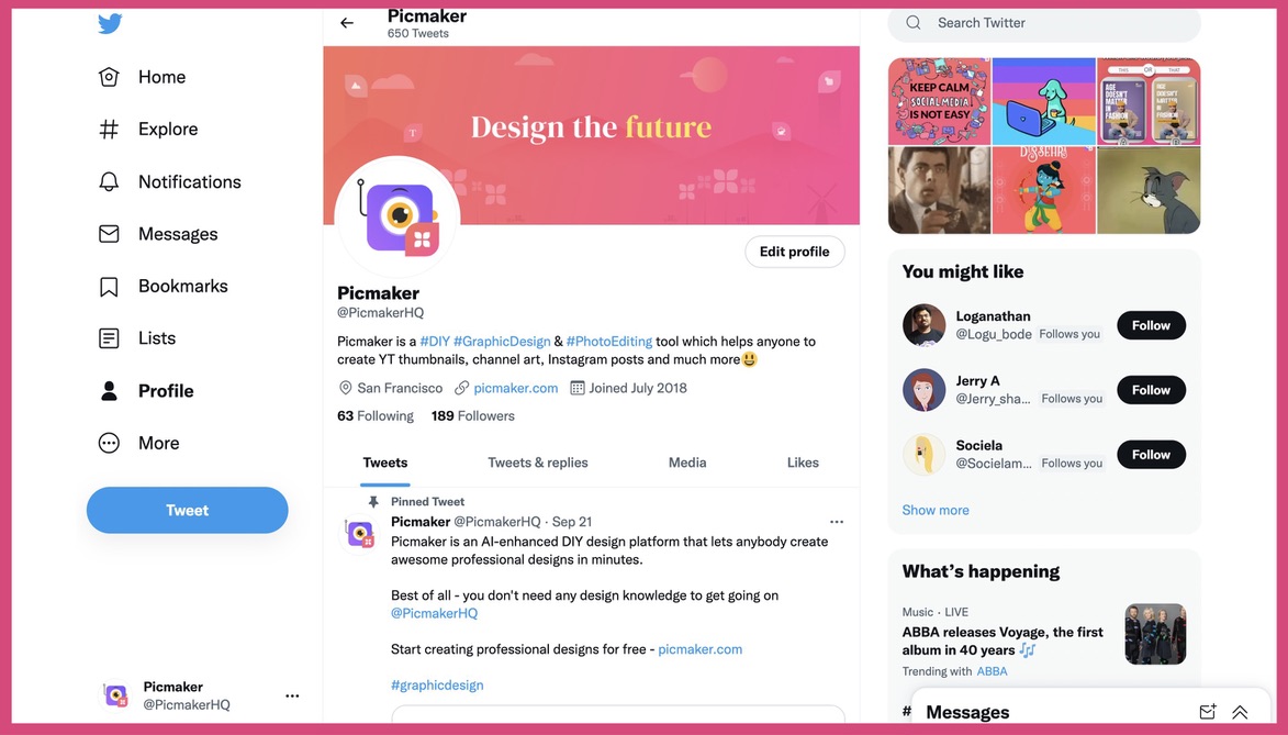
We have used Picmaker’s logo as not only the Twitter profile photo but also as the profile photo for Instagram, LinkedIn, Facebook, and YouTube.
However, in your case, if you plan to use your brand logo as your profile photo, make sure it fits within the circle. The standard logo size is 500 x 500 pixels, but Twitter’s recommended profile image dimensions are 400 x 400 pixels. So, if the smaller version of your logo doesn’t fit the placeholder and is not legible, you might need to choose the first letter of your brand name and use it as your social media profile photo.
Here’s one example.
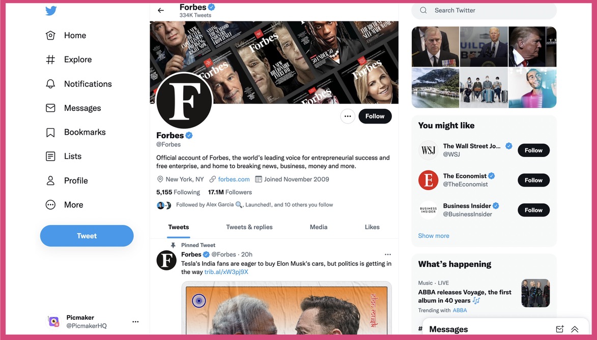
Forbes, a renowned American business magazine, uses the letter “F” as its Twitter profile photo. It stays true to its brand identity by using black and white colors.
Pro tip: When you choose an abbreviated version of your brand name or logo, make sure you give it a unique touch (with colors or fonts). So that the profile photo is distinguishable from other brands who use the same letter.
Tip #2: Choosing your profile cover photo
Facebook, Twitter, and LinkedIn give users the option of a profile cover photo, which is the large rectangle banner that sits atop the profile page.
It is another piece of social media real estate for brands to be creative and represent themselves in visual form.
Unlike the profile photo, which is constant, the cover photo can be changed from time to time to make your audience aware of key company events or a product feature update. And oh, your brand tagline is another excellent option to display as a social media cover photo.
Take Nike as an example.
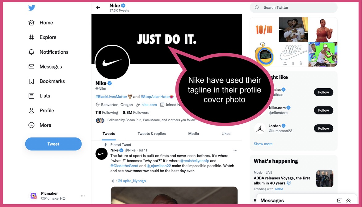
Their tagline “Just do it” is part of their cover photo on Twitter and Facebook, complementing their iconic swoosh logo.
Here’s another example of a profile cover photo of former LinkedIn CEO Jeff Weiner - with the message "Connecting talent with opportunity at massive scale" - that professionals can relate to.
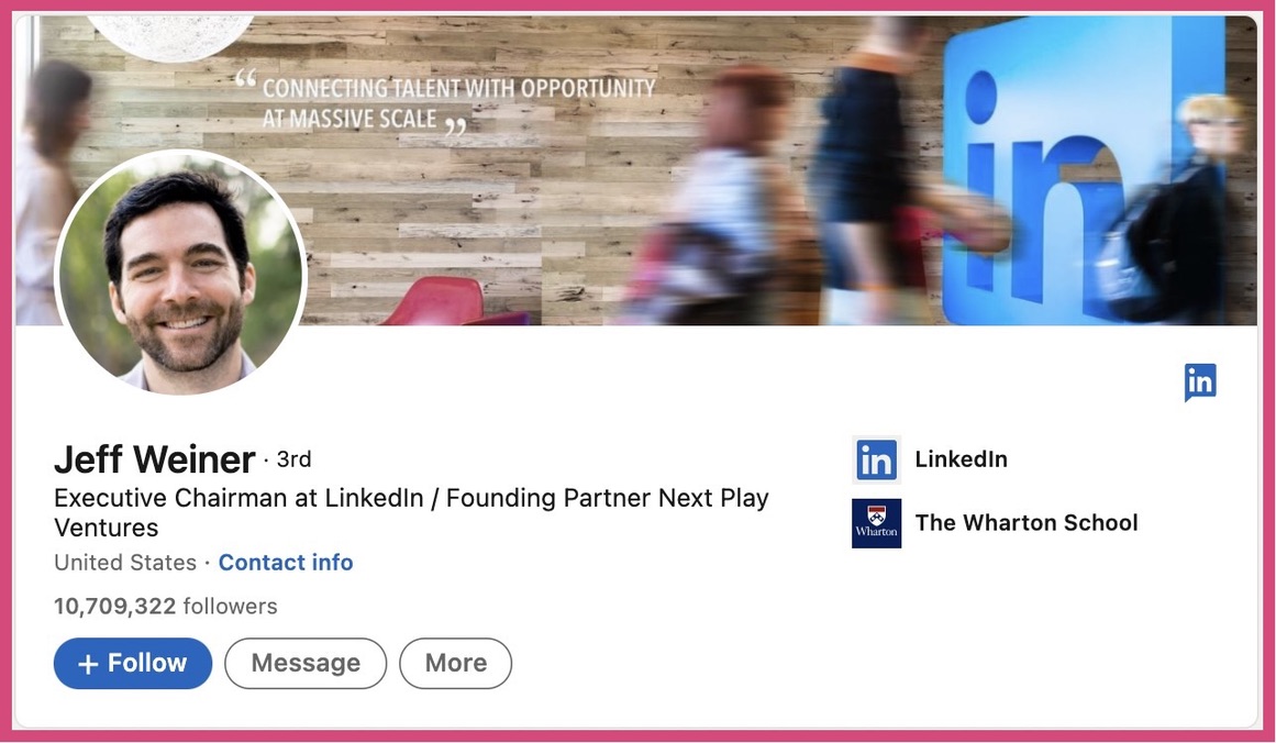
Brands can also use their cover photos to display details such as their store address, contact information, working hours, and more.
Pro tip: When designing your social media cover photo, ensure that the final design is responsive for it to be clearly visible on all devices.
Tip #3: Profile layout
Brands have minimal control over the layout of their social media pages. But that isn’t to say they cannot make them user-friendly.
Here, brands don’t need to create social media graphics. But good alignment and even spacing between elements will provide the pages a rich look.
Video-sharing platform YouTube is perhaps the best when it comes to customization options that help brands organize their channel content.
Take Netflix’s YouTube homepage as an example.
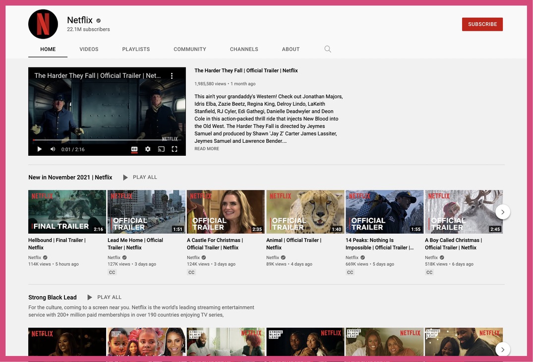
They’ve gone the traditional way of pinning a trailer video to the top of their page.
But look below and you’ll notice the hierarchy - trailers and most recent content of audience interest, followed by documentaries, playlists, and more.
And yes, brands can also update their bio in the “about” section, link other channels managed by them, to name two other options.
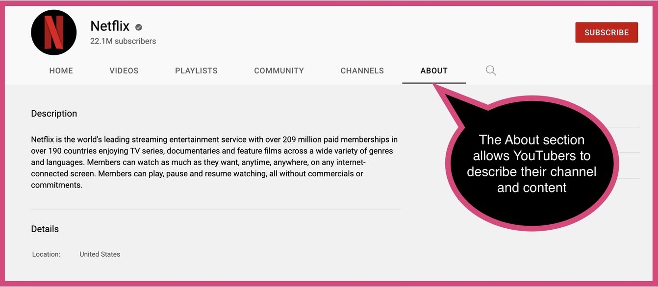
Irrespective of the platform, brands must ensure their important and recent content is displayed first, followed by content relevant on a particular day or in a month of the year (say, the holiday season).
Tip #4: Platform-specific design
In terms of social media design, the way you shoot videos and the way you share content should be adapted to what works best on your target platform.
For Instagram Reels, for example, you’ll have to shoot the video in portrait orientation as it’s designed to be viewed on a 9:16 (1080 x 1920 pixels) screen.
For a Facebook video, however, you have the option of shooting in portrait or landscape orientation.
When shooting a video, you need to also be mindful of the video length. Four hours is the maximum length of a video permitted by Facebook. Twitter, on the other hand, has a limit of 140 seconds per video (two minutes and twenty seconds), and the maximum size of a video cannot be more than 512 MB.
The pertinence of a content type for a social network needs to be taken into account long before you create it. For example, your Twitter audience would rather prefer reading a thread of 25 tweets than consuming a data-packed infographic on their smartphones.
Brands with a Twitch channel must create an “offline” banner to inform the audience when the channel is offline.
Tip #5: Create for your followers
In other words, your social media content should match the expectations of your page’s followers.
People followed your brand page because they liked your content and the sentiment you expressed. So, before you finalize your content or publishing schedule, ask the following questions:
- Will this piece of content engage, entertain or enlighten our audience?
- Will this content add value to our audience?
- Is this the best content to publish today?
Some days, the best social media content is as simple as a question that encourages and empowers your audience to share their opinions on the topic.
We're curious!
— Picmaker (@PicmakerHQ) October 19, 2021
How do you know if you've made good social media graphics?
Let us know in the comments section:) pic.twitter.com/aD4lQieFVH
If you’re doing this and your post is getting plenty of replies, don’t think twice about acknowledging the comment. And, where possible, make sure you engage in conversation. It will show your audience that you care and respect their opinions. What’s more, it’ll improve how people perceive your brand.
Tip #6: Content variety is key
Yes, you must give your audience what they want, but it’s also great to spring a surprise from time to time.
Have you been publishing #MondayMotivation posts for the last few months? It’s possible that your social media followers expect this post from you each Monday. Over time, they have grown used to your publishing routine to such an extent that the engagement rate starts to dwindle.
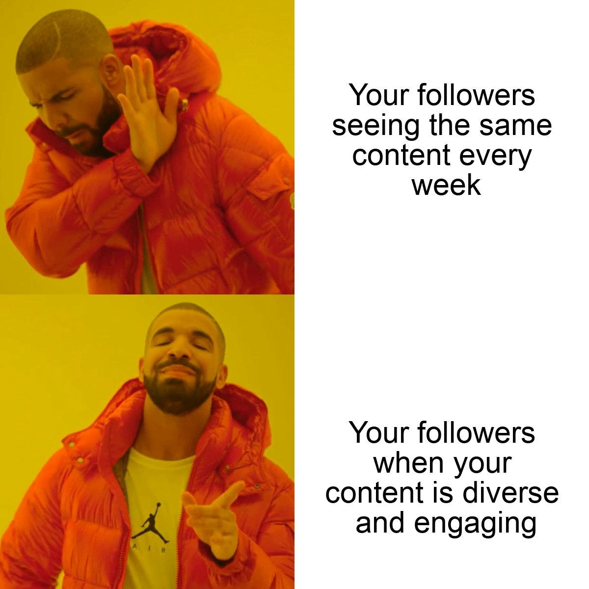
Surprise them with a meme or a GIF that they can relate to and which puts a smile on their face. Picmaker’s free online Meme Generator helps you create funny and witty memes without breaking a sweat. You get free access to hundreds of meme templates to design a unique, timely one.
Alternatively, give your followers a word puzzle to solve in fixed time duration and provide the answers in the replies.
This is not only a great way to engage your audience but also gives them something new to look forward to from your brand’s social media pages.
As we have mentioned earlier, your content calendar should include lots of different types of content. This can range from customer testimonials and product launch updates to casual and relatable posts.
Tip #7: Get creative with Instagram layout
Designing your brand profile around a theme allows your brand personality to shine through and break the monotony. And it’s especially key on a visual platform such as Instagram.
Instagram’s grid layout is perfect for brands to let the world know who they are.
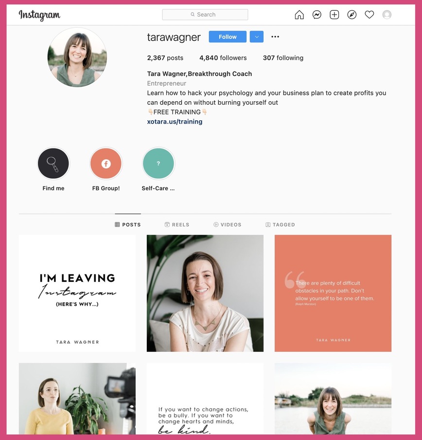
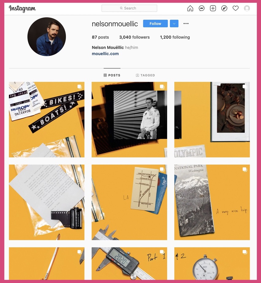
Here are a couple of examples. The first is the checkerboard effect, while the second showcases how you can combine your posts to complete a visual puzzle.
Tara Wagner, an entrepreneur, provides a checkerboard effect to her Instagram layout by alternating between image posts and caption posts.
The puzzle layout (below), by commercial photographer Nelson Mouellic, simply takes the breath away! It’s a combination of interconnected puzzle pieces which make one unified image.
For your Instagram brand page, you can implement different variations of colors to your feed by alternating white with other shades, implementing a row theme that gives your profile the look of a magazine, et cetera. The options are unlimited.
Tip #8: Choosing a typography
Ensure that your choice of font doesn’t dilute the personality you want to project to your audience through your social media design.
For example: if you’re a fast-food brand - Open Sans, Helvetica, Thirsty Soft, and Baskerville are some excellent font choices. They combine legibility and style to strike the right tone for your product.
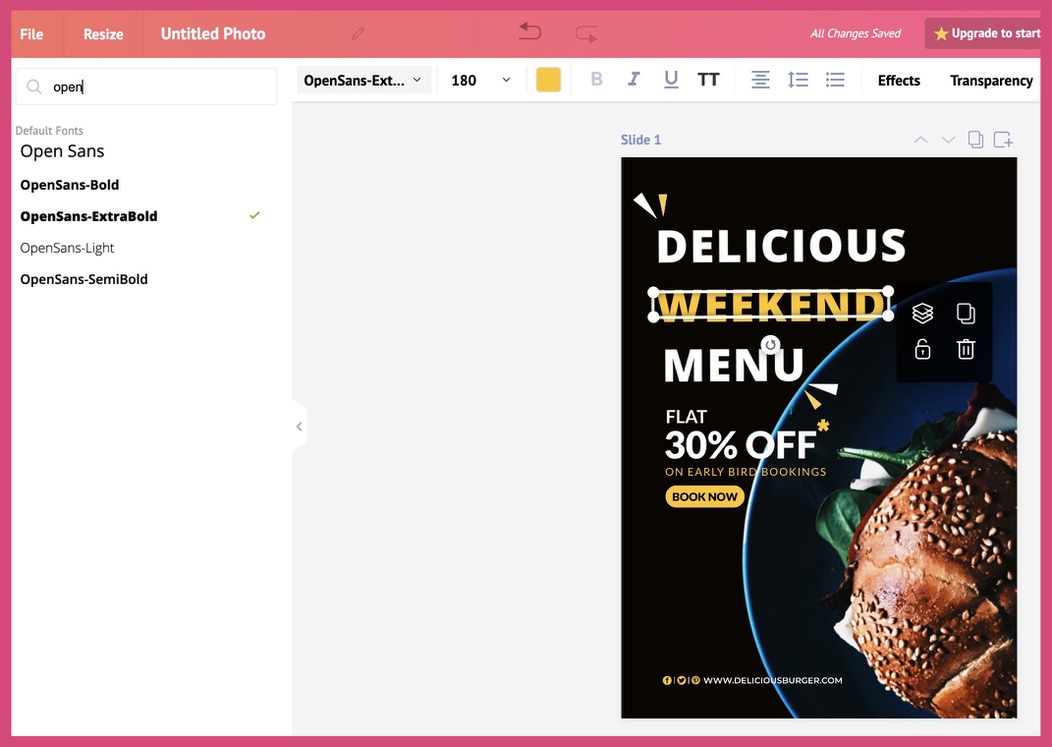
Your choice of font is crucial as you don’t want your brand’s audience to become distracted or not comprehend your message.
Should you opt to use more than one font in your design, combine fonts with a high contrast to create balance and make your design pop.
Tip #9: Make real-world references
The trick is to convey a message by combining visuals and text. And it’s especially powerful if you pull this off on Instagram or another visual platform.
The concept is manifested by this Instagram post (below) by The Mayfair Group, a creative agency whose brand ethos and messaging are about connection and compassion.
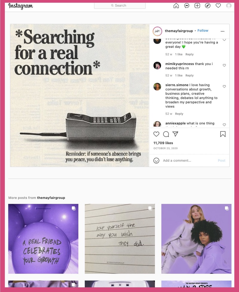
The post conveys an important message. Displaying a vintage telephone receiver along with the message “Searching for a real connection”, it provides a reminder that not all human connections are necessary.
Here’s another.
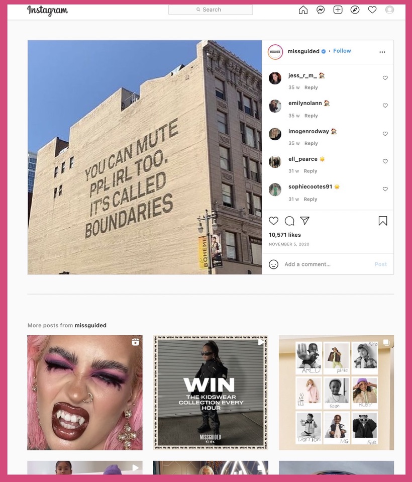
As with any other type of social media post, ensure you stay on-brand when trying out-of-the-box ideas such as these.
Tip #10: Tap into what’s trending
Not all brands can pivot their content strategy to fit in a piece of social content simply because it falls under a trending topic.
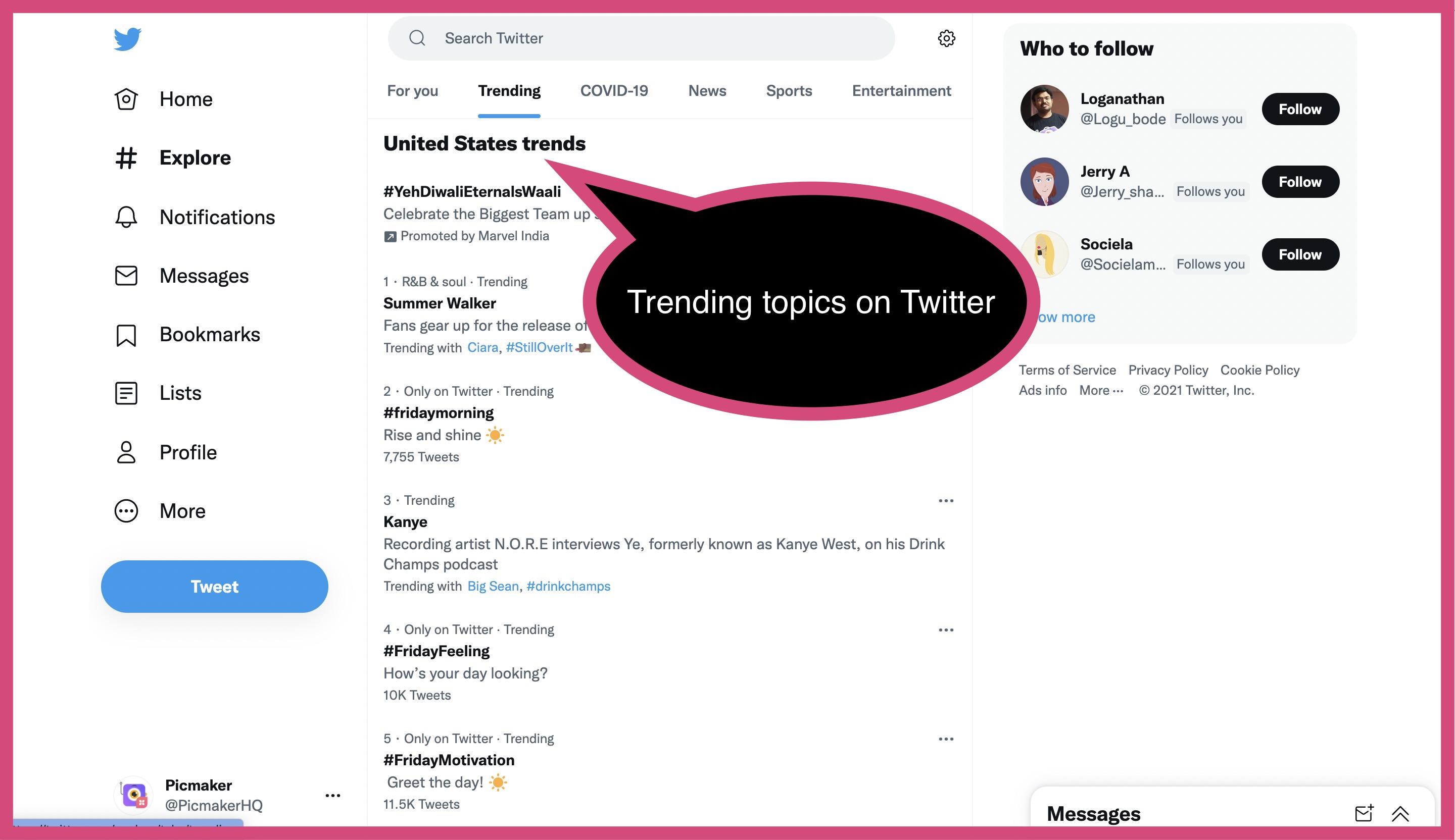
But a tweet, an Instagram Story or a TikTok video around a trending topic - such as Super Bowl, Star Wars, or a recent Netflix series that’s got Gen-Z and Millennials talking - can generate brand awareness and visibility.
Make sure you stay on-brand when you tap into trending topics.
Use relevant hashtags in your posts to enable social platforms to display your content to a wider audience. Hashtags will also help your own audience understand what the topic of your post is if they weren’t already aware.
Conclusion
In a digital-first world where close to four billion people use social media, brands have a tremendous opportunity to shape public opinion and delight their target audience with a well-defined social media design. Social media also helps brands to gain new audiences, gain their trust and loyalty, and drive business growth.
- Before creating a social media design plan, brands must understand the psychology of people on social media, including their motivations, needs, pain points and more.
- Subsequently, brands need to conduct audience research and understand social media content guidelines, including image sizes for each social channel.
- They must then plan and create a social media strategy that aligns their business goals with engaging content which generates likes, shares, backlinks, retweets, and more.
- The brand logo makes for a good choice for a profile photo on any social media platform. Alternatively, brands may use the first letter of their brand name as a profile photo.
- The cover photo serves as another piece of social media real estate where brands can display their tagline, promote an upcoming event, a new product feature, or other key details about the brand and those relevant to their audience.
- Brands must ensure their design is platform-specific and that the profile layout is user-friendly.
- A brand’s social media design must take into account whether a piece of content will provide something of value to the target audience while meeting their expectations.
- It’s important, also, to add variety to the content to provide followers with an element of surprise and ensure the engagement rate doesn’t drop.
- Brands should also get creative with their Instagram profile layouts, publish real-world reference content that the audience can relate to, and tap into trending topics - all while staying true to their brand.
Additional reading:
Feature Update: How to Present Your Graphic Design Work to Your Client
From Defining Brand Identity to Finalizing the Design, Here’s How You Create a Logo from Scratch
12 Metrics for YouTube Analytics Which You Should Be Measuring


