Your 6-Step Guide to Create a Show Poster + Design Tips & Free Templates
You’re a show organizer planning for a fast-approaching concert, a music event, magic, or a game show. You want to make it a successful event that's sold out and is attended by a large audience. Achieving sponsor satisfaction, generating record revenues, and receiving great feedback for your work are also among your key objectives. Marketing is a big part of driving ticket sales and getting people to attend your event. A show poster can help generate buzz, inquiries, and eventually bring people through the turnstiles.
In this article, we’ll provide you with valuable design tips, easy-to-customize templates, and illustrate how to design a show poster on Picmaker, an online poster maker free without login.
Poster Advertising
For decades, posters have been a key part of advertising—both digital and print. Posters offer flexibility in placement and are affordable though they are predominantly used for outdoor advertising. They also drive brand awareness and fuel brand recall.
Posters, according to a Statista survey with 1,986 respondents, have influenced consumer actions in the US. Forty percent of consumers said that they visited the advertised business after seeing its poster. Twenty-four percent went a step further with a purchase.
LEARN: How to Create and Edit Designs on Picmaker
A well-designed show poster will kindle excitement in your audience and make them curious to learn more about the event.
So, what elements should your poster include to drive the intended action?
What Should Your Show Poster Include?
Think from your audience’s perspective and what you want them to take away from your poster. For a show poster, your audience must know:
- What is the event (game show, music concert, cultural)?
- Where is the event?
- When is the event?
- Who’s the performer at the event (if applicable)?
- What’s the ticket cost for the event?
- Where can the tickets be booked?
What Is The Event?
This is typically your event name, prefixed by the edition or the year when it’s being held. For example, the title for your upcoming event can be: “22nd Rock Music Festival”.
The ‘what’ element should be prominently displayed (top-center is ideal) to help your audience effortlessly see it as soon as they glance at the poster.
Where Is The Event?
This, too, is self-explanatory. Mention the venue and the city or town where it’s situated. If the venue has more than one stadium or auditorium, mention the respective number and the exact manner in which it is denoted.
RELATED: 75+ Digital Poster Examples For Any Audience
For example, the name of your venue could be mentioned as: “Town Hall, Tennessee, US”.
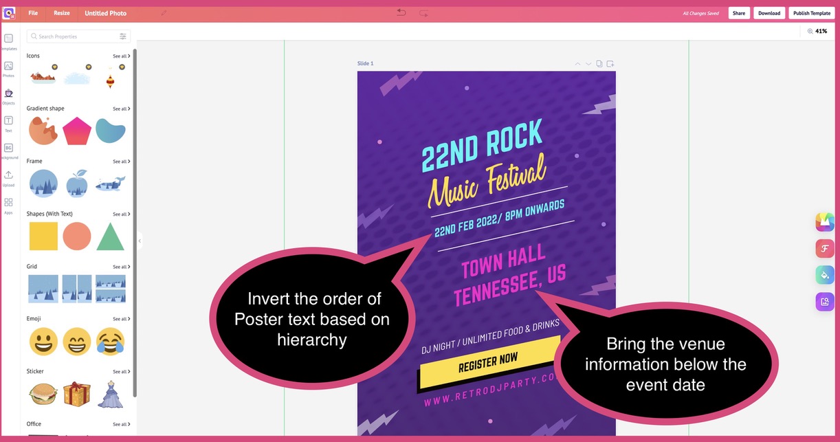
The venue details should be written below the name and date of the event for optimal visibility.
When Is The Event?
Include the day, month, and year of the event - written in a format that’s familiar to your audience. For example, if your target audience is in the US, write the date in “mm-dd-yyyy” format. So assuming your event falls on 22nd February 2022, you’d write it as 02-22-2022.
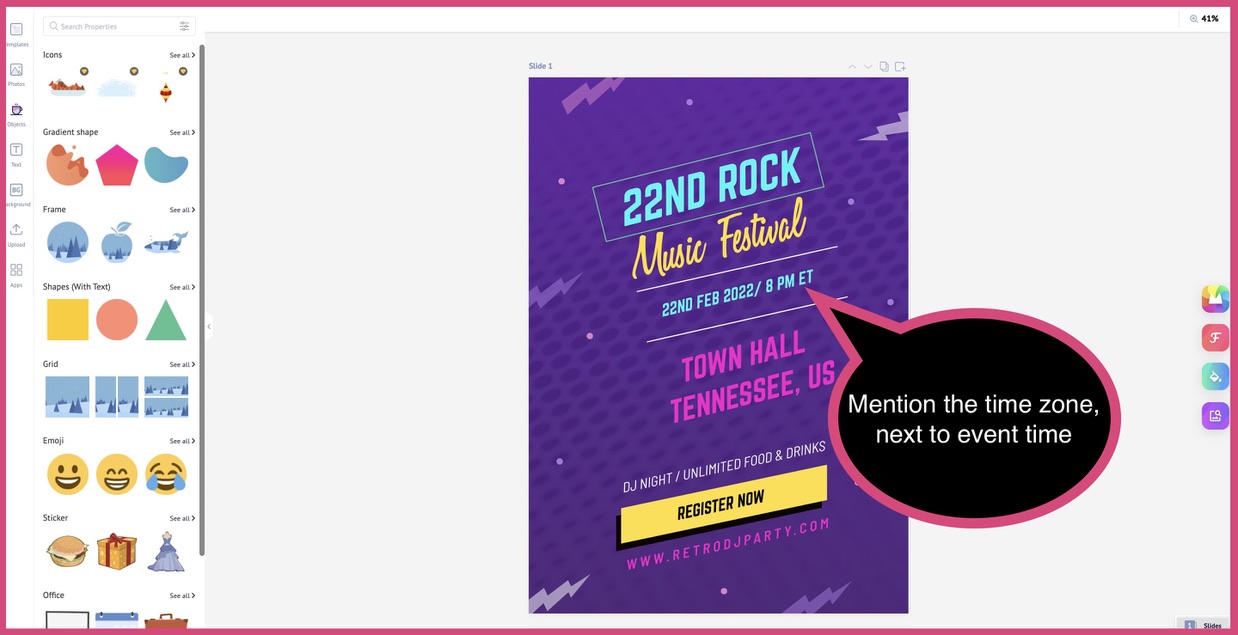
The event time and the time zone should also be mentioned. For example, 21:30 GMT, 18:00 ET, 19:00 PT, and so on.
Who’s The Performer At The Event?
Not all event or show posters need to include this detail. For example, if you’re organizing a fashion show, the name of the designer whose collections are being showcased may (or not) be included.
On the flip side, a music festival can include details about the band or musician performing at the event. If you’re including the performer’s name, mention their original name along with their stage name (if any) to make them recognizable to your audience.
What’s The Ticket Cost For The Event?
While your poster will include the actual cost per ticket for entry, mention specific details about what the ticket holder is eligible for apart from getting entry to the event (such as food or drinks, entry to VIP areas, and so on).
Where Can The Tickets Be Booked?
Whether you’re designing a digital or print poster, you must include the web address where your audience can book their tickets and know more about the event.
Your poster should also include an email address for your audience to submit queries and raise grievances that the organizing committee must resolve.
ALSO READ: How to Create Engaging Visuals for Your Social Media Posts – 13 Guaranteed Tips for Glory
Design Tips For Show Poster
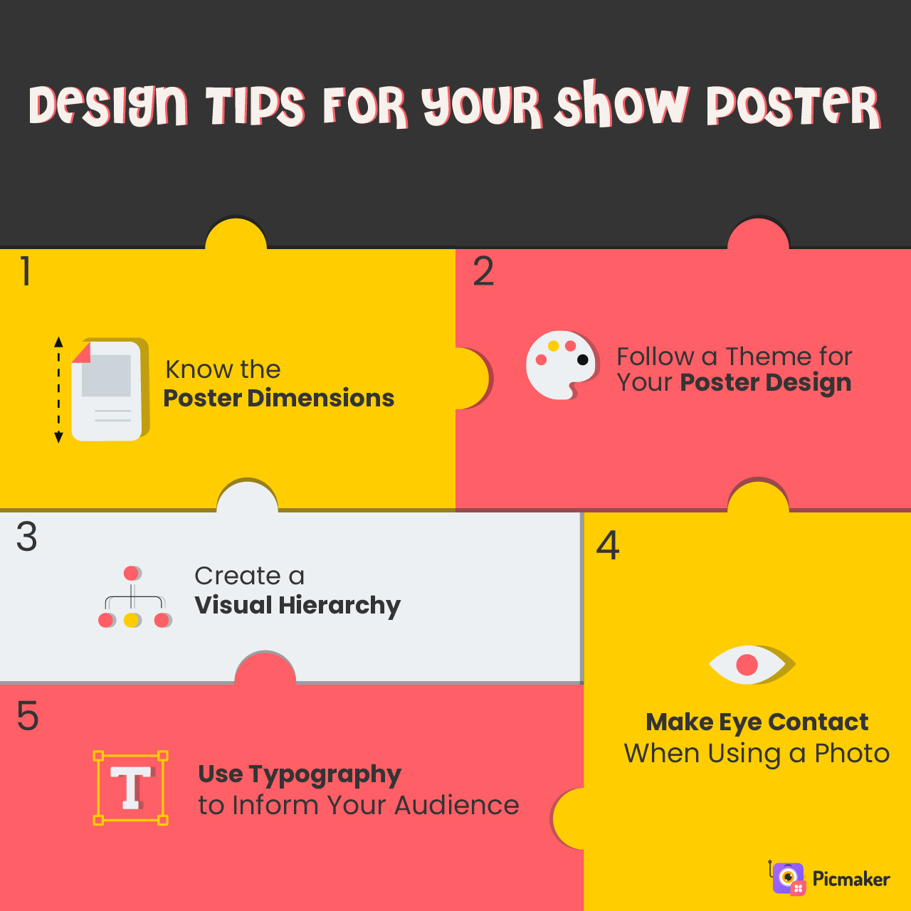
Designing a beautiful, informative poster need not be difficult—even if you are new to design. The following tips will help you create a show poster that is attention-grabbing, has the standard dimensions and is relevant to the theme of your event.
WATCH: How to Choose the Best Templates?
Tip #1: Know The Poster Dimensions
Posters come in different sizes. The recommended poster size is as follows:
8.5 in x 11 in - This poster is used for roadside advertising and for display on noticeboards.
18 in x 24 in - It is a medium-sized poster that’s best for indoor advertising.
24 in x 36 in - This size is for outdoor advertising posters. These dimensions can even be stretched up to 27 in x 39 in.
42 x 59.4 cm - This poster is a standard A2 sheet-size poster that’s ideal for event promotion, an inauguration ceremony, or a product release.
Pro tip: You should determine the size of your poster based on the country you’re promoting your event in, and where you’ll be displaying the poster. A poster displayed on the side of the road will have larger dimensions. However, a poster displayed on a school noticeboard will typically be 18 in x 24 in, or lesser.
Tip #2: Follow A Theme For Your Poster Design
The text on your poster will convey the essential information. But its layout and design must reflect the theme of the event or show that is being promoted.
Because posters should not only inform people but must also grab and hold their attention.
If the layout, color scheme, or any visual element of a poster is incongruent - viewers may not pay attention and absorb information.
To get your show poster to do its job, make sure you use a color combination that radiates energy and draws people in. Remember, colors have the innate ability to evoke emotions and convey information nonverbally.
Here is a show poster that sets the mood for an entertainment event. The rising sun in the background indicates that it’s a post-summer event. Waterlily and Montserrat SemiBold lend style to the poster while they are also legible for the viewer to grasp information.
Tip #3: Create A Visual Hierarchy
A combination of illustrations and typography is typically used for posters.
Visual hierarchy is the concept of arranging elements in a specific way to highlight their order of importance to the viewer.
It will vary from poster to poster: for a show poster, the musician or magician performing at the event is typically the focal point. The text merely complements the photo.
When it comes to quotes and environmental awareness posters, highlighting the text provides emphasis and draws people’s attention.
Tip #4: Make Eye Contact When Using A Photo
When using a photo in your poster design, ensure that the person looks directly into the camera and makes eye contact.
Eye contact is one of the most powerful ways to draw your audience’s attention and communicate information. To strike an optimal balance, adopt a minimalist design for your poster.
The above poster has a prominent image of a man making eye contact, combined with the message “STOP RACISM”. It reinforces the crusade against racial discrimination.
ALSO READ: 15 Best Instagram Post Ideas With Images to Drive Huge Engagements in 2021
Tip #5: Use Typography To Inform Your Audience
Even when you’re using a photo as the focal point of your show poster, the text should be on point, legible, and informative.
Your poster title text should be in uppercase and centered on your layout to ensure it’s the first piece of your poster your audience will see.
The font size should make the text legible to your reader without being distracting. A 24-point font is best for the body text of your poster, 36-point for sub-headings, and 85-point for the header (or poster title).
Sans Serif fonts such as Franklin Gothic, Helvetica, Futura, and Lavenderia are excellent font choices to make an impact with your poster.
How To Make a Show Poster On Picmaker?
We’ll show you how to customize a poster template on Picmaker, a free poster creator, with an example.
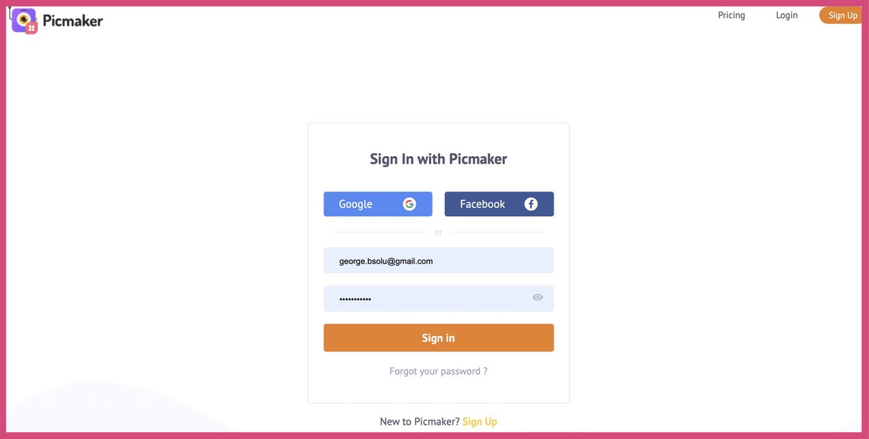
Step 1: Log In or Sign Up
This is the login page on Picmaker, the best online tool for poster making, where you can use your email or social media account to either log in or sign up.
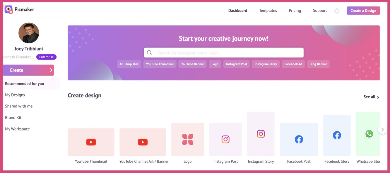
Step 2: Enter Picmaker Dashboard
You'll enter the Picmaker Dashboard once you’ve entered your login details and signed in.
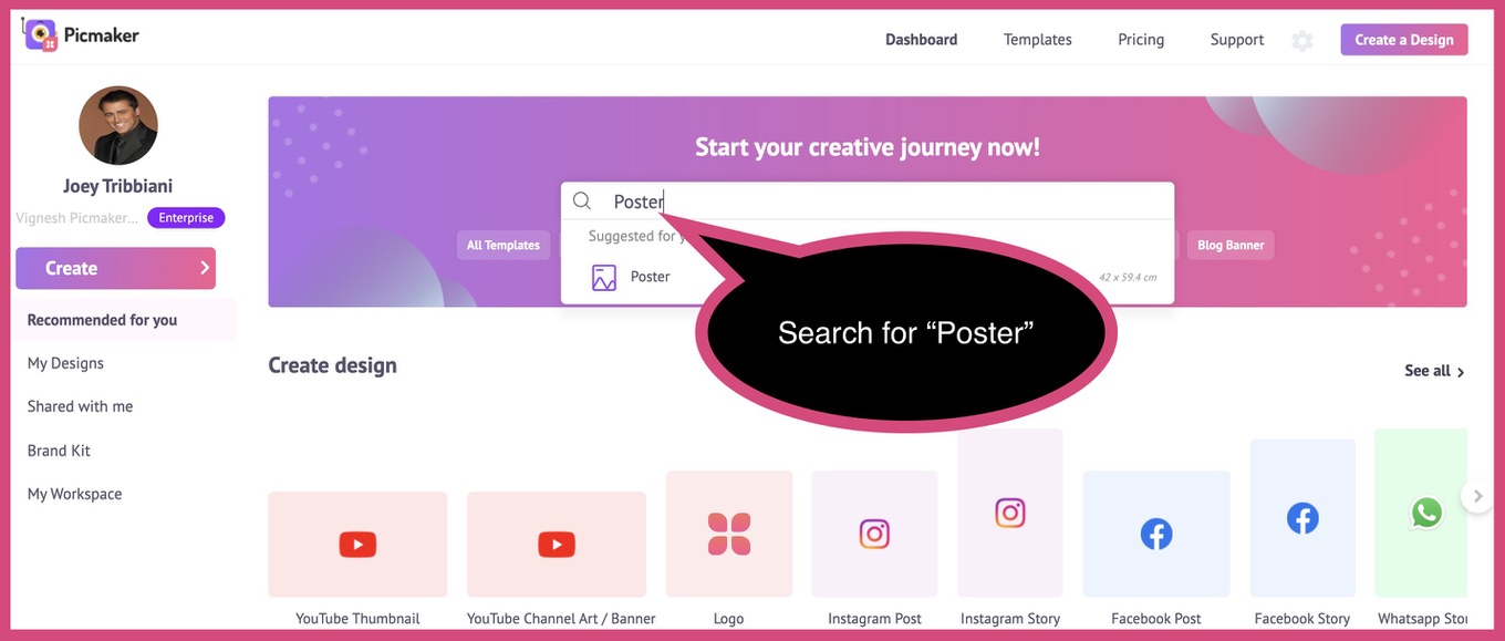
Step 3: Search for a Design
Let’s search for “Poster” on the search bar.
Step 4: Select a Template
You’ll enter the poster templates page. Choose from a vast collection of posters across categories.
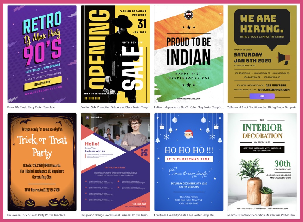
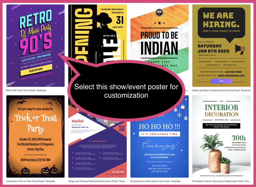
As we are designing a show poster, let’s select this (screenshot below) poster for customization.
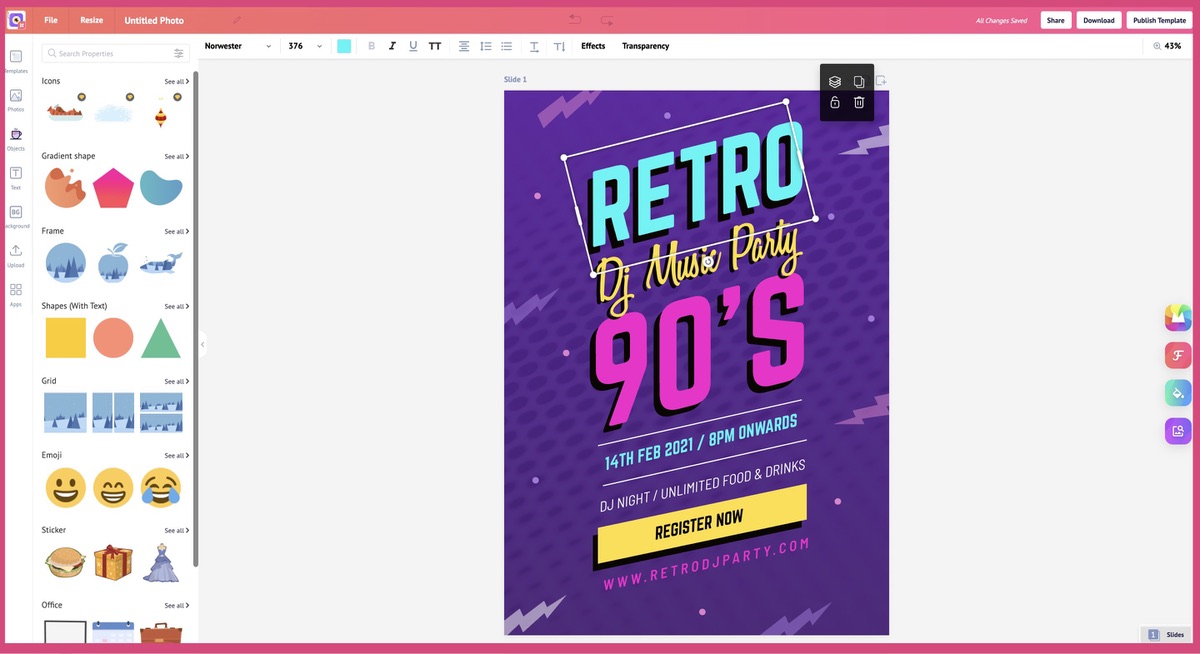
Step 5: Customize the Template
First, select the text you want to edit.
Second, edit the text as per your need.
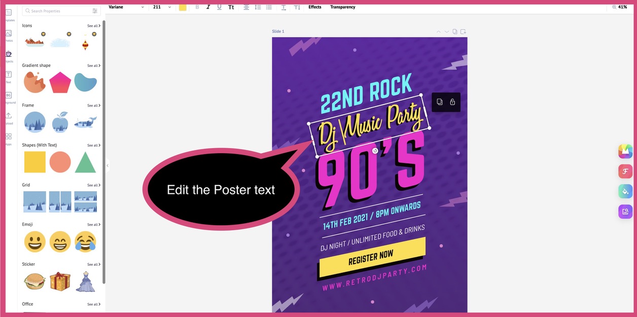
Third, ensure the hierarchy of text is customized for your poster. As this is a show poster, the date and time of the event must come immediately after the poster title.
Fourth, mention the time zone to avoid confusion around the event time.
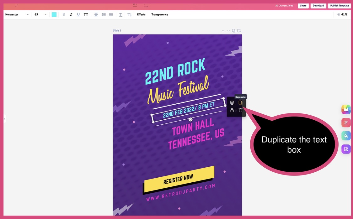
Fifth, duplicate the text box to retain the same format and choice of font.
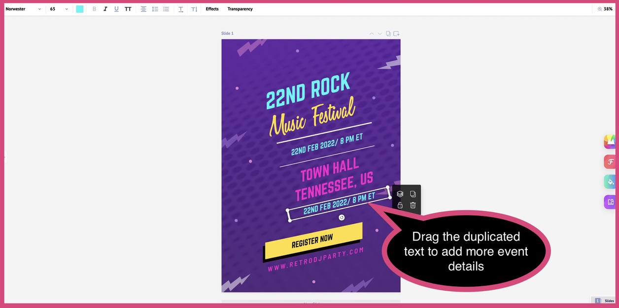
Sixth, move the duplicated text box below the venue information.
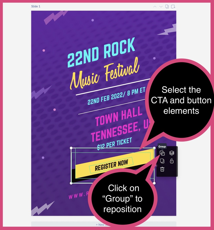
Seventh, reposition the CTA button.
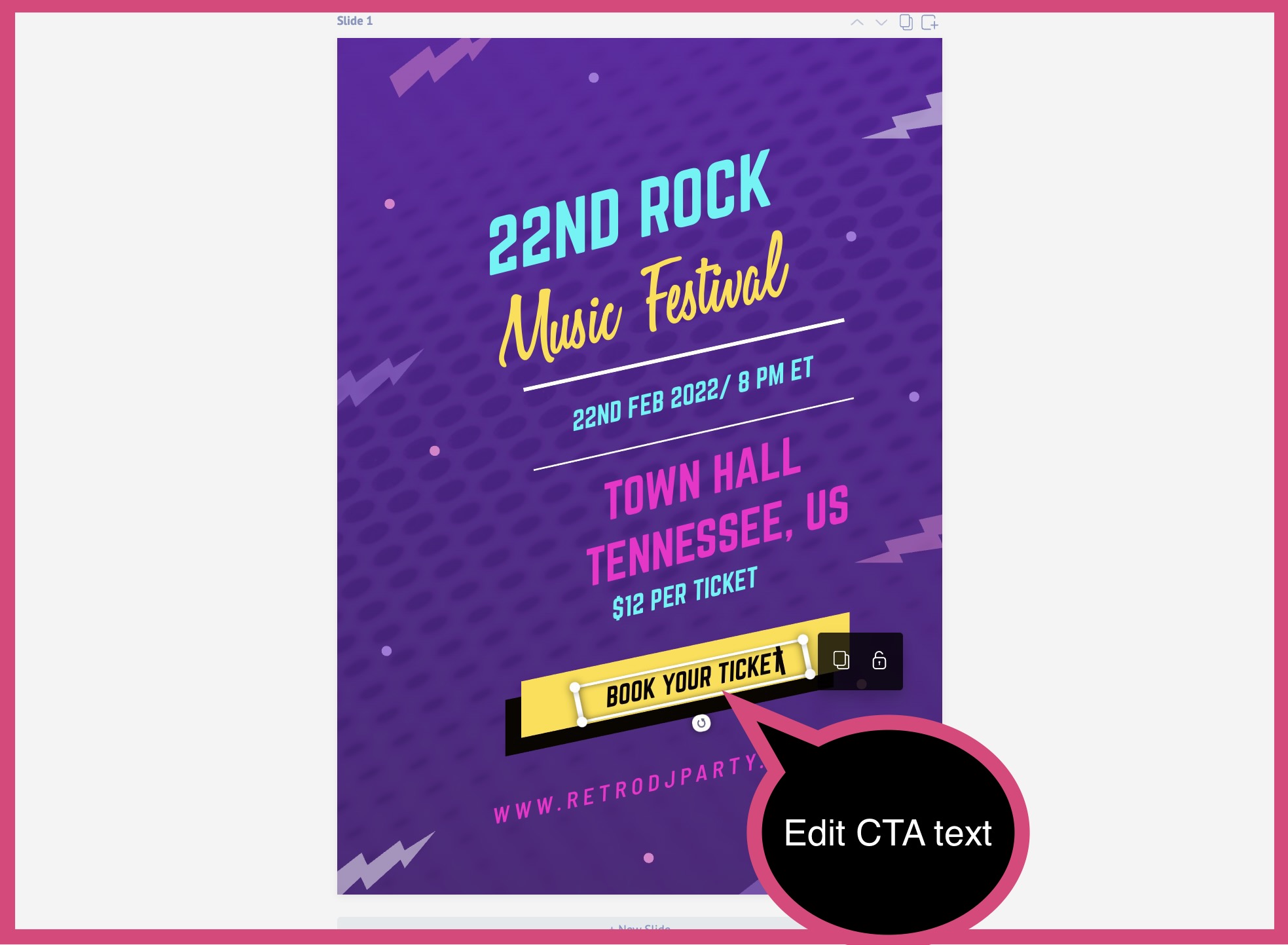
Eighth, edit the CTA based on your event.
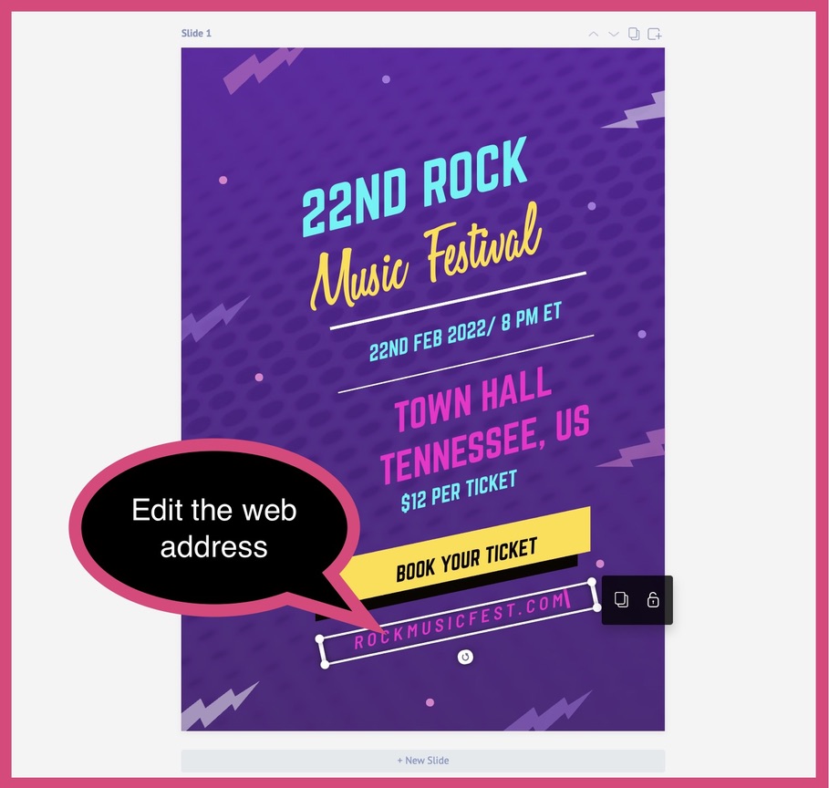
Ninth, edit the web address to direct your audience to the event website.
Check for proper alignment of all poster elements, as a final step.
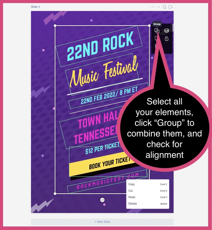
Voilà, you’ve created a show poster!
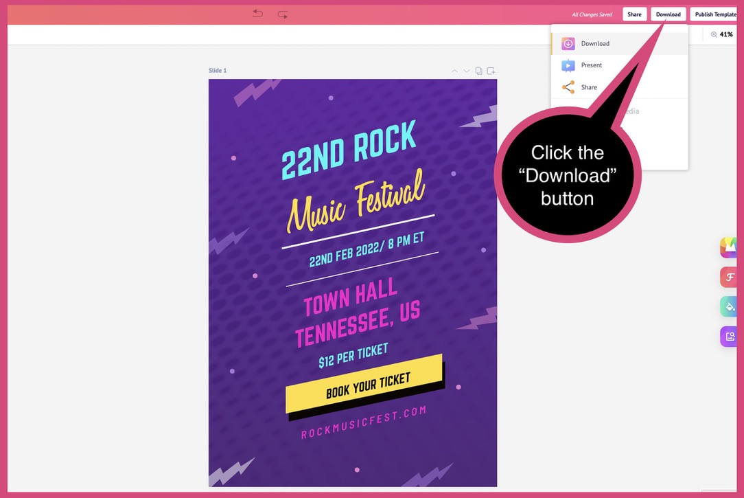
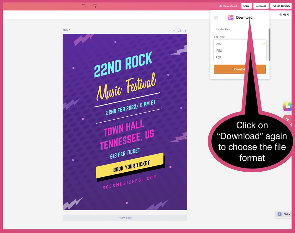
Step 6: Download Your Show poster
Picmaker allows you to download your design in either PNG, JPEG, or PDF format.
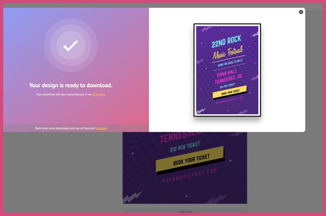
Great, you’ve downloaded your show poster! You’re now ready to distribute it to grab your audience’s attention, drive ticket sales, and make your show or event a success.
Conclusion
Posters are one of the powerful marketing tools that drive the desired user action. They help promote events, product launches, inauguration ceremonies, and to get the word out about almost anything. According to data, people are receptive to posters. It convinces them to check out advertised businesses and even purchase from them.
- What details should you include in your event poster? The key details are the event name, event date(s), event time, show performer, ticket costs, and where the tickets can be purchased, and more.
- To ensure your poster grabs and holds people’s attention, you must:
- Know your poster dimensions
- Follow a theme for your poster design
- Create a visual hierarchy
- Ensure the person who’s featured in the poster photo makes eye contact
- Use typography effectively to inform your audience
- Picmaker has a large library of poster templates across categories to cater to any promotional need you may have.
- Customize the copy of your poster in just a few clicks, ensuring all the elements are coherent, consistent with your brand identity, and engaging for your audience.
- Ensure proper alignment of all your poster elements to help your audience absorb information quickly.
- Download your poster in a single click - in PNG, JPEG, or PDF format.
- Use the AI-powered MAD Button to generate suggestions for background colors, fonts, and design elements that will enhance your poster design.
- After you’ve downloaded your poster, ensure that you distribute it through online and offline media to generate event buzz and, importantly, make your event a success.
Additional reading
- The hidden secrets of how to make a poster online for free (Includes 5 awesome poster templates for everybody)
- Digital Poster: Advantages, Design Mistakes To Avoid & 75 Free-to-use Templates
- Creative Poster Making and Design Ideas (+Free Design Templates to Create Your Own)
- Do you want to have an awesome Star Wars poster for yourself? Read our detailed guide about how to create one that stands out.


