Contents
Where did it start for Instagram?
What is an Instagram carousel?
What are the different dimensions for Instagram carousel posts?
3 reasons to choose an Instagram carousel over videos
How to create an Instagram carousel post?
Start with a primary idea for your Instagram carousel
Develop a short script around it
Choose your brand colors and fonts
Create your primary slide and use that as a reference
Build your story on each slide
Proofread it and check your alignment
The Ultimate Guide to Eye-Popping Instagram Carousels [9-Steps to Immortality]
*An abridged version of this blog about Instagram Carousels originally appeared on Mention's blog on 15 July 2021.*
Where did it start for Instagram?
It all started in 2010, when a 27-year-old Kevin Systrom, a Stanford graduate, quit his job and launched Burbn. Kevin had a seed funding of $500,000 for his startup. Over time, he changed Burbn to Instagram.
As of 2021, Instagram’s advertising revenues in the US alone is expected to touch $18 billion. It is also estimated to have more than a billion active users, out of which more than 25 million are business accounts.
The COVID-19 pandemic boosted the total number of users on the platform in 2020. As more businesses were forced to shift their offering online, the number of business accounts on Instagram blew up.
What is an Instagram carousel?
An Instagram carousel is a post with more than one picture or video. You can view all the contents by swiping left on the screen.
The screenshot below is a normal Instagram post.
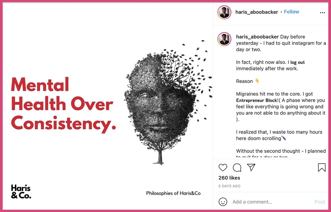
However, the below picture is an Instagram carousel post. By clicking on the arrow on the right side of the post, you can see more pictures.

Here is slide 3 of the same Instagram carousel post.
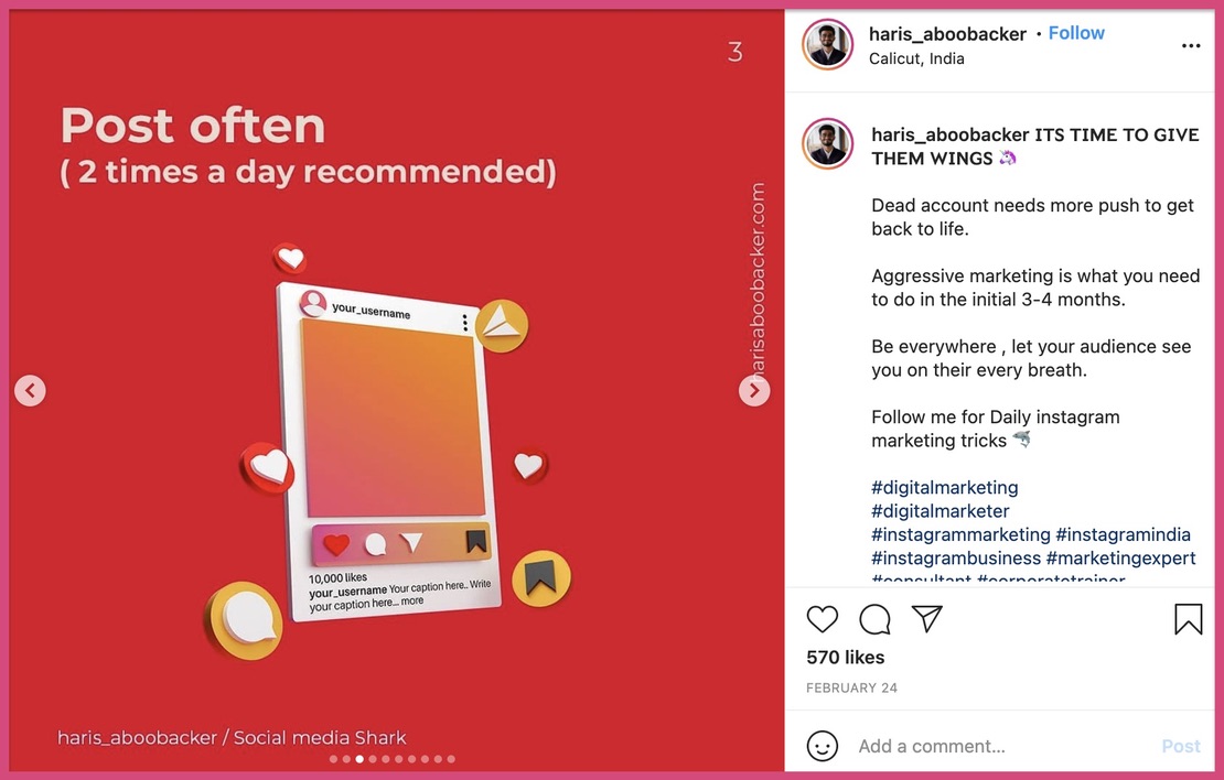
However, an Instagram carousel isn’t just restricted to photos. You can add videos or a mix of photos and videos on your Instagram carousel post. You can also break down long panoramic photos and add them as an Instagram carousel. Additionally, incorporating videos and panoramic photos in your carousel can help bring your brand to life and create a more dynamic experience for your Instagram followers. So don't be afraid to get creative and experiment with different types of content in your Instagram carousel posts!
What are the different dimensions for Instagram carousel posts?
Just like any normal post, Instagram carousels have typical dimensions. Here are the different dimensions for photos and videos in a carousel post.
Instagram carousel sizes for pictures
- Landscape carousel size: 1080 x 566 pixels
- Portrait carousel size: 1080 x 1350 pixels
- Square carousel size: 1080 x 1080 pixels
Instagram carousel factors for videos
- Minimum length of video: 3 seconds
- Maximum length of videos: 60 seconds
- Recommended video formats: .MP4 and .MOV
- Recommended aspect ratios: landscape (1.91:1), square (1:1), and vertical (4:5)
- Maximum size of each video: 4GB
3 reasons to choose an Instagram carousel over videos
You might ask, “Why should I spend time creating an Instagram carousel post over other formats?”
For starters, the 2021 Mention-HubSpot engagement report for Instagram states that carousels are the second most popular format after videos. The same report also states that carousels are at the top of the median number of likes and comments.
Instagram carousels also maintained a consistent 62 likes and 5 comments for more than 50% of the users on the platform. Consider that for a moment, especially if you’re just starting on Instagram.
Besides, here are three more reasons to choose an Instagram carousel over other formats.
1. Instagram Carousels are easier to create than videos
Winning at video requires you to be good at multiple things. You need a good camera, brilliant lighting, good audio quality, and camera presentation skills. And, these are just basic requirements for creating a video.
Let’s assume that you use a smartphone, zero lightings, and average audio quality. You could get away with this, but you would still need to have excellent camera presentation skills.
And, it’s no different for animated videos too - you need to master animation video software before you scale.
Even with the first option, you need to edit your video clips before launching it. So it’s safe to say that creating wow-worthy videos is hard.
2. Carousels can be scaled with a templated approach
Once you have created your first carousel on Instagram, you would have a skeleton for your posts.
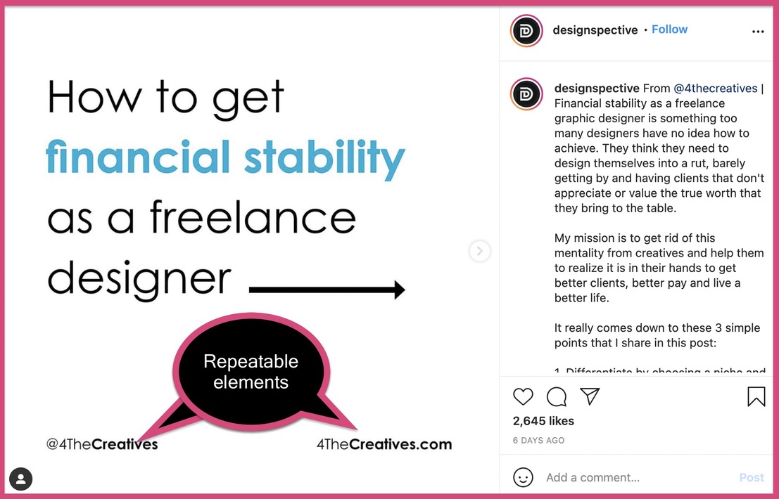
All you need to do is change the text on each slide to maintain continuity.
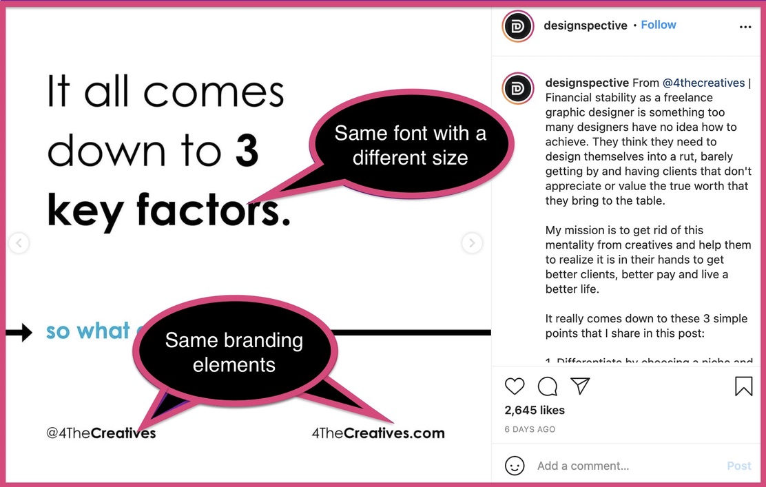
For example, in the above carousel post, the design is consistent throughout, and it has been modified for consecutive ones. Once you have enough practice with it, you can churn out Instagram carousels quickly.
However, if you want each carousel slide to be unique and different from each other, you will need to work on it. But, that takes comparatively less time and effort than shooting and editing videos. Using a free Instagram post maker, you can create carousel posts effortlessly. It can help you combine content, color, and graphics.
Here’s an example of an Instagram carousel post with good variety:
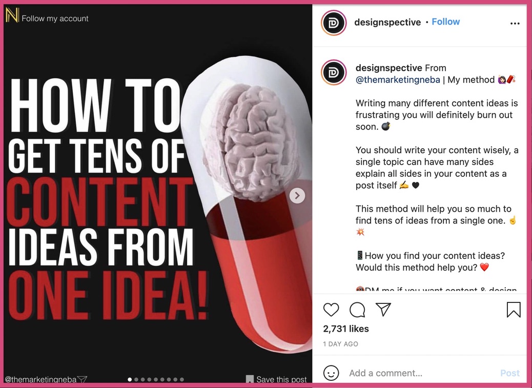
Each slide is wildly different from the other and requires more time than the previous example.
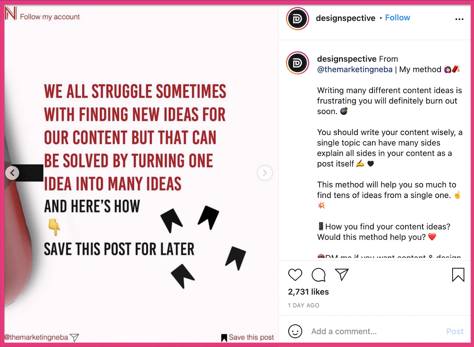
Even with such variety, you can still have the same branding elements fixed on each slide.
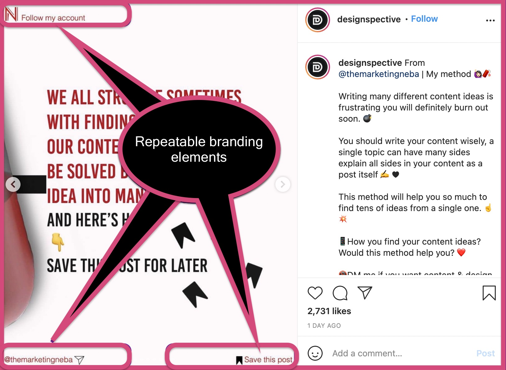
The idea is that carousels allow you to create a repeatable procedure for your posts. It saves you time and helps you get from thinking to creating quickly.
3. There is no limit on the amount of information that can be shared
While there is no limit to the length of videos on Instagram, you will lose your audience’s interest beyond a point. If you’d like to include more information, your videos need to be longer. When they are longer, you risk losing your audience’s interest. To keep things interesting, you must invest in quality editing and good storytelling.
However, an Instagram carousel post can help you say more without effort (comparing the amount of effort you need to put in a video).
How to create an Instagram carousel post?
Creating an Instagram carousel is a piece of cake, as long as you follow the proven steps mentioned below.
Start with a primary idea for your Instagram carousel
Just like any piece of content, your Instagram carousel should start with a base idea. Remember that this base idea must be helpful or entertaining for your target audience (brownie points if it’s both helpful and entertaining).
Ask yourself these questions before figuring your core idea for carousels:
- Is this idea genuinely helpful or interesting to my followers?
- Can I explain this idea in a few slides?
- Should I make a carousel or create a single image post for this idea?
If your answer is ‘NO’ for any of these questions, it’s time to rethink your Instagram carousel idea.
If your idea is too big for one carousel post, break it down into subsections. You can use each subsection to create a unique Instagram carousel post.
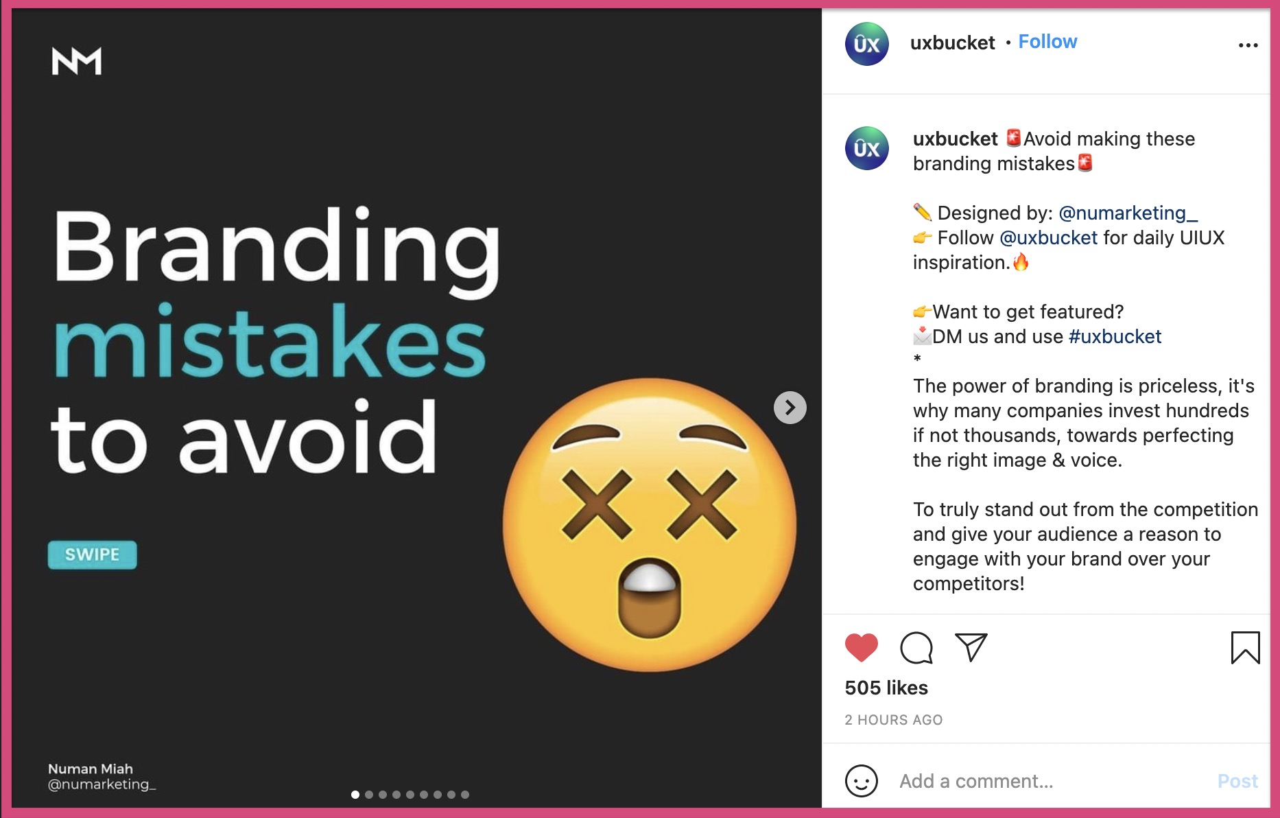
For example, “Branding mistakes to avoid” is a mammoth idea. But this carousel conveys it in 10 slides. The example above features the most important points and their subsections related to “branding mistakes”.
If your idea is too small for a carousel post, add facts, data, or a story to it.
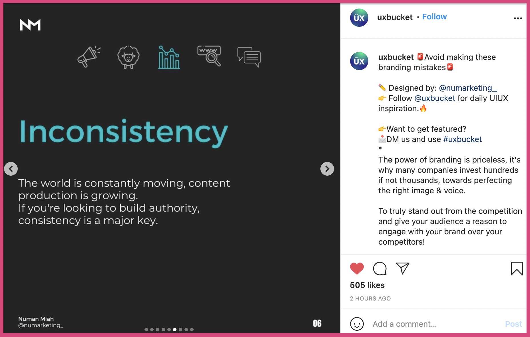
For example, ‘Inconsistency’ is a big killer on any social media platform. To remain relevant, you need to be consistent with your content. This is a small idea that is part of a carousel. However, you can use this single idea to create an individual carousel post.
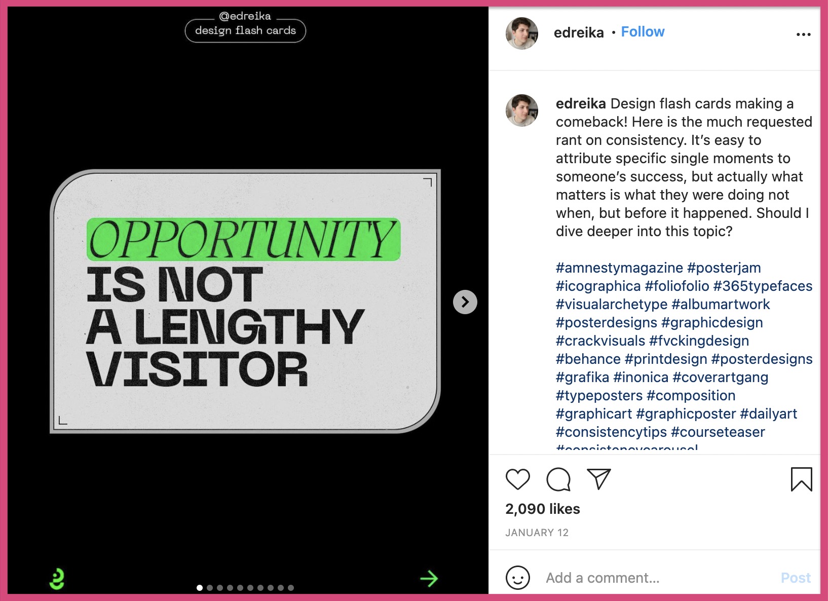
The above Instagram carousel features 10 slides stressing on the importance of consistency on social media. With a little bit of creativity, you can create Instagram carousel posts for any topic.
Develop a short script around it
Once you have answered the questions in the previous point and selected an idea, write a script for your Instagram carousel post. There are three main parts to the script:
A. Hook (The title)
B. Story (The content)
C. CTA (The final slide)
Choose any Instagram carousel and these are the three sections you’ll come across.
A. Hook (The title)
It is essentially the first and the most important slide of your Instagram carousel post. You have been told to “Never judge a book by its cover”.
But it’s impossible not to judge a book by its cover or a person by his/her clothes. You cannot override billions of years of human evolution in a second.
Your followers will judge your Instagram carousel by the first slide (the hook). If the first slide does not captivate them, nobody will mind checking the rest of the carousel.
A good hook must capture the attention of someone scrolling their feed. It should intrigue them to slide left and read through the rest of your Instagram carousel.
Here are some examples of a good hook.
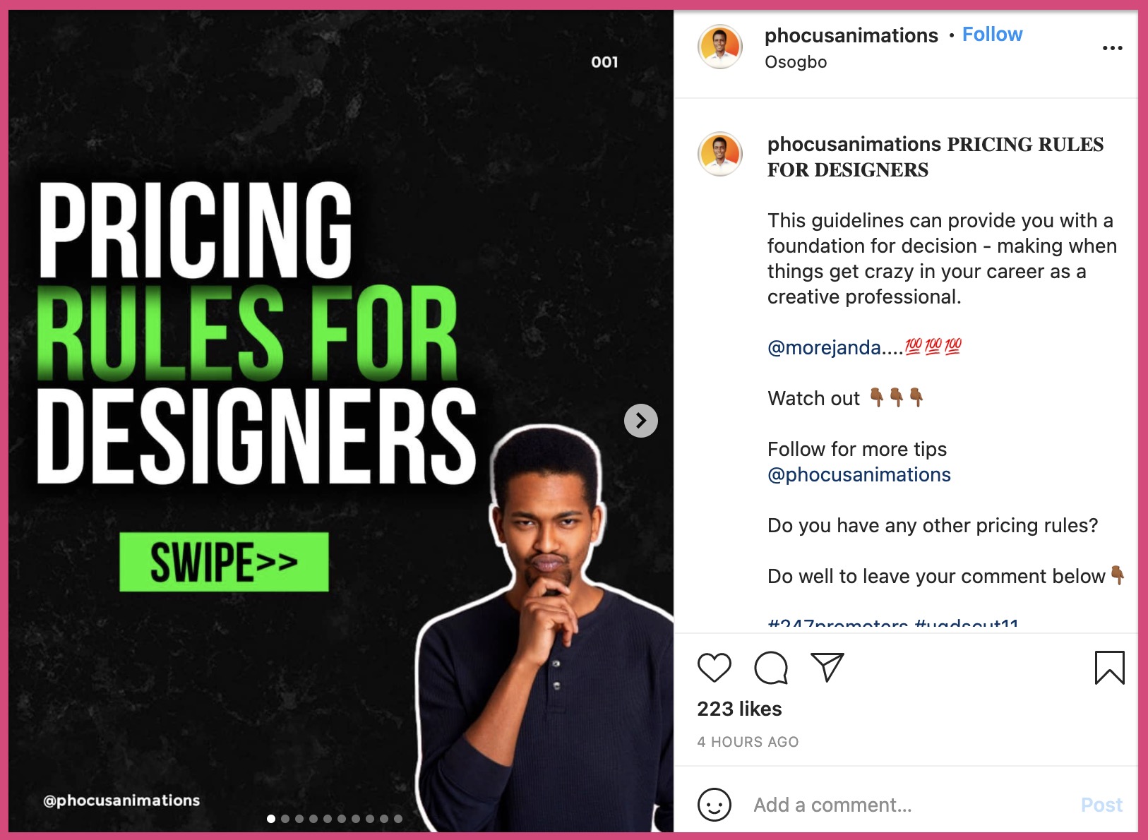
The above Instagram carousel has a solid hook.
- It has a picture of a person facing the viewer with a white outline
- The title is short and intriguing for a narrow audience, i.e. designers
- It uses 2 colours on its font
- It has a big swipe button to encourage users to swipe left
In one glance, you’ll fall for this Instagram carousel post.
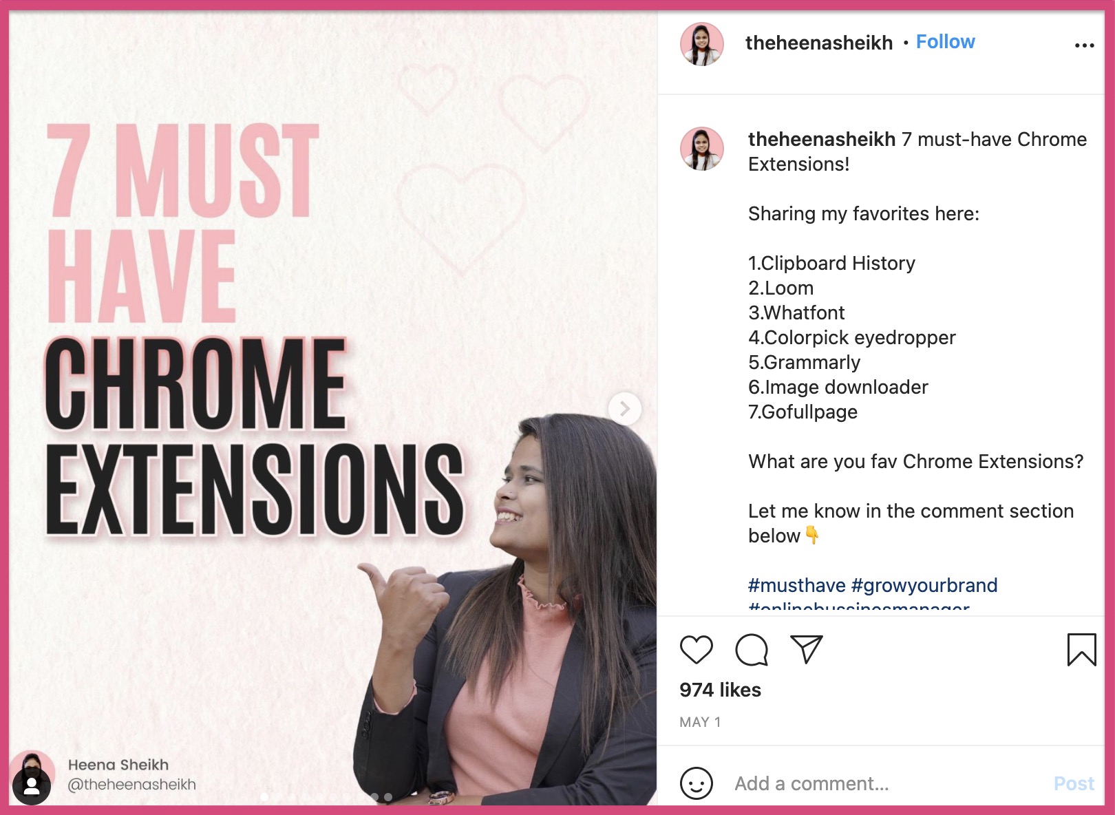
The above is an Instagram carousel post that gets a lot of things right, which include:
- Picture of a real person pointing to the heading
- The heading is written in 2 colours to grab the attention
- Words like ‘must have’ force you to swipe left
And, here is an example of an Instagram carousel with an average hook.
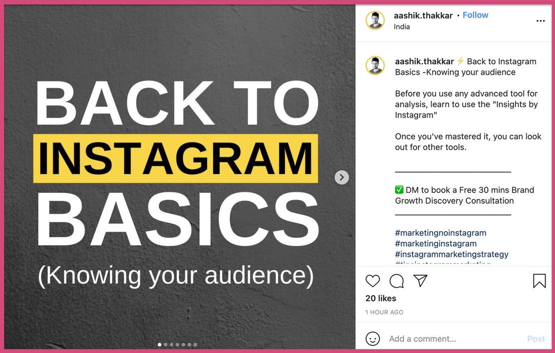
Although the content is great in this post, most people may not read it. The hook does not stop the viewer from scrolling past nor does it invoke a sense of curiosity.
B. The story (The content)
After hooking your audience with the first slide, your next goal is to make them swipe left. The goal of each consecutive slide is to take them to the next slide.
The goal of the first slide → Take your audience to the second slide
The goal of the second slide → Take your audience to the third slide
And, that of the third slide → Take them to the fourth slide
.
.
.
.
Finally, the goal of the final slide → Take your audience to the CTA slide
A great way to move your audience from one slide to the next is with a story around your core idea. Let’s consider this example.

We’ll admit this - we’re truly intrigued by this carousel, and we will swipe next.

After swiping left, we saw a bold statement and we began to wonder, “So what?” The arrow button prompts us to click to the next slide.
The subtle cues are nudging us to go to the next slide. So we swipe left.

It reads “Let’s see some bad design examples” and that’s really interesting. Why? Because all of us make mistakes and we want to fix them. So we swipe left again.
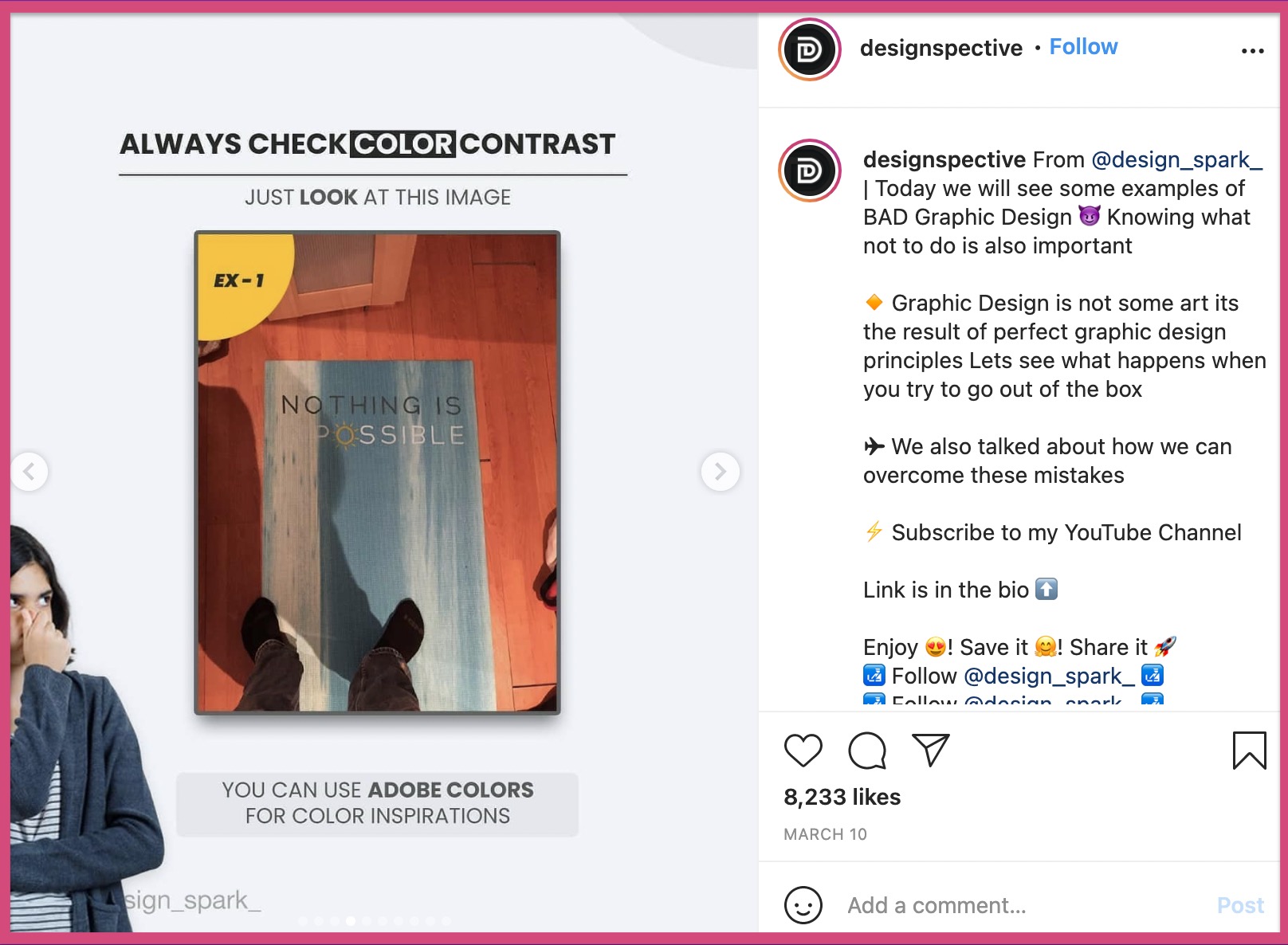
And there’s the first example, along with a small description on top. By now, we’ve swiped left four times and there is no way we’re going to turn our backs on this carousel post.
C. The CTA (The Final slide)
After moving your audience through your Instagram carousel, they’ll finally land on your CTA (the last slide). Much like the hook (on the first slide), the CTA slide is also important for your engagement.
The right CTA will determine how your visitors will engage with your posts. Rather than just hoping for your audience to do something, you need to tell them what to do instead.
Here are some things you can ask your audience to do on the final slide.
- Like this post
- Comment something specific
- Ask a question and direct your visitors to leave the answer in the comments
- Bookmark this post
- Follow your profile
- Visit your profile
- Share this post
- Tag a friend or a colleague
And more...
The CTA might not look important, but optimizing it is one of the most important growth hacks in Instagram marketing.
Let’s take a look at the CTAs of some Instagram carousel posts:

This carousel asks you to follow a specific account. Besides, they are asking their audience to like the post. The designer of this post has filled up the ‘like’ button on this post with white color. On a subconscious level, this nudges you to click the ‘like’ button and achieve symmetry.
Here’s another example of a good Instagram carousel CTA.
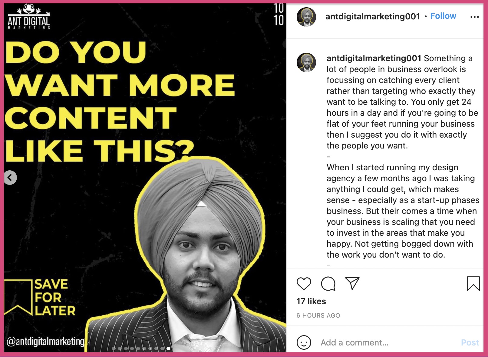
It uses a question and a ‘Save for later’ CTA in the final slide. When your audience saves your content, it gives a major boost to your engagement levels. ‘Saves’ on Instagram carousel are regarded as a ‘Super Like’ on your post. By pushing your audience to hit the ‘Save’ button, you can increase your engagement rates.
Here’s one final example to design your CTA.
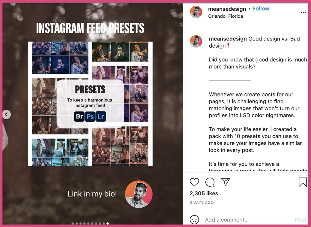
This carousel asks viewers to click the link in the bio. He states that he has a number of presets which you can use on your Instagram account. This is a good CTA strategy.
You can always be creative with your CTA.
But there’s one thing you need to keep in mind - Is the offer on my CTA relevant to my content?
If it’s irrelevant to your Instagram carousel, you can do one of two things.
- Change my carousel into something relevant
- Or, add an offer that’s relevant to your Instagram carousel.
With those examples, we are done with the second step of designing our Instagram carousel - designing a short script.
Choose your brand colors and fonts
Designing your Instagram carousel post becomes easy when you have a brand guideline. This brand guideline should include the name of your fonts, your brand colors, and design guidelines. However if you don’t have a brand guideline, you can make one from scratch.
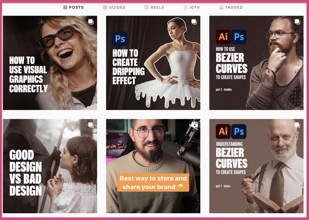
Let’s take a look at some examples to understand how brand guidelines play a role in Instagram carousels.
The above carousel posts have a brownish theme. All fonts belong to the same family and it also includes a picture of a person on the first slide of all carousels.
Such consistency helps in remembering the personality behind these carousels.

Let’s take a look at another grid that does not follow any branding guidelines.
The above carousel examples are professionally designed, but they’re inconsistent. The fonts, colors, and pictures vary from one carousel to the other. In the previous example, we saw the brownish theme across all carousels, but we do not see the same consistency here.
It’s not a bad thing to be random and erratic with your brand colors, but it certainly is not very good either!
Before you create your Instagram carousel, make sure you have a brand guideline in place. If that’s too complex for you, here are a few things you need:
- 2 standard fonts for your brand
- 2-3 standard colours for all carousels
- A PNG copy of your logo
- A voice and tone of your brand
Create your primary slide and use that as a reference
Once you have selected your brand colors, fonts, and logos, it’s time to start designing. You can use dedicated online/ offline design software to create an outline for your Instagram carousel post.
Here are some things to consider when building your reference slide:
- Your brand logo
- Your brand name
- Like, comment, share and save buttons
- Page number
- ‘Swipe left’ text or a simple arrow
All the elements on the reference slide will be common for all the slides, except the first and the final slide.
Let’s take a look at an example to understand the different elements in your reference slide.
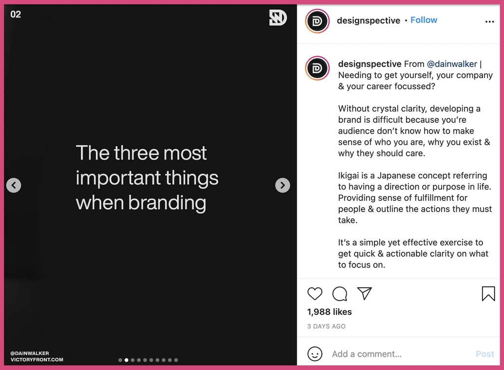
Let’s take a look at all the branding elements in this carousel post.
A. Page number
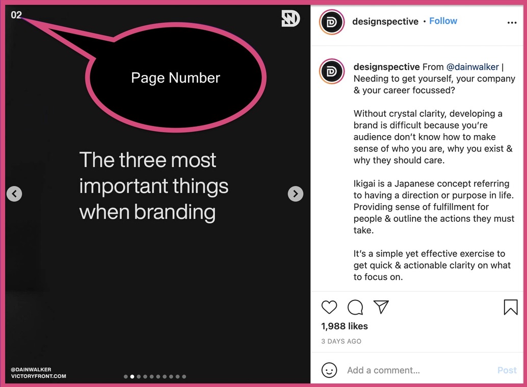
Page number is not a must have on your Instagram carousel. But it is really beneficial to have the page number of each slide on the left or right top corner. It adds to the user experience and allows them to understand the slide they’re on.
B. Logo
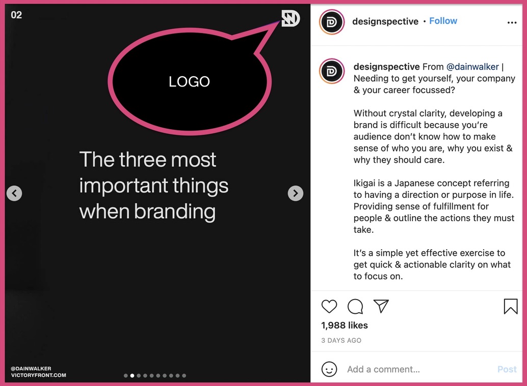
The logo is a must-have on all your slides. It does not need to be massive and take up a quarter of the slide. Your logo should be placed at any one of the four corners of your Instagram carousel. It is a small branding cue playing an important role in your carousel.
C. Name and website
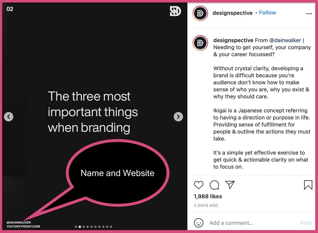
Your name and website are not a must-have on your Instagram carousel. If you are going to add your name and website, make sure that it is small. If it takes too much attention - remove it. Providing a seamless user experience is better than adding your name/website.
Build your story on each slide
Now that you have built your skeleton, let’s go ahead and start with your main content. Your primary objective is to add a hook and build a story from there.
Let’s take a look at an Instagram carousel post to understand how a story is built.
A. The Hook
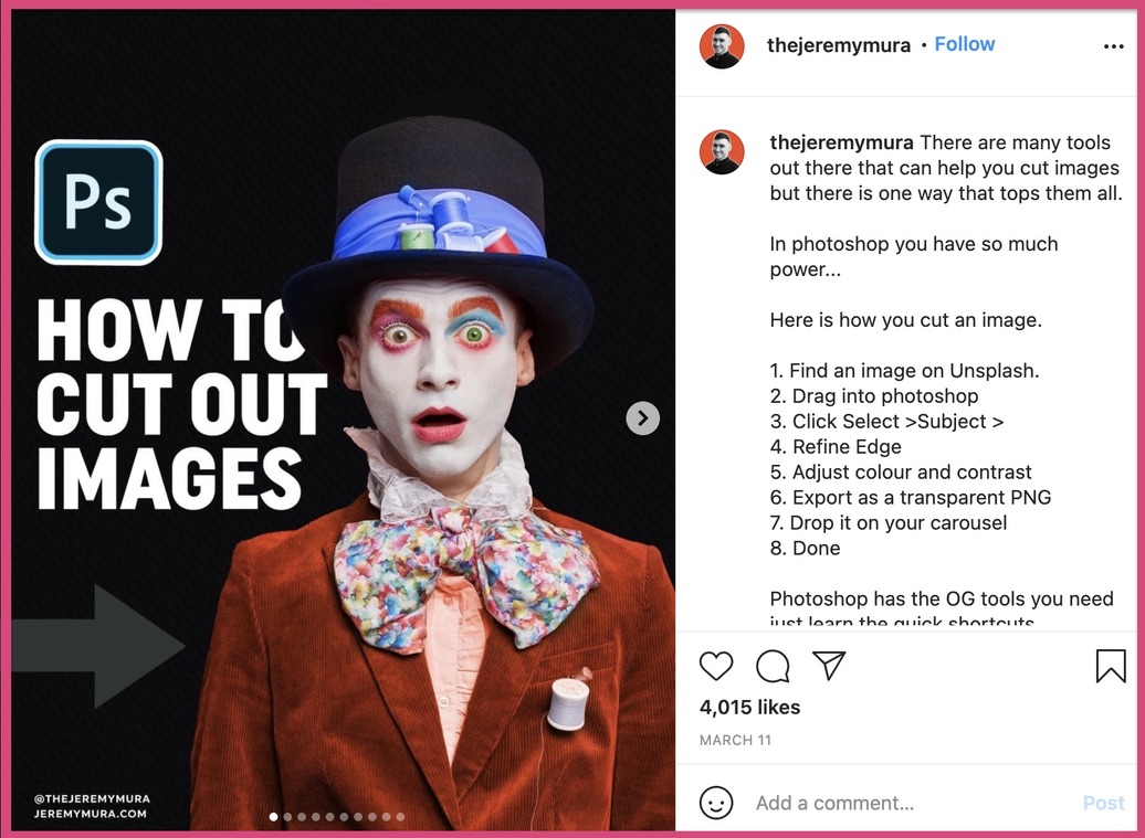
This is a perfect hook that captures our attention and pushes me to swipe left. The bright white text and the picture of a clown staring into you will stop your scroll. The overlaid picture gives it an extra depth and captures your attention.
B. Slide 1
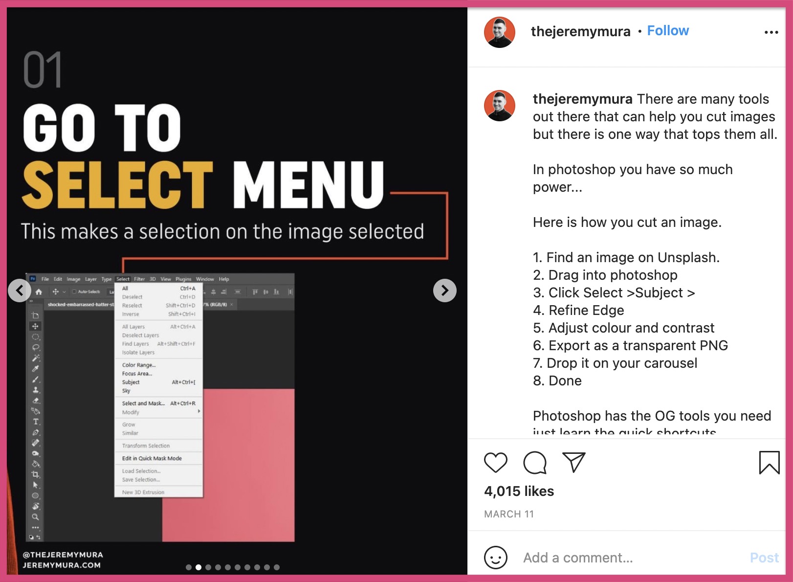
Step-by-step posts like this are a terrific way to keep your audience hooked. Instagram carousel posts in this format keep your audience engaged and intrigued about the next steps.
C. Slide 2
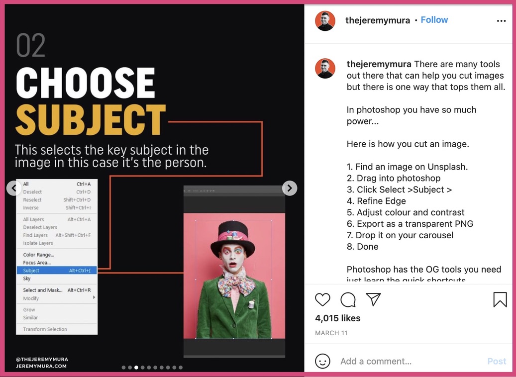
With slide 2, we know the Instagrammer is cropping out the clown we saw in the hook (slide 1). Adding examples from things you’ve already executed enhances consistency.
D. The Final Slide
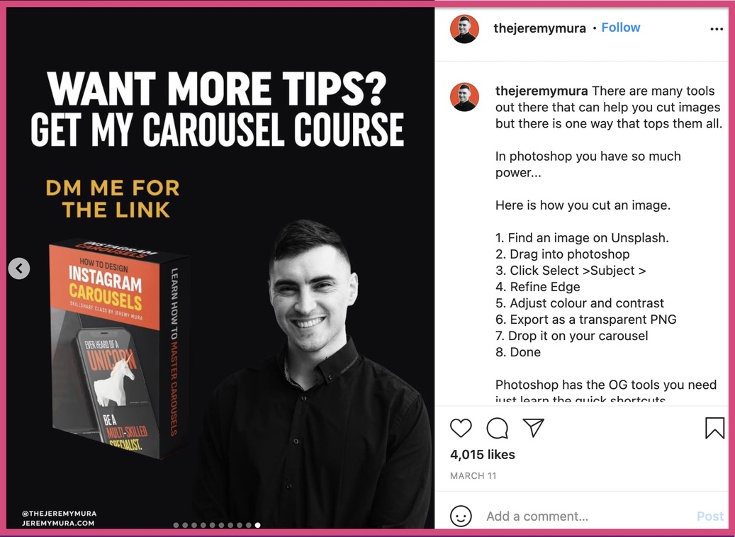
Once you are at the final slide, you’re introduced to his CTA, “Want more tips?”. If you do want more tips, you can get his carousel course. But of course you need to DM him to get access to the carousel course.
This is another common way to build your marketing funnel using your Instagram carousels.
Proofread it and check your alignment
Once you have created your Instagram carousel, check it for errors and alignment issues. Proofread the copy and make sure that there are no spelling mistakes and grammatical errors.
Make sure the graphics and text on your posts are aligned consistently. Here’s an example to help you understand proper alignment in an Instagram carousel post.
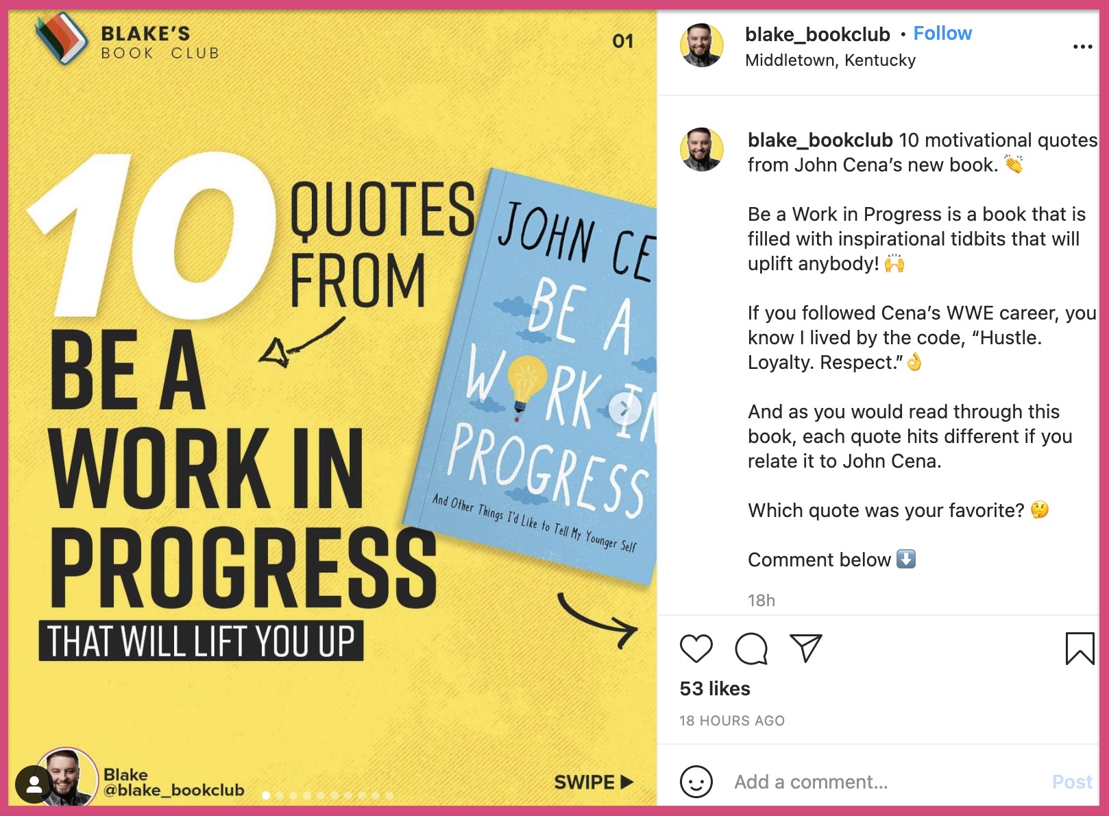
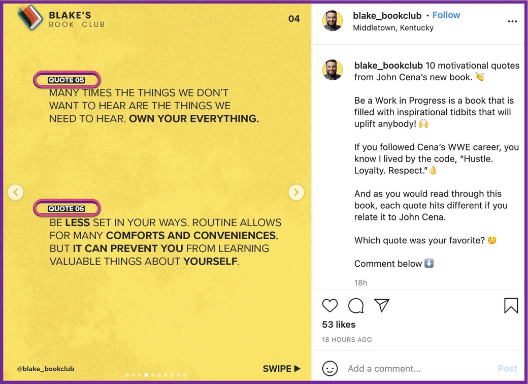
This Instagrammer has created an Instagram post to display the top 10 quotes from John Cena’s book - “Be a work in progress”.
Here’s slide 2 of this carousel.
Take a look at the alignment of Quote 1 and Quote 2.
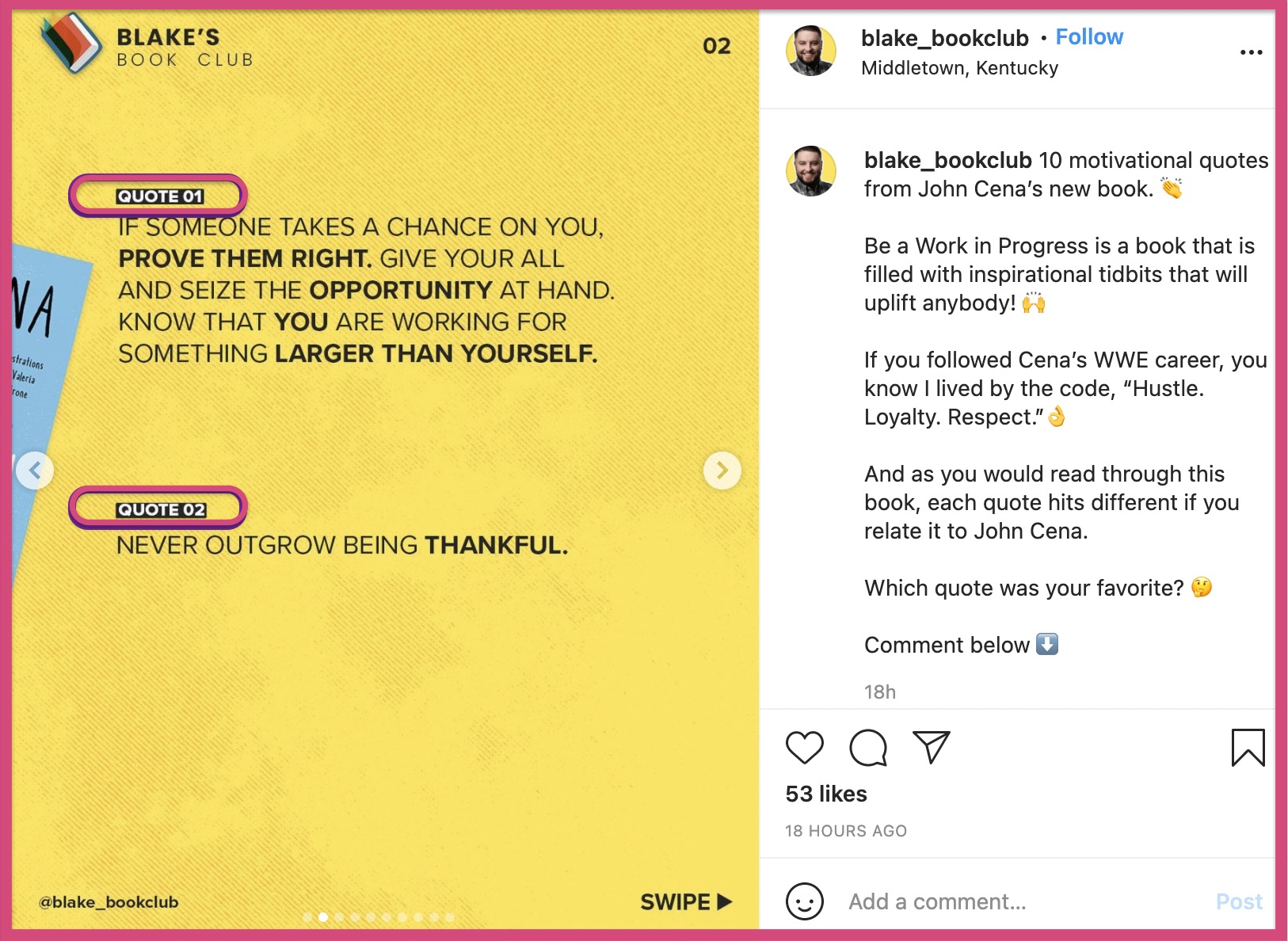
Now let’s take a look at slide 3 and slide 4 too.
Slide 3 of the carousel
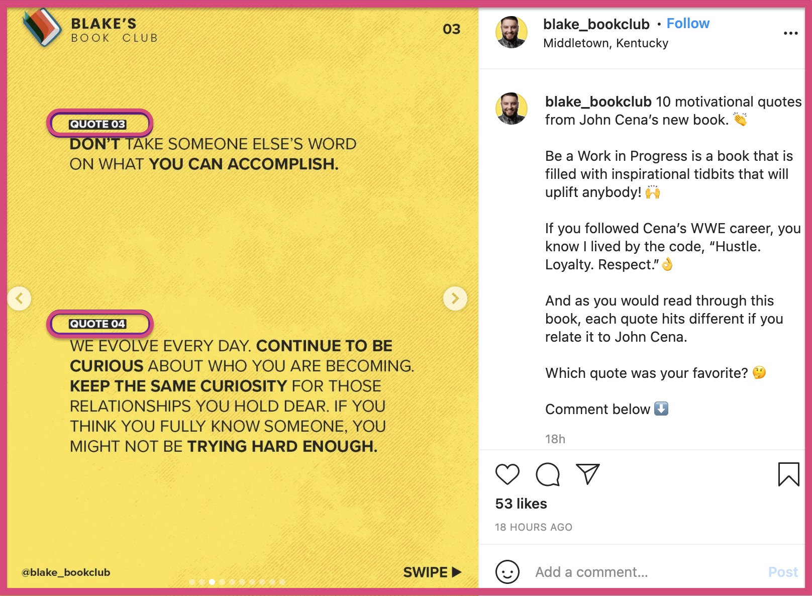
Slide 4 of the carousel. You can see how the alignment of all these quotes is consistent. This is visually appealing as you slide from one page to the other. Without alignment, your Instagram carousel will look unprofessional to your audience.
Download your Instagram carousel post
Once you are done with your final proofread, download your Instagram carousel and post it onto Instagram.
But wait!
Aren’t you missing something?
You missed the other two important parts of an Instagram carousel, which are
- The captions
- Hashtags
Add your captions
Captions help you explain your idea even better. But that’s not the only reason to include captions in your posts. Here are some more ways in which captions can be used in your Instagram carousel post
A. Include details about your products/services
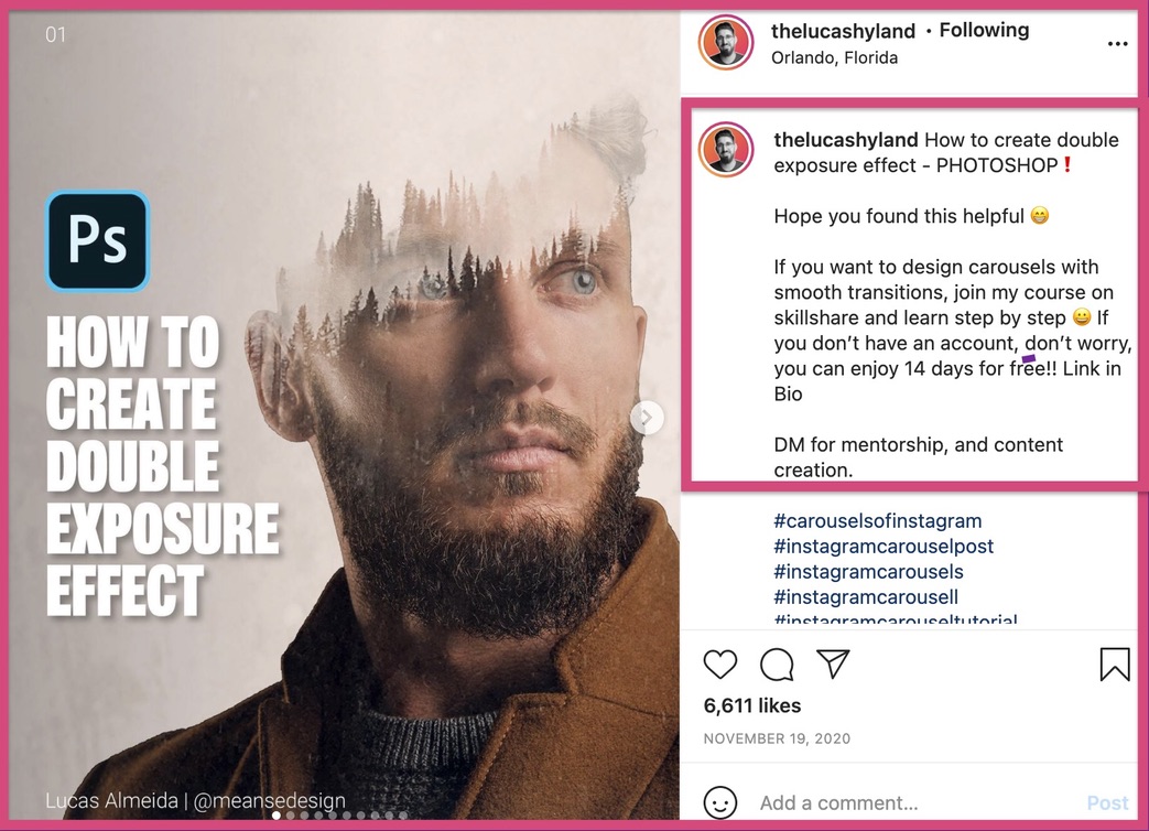
This Instagrammer uses his caption to advertise his design course on skillshare. You can also add short descriptions to advertise your business and it’s products in your Instagram carousel captions.
B. Describe the core idea of your Instagram carousel post
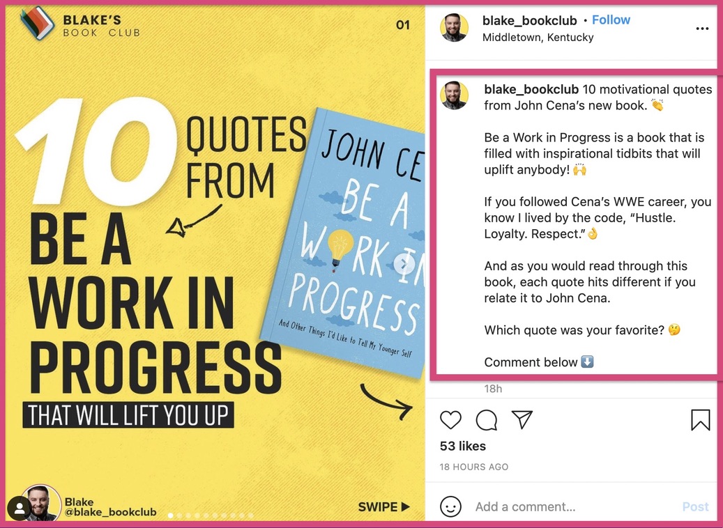
This Instagrammer uses his caption to describe the core idea of his carousel from his perspective. He has also included the title of the Instagram carousel post in the first line. This helps his audience understand what this post is all about.
C. Go on a short rant about your carousel post
This Instagram account uses the caption to go on a short rant about their Instagram carousel post. Sometimes the carousel may not be enough to describe all your ideas. Or maybe you weren’t able to describe your idea in detail.
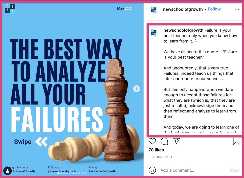
In moments like this, you can use the caption to describe your post in detail.
Moreover, Mention’s Instagram engagement report states that longer captions bring higher engagements to your Instagram carousel post. But don’t write a long caption, just for the sake of it.
Add your hashtags
The final ingredient of the perfect Instagram carousel post is the hashtag. According to the same Instagram engagement report, “the average post had 6.93 hashtags”. This was a huge decrease from the number of average hashtags/posts last year. This study also revealed that 50% of posts included one or zero hashtags in a post.
This gives you a huge opportunity to use hashtags to the full benefit. Hashtags help you reach new audiences and increase the reach of your Instagram carousel post.
We can go on for ten more pages about hashtag and hashtag research. If you’re interested to learn about the right hashtag strategy, you can check out this hashtag report by Mention.
To get an idea about the top hashtags across multiple industries, check out this hashtag sheet we put together . This list contains hundreds of hashtags that are highly searched for different niches like Sales, Marketing, Real Estate, Finance, Health etc.
Wrapping up
Let’s recall the most important points from this guide.
Here are the 3 most compelling reasons to choose Instagram carousel posts over videos
- Carousels are easier to create than videos
- Carousels can be scaled with a templated approach
- There is no limit to the amount of information that can be shared on a carousel post.
Here are the 9 steps to create a carousel post on Instagram
- Write down your primary idea
- Write a short script for this idea, and check if this idea is feasible for an Instagram carousel post
- Choose your fonts and brand colours
- Create your primary slide and use that as a reference
- Build your story on each slide
- Start with a ‘Hook’
- Write the main content
- Add a CTA at the end
- Proofread and check for alignment issues
- Download your Instagram carousel
- Add your Captions
- Add your Hashtags
And hit the ‘post’ button.
We hope this Instagram carousel guide was helpful to you. If you have any doubts or questions, feel free to leave them in the comments and we’ll get back to you.


