Contents
How to make an advertisement flyer?
STEP-1: Fundamentals of your flyer
STEP-2: Adding your main content
How to design an advertising flyer + 15 free templates
You have a new offer or service or product to promote using an advertising flyer.
Or, you just have a whole new business to advertise. Or, it is a carnival in your neighborhood that you want to promote. Perhaps, it is a garage gathering to raise money for charity.
You know that you should be using a kickass advertising flyer to promote it.
But the cost and time required to design a flyer is keeping you back. You always this itching question: "What if no one reads my advertising flyer?"

Don't you worry about it, because you're in the right place. This blog gives you a 4-step plan to create an advertising flyer with a readymade template.
Let's jump into our guide right away.
What is an advertising flyer?
An advertising flyer is a single sheet of paper designed to advertise a product, service, event, business, or interesting piece of information. The aim of an advertising flyer is simple - bring attention to the topic and spread the word about it.
How to make an advertisement flyer?
Here are 4 steps to help you design and download advertisement flyers. You can click on the links below to jump ahead of some steps.
- STEP-1
- STEP-2
- STEP-3
- STEP-4
You can also use this detailed infographic to help you design an advertising flyer using templates.

STEP-1: Fundamentals of your flyer
1. Fundamentals before designing your advertising flyer
Before you go get into the nitty-gritty of designing your advertising flyer, you need to get the fundamentals right. To explain this concept, we are going to make some assumptions. We will then use these assumptions to design a stunning advertising flyer.
1. State your main goals for the advertising flyer
All your advertising flyers should have one main goal. The more focused this goal is, the better will be the output. For example, here are some goals to consider for your advertising flyer:
- Increase your sales with a limited time offer
- Increase your sales with a discount code
- Drive more offline store walk-ins
- Enhance your brand recognition
- Collect more money for the charitable causes you run
- Increase registrations for your show or event
Choose one particular goal for your advertising flyer and stick with it. Now let’s make our first assumption for this advertising flyer
Assumption 1:
Let’s assume that you’re the owner of a music instrument shop named ‘Geetar’. You are planning to conduct a live show outside your shop. Your goal is to conduct this live show and thereby increase the value of your brand.
Let’s also assume that you have 12 bands lined up to perform at your show. All you need to do is advertise the show and bring people to watch your show.
2. Write down more details about your advertising flyer
After identifying your goal, go ahead and write down all the details of your event. You need to write down details like the time, location, contact details, name of the event, and why people should attend the event. If you're unsure of all the things you should write down, you might find this event planning template from Teamwork useful
It’s time to make assumption number 2 for our flyer.
Assumption 2:
Let’s assume that our event will be held on '12/04/2022', which is a Tuesday. The event will be held at the small empty ground you have near your music shop. Let’s assume the following address for our music shop:
12, Macintosh Street, Avery, Fresno, California.
Let’s also assume that the following artists will be performing at your live show.
- Ed Dheeran
- Seyonce
- Mia
- Justin Goulding
- Ellie Beiber
NOTE: We mean no offence to the true fans of all the original artists. We’re just trying to make this blog post a tad interesting.
Finally, we’ll assume the following add-ons for our event
- Free beverages
- No parking charges
- 24 varieties of food stalls
3. Write down the Call To Action
After you have written down all the important details, it is time for the CTA. This will give your readers a direction and tell them what to do next. An advertising flyer always works better when you show some urgency and a deadline to get things done.
ALSO READ: Easy-to-implement Tips & Tricks to Design a Business Flyer (+Free Templates)
For example, a good way to increase the value of your show is by limiting the audience. This makes access to your show scarce and suddenly everyone wants to attend it. Now is the time for our last assumption before we design our advertising flyer.
Assumption 3:
Let's assume that your show can only hold 1000 people. After this cap, no one will be able to buy tickets and watch the show. Let’s also create a website to buy tickets for this show.
Here’s a possible CTA for this advertising flyer - Only 997 tickets remain, get yours at the website below.
But for this advertising flyer, were going to go with a very simple CTA.
CTA - "Buy your tickets at www.geetar.com"
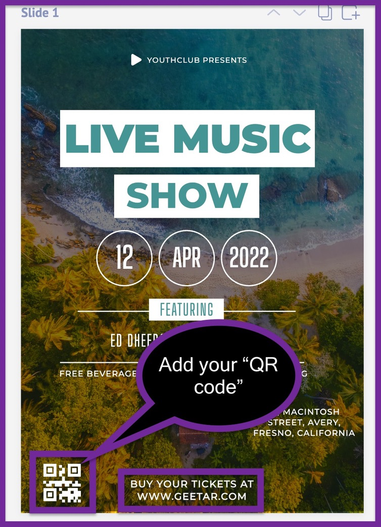
You can also include a custom QR code at the bottom of your advertising flyer. This way people can just scan it and hop onto your website via their smartphones to book a ticket.
2. Log into our free graphic design software
Now that we’ve laid the groundwork, let’s start designing our advertising flyer. The first thing you need to do is use a free graphic design software. You can use any graphic design software, but we recommend Picmaker.
Why Picmaker, you ask?
That’s a good question. We actually have two reasons for you to use Picmaker
- Because this is our blog and you’re already here.
- Because we’re very biased towards our product.
We’re kidding. 😜
We’ll explain the real reason you need to use Picmaker in the steps that follow. But for now, let’s just log into our free online flyer maker and get on with the process.
Congratulations, you're officially done with the first step of designing your advertising flyer.
3. Select an advertising flyer template
Once you're on the Picmaker dashboard, type 'flyer' in the search bar. This will bring you a ton of free flyer templates. You can choose any of these templates to create your advertising flyer.
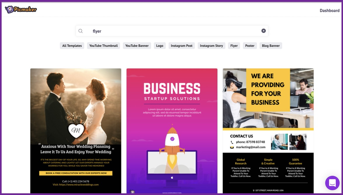
As the famous Picasso always said, "It is the best option to create flyers from templates rather than scratch".
Maybe Picasso didn't say that, but it's easier to create your advertising flyer from a template rather than from scratch.
From the list, go on and select a flyer template that suits your current needs. For starters, we will select this flyer template for our advertising flyer.
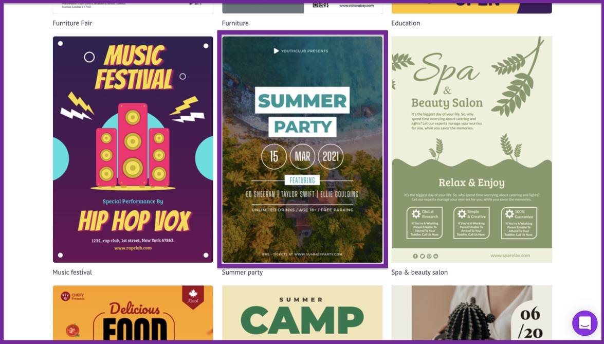
Here's the copy of the template mentioned in this example.
If you don't like this template, here are some more variations you can use for this scenario.
Advertising flyer template #2
Advertising flyer template #3
Advertising flyer template #4
All these are great advertising flyer templates to promote our music festival. We have many more templates you can choose from.
For this blog, we're going to go with our first choice in the mix.
STEP-2: Adding your main content
4. Insert your main content
Once you've picked your template, you can hop on to your workspace. This is where we will customize everything - our copy, font, colors, graphics, pictures, and background elements.
This is where you sculpt your advertising flyer to meet your current specifications.
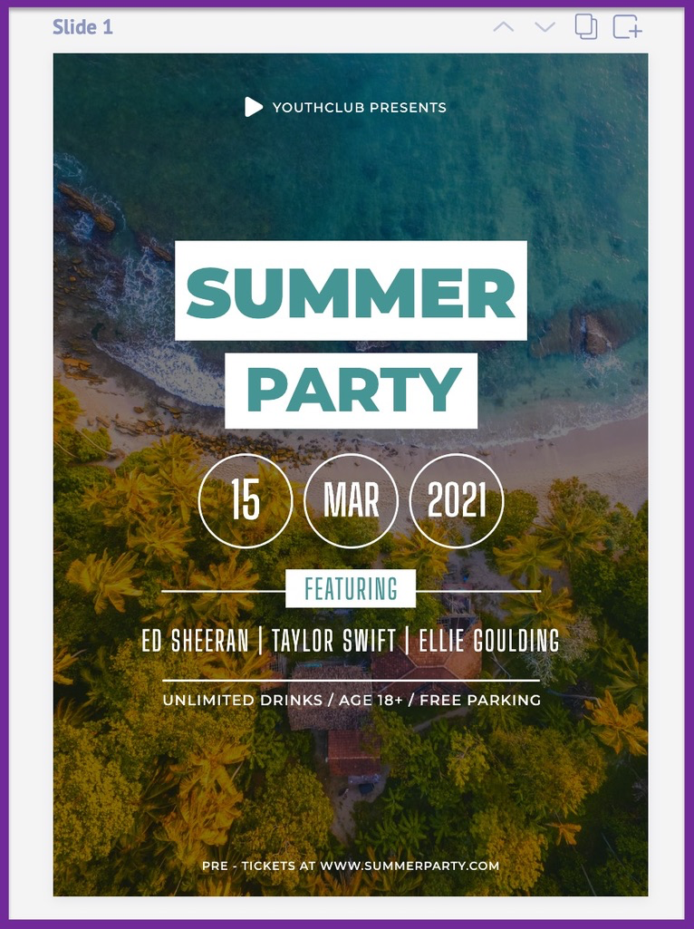
It's time to modify the text placeholder with your original content.
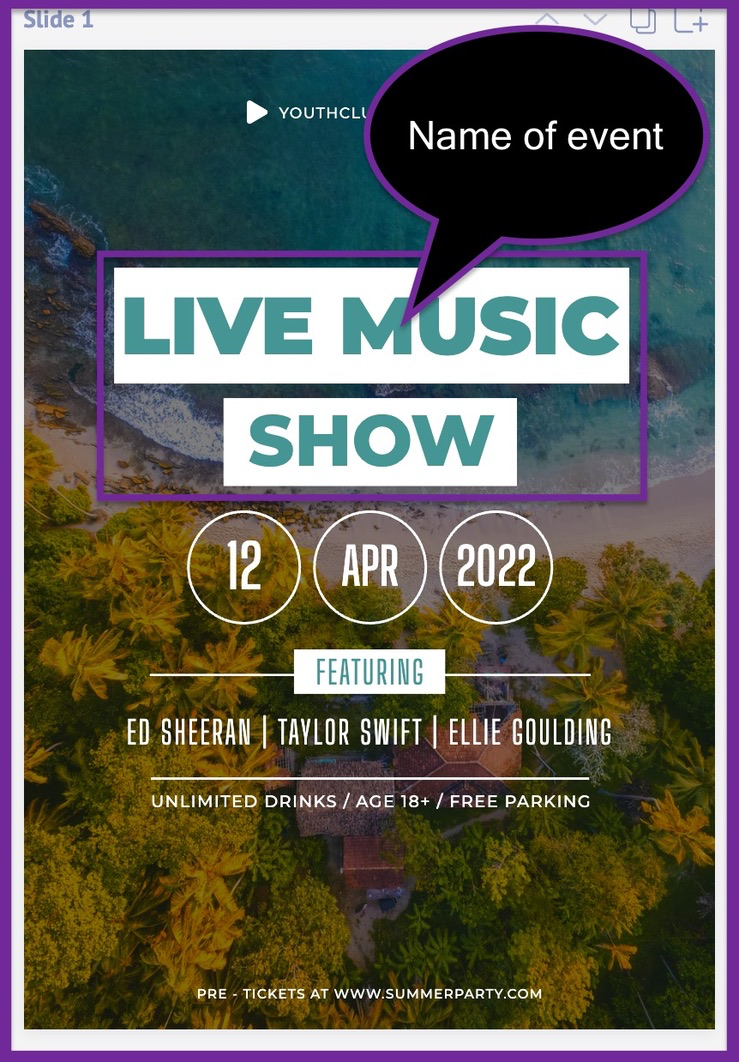
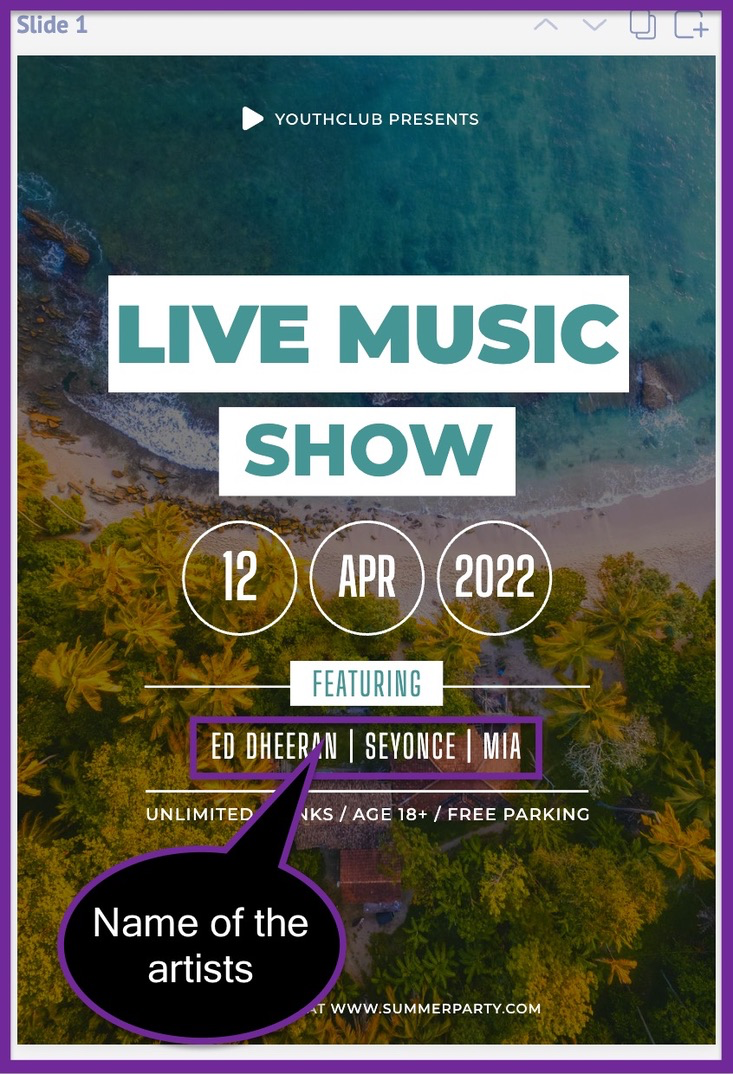
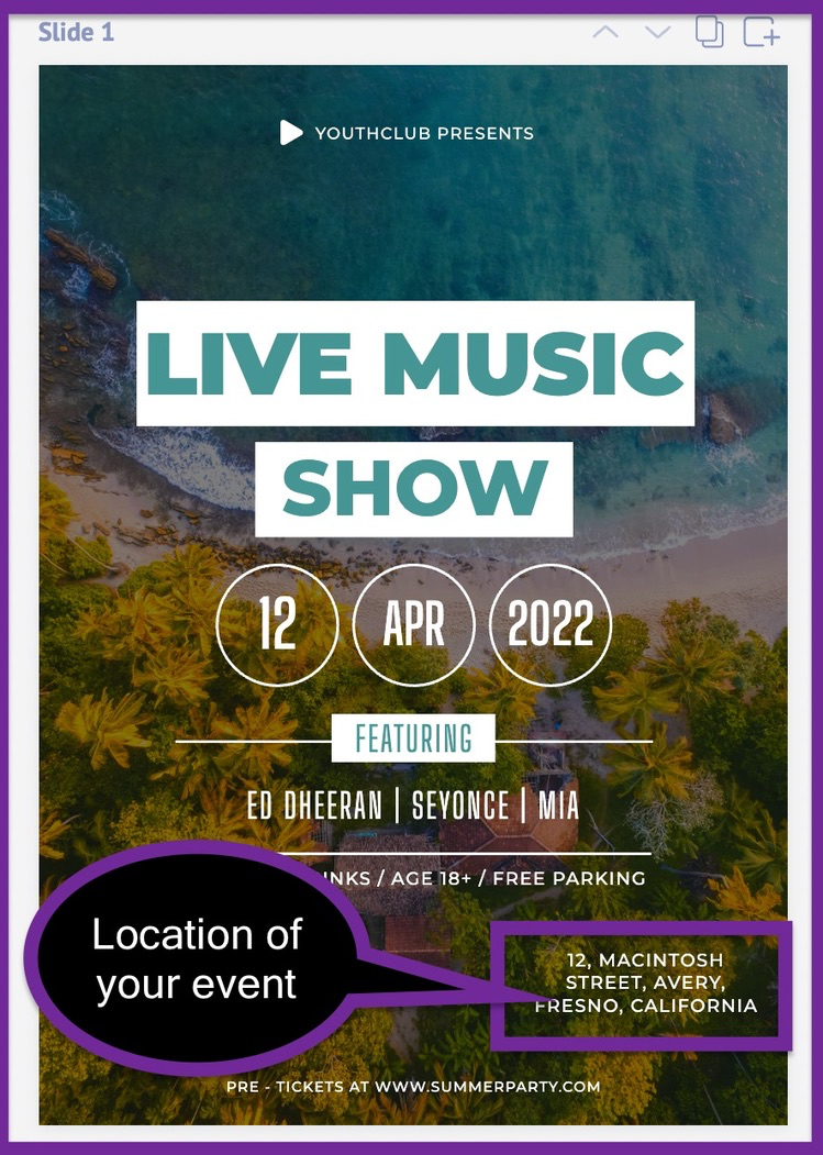
Since the original theme of this template matches our event, it requires little changes to go. Here are the contents we have replaced in this step.
Plug in the date of your event
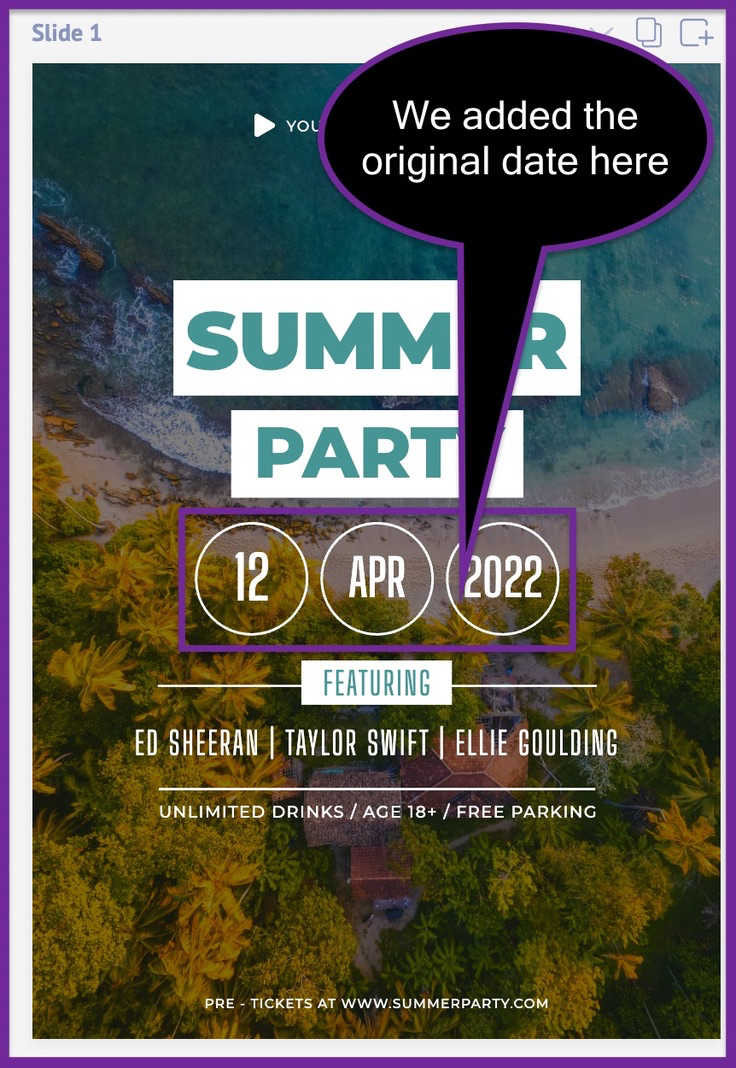
Insert the name of your event
Add the name of the artists who'll be performing in your event
Insert the location of your music festival
Include the features of your music festival
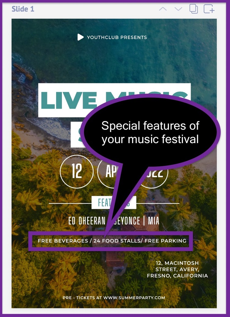
All these details have been updated based on the assumption we've made in the first step. Our initial assumptions will be our guiding lights for designing this advertising flyer.
5. Insert your CTA
The CTA is the most important part of your advertising flyer. It explains what the other person should do after going through your flyer. The idea is to give them one particular goal or direction with your CTA.
For example, our CTA is to ask people to buy their tickets at "www.geetar.com". So we have added that at the end of our advertising flyer.
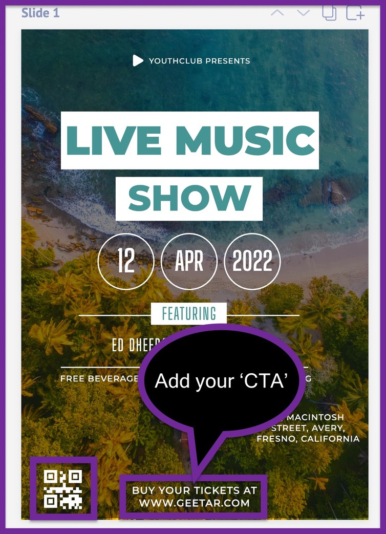
You can also use a free QR code generator to design your own QR code. You can then paste this QR code onto your advertising flyer, as we've done in the screenshot below.
6. Add your logo
You have successfully added the primary contents and CTA of your advertising flyer. After this, it's all about making sure your advertising flyer fits your brand.
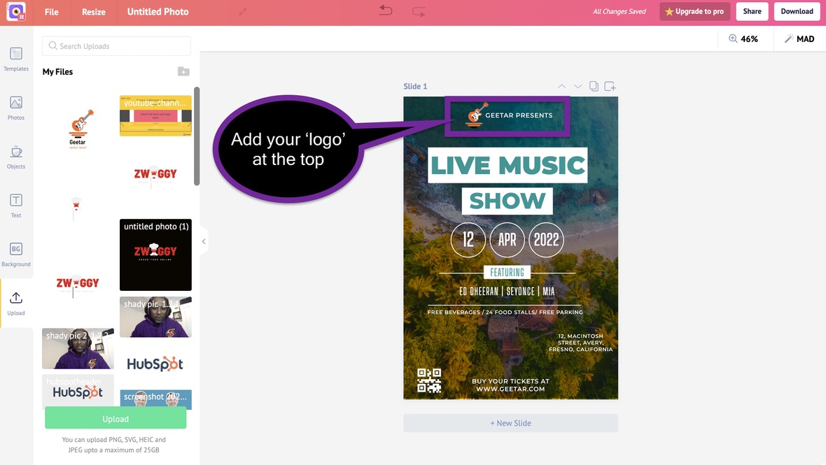
If you have a logo, you can upload it to your dashboard and use it on your design.
If you don't have a logo, you can create one with our free online logo maker. We have also written a detailed guide to help you design your logo from scratch.
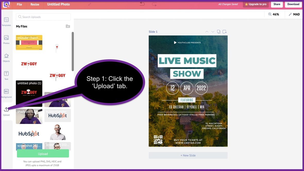
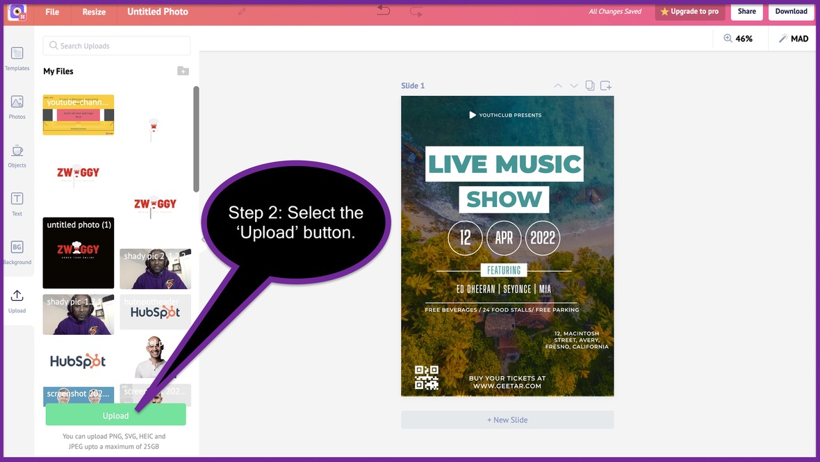
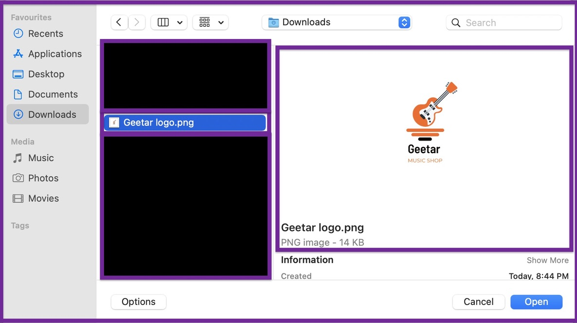
Here is how you upload your original logo to the Picmaker dashboard
1. Select the 'Upload' tab
2. Click the 'upload' button
3. Select your logo
4. Drag it onto your advertising flyer
For example, we designed the original 'Geetar' icon using our free logo maker.
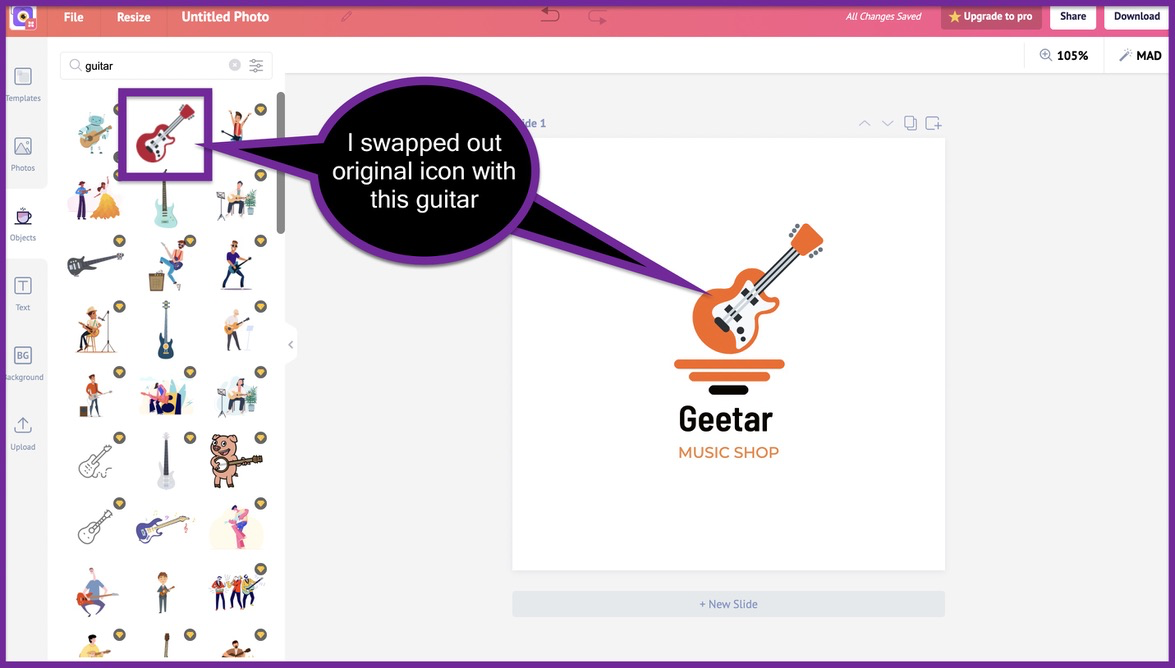
We swapped the original logo icon with this guitar icon inside the logo. We also used the same colours to design this logo.
It's easy it is to create your logo with Picmaker, isn't it?
With that shameless plug, let's continue with the process of designing our advertising flyer again.
STEP-3: Customising your flyer
7. Customize the colors
Colors make your flyers beautiful. Each colour has a meaning and a purpose. There is a unique psychological expression behind each colour you choose for your advertising flyer.
When you are designing an advertising flyer, it's always a good rule of thumb to stick with your brand colors. You want people to associate your brand with a particular color or set of colors.
Here are some examples:
- Coco-Cola
Whenever you think of Coca-Cola, the colour red pops into your mind. This colour symbolises drive, ambition, and passion.
2. Twitter

When you think of Twitter, the colour blue pops into your mind. It symbolises peace, tranquility and reliability.
3. Spotify

When you think about Spotify, their iconic green pops into your head. This colour symbolises compassion, kindness, and health.
Each colour has a persona and the colour you choose will define your brand. So it's always a good choice to make sure that your posters are designed with your brand colours in mind.
Since our music shop is a made up brand, we'll also make up some brand colours for it.
The orange colour on the logo looks like a good choice. Let's go with that as the primary colour of our brand and hence our advertising flyer.
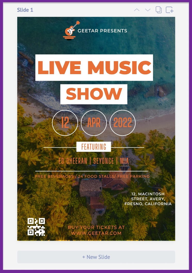
We went ahead and changed the colour of all the fonts to orange. Since we have the white on the logo, let's use it as a secondary colour for our advertising flyer.
To make sure that you're always using the right brand colours, go ahead and add it in your brand kit.
Here are the three steps to add your colour to your brand kit
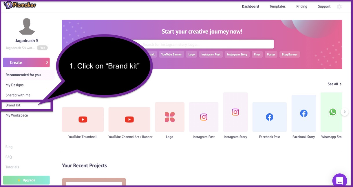
Step 1: Click on the "brand kit" tab on your dashboard.

Step 2: Click on "add new palette" and select your brand colors.
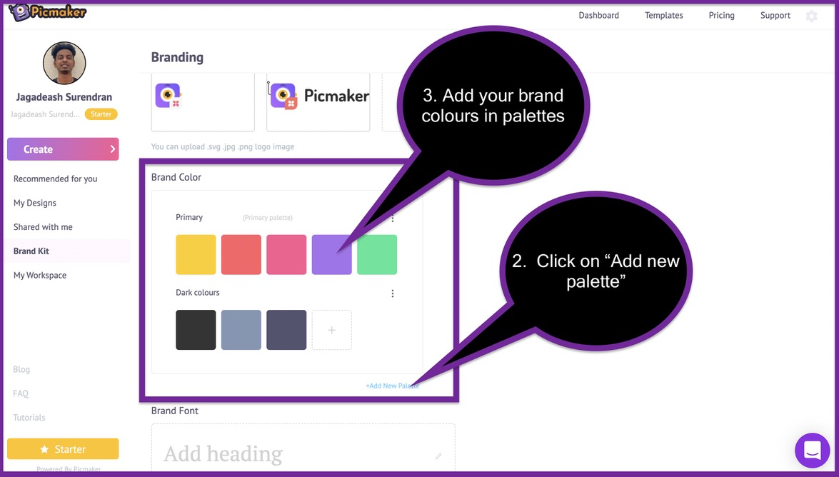
Once you have selected your brand colours, they will be visible on your colour palette. You can select them from the colour portal and add them to your designs and fonts.
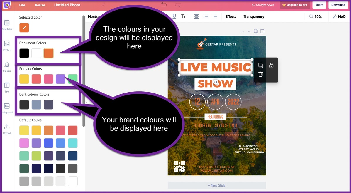
The color box also displays the colors that are already present inside your design.
8. Tweak the fonts
After you've selected your primary colors, it's time to select the standard fonts for your advertising flyer. All our flyer templates are designed with 2-3 font choices at the maximum.
These fonts are carefully chosen by our designers to reduce cognitive overload. The fonts are chosen in such a way that the flyers do not overwhelm your readers in any way.
For example, let's take a look at the font choices in our current flyer design.
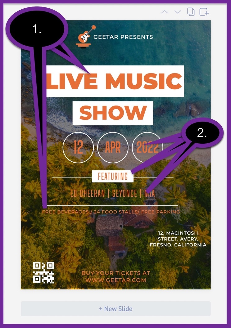
The font style on Number.1 is "Montserrat Black". The font style of number 2 is "Big Shoulders". Each of these fonts has been chosen by experienced designers to make sure that they look good with each other.
If you have chosen a set of fonts for your brand, you can go ahead and use them for your flyer design.
To change any font, click on the words and select your style from the drop-down list. At the moment, we have more than 100 different fonts to choose from. We are always adding new fonts to the mix to increase your choices.
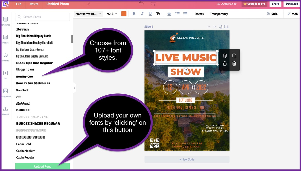
You also have the ability to upload new fonts to your drop-down list.
Let's try and change the fonts on our advertising flyer from the drop-down list for now.
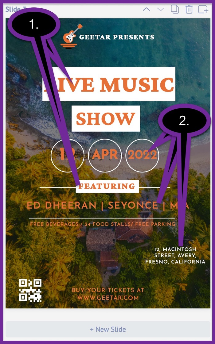
We went ahead and changed the font styles on the whole copy. The 'Montserrat' fonts were replaced by "Crimson Pro" in number 1. Likewise, the "Big Shoulders" in number 2 were replaced by "Josefin Sans".
Keeping all your designs consistent is an important component of branding. But keeping all your fonts consistent shouldn't have to be a difficult process.
You can add all your font choices inside Picmaker's brand kit. Once added, they will appear under the 'text' tab and you can apply to them to your designs in minutes.
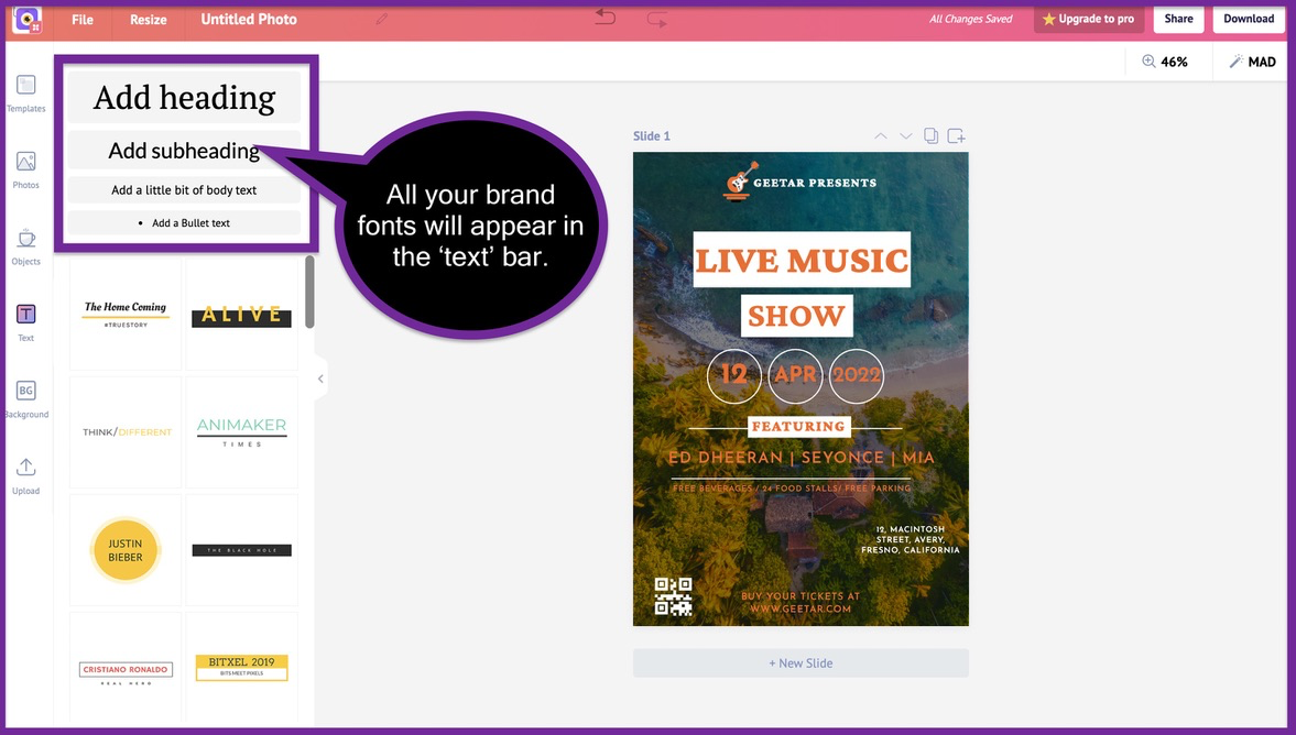
Here are three steps to add your fonts to your brand kit
Step 1: Click on the "brand kit" on your dashboard
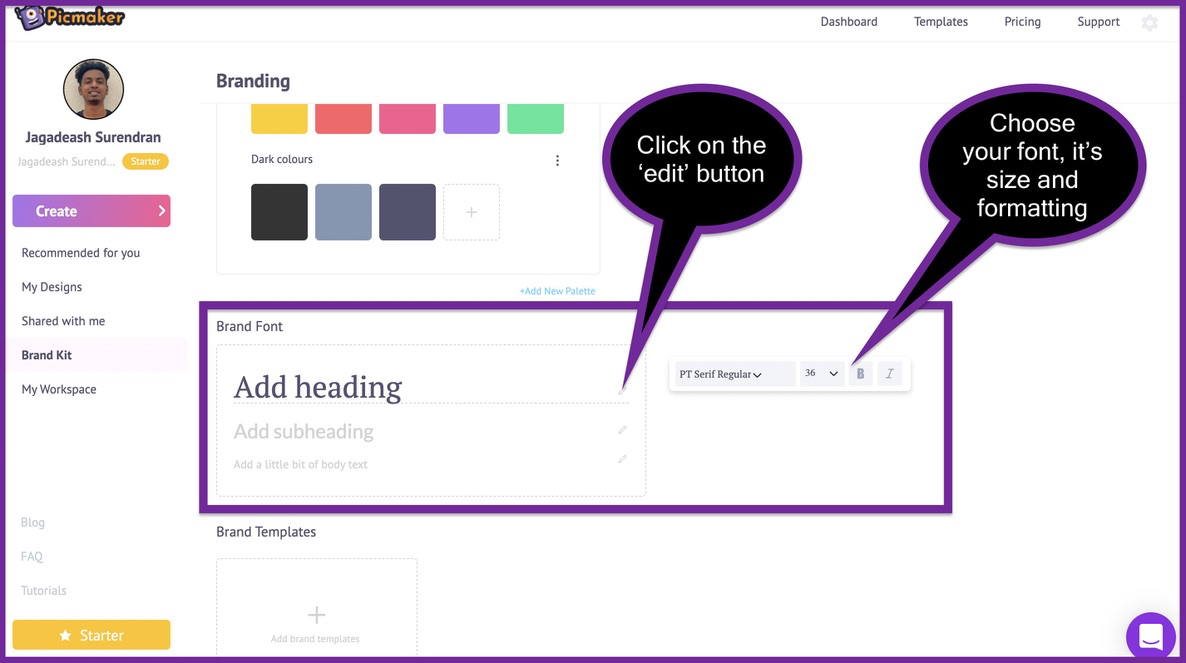
Step 2: Select your primary fonts under the "brand font" section
Once you have chosen your default fonts, they will appear on your 'text' tab. Now that's one less thing you have to worry about.
9. Change the background
We are nearing the end of our beautiful flyer design journey. We are going to miss you after this. Maybe you should take a picture with us before you leave.
Talking about pictures, do you think the picture on our advertising flyer could have been better?
If you think that the background picture could have been better, then join the club. We are also thinking about the same thing.
The first thing we need to do is remove the picture from our background.
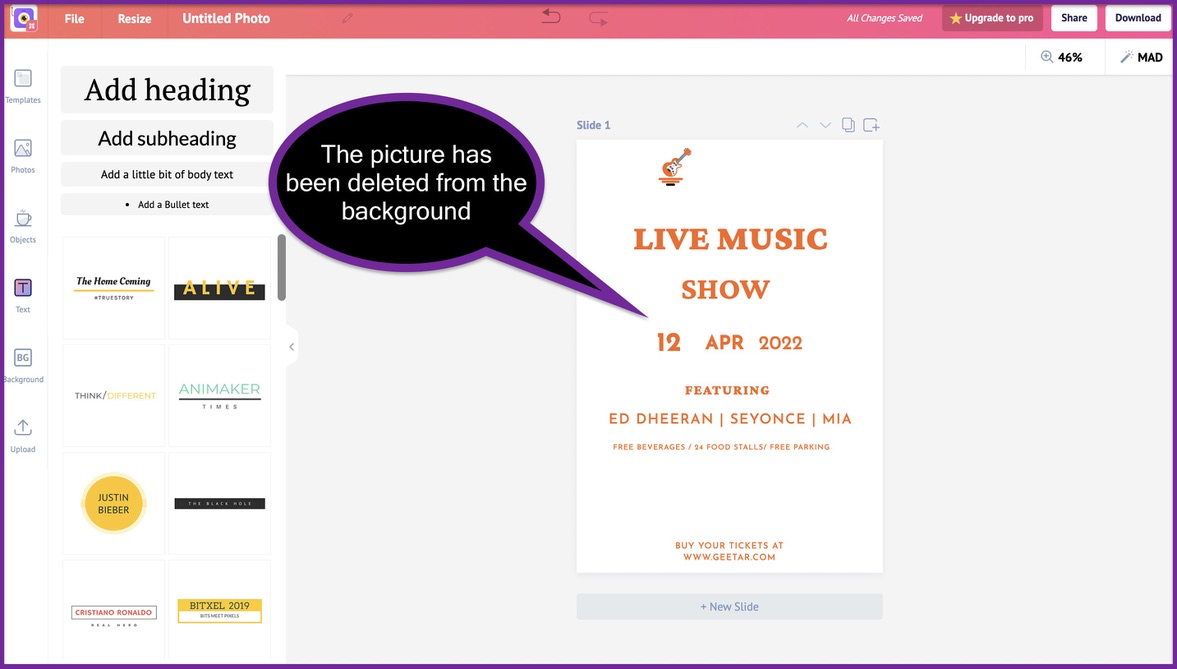
From here, you can click on the 'background' tab to add a background to your advertising flyer. This can be anything from pictures, gradient backgrounds, textures, patterns and more.
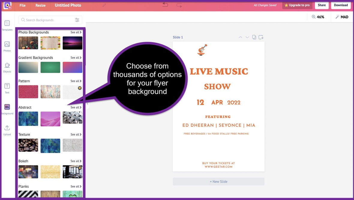
All you need to do is choose a suitable background for your advertising flyer. We went ahead and chose this background picture for our advertising flyer.
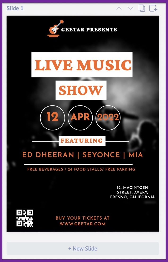
We also went ahead and added some 'adjustments' to the photo. This made sure that the photo didn't shift the focus from the main content on our advertising flyer.
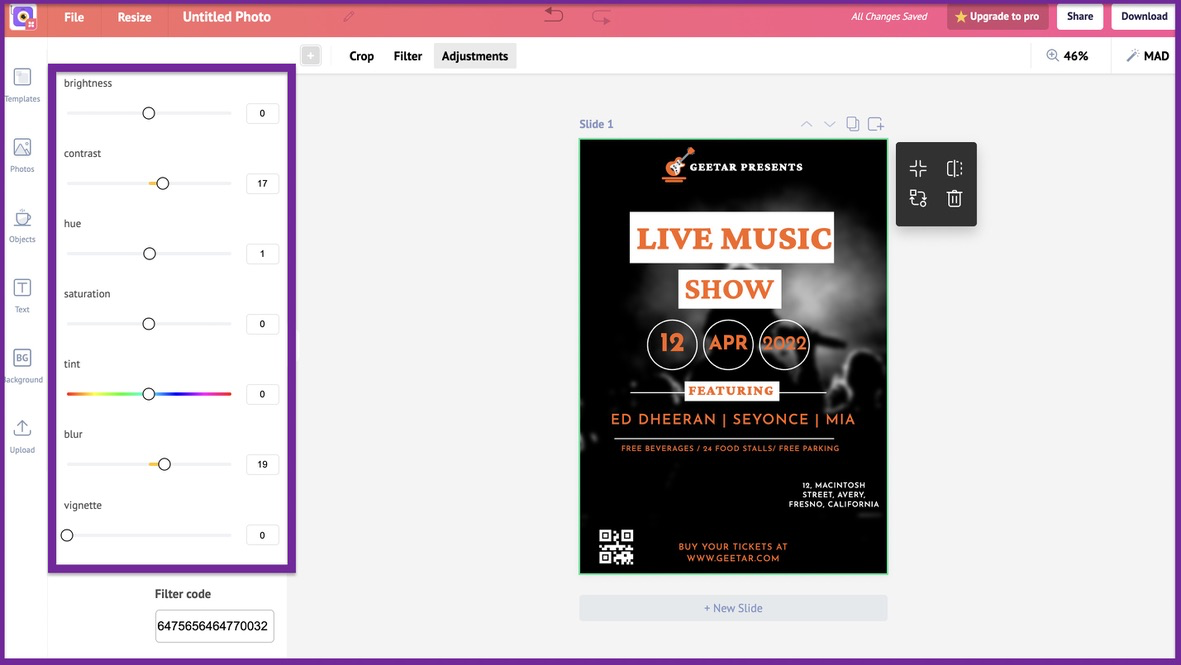
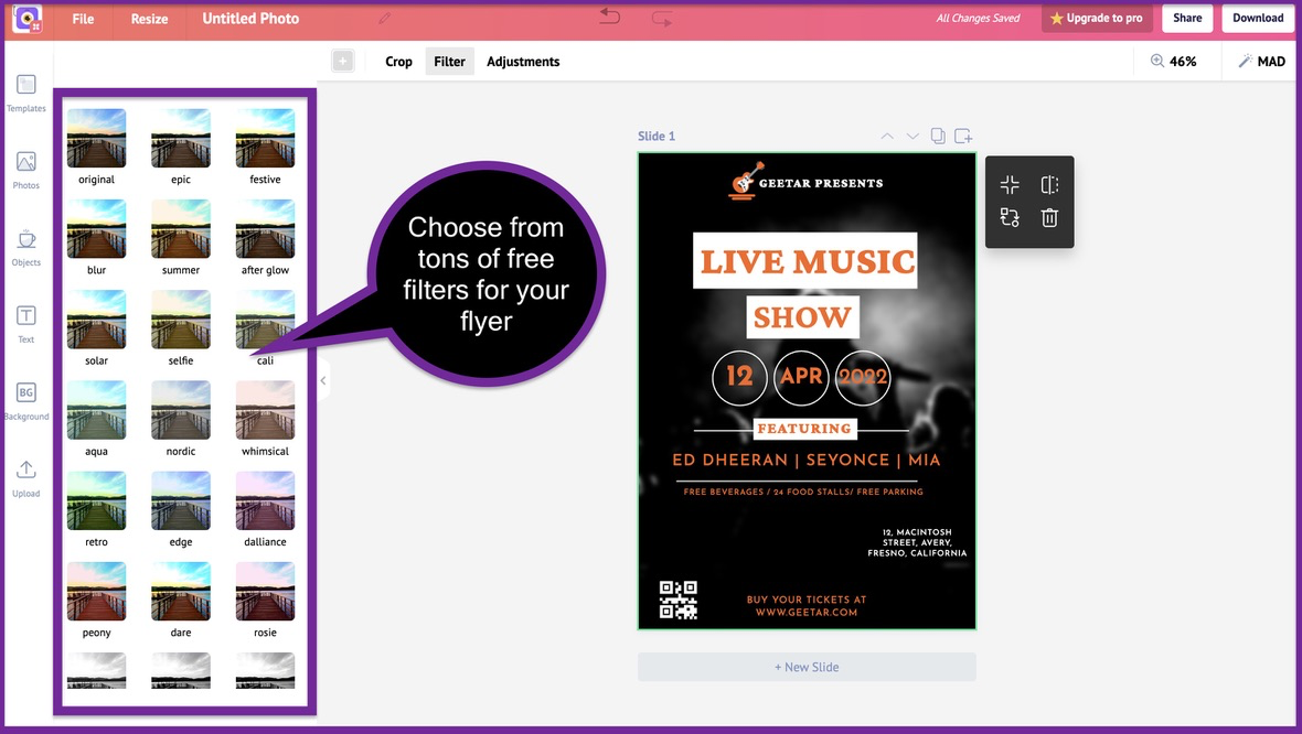
If manually adjusting your photos is a challenge, you can choose from tons of free filters. Just select a photo and click on the 'Filter' button on the top bar. You can now add a pre-defined filter to your advertising flyer.
10. Change the graphic elements
Do you see all the squares and circles on this advertising flyer?
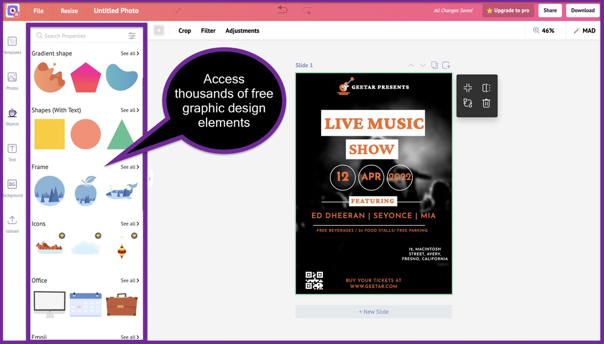
These are all the graphic elements that are present on this advertising flyer by default. We have 70 thousand graphic design elements you can add on your advertising flyer.
Just click on the 'Objects' tab to access these graphic design elements for free.
Here's our advertising flyer after adding and rearranging some graphic design elements.
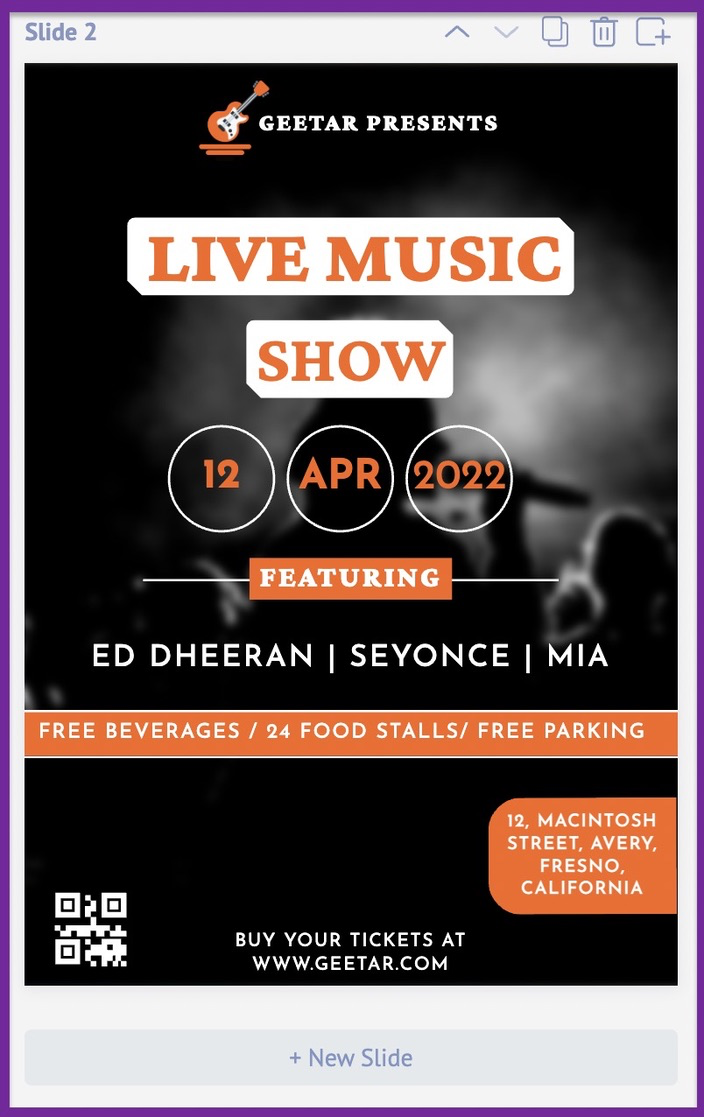
Looks really cool, doesn't it?
We added a couple of shapes to make sure that our address and other details stand out.
STEP-4: The final touches
11. Rearrange elements on your flyer
You have finally customized your advertising flyer to your liking. You have also adjusted the pictures, fonts and colours to make it brand compliant.
Now you need to go ahead and rearrange the elements on advertising flyer. Make sure that every text, graphic element and picture is aligned in the right way.
Here's a small checklist you can follow:
- Alignment and size of your logo
- QR Code and your CTA
- Accuracy of the address and other important contact details
- CheckIndividual text boxes for spelling and grammatical errors
- Check all the text boxes and graphic elements for their alignment
IMPORTANT NOTE:
We suggest you take a break for an hour or two before you get to this step. This gives you time to separate yourself from your flyer and look at it from a fresh perspective.
12. Proofread your advertising flyer
After you have rearranged the elements on your advertising flyer, proofread the content. Make sure they are devoid of any spelling mistakes or grammatical errors.
12. Download your advertising flyer
After you have worked on the final changes of your advertising flyer, go ahead and download the advertising flyer.
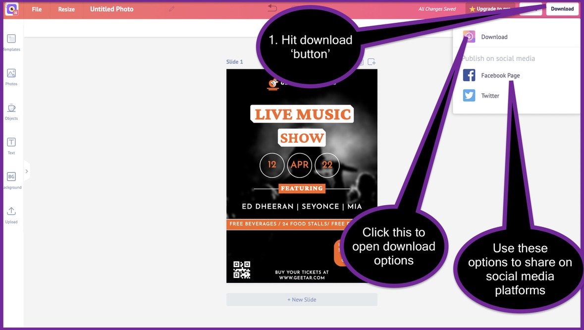
You can use the share buttons to share your designs on Facebook and Twitter.
When you hit the 'Download' button from the drop-down list, you will open up the final download list.
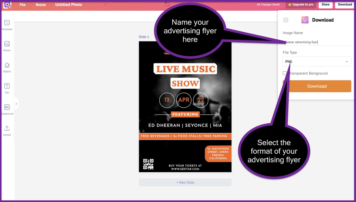
From this menu, you can change the 'name' of your advertising flyer. You can also choose the format of your advertising flyer. The multiple formats available are PNG, JPEG, and PDF.
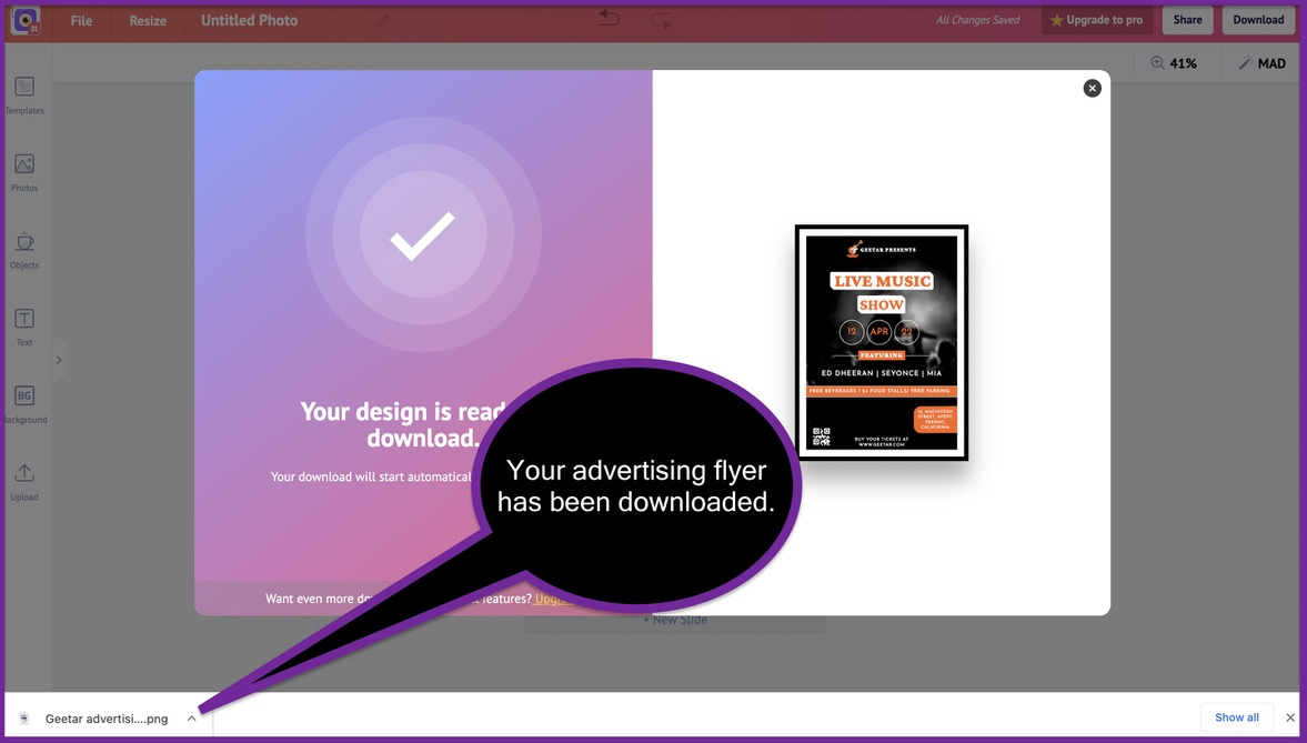
Congragulations!
You have just created and downloaded your kickass advertising flyer.
15 Advertisement flyer examples
We have created an advertising flyer using 1 example from our list flyer templates. Let's take a look at the tons of advertising flyer template options available on our platform.
Advertisement flyer 1
This advertising flyer can be used for promoting your products and their offers. The intense color of this flyer makes your product and the message stand out.
Just swap out the picture of the shoe with your product and you'll be good to go.
Advertisement flyer 2
This advertising flyer can be used by E-commerce stores to run offers on their products. It can also be used by physical stores that are looking to advertise their latest offers to the public.
Advertisement flyer 3
This flyer example can be used by fast-food restaurants and eateries. They can swap out the photos of the burger and the soft drink bottle with their offerings. The plain red background is perfectly complemented by the white text and yellow shapes on it.
Advertisement flyer 4
You can use this flyer to advertise music festivals and events. Just change the name of the event, the performers, and the address. You can also add many more graphic elements to this flyer our free online flyer maker.
Advertisement flyer 5
This flyer template is perfect for events that have alcohol at play. Pubs and discotheques can use this flyer to advertise the latest events. The frothy beer glass logo and the layered "Oktoberfest 2021" text make this a treat to the eyes.
Advertisement flyer 6
This advertising flyer can be used by car salesmen or people selling their cars. Although this flyer can be used with the picture of the blue car, we suggest you use a picture of one of your cars at the sale. This will keep your flyer distinct and give you the ability to showcase one of your cars at the sale.
Advertisement flyer 7
You can use this flyer to advertise food & film festivals conducted by yourself or your organization. The blue and white theme keeps this advertising flyer fresh and eye-catchy.
Advertisement flyer 8
Yet again, we have another flyer which can be used to advertise your offers. All you need to do is replace the content on this flyer with your original content. With good colour schemes and minimal text, this flyer is easy to customize and definitely good looking.
Advertisement flyer 9
This advertising flyer is the best example of one created to advertise your products and their offers. Right from the top to the bottom, it displays nothing but relevant products and their offers.
You can replace the default picture with pictures of your products to use this flyer at scale.
Advertisement flyer 10
Here's another advertising flyer that can be used for advertising your physical products at scale. Just swap out the pictures of the t-shirts with that of your products and you're good to go.
Advertisement flyer 11
You can use this flyer to advertise workshops and events that you are conducting. The theme is simple and gives heavy emphasis to the content on the flyer. This allows the readers to get to the message and consume it without any distractions.
Advertisement flyer 12
Here's a flyer that can be used by retail and E-commerce stores alike. If you change the picture of the fruits with meat, this becomes a flyer for a meat shop. If you change the picture of the fruits with honey bottles, it becomes a flyer for a honey store.
This is a flyer design that is perfect for hundreds of use cases and industries.
Advertisement flyer 13
Saloon owners can use this flyer to advertise their services. As a matter of fact, all service businesses can use this flyer to advertise their services. All it takes is one swap of the photo. You can seamlessly use this flyer across multiple industries and service businesses.
Advertisement flyer 14
Fast-food restaurants and eateries can use this flyer to promote their best selling items on the menu. Replace the picture of the tasty dish with one of your original dishes from the menu. Then go ahead and change the logo and the items to make it truly yours.
Advertisement flyer 15
This is a classic flyer that can be used to advertise just one product. Select a high-quality photo of your product and replace it with the picture of this man. Insert your original offer in the light grey text box at the bottom right. Mention more subtle details at the corners and you will be good to go.
To get more flyer templates, feel free to use our free online flyer maker. This will help you design stunning flyers with ready made templates.
That's all for this detailed guide. For more information, you can check our latest blog posts below.
Thanks for reading!


