From Defining Brand Identity to Finalizing the Design, Here's How You Create a Logo from Scratch
The topic of logo creation is so broad that it can be easily broken down into several sub-topics.
One sub-topic might cover the aspect of choosing the right color. Another sub-topic might cover the aspect of choosing the best font. A third could be about the different types of logos and the type that’s suitable for your brand.
What we’ll be covering in this article is the complete process of how to create a logo from scratch.
If you’re looking for ready-to-use, customizable templates to get started and an easy-to-follow guide on how to piece everything together, we’ve covered that in this article (using gaming logos for demonstration).
Looking for tips on how design a logo from scratch? Then this is your go-to article with ten actionable recommendations.
Otherwise, continue reading.
Think of brand logos like country flags.
Every element of a country’s flag has significance attached to it.
Take the flag of the United States of America (USA). The blue rectangle on the upper-left hoist side bears 50 five-pointed white stars, representing the 50 states, arranged in nine horizontal rows. It also consists of 13 horizontal stripes (of seven red and six white), which represent the 13 colonies.
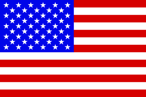
Its colors are symbolic, too. White symbolizes innocence and purity; red symbolizes valor; and blue symbolizes perseverance, vigilance, and justice.
The North American Vexillological Association, the world’s largest organization dedicated to the study of flags, has put together a set of five principles that provide the foundation for a successfully designed flag.
They are:
- Keep it simple
- Use two or three basic colors
- Meaningful symbolism
- No lettering or seals
- Be distinctive or be related
A few of those flag principles, unsurprisingly, apply to logos as well.
Logos must be simple enough that anyone can recreate them from memory. Any symbol that’s part of a logo must be unique and distinctive. And the color palette need not always be bold and expansive.
Some of the iconic logos are the simplest, use fewer colors, and are unique at the same time. The Nike swoosh, the golden arches of McDonald’s, or the bitten apple of one of the world’s biggest tech companies - each one is both simple and memorable.

Creating a logo from scratch
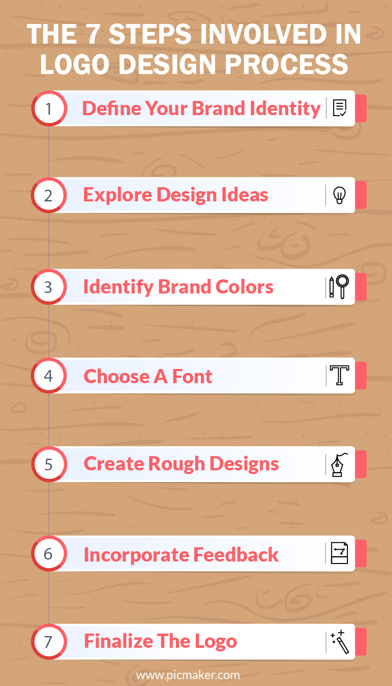
Whether you plan to outsource your design, create your own using a free online logo maker like Picmaker, or in another way - the process to design a logo typically involves seven steps:
- Define your brand identity
- Explore logo design ideas
- Identify brand colors
- Choose a font
- Create rough logo designs
- Request and incorporate feedback
- Finalize the logo
Define your brand identity

The term “brand identity” refers to all the visual elements - such as the logo, typography, colors and more - associated with a brand.
To quote Seth Godin: “A brand is the set of expectations, memories, stories, and relationships that, taken together, account for a consumer’s decision to choose one product or service over another.”
Designing a logo is a step towards fostering a strong brand identity.
You must have a clear idea of who you are as a brand. That, then, helps create the best logo, representative of your brand.
Asking yourself the following three questions is the easiest way to define your brand the following three questions:
- Why did you start a business?
- What is your unique value proposition?
- What are your business’ core values?
Why did you start a business?
The motivation to start a business varies from one brand to another.
For some, it is a case of filling an existing gap in the market. Brands can ask their potential customers what they are missing and then develop a solution to fill that gap.
Netflix, the popular OTT platform, has filled several market gaps since its inception. It first rented out DVDs through a mail service in the US. Then switched from a pay-for-use model to a subscription-based model. And all that was before it started providing on-demand entertainment on handheld mobile screens.
Likewise, you should identify the solution that you bring to the marketplace, and discuss it when designing your brand logo.
What is your unique value proposition?
To define your unique value proposition, also known as unique selling proposition, identify how your product or service offering benefits your customers.
Identify your target market, clearly define what sets you apart from your competition, understand your customers’ pain points, and define what you stand for as a brand.
The proposition statement is an important part of conceptualizing your logo.
When done right, it provides the creative spark you need to make a unique logo.
What are your business’ core values?
Roy E. Disney, the son and nephew of The Walt Disney Company’s founders, said: “When your values are clear to you, making decisions becomes easier.”
A great customer experience, diversity, inclusion, honesty, and quality (of product/service) form the core values of almost all business organizations.
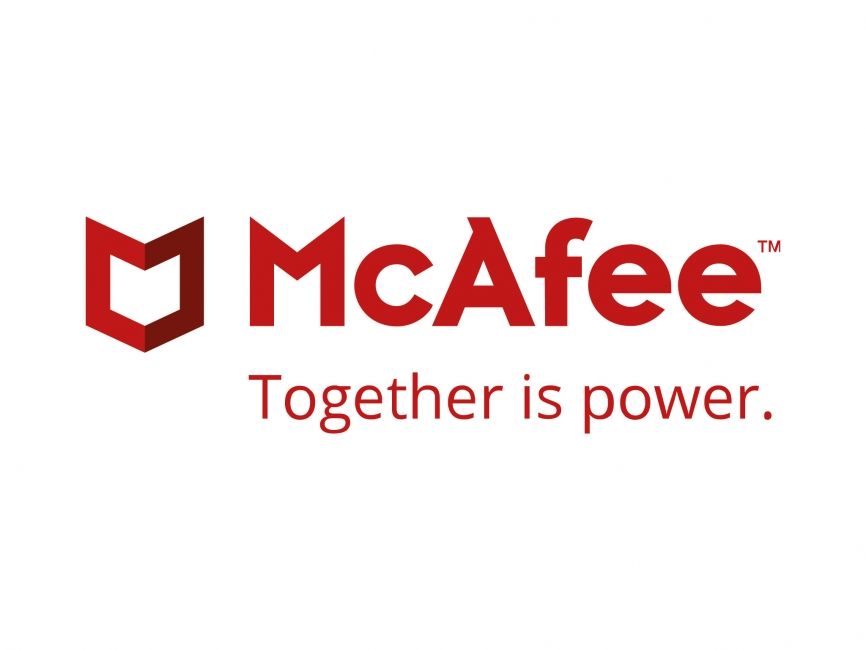
The McAfee logo is an example of how you tie a brand’s core values to the design.
At first glance, the emblem looks like a shield, which symbolizes “protection”. But look closer and you’ll find the shield forming an “M” while, at the same time, creating an interlocking connection across all sides.
On its rebrand page, McAfee mentions the design significance of its logo. “The new McAfee is driven by the belief that only when people, technology, and organizations work together we can address the biggest challenge of the digital age - cybercrime. For this reason, we introduced a new logo featuring two separate parts that “come together” to form a shield, and we also developed the tagline ‘Together is power”.
The logo is the centerpiece of your brand identity. It must be designed in a way that it:
- Communicates the ‘who’ and the ‘what’ of your brand
- Is aesthetically pleasing and is also simple and uncluttered
- Stays timeless - you don’t want your logo to go out of fashion in a few months
- Leaves a lasting impression on customers
Pro tip: Ensure that your logo is designed in multiple formats and in different sizes - albeit in line with your brand identity - to use it for all branding purposes.
Explore logo design ideas (find logo inspiration)
You’ve defined your brand identity and probably have a mental image of your logo.
However, you are far from creating the final version yet.
Before you get started, it’s best to look for design inspiration and, perhaps, even take a second look at some of the iconic brand logos. This will help you have more clarity about what you’re looking to create and how you must proceed with the design.
Below is a collection of accounts and resources where you can find logo inspiration.
It shares logos created by web artists using various graphic design tools. The logos are varied in terms of their types (pictorial, abstract, wordmark, et cetera), and featured from different genres and industries.
The account shares innovative, eye-catching logo designs, but it also goes a step further by featuring mock-ups of the way designers might recreate popular logos.
This account features logo designs created by New York City-based graphic designer, Brandon Nickerson. If you’re looking for wordmark logo ideas, then this is an account you must check out.
If you’re looking for abstract or pictorial logo design ideas, you’ll find plenty of them on this account, run by designer Rich Baird. Almost all posts feature a white symbol on black background, giving them a classic, rich look.
As the name suggests, here you can find most things related to branding, including logos. You’ll also find beautifully designed brand identities, packaging, and more.
You can also use graphic and logo design-related hashtags on social media (with tens of millions of posts) to gather ideas. #logo, #logodesigns, #logodesigner are some of the hashtags you can check out for inspiration.
Identify brand colors
Poetry makes people swoon. Images drive engagement. Colors? They invoke emotions.
As per data, 60-90 percent of people judge a product based on its color alone.
For your logo design, you must define and stick to a color scheme, but also be aware of how and when to use individual colors. Your choice of logo colors is key as it’s going to go on your brand website, social media pages, newsletter, and everywhere a potential customer interacts with your brand.
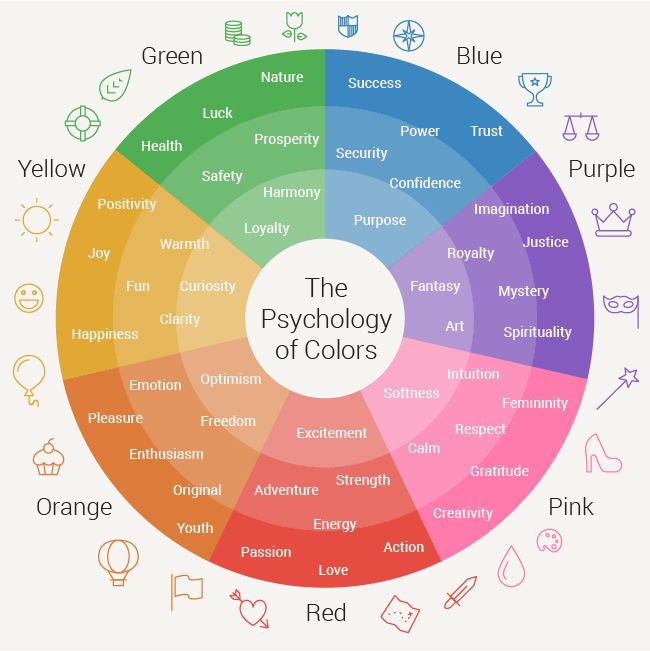
Source: Pinterest
Seventy-six percent of designs by major brands consist of only mono or dual color tones in their logos. Single-color logos simplify the design process but they are also easier to remember and stick in the customers’ minds longer.
On the other hand, medium and dark blue are considered corporate colors as they incite feelings of trust and peace.
When using multiple colors, it’s best to incorporate hues that are opposite to each other on the color wheel.
Another effective technique is to pick a single color and pair it with another on the grayscale. Black, white and gray sit well alongside most colors.
With or without colors, your brand logo must be versatile enough to be used in digital and print media, embroidered on a t-shirt, or in another place.
The best way to achieve versatility with your logo is to design it in black and white and add color later.
Choose a font
Your choice of font influences how your customers feel about your brand, and how they interact with it. A on-brand font will add personality to your logo, but a poor choice of font and font combination will make it unappealing.
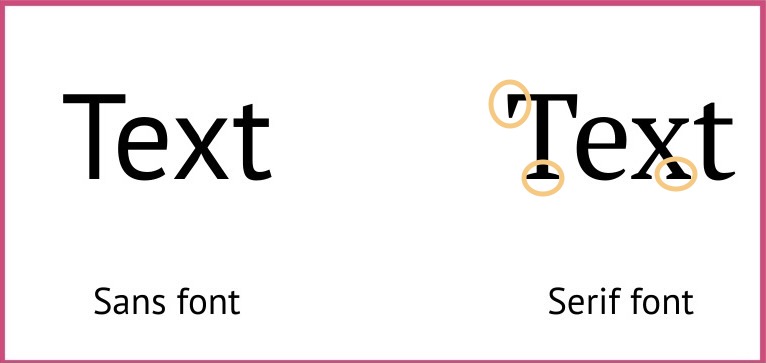
For example, a Sans Serif font is ideal if you’re envisioning a modern, minimalist logo. Sans Serifs are prominent for their simplicity, minimalism and modernness.
Google, LinkedIn and Jeep are among the famous Sans Serif logos.

A Serif font is best for a traditional logo. Serifs are typically associated with history and tradition, and radiate elegance and authority.
Mercedes-Benz and Rolex are popular examples of Serif logos.

In today’s digital age, cursive (or script) fonts also make for a great choice. Broadley, Tahu, Estampa offer modernity, versatility, and visual appeal.
Harrods, Virgin and Ford are examples of Cursive logos.
The number of fonts you want to use is another aspect you must consider. The ideal number is two or three, but that also depends on the text layout you’ve planned for your logo.
How to choose fonts for a logo
- Pick one font for the brand name on your logo and a complementary font for the tagline that comes under the brand name. (It should go without saying that the font for the brand name should be the most attention-grabbing.)
- If Montserrat is your font choice for the brand name - Lato, PT Serif and Esteban make excellent complementary font choices. On the other hand, if Josefin Sans is your chosen typeface, you can pair it with Playfair, Cardo, Abril, and even Lato.
- It’s also important to be consistent with your choice of fonts. Constantly switching between fonts might lead to anxiety and distrust.
Create rough designs
You’ve probably spent hours brainstorming, browsing the web for ideas and inspiration, and discussing how you’ll put everything together. Oh, you’ve also probably exhausted several handbooks making notes of all the essential details about logo design.
Now it's time to put them all into action and start laying the foundation for your brand logo.
A lot of trial and error is involved in any design process. When it’s your brand logo, it’s probably going to involve many more iterations before the final design.
You might come unstuck somewhere.
Maybe it’s the typeface that doesn’t invoke the emotions you envisioned. Perhaps, it’s lacking in legibility. Perhaps the color combination feels a little bland all of a sudden. Or, the design as a whole feels more formal when you want it to be informal, fun, and playful.
But, relax!
Now is the time to create rough sketches of your logo. Create, refine, and repeat.
Your logo will start to take shape. You will be 20 percent satisfied with your logo. Then 30 percent. Sixty percent later. And you keep inching closer to perfection!
Request and incorporate feedback
Feedback is a key part of any creative process. It is also the only way creators and artists can test if their ideas work.
In this article, the feedback stage of the logo creation process comes sixth, just after you’ve started creating rough designs. But it need not always be in this order.
Some designers may start with rough designs first, get feedback, use it to refine their design, and decide later on fonts and brand colors.
When you create rough designs, it’s possible (as mentioned in the previous step) that the design might be unrecognizable. It is at this juncture that you must start picking others’ brains.
You can seek feedback from anyone. Some questions that you may ask to understand them:
- How do you perceive our brand after seeing our logo?
- What do you first notice about the logo?
- The aspects you like/dislike/admire about the logo?
- Is the logo similar to what you’ve seen elsewhere?
- What would you add/remove from the logo to make it better?
Remember, the more specific your questions, the more non-generic the feedback will be. Don’t hesitate to ask follow-up questions and evaluate which feedback/answer adds value.
Also, ask for feedback from people in your target demographic and geographic segmentation. So that when you incorporate the feedback, the design is appealing to the people who you’re potentially going to serve as customers.
Request feedback from a high sample size of people, which helps gather different ideas about your design.
Finalize the logo
If you’ve come this far, you aren’t far from the final, polished version.
Check to make sure the brand name, tagline, and other descriptive text on your logo are spelled right. Ensure the fonts and brand colors are uniform throughout. Ask people in your teams/groups to review your design to ensure your logo is free of basic errors and alignment issues.
When you started designing your logo, you’d have created a list of action items along with checkboxes for each. Now’s the time to start ticking off each one to complete the design.
Finally:
- Create different color variations of your logo (black, white, monochrome, and full color)
- Design a style guide for external or third-party use at corporate events, workshops, and more.
- Create different versions (PNG, JPEG, and PDF) of logo for use on the web and print. You might also have to create high-resolution files with transparent backgrounds.
Designing your logo for free
We’ve covered the steps involved in designing a logo from scratch. Now, let’s look at how you can create an impressive one for free.
If you’re crunched for time and require a professional logo, then a free online logo maker like Picmaker is your go-to option.
Picmaker offers you tens of thousands of modern, traditional and easily customizable templates to design a unique logo.
Whether you are a construction company, a fast-food restaurant, a café, a full-time streamer, or a content creator on YouTube - Picmaker’s rich library of templates gives you enough options to create a logo.
Follow the step-by-step instructions below:
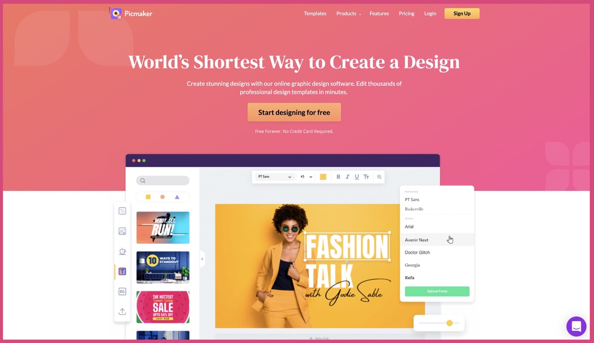
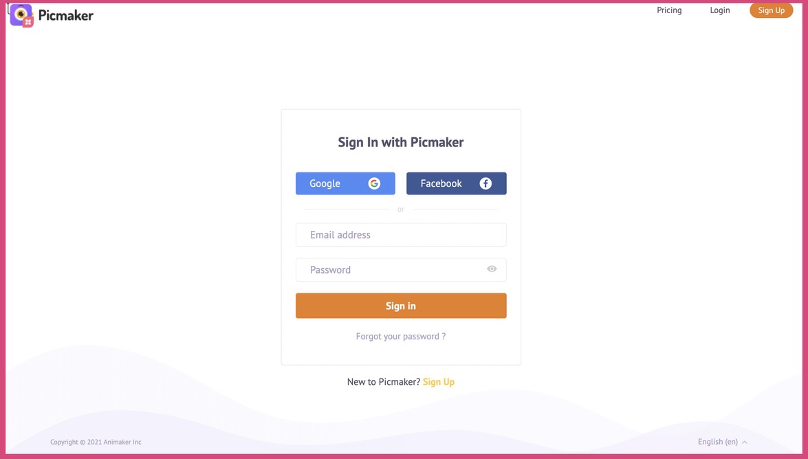
- Log in or sign up to Picmaker with your online account
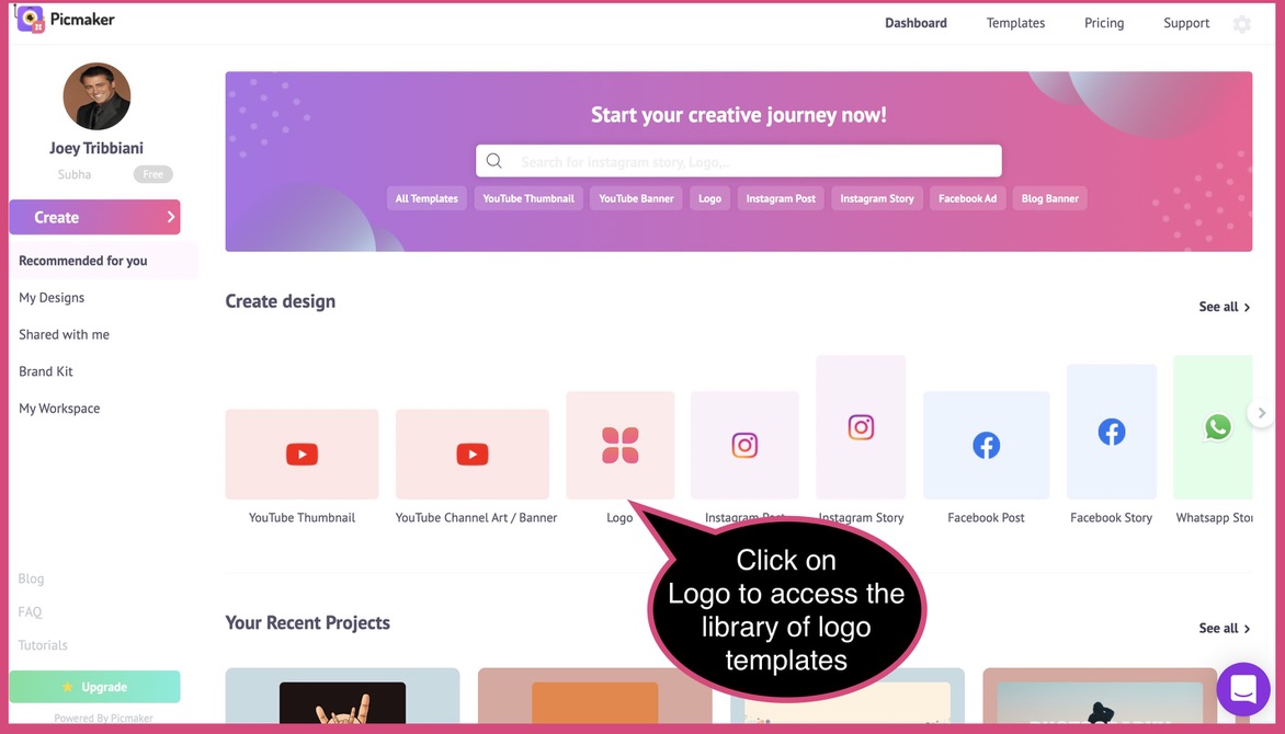
- Choose a template from the templates page to get started
- Customize the copy by adding your brand name, tagline, descriptive text, established year, and more
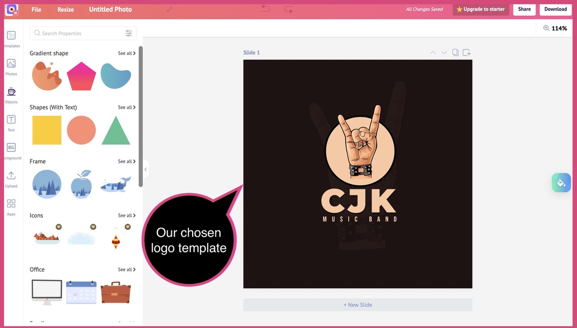
- Choose a font that is legible and reflects your brand identity. Alternatively, upload your own custom font and incorporate it into your design.
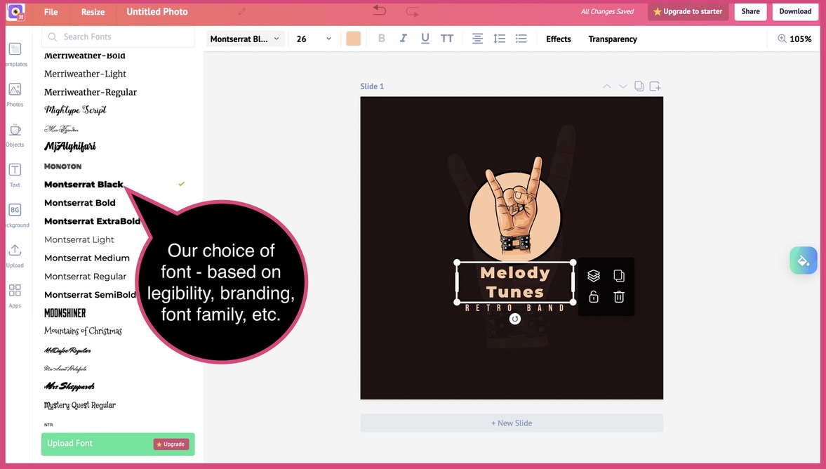
- Opt for a suitable color scheme to fit the tone of your brand. You can also upload your brand colors and incorporate them into your design.
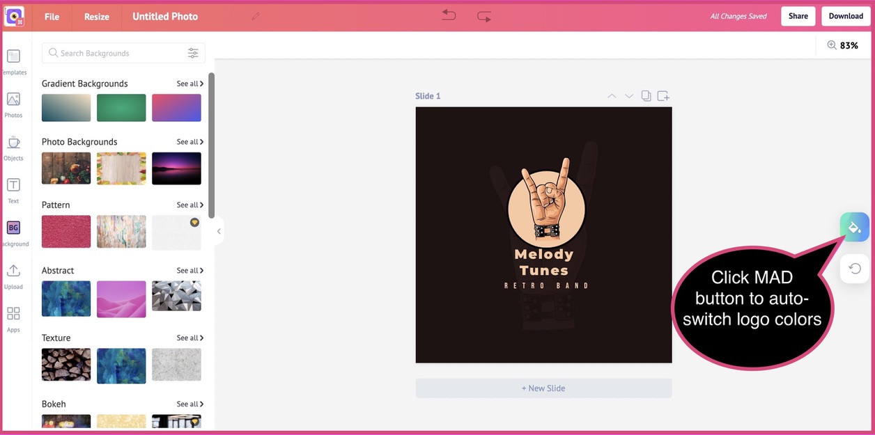
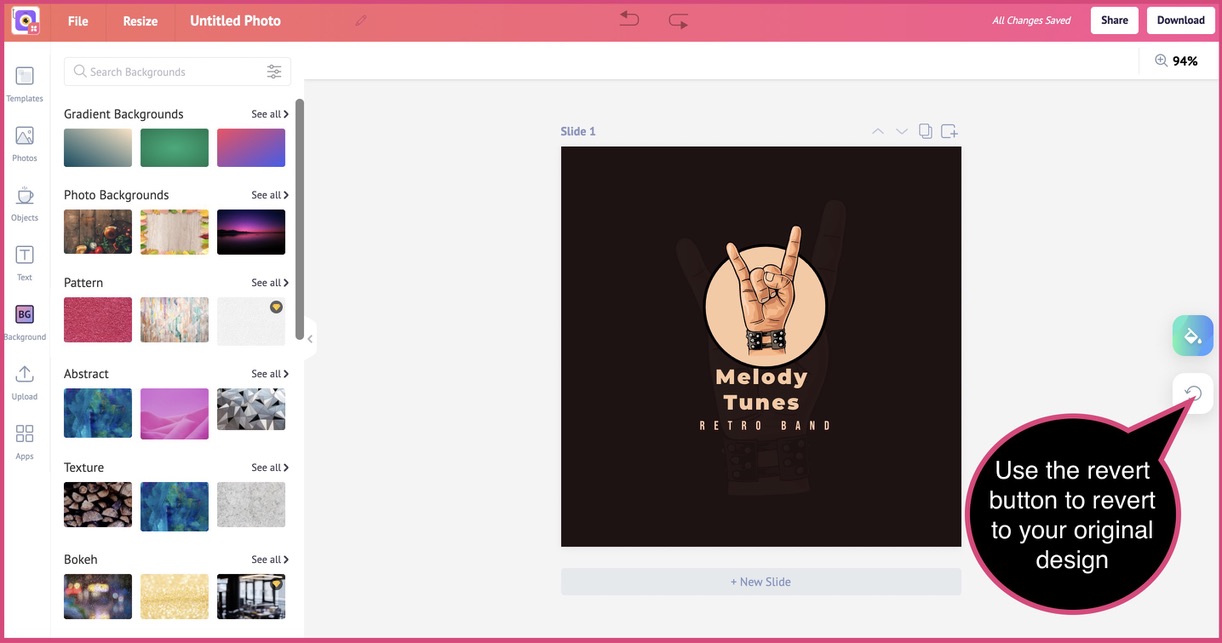
- Use the AI-powered MAD button to get automatic recommendations to enhance your logo. Switch up the colors until you see a design version that is the same as you envisioned. Don’t worry, you can undo the one-click edit at any time and revert to your original design.
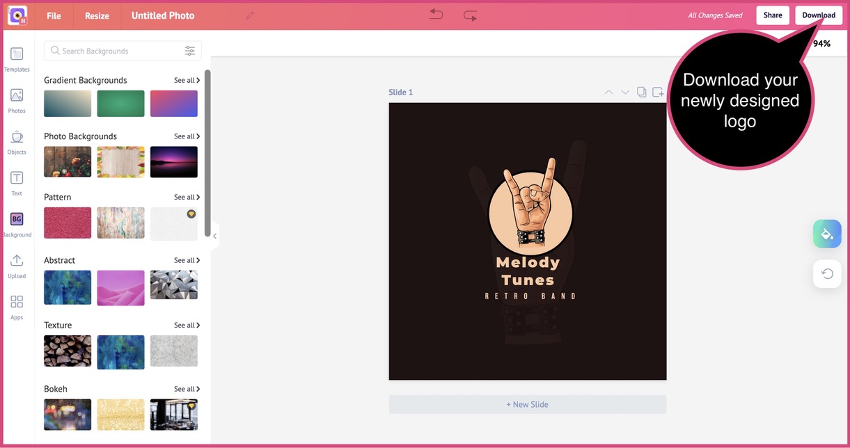
- Download your design by clicking the “Download” button and choosing the file format in which you want your logo.
Hurray, you’ve created an awesome, eye-popping, attention-grabbing, timeless logo for your brand!
Important takeaways to create a logo from scratch
- Define your brand identity: Do not proceed with designing your logo before you’ve defined your brand identity. Ask yourself: Why did you start the business? What are your brand’s core values? Your brand’s unique value proposition?
- Gather design ideas: Explore design ideas to gain clarity and create something truly unique. Social media platforms and search engines are great resources to search for design inspiration. Understand what others in your industry have done, how they’ve conceptualized their logos, the color scheme they’ve implemented and more.
- Choose colors: Identity brand colors for your logo. More than 70 percent of your customers judge a product based on its color alone. So, choose a color that reflects your brand, the product or service you sell, and the target demographic you cater to.
- Logo fonts: Your choice of font influences how your customers feel about your brand. A Sans-Serif font is a great choice if you envision a design that’s minimalist and modern. Serif font is ideal for a more traditional choice. Either way, don’t choose more than two or three fonts for your logo text.
- Start with rough designs: Create rough designs based on the brainstorming, research and discussions you’ve had within your team. You might come unstuck somewhere, but that’s normal. Your rough drafts can always be revised until you find one that’s as you had envisioned.
- Collect feedback: Ask people for feedback on your design. Check with people who’re in your target demographic and geographic segmentation. Ask them specific questions, so that they provide you with concrete, non-generic feedback to help you improve your design.
- Finalize: Finally, review your copy, check for alignment issues and create different versions of the design for easy distribution and implementation across the web and print.
ADDITIONAL READING: 10 Stellar Ways to Use Infographics in Your Marketing Strategy


