
Contents
What Is A Grid Design In Graphic Design?
What Are Some Popular Grid Layout Design Examples?
How To Make A Stunning Photo Collage Without Photoshop?
How To Design Grid Layout With Different Image Sizes
Feature Update: Grid Design | Learn How To Make Stunning Grid Designs
Karthik S - December 2, 2021 - Leave your thoughts.
What Is A Grid Design In Graphic Design?
A grid system in graphic design is a sequence of columns and rows that helps arrange any type of content systematically. It places graphics, pictures, and text in a sequential manner for easy viewing and comprehension. In this blog, you'll learn the different grid designs and layouts, and how to use them in your art work using DIY graphic design software.
In fact, if you are attending your first art or drawing class, your instructor will explain the importance of straight lines, circles, shapes etc. That's how you start making your art proportional to the canvas.
Grids are used in posters, flyers, magazines, newspapers, infographics, presentations, Instagram posts and stories, email designs, etc. They help divide the art board into a balanced layout for symmetric arrangement of the information.
Grids are also called as collages or collage layouts or classic photo collages that have neatly stacked rows and columns with pictures and text.
P.S. Grids and collages are interchangeable terms used to describe the same layout in graphic design.
History Of Grids
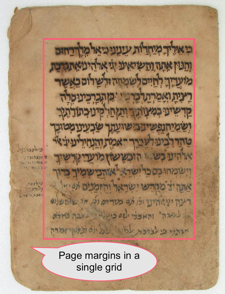
Grids originated in ancient history when writers used handwritten typography to arrange their writings on paper. Grids helped organize written text into readable blocks.
In the below ancient manuscript, we can see a single column layout with ample margins at the sides and at the top and bottom. There's even some text that appears in the margins too. The font appears to have been printed using handmade printing blocks.
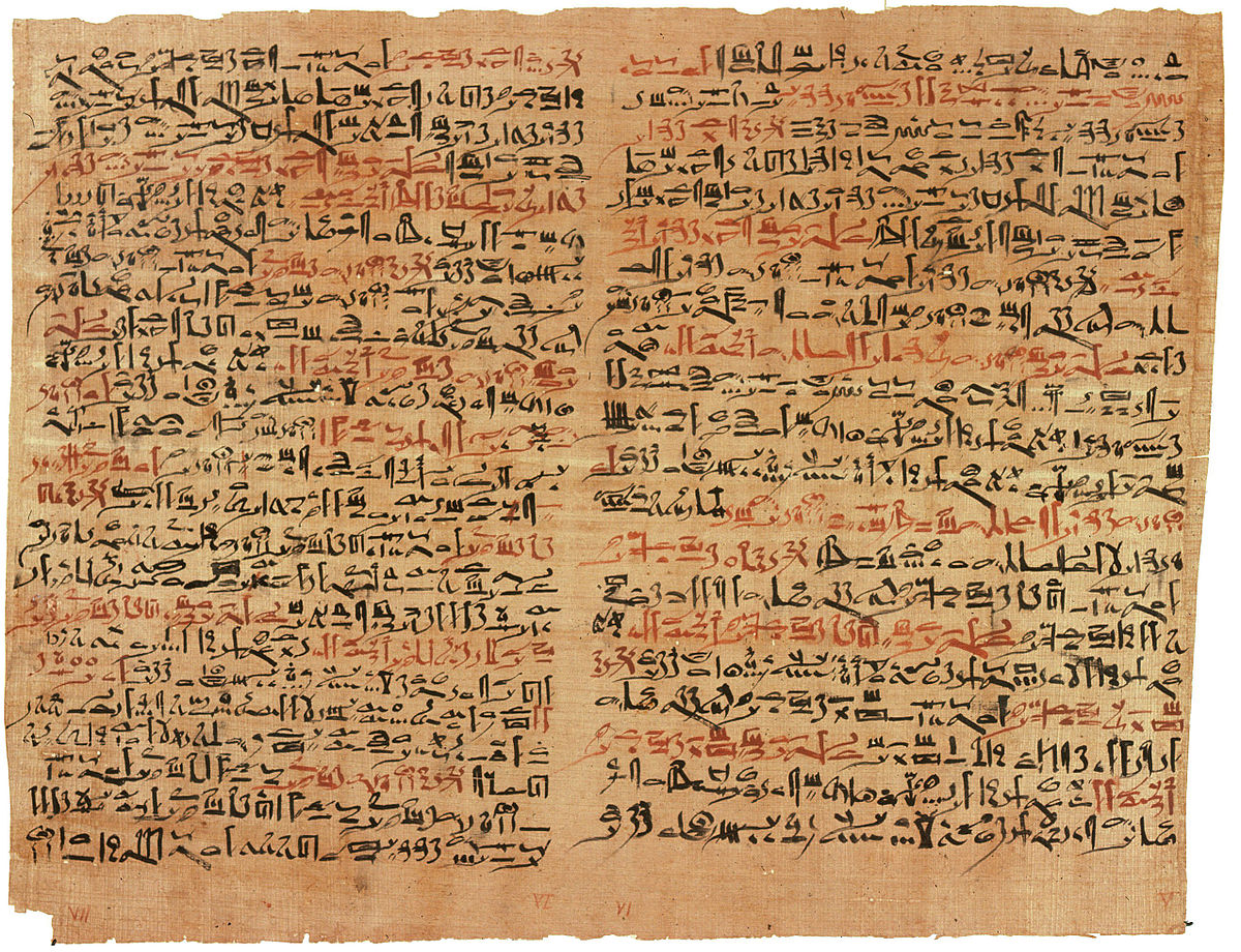
Besides, here's an example of a two-column grid. The below picture dates back to 1600 BCE, and is called as 'Edwin Smith Papyrus.' It is part of a collection of Egyptian medical text on the treatment of trauma and referred to as the Secret Book of the Physician.
It follows a two column layout and does not have much margins at the sides. There's very little space in between the fonts and consecutive sentences too.
Today, grids have come a long way. They're used nearly in all aspects of our lives - computer screens, building layouts, architecture, etc. They help define the boundaries of spaces, and divide them into equal rows and columns for consistency.
What Are Some Popular Grid Layout Design Examples?
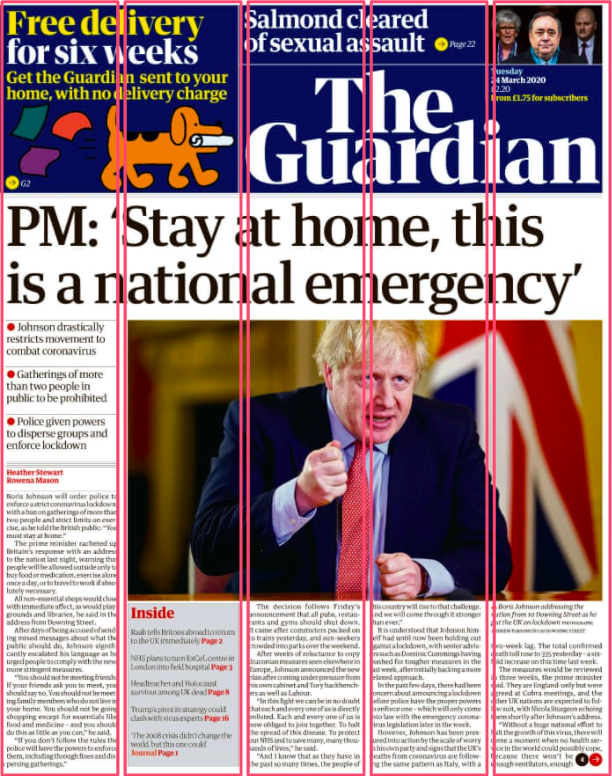
But, before we proceed, here's a live example of how a lead UK daily uses grid designs on its format. For simple understanding, we have divided the front page into equal vertical grids. In fact, this picture has horizontal grids too. But, showing all together will rob the image of its aesthetic.
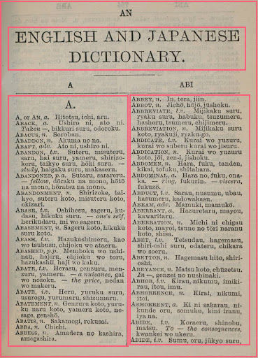
But, grid designs have been in vogue for a long time. Here's an example from the inner page of an English and Japanese dictionary. The pages in this book have a two column layout.
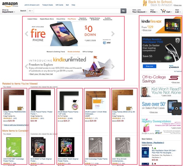
However, grid design layouts are not restricted to books and newspapers alone. They apply to websites too. Here's Amazon's homepage layout with the individual columns.
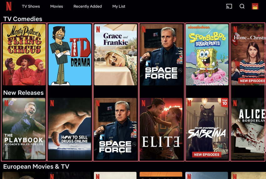
And, it extends to a lot of other websites too. Here's Netflix's homepage with the shows/movies appearing in columnar forms.
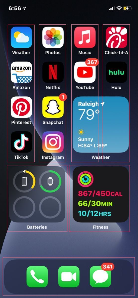
And, there is the mobile phone with the various appearing in a grid layout.
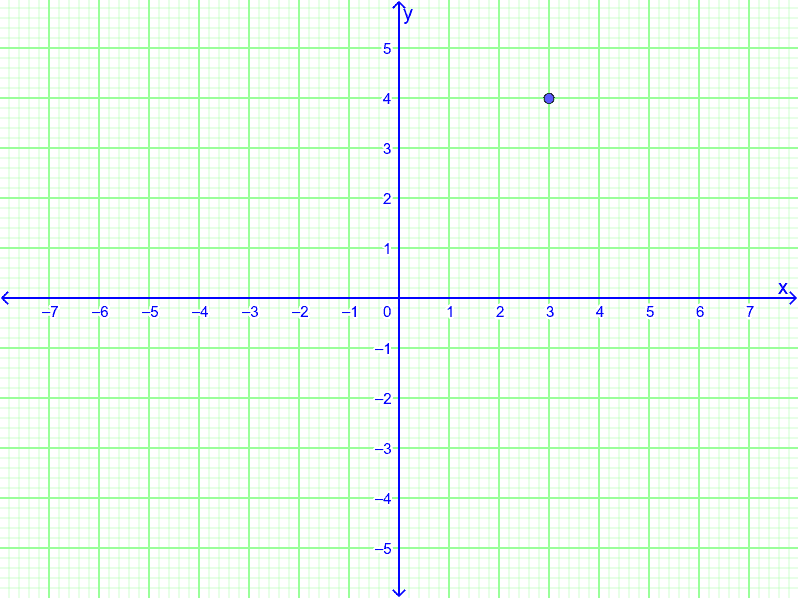
Furthermore, grid designs are applicable in our daily lives. Think about the time you learnt how to plot numbers on a X and Y axis.
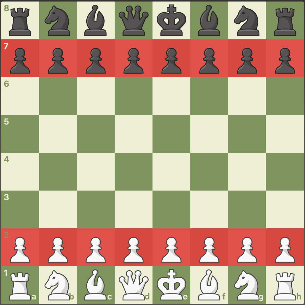
Finally, here's one of the most familiar grid examples that needs no introduction. Queen's Gambit, anybody?
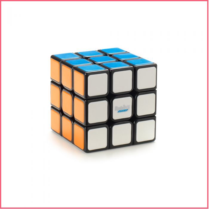
And, finally, one last childhood memory to reinforce the concept of a grid layout. You'd have surely tinkered endless hours with a Rubik's cube.
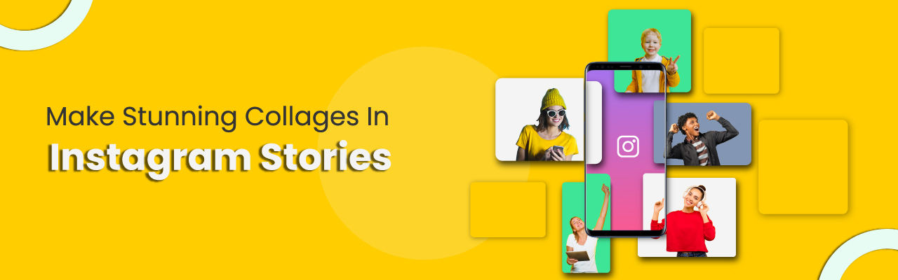
A Quick Example Of An Instagram Story Grid
The below is an example of an Instagram story in a grid design. If you notice, the different pictures appear randomly, but they are placed in a way where the key portions of a picture appear clearly to the viewer.
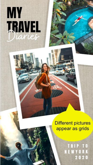
Besides, if you're interested in using this Instagram story grid design for your most recent trip, here you go.

Grids Are Derived From The Rule of Thirds
The Rule of Thirds is a famous principle followed in photography, designs, paintings, artwork, etc. It says that if we were to divide a picture into 9 equal parts with 2 rows and 2 columns, then the core element/s of the picture would on the intersection/s.
To illustrate our point, let us examine the below picture. Notice the person standing on the dock because we will focus on this.

Now, let us apply the Rule of Thirds to the above picture and see what happens. If you notice, the Rule of Thirds ensures that the person appears right at the intersection of a vertical and horizontal straight line.
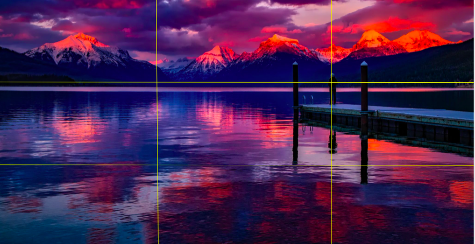
Sometimes, the central element in the design/picture might be closer to the points of intersection, so that's still fine.
Understanding Grid Layouts In Graphic Design
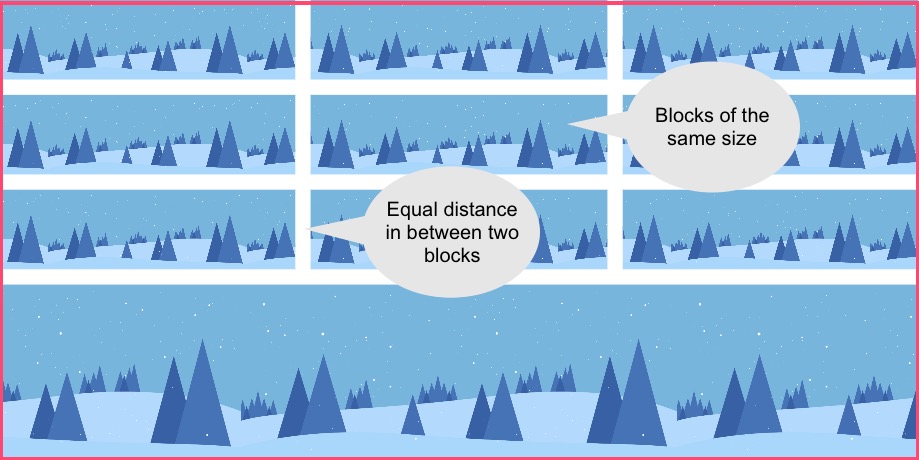
The most unique things about a grid design is that each block is each block in a grid appears in symmetry with the rest. Every block has a role to play in the entire design. It creates the visual balance for readers/viewers to skim through the content.
As a result, they are of equal size, and even the gaps between them (called gutters, which we will understand later in this section) are of equal sizes too.
Now, before we move ahead with learning how to use grids designs, let us understand the different terminology about them.
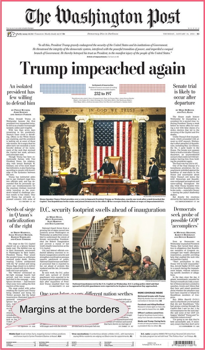
Format
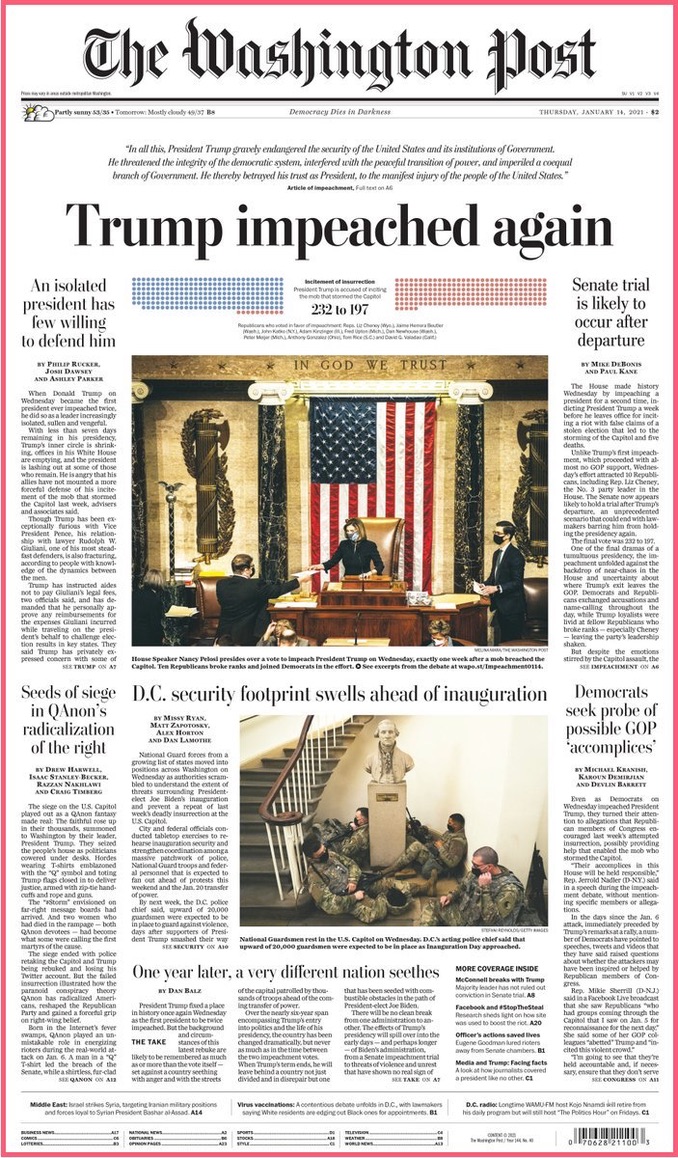
The format is the area or the space where the content in the grid will be displayed. For example in a newspaper, it is the entire page of the newspaper minus the margins. In a TV screen, it is the entire screen barring the tiny margins.
Here's the front page of The Washington Post's newspaper. Notice the entire length and breadth of the newspaper that has written text, pictures, visual graphics, bar codes, etc. The grid format is neatly laid out with margins at the top, bottom and at the sides.
Margin
The margin in a grid is the area at the borders where there is no content. This space ensures better discoverability and readability for the content. Note that the term 'margin' is applicable only for the space at the border, and not in between different grid layouts.
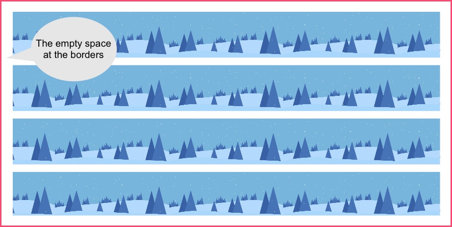
In the above newspaper front page screenshot that we introduced, the margins are clearly demarcated. They separate the format (text or the content) from the edges of the page.
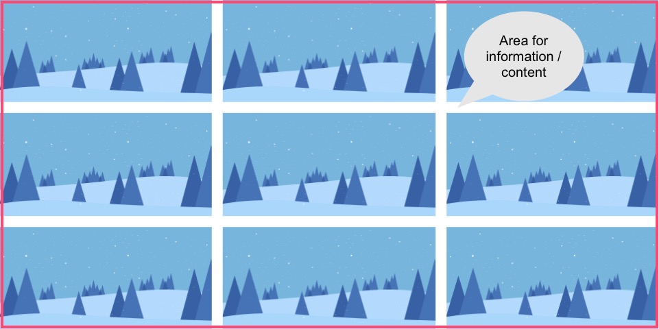
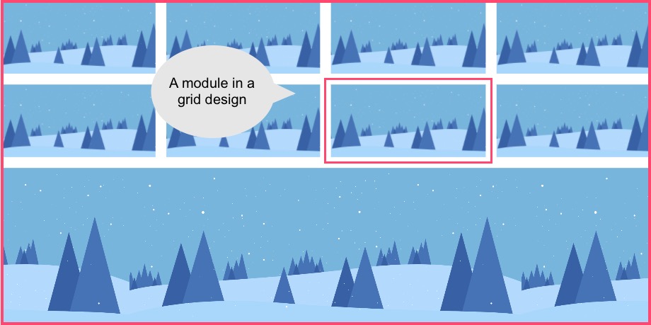
Module
A module is a block in a grid design that contains the information. So, for example, a group of vertically placed modules form chunks of texts or paragraphs in a magazine layout. Whereas a group of horizontally placed modules form an array of pictures.
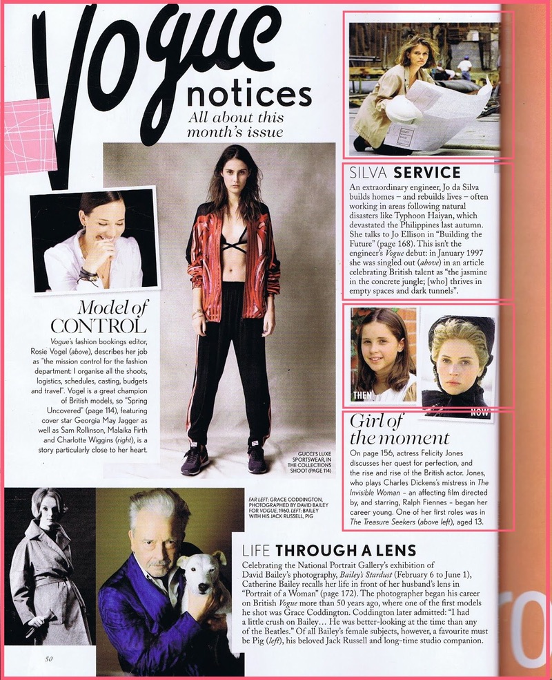
In the below magazine grid layout from the Vogue magazine, notice the array of vertically stacked modules on the right side. They are a combination of pictures and text and help the reader peruse through the page.
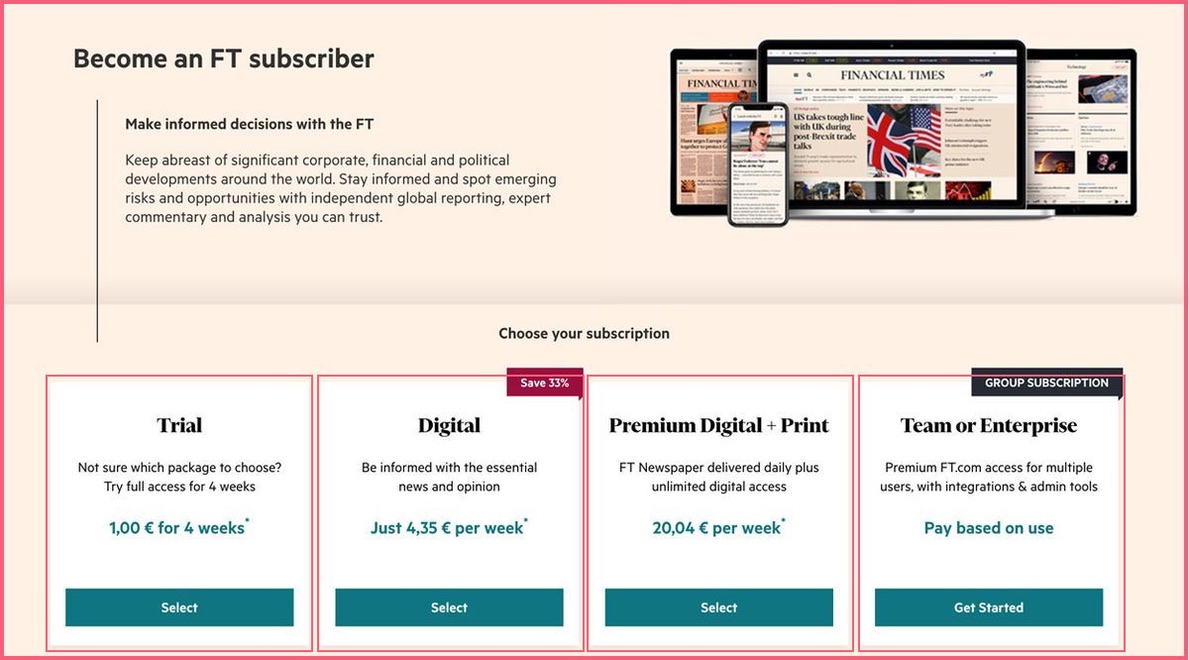
On the other hand, in the below screenshot from Financial Times that invites users to subscribe to their publication, observe the horizontal modules neatly stacked.
Vertical and Horizontal Regions
Next up, we have the vertical and horizontal regions in a grid or collage design. An array of modules aligned vertically and horizontally are called regions. They are a series of consecutive grid design blocks that can be used to display information. Designers use the regions can to place content by combining two or more regions together.
In the below image, notice how vertical paragraphs have been displayed with text blocks one after the other. The blocks appear quite close to the adjacent vertical space, but, yet the reader can discern the next line.
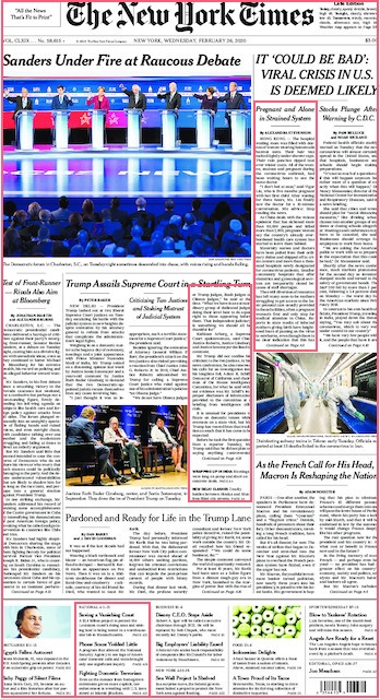
Source: The New York Times
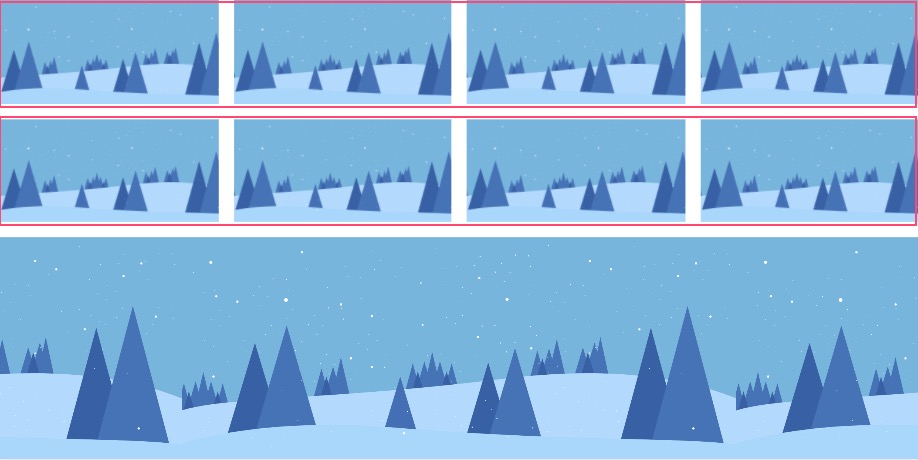
Rows
Rows are horizontal regions that are used in a left to right manner (excluding the margins). In the below image, we see the horizontal regions with an outline as 'Rows.' Designers could use these blocks to place images and text to suit the overall layout.
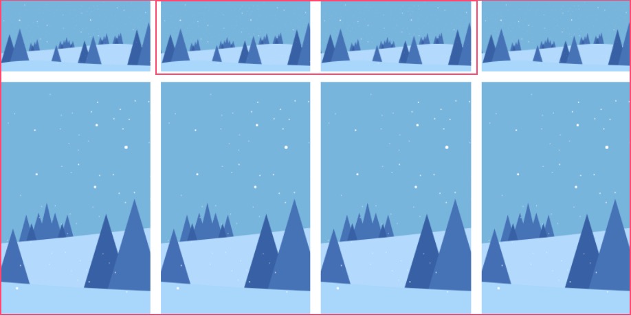
Columns
Columns are vertical regions that can be used to combine and place content. Newspapers, magazines, presentations are popular media that use the vertical columns. In the image below, notice how two vertical columns are combined next to each other.
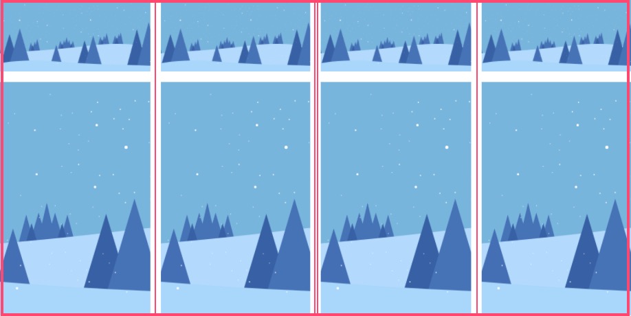
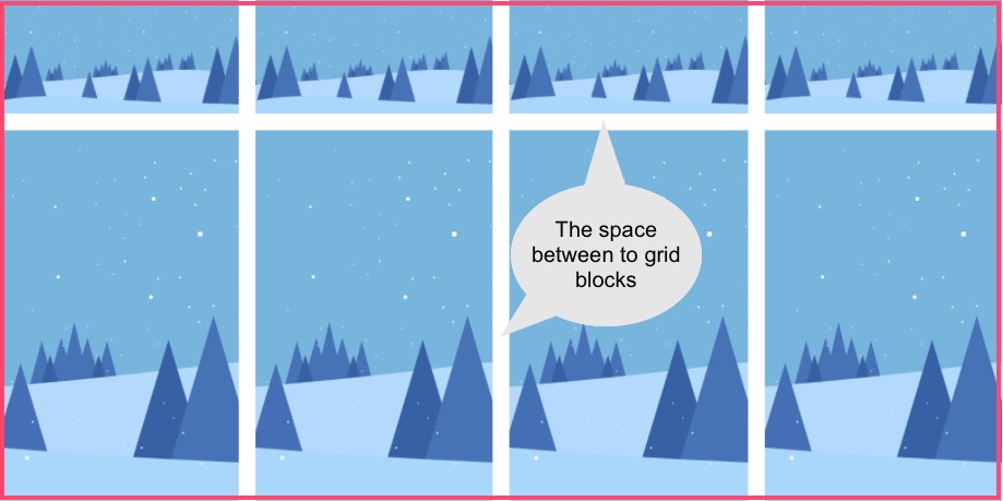
Gutters
And finally, we come to one last component in grid designs - they are the gaps in between two grid blocks. Guess what are they called? They're called gutters. Guess what is so typical about them? They are of equal space so as to maintain the symmetry and equilibrium in the grid layouts.
How To Make A Stunning Photo Collage Without Photoshop?
Okay, let us now get to some practical examples of how to get an awesome picture collage for yourself.
Hold on! Did you say you needed to learn Photoshop?
Nah! You needn't learn Photoshop when you have a free online collage maker like Picmaker.
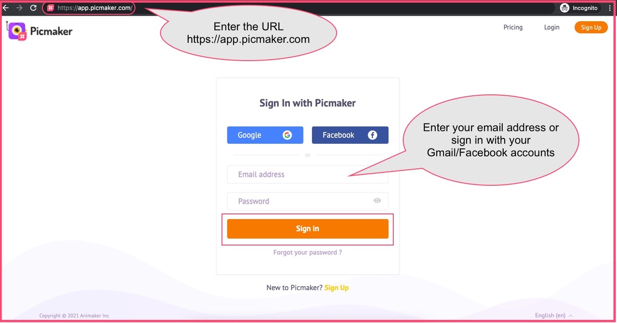
Step 1: The first step is to sign up to Picmaker. If you already have an account, go ahead and sign in.
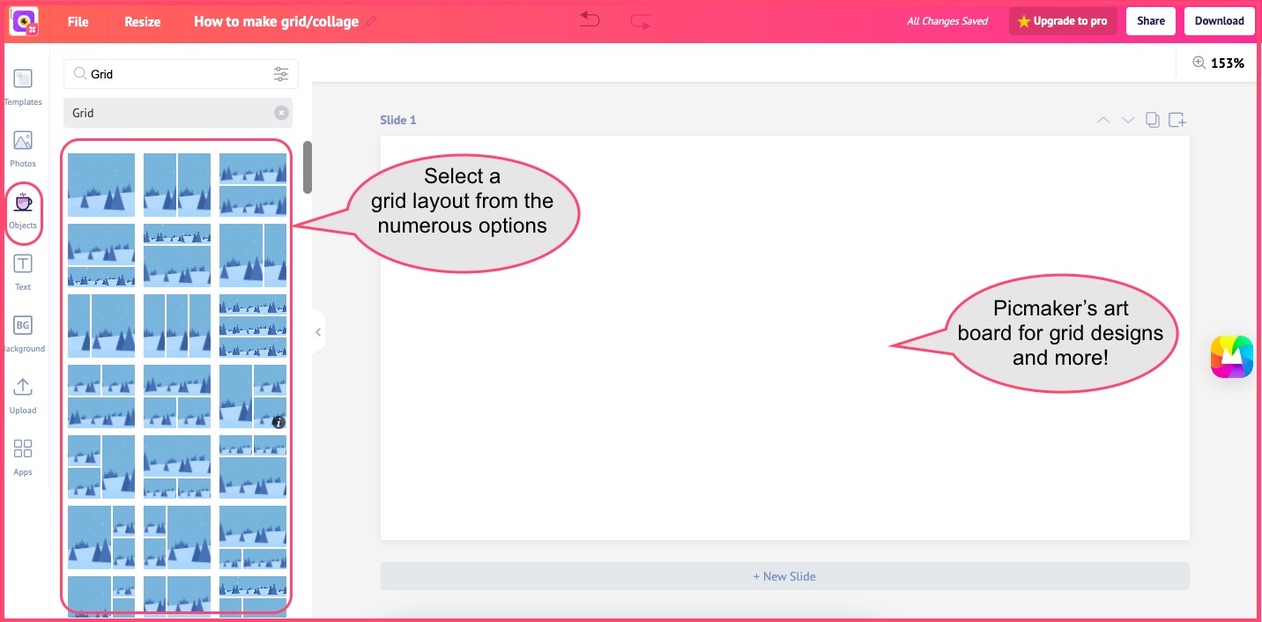
Step 2: The next step is to go to Picmaker's art board that gives you hundreds of different collage or grid layouts. You can either start from a 'Custom Size' or choose from a template option.

Step 3: The next step is to go to the grid layouts in Picmaker. You'd find them on the left-hand menubar.
Now, let us look at different grid or collage layouts in Picmaker. We will start with a 3-column vertical collage layout.
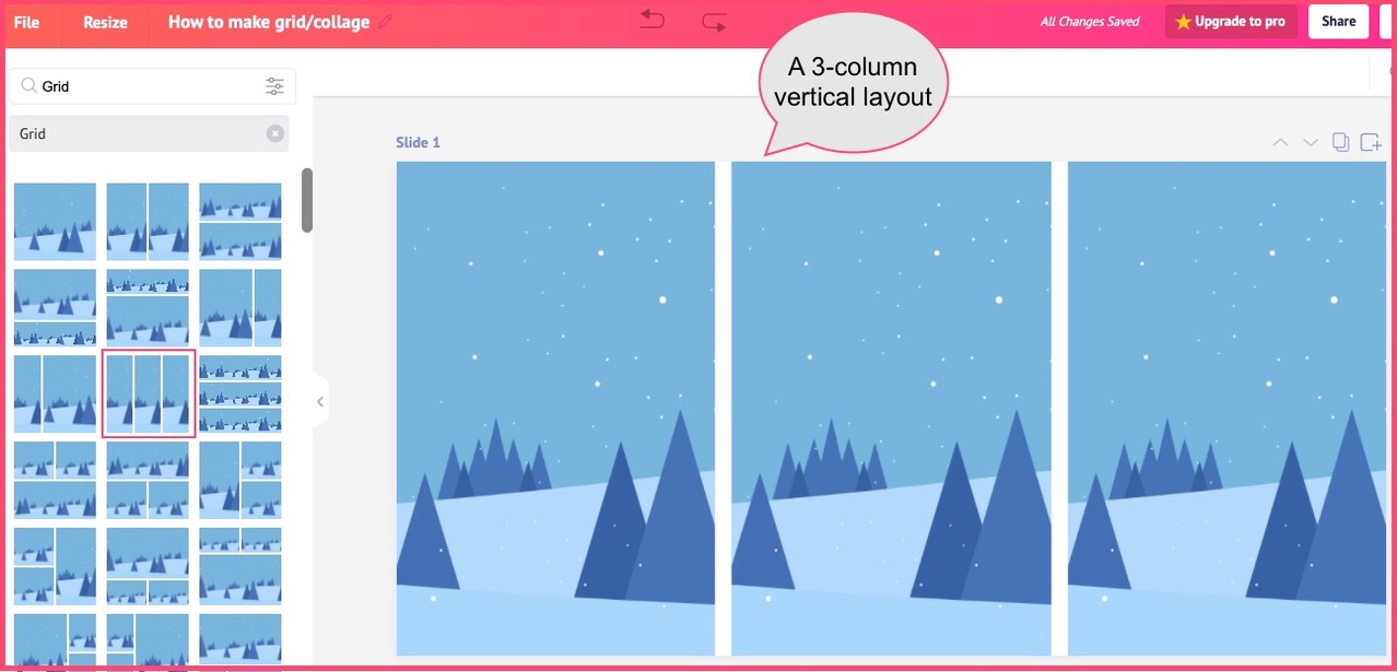
Let us turn this into something snazzy. We will select three pictures from Picmaker's collection of 100 million images and drag and drop them in the grid.
We added the pictures of three gentlemen with big grins on their faces, and a great heading to the collage design.

How To Design Grid Layout With Different Image Sizes
Now, let us try a slight varied combination with this grid design tool. This time we will try a 4-block grid design to design a collage of our latest beach vacation. Here's the grid layout. It has a square module or block on the left and the rest are rectangle modules.
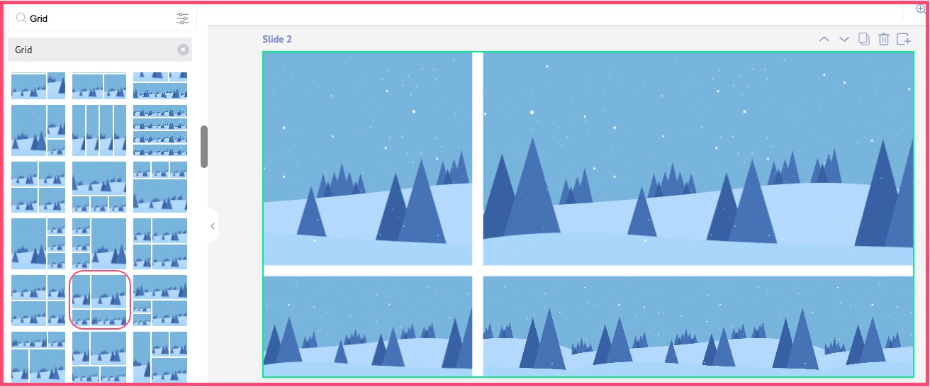
Now, we will choose stock images from our Picmaker's image library (because, the last time we visited a beach was several years ago, and we didn't take any pictures!)
Here's how the grid looked after we inserted the pictures in it. It sums up our mood at the beach!

Gee! How many steps did that take us? Just three.
Wow! Who said you need to learn Photoshop to make awesome grid designs?
How To Create A 16-Picture Collage?
Okay, we've learnt quite a few ways to play around with grid layout ideas. So, why not try one more idea? This time, let us try and make a 16-picture collage using Picmaker's online collage maker.
For that we select a 4x4 collage layout from Picmaker on a 1280x720 format to depict our art.
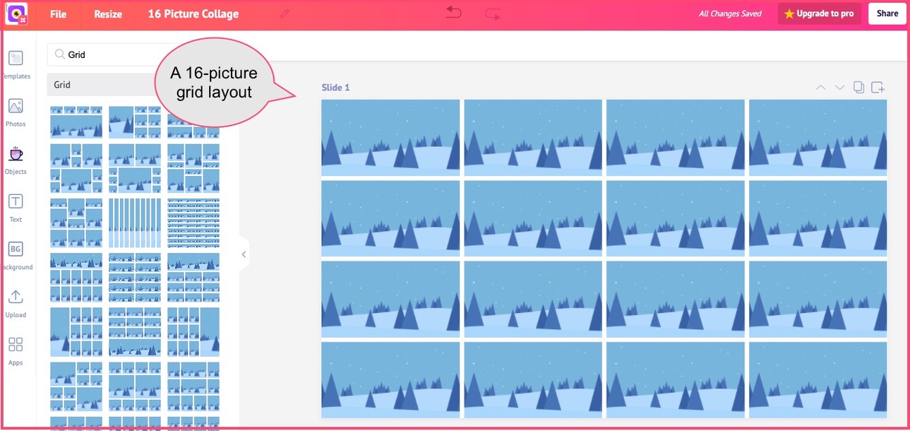
Now, let us insert a few pictures of smiling people in our 16-picture collage, and see how it looks. The good thing about making such collages is that they are an easy drag-and-drop feature.
You can even try inserting these pictures in different modules in the collage layout, and do a mix and match until you're happy with the output.

How To Make Grid Design/Collages - Conclusion
In this blog, we understood how grids and collages are a creative way of expressing your art. The fact that grid designs have survived the onslaught of several waves of technology is proof of why we must take them seriously.
In our blog, we've explored how you can extend grid designs to social media and other digital platforms to make your art stand out. Keep your comments coming in, and stay tuned for more feature updates from us.
Ciao!
Additional Reading
- Feature Update: Looking to present your graphic design work to your client? Here're 11 tips to deliver a killer graphic design presentation and the best tools to do that!
- Looking to get more engagement for your social media posts? Are you sure they're rightly sized? Learn how to get your social media image sizes right and displaying full photos across devices and all screens.