Contents
The importance of graphic design in digital marketing
13 Graphic design trends in digital marketing you cannot ignore [in 2022]
In 2022, the new graphic design trends will be more focused on brand aesthetics, gaining customer attention, and achieving exponential results. So, prepare to take bold risks this year by putting your creativity and imagination into graphic design. In this blog, we will explore some of the most fashionable graphic design trends in digital marketing in 2022.
- Subdued colors
- Geometric shapes
- Minimalist style
- Serif font
- Duotone/monochrome
- Flat icons/Illustrations
- Grain and blur
- 3D visuals
- Creative symbols
- Retrofuturism
- Simple infographics
- Overlapping designs
- Isometric design
But, before we move on to the core topic of this blog, let us understand the importance of graphic design in digital marketing.
The importance of graphic design in digital marketing
Today, graphic design isn't a luxury for businesses, it is a must-have. Designers have a massive role to play in attracting the right audience to an online business and getting them to stay longer on a website, buy products/services etc.
Besides, the size of the graphic design market isn't shrinking. According to FinancesOnline, the size of the global graphic design market is predicted to reach $45.8 billion.

Here're 3 reasons why graphic design is important in digital marketing:
1. Builds your brand
Graphic design helps you create a unique voice for yourself. It sets you apart from other businesses. Imagine this - if you have created an awesome logo for your brand, using an online logo maker, then every time somebody sees it, you're creating extra space in their minds. The next time they come across your it, they know that you mean something special.
Or, it could be the dominant colors and fonts on your digital assets - such as website, newsletters, landing pages. Today, companies spend enormous amounts of energy to determine the right color and font for their businesses so that they're unique.
The same goes for your blogs too - if you're creating stunning blog banners for your blog, your readers online will easily identify you from a distance. So, it is about crafting an online presence for yourself through impeccable graphic that can woo audiences.
2. Pictures are worth a thousand words
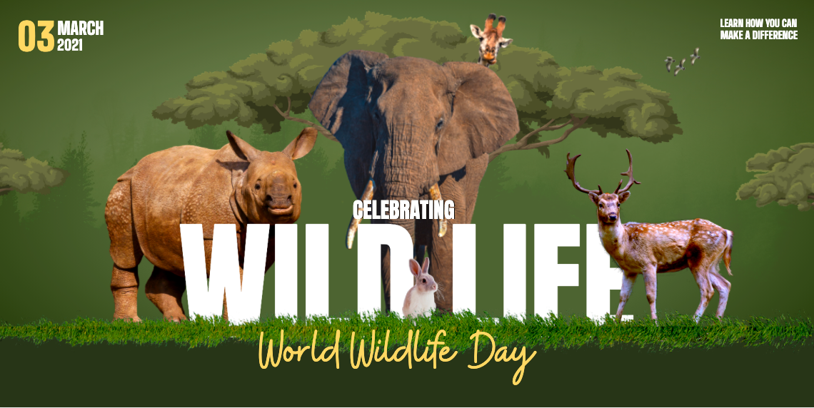
Everybody likes a beautiful picture when they see one. That's why brands prefer to invest in online graphic design software that gives them access to millions of original pictures by professional photographers. Modern graphic design trends in digital marketing espouse an increased use of bold pictures that convey the message aptly.
Besides, pictures do not just stop wowing an audience on a company's website. Popular search engines such as Google, Bing, and Yahoo index these images, and serve them up to searchers who're looking for solutions.
3. Breaks down the language barrier
Vocal languages help humans communicate better. But, the written language nudges them to take an action. For example, imagine a Call to Action (CTA) that says:
- Click here
- Try our product for free now!
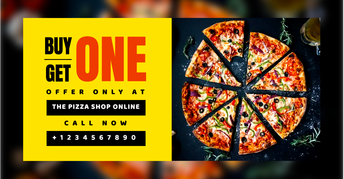
As a consumer, you're most likely to click on a button that displays the second CTA because it is explicit and tells you what to do. Research shows that the human brain can comprehend images 60,000 times faster than text. So, when humans see such easily-comprehensible CTAs along with great imagery, and themes, they know what to do. They don't need an a person standing next to them to guide them.
Great graphic design can combine vivid imagery with text to help buyers process options faster. For example, an ad or a social media post that shows bold images, with text, and a self-explaining CTA can drive tons of signups and subscriptions that cannot be done through any other means.
The latest graphic design trends in digital marketing
Let’s find out the latest graphic design trends in digital marketing.
Subdued colours
Muted colours are becoming more and more fashionable, and this trend is not going to decline, as they instill a sense of serenity, which is especially welcome in our current hectic environment. Bright, bold colors have long dominated the visual world, and while they still have their place and demand our attention, a more natural, fresher palette is a welcome new trend. This trend is most often used in restaurant advertising.
LinkedIn is an excellent example of this trend. Their brand combines delicate pastel and muted color tones in their content publishing strategy. Thanks to their social media advertising, they've adapted particularly well to the pandemic.
Geometric shapes
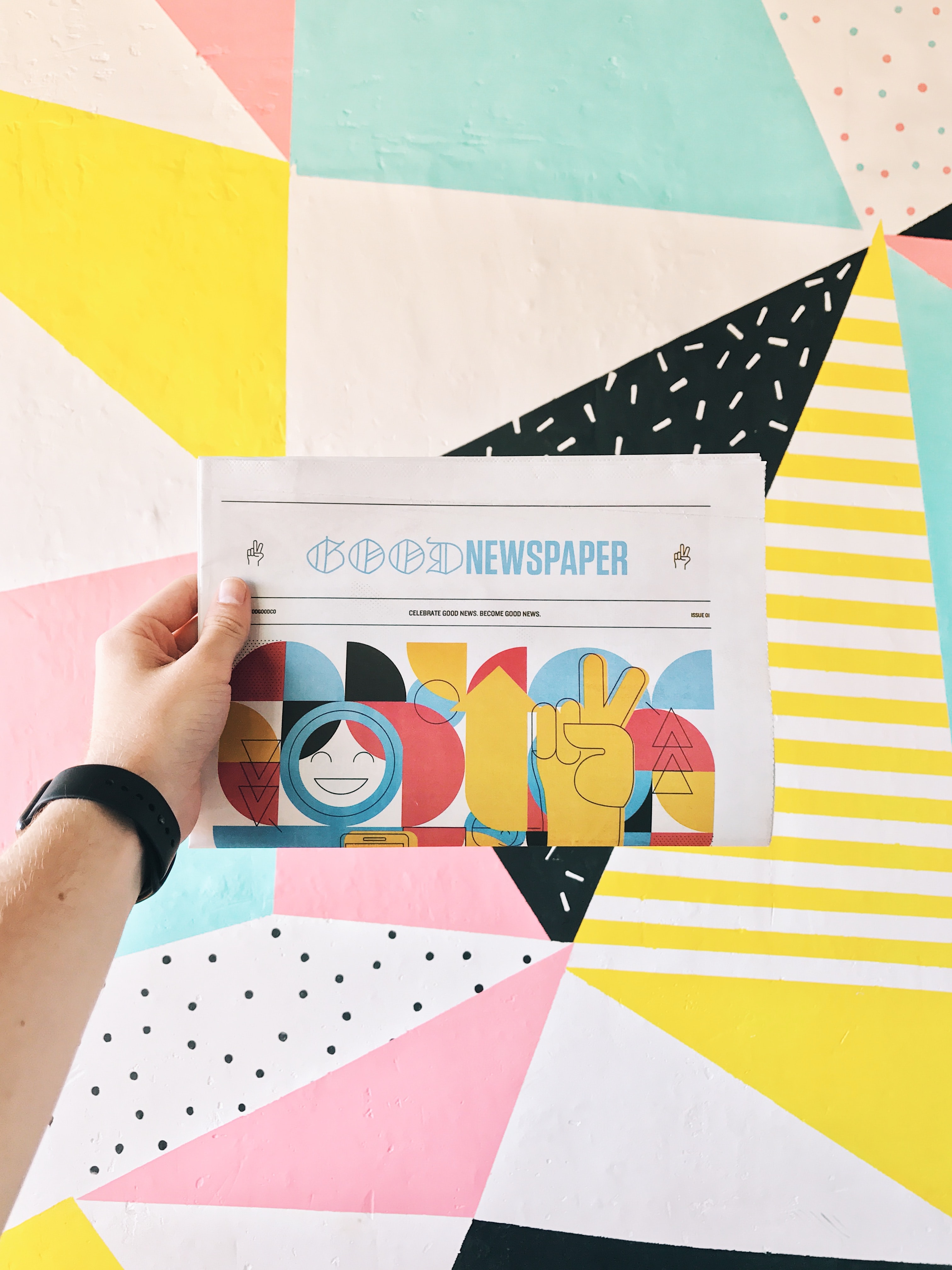
Geometric shapes will be a tremendous source of inspiration. It is a fascinating design trend used in well-balanced, well-thought-out compositions, producing a simple, minimalist aesthetic and a base for text and content placement.
They can adopt a more ambiguous looser grid, which is both fascinating and contrast-rich. In addition, image and shape can be combined to create fascinating compositions. So, within this design trend, there is also a lot of room for animation.
Minimalist style
The graphic aesthetic of minimalism and uncomplicated design has dominated for a long time. So, it's crucial to have plenty of white space and clarity so that the viewer can quickly explore the design and not confuse the primary messages. Nowadays, minimalist style design is fashionable in video marketing. You can create a music video in minimalist style.
Serif font
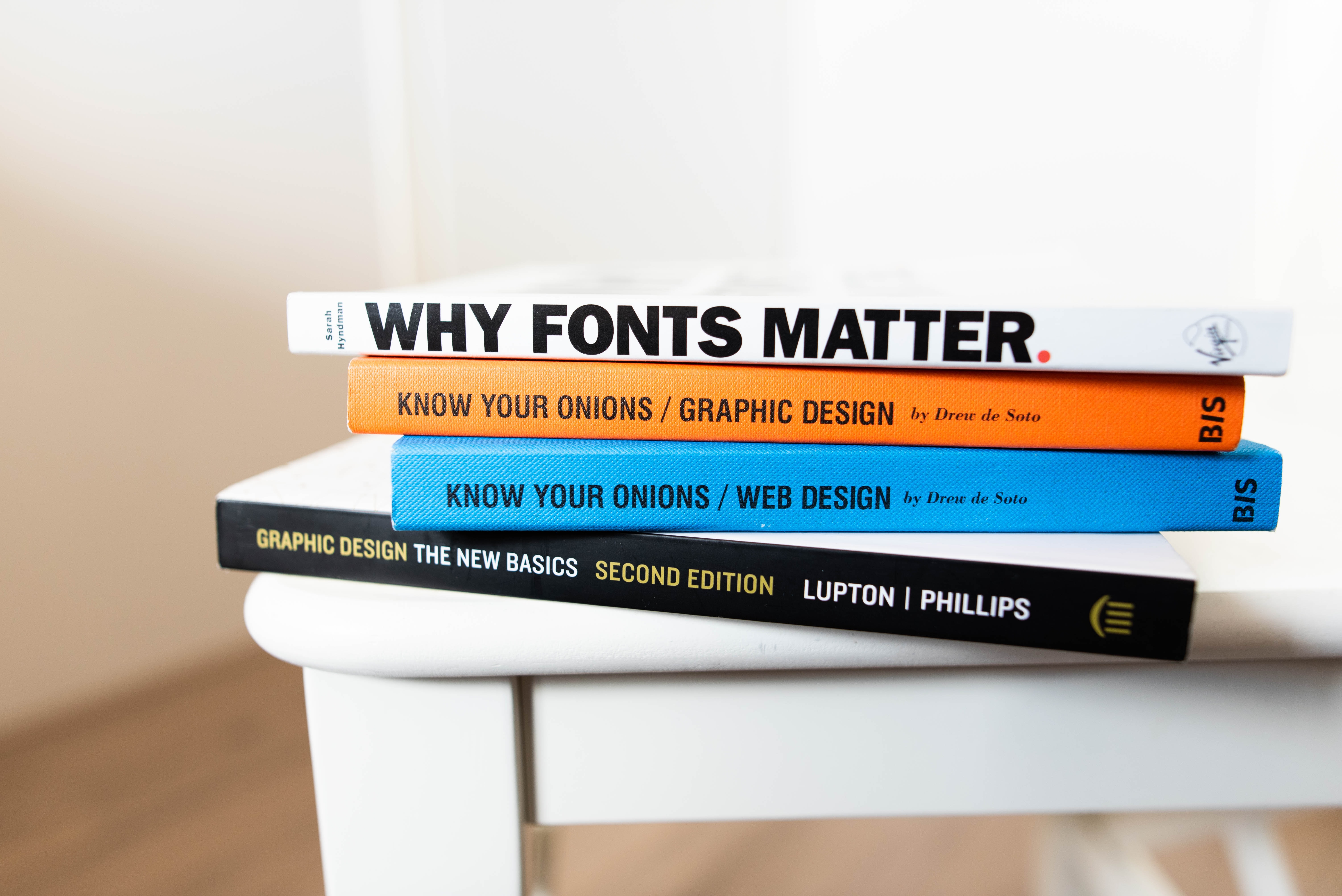
Over the last few years, the traditional serif has made a comeback. It is reliable and nostalgic, and it is gaining popularity by demonstrating that it is timeless.
Duotone/monochrome
One design trend that looks ready to resurface is the use of a more limited color palette, such as duotone or monochrome color schemes. Designs with only one or two colors can have a big impact. Moreover, due to the numerous techniques and filters available, they can generate a calmer, more relaxed, smoother feel and allow designers to be more creative and abstract in their compositions.
Flat icons and illustrations
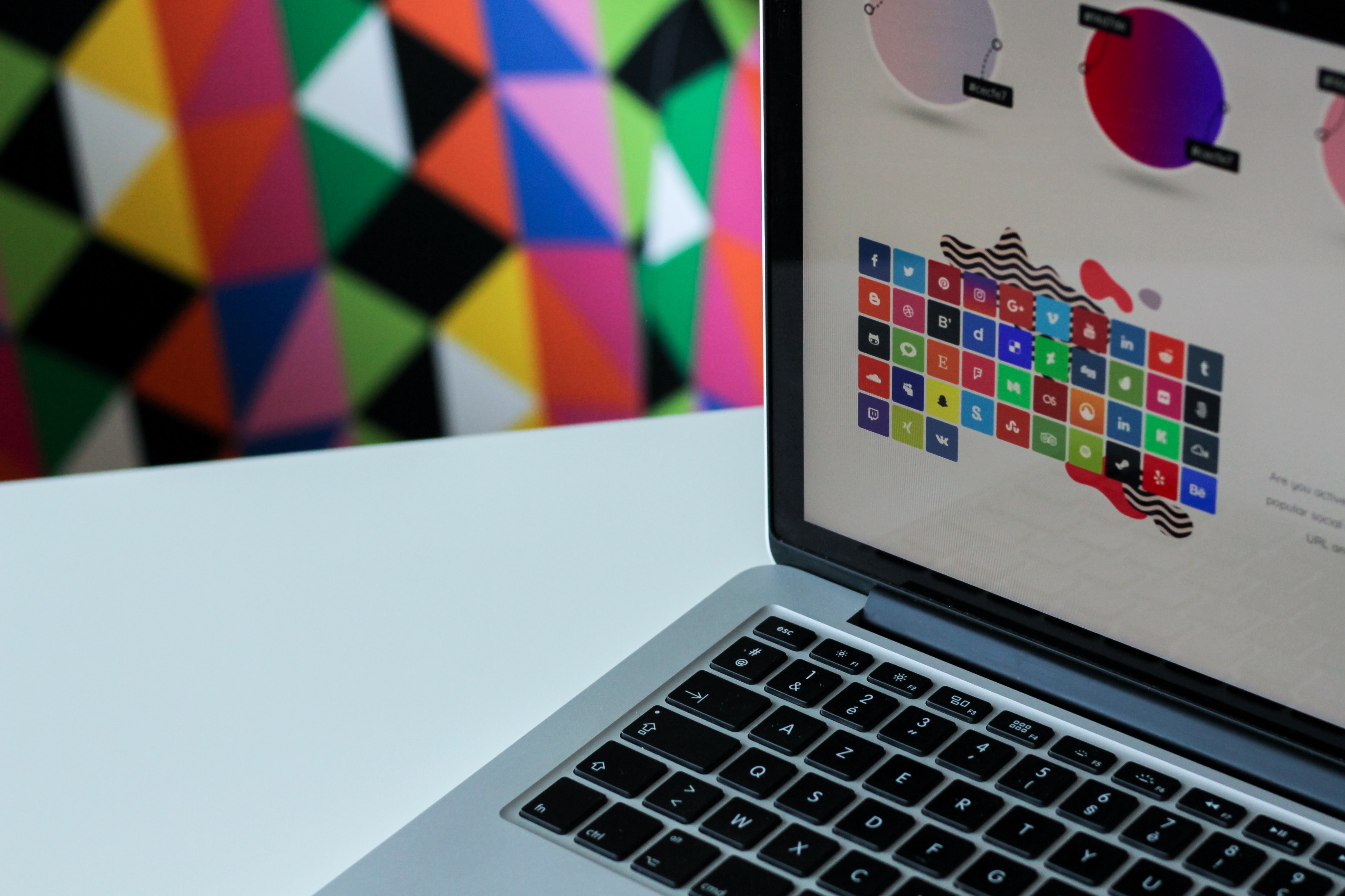
Flat icons and illustrations are a popular choice of design elements among many creative design agencies. The term, 'flat design,' often known as 2D dimensional design, aids the business in communicating information in a minimalistic and straightforward manner.
Flat icons and illustrations are seen as a potent communication tool by many skilled graphic designers. These components are expected to capture the attention of brands looking for simple designs that can creatively communicate complex messages in fewer words.
Grain and blur
The inventive use of gradients was one of the most prominent trends in recent years. In 2022, creative designers began emphasizing the use of pop-out text on a background. This is where the blur and grain come into play. Because of the extensive use of social media by brands, this trend has spread across the industry. The blur and grain effects produce unique shadows and visual textures.
It keeps the design looking new and encourages customers to spend more time on the brand's promotional platforms. This will be a futuristic trend in graphic design since it allows the creative designer to experiment with various components and attract attention.
3D visuals
3D objects give any visual element a sense of realism. Any 2D object can be converted to 3D, making it more dynamic and lifelike from the standpoint of the viewer. In 2022, 3D visuals will be yet another game-changer for graphic designers and SEO gurus.
You can instantly make your customer's digital experience more engaging and enticing by adding 3D elements to your website. If you want a more modern and engaging website, go with this art style.
Creative symbols
When it comes to graphic design, small details are crucial. A small adjustment in symbols can have a significant impact on your SEO rankings. Concentrate on designing eye-catching symbols. So, the idea is to use visually appealing components such as lines, colors, textures and shapes to portray your brand image and make it stand out.
Create or use a symbol that reflects your company's mission and story. Look for well-known people from history and popular culture to use as inspiration for your graphic design plan. Therefore, you should be able to create a style that would appeal to your target audience. This trend is suitable for advertising the food business.
Retrofuturism
Retrofuturism is a term used to describe an early art trend that shows the future as it was in previous times. Its aesthetic style is similar to cyberpunk, steampunk, and dieselpunk science fiction subgenres.
While retrofuturistic art may not be completely realistic, but it reflects visions of a bygone era. So, if you want to attain a timeless aesthetic, use retrofuturism as inspiration for your artworks. Companies in technological sectors and industries benefit the most from this type of creative movement.
So, consider using cartoon characters to create a mascot for your company. Cartoons, like symbols, can reflect your business image in a variety of ways. In fact, your cartoon character might represent your company's personality and voice and symbolize the attitude and tone of your company.
Simple infographics
People do not want to put in the effort required to learn numbers and facts. But, they want a clean and concise structure to quickly extract the information they require. For efficient communication, infographics are becoming even cleaner, smoother, and more streamlined this year. Instead of going into details for the sake of gut, the message is becoming more focused and specific.
Overlapping designs
Layers of depth can be created by overlapping design elements in graphic design. Furthermore, it also enables web designers to maintain a minimalist aesthetic by grouping items to create sufficient visual white space. Hence, this tendency can be used to generate logos and sometimes create illusions with them.
Isometric design
One of the few approaches that allow marketers to transmit more visual statements in a restricted amount of space is isometric design. While it may appear to be overly complicated, this technique merely entails the conversion of any three-dimensional object into a two-dimensional object. Moreover, the end effect is a clear graphic work that is much more tactile and warm to the eye than a flat design. This style can be used in various software designs - employee onboarding, payroll, human resources and content management softwares.
Graphic Trends in Digital Marketing - Conclusion
Technology is progressing, people are running online businesses with no inventory and companies are becoming more open to experimenting with their brands in order to better match their customers' desires. Therefore, a combination of simple design and the above-mentioned trends will lead the industry and boost customer engagement.
This blog was contributed by Georgi Mamajanyan. Georgi is a result-driven SEO specialist with passion for automation and neuromarketing. With the help of off-site SEO custom scripts, Georgi makes sure to get the best for his company's clients.
An awesome flyer can make your digital marketing campaign soar! So, learn how to design flyers for your business, it isn't even half as complicated as you think.
Similarly, a well-designed poster can drive audiences to take attend your online/offline event in droves. Discover how to design stunning posters with free templates.
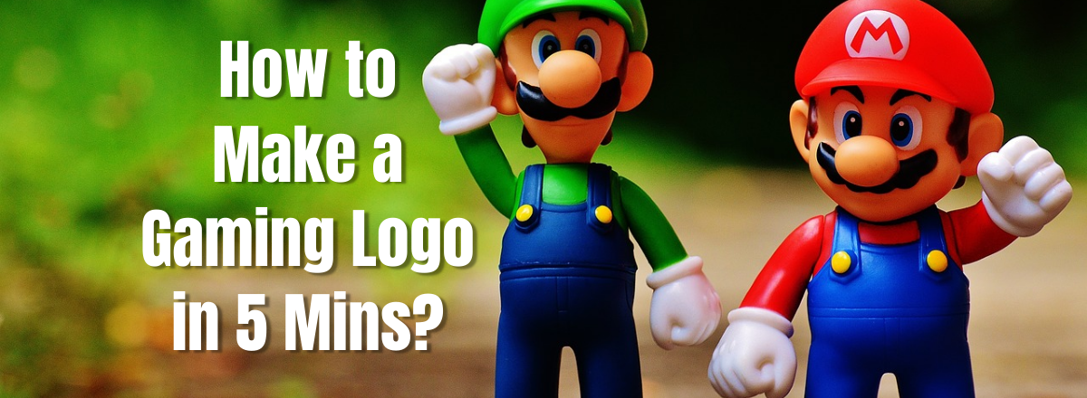
Besides, all business - digital or non-digital - have one thing in common - a logo. In this step-by-step guide, learn how to design a logo in 5 minutes using customizable templates.


