Contents
What Is a Responsive Newsletter Design?
What Makes a Perfect Newsletter?
Creating An Ideal Newsletter: Step By Step
12 Incredible Email Newsletter Design Examples That Inspire
Over 4.1 billion email users (Statista, 2021) to converse with and ultimately to sell to, may make email marketing look like a walk in the park.
But, consider the 320 billion emails (Statista, 2021) that are being exchanged daily between them. Suddenly, you realize that in order to make any real money out of your emails, you need to stand out in the prospect's inbox in the midst of so many other similar-looking and similar-sounding emails!
Now everyone tells you that the success of your email newsletter depends on a lot more than just the awesome message you intend to convey.
So, what are these different elements that ultimately decide the success or failure of your email newsletter campaign? How can I optimize them best for maximum opens and clicks in 2022?
Is it even possible that there’s a step-by-step framework to help you design highly effective email newsletters that magically convert casual, one-time subscribers (who got in because they wanted your FREE lead magnet) into life-long brand-loyal fans?
We answer all of these and more (PLUS easy-to-understand examples), in this email newsletter design done right 101!
Email Newsletter: Definition
An email newsletter is a unit of communication from a business to its list of opted-in email subscribers.
This can happen based on a trigger (e.g. upcoming sale or promotion) or it could just be plain and simple scheduled emails that go out on a particular day at a given time to the readers (e.g. weekly or fortnightly e-newsletter).
WATCH: 21 Design hacks to Present like a Pro
Either way, an email newsletter does a mighty fine job of getting the right communication through to your list (or segment) in a timely and effective manner.
In your newsletter, you could announce the next discount sale, provide critical product or service updates, invite your readers to a webinar, share a link to your newest blog article, or even entertain subscribers with fun content.
No matter what your objective is, getting the design of your email newsletter right is crucial to boosting engagement, improving brand loyalty, and increasing sales.
What Is a Responsive Newsletter Design?
A responsive newsletter design can adapt to screens of different devices. Your subscribers should find it easy to open your newsletters from laptops, tablets, or mobile phones. Most email account holders nowadays open their emails using their smartphones. According to data, for 85 percent of users, smartphones are the main device for checking emails.
What Makes a Perfect Newsletter?
With a responsive newsletter design at hand, it's time to create your newsletter. But before that, you need to know what makes up an outstanding newsletter. Below are tips for writing a perfect newsletter.
1. Lay Down Clear Goals
Setting an understandable mission and the right message for every newsletter is essential. To come up with workable goals, use the SMART goal approach!
- Specific: be precise when writing your goal. For example, "to drive traffic and attract X guests to your site within Y months."
- Measurable: include metrics and milestones in your goal. For example, "publish three articles per week to boost website traffic by 20% every week.
- Attainable: although it's good to aim high, let your goals be realistic. Long-term goals should be a combination of several achievable short-term goals.
- Relevant: your goal should match the overall business plan and be within reach.
- Timely: your goal should have a well-defined timeline with deadlines to meet to create a sense of agency.
In addition, you may subdivide your email list according to particular goals and send relevant and personalized content to each segment.
2. Use Catchy Subject Lines
A subject line is a crucial component of your newsletter email. It influences your recipient's decision of whether or not to open your newsletter. Keep your subject line short ( three to five words).
Close to 64 percent of email recipients make a decision to open emails based on the subject line. And a whopping 69 percent report emails as spam after just reading the subject line.
LEARN: All About Picmaker's Pricing And Plans Designed For You
Whether your goal is improved open rates or a high inbox deliverability rate, a great subject line makes reaching that specific objective easier.
Also, consider writing it after you are done with other parts of your newsletter to have a clear picture when crafting it.
Best Practices For Writing Effective Email Subject Lines
To create an attention-grabbing subject line, consider the following tips:
- Be brief and to the point
- Personalize it
- Use numbers
- Write in active voice
- Include descriptive words
- Limit capitalization, punctuations, and emojis
- Segment your list
- Test it
3. Keep It Easy To Read And Scan
Most people are busy and will rush through their inboxes. Therefore, it's crucial to keep their newsletter experience more convenient to avoid landing in the spam inboxes.
4. Use Diverse Newsletter Ideas
By researching your prospects and their pain points, you will be in a position to develop a wide range of email content ideas that delve into everything your prospects care about, while sounding fresh every time.
Examples of newsletter ideas include:
- Writing fresh content
- Customer reviews
- Sharing eCommerce tips
- Engage your audience
- Educate the reader about your industry
- Give news and updates
- Share your personality and culture
- Top 10 list approach
5. Be Brief and Concise
Once you get the subject line right, getting opens from curious subscribers is easier. But ultimately it’s only your content that’ll keep them reading to the very end and even click on the CTA (Call to Action) and perform the desired action.
The key to writing high-converting email content is to choose any two-way combination between simple, relevant, and interesting.
Short sentences that convey simple ideas work best.
Common pitfalls include beating around the bush, trying to inject the odd forced humor element, and generally just trying to write clever. Remember that when it comes to all things copy, clear is always better than clever. Everything, needless to add, starts with being clear about the one objective your email is expected to achieve, and next figuring out what is the simplest way to get out there?
6. Maintain Brand Consistency
Did you know that over 59 percent of shoppers prefer to buy new products from brands familiar to them? Or that color improves brand recognition by up to 80 percent?
promotional sales email or your regular weekly newsletter, sticking to your brand identity and design elements such as color, font, formatting, and voice consistently creates a strong impression in your prospects’ minds over time.
Maintaining a consistent brand identity throughout your email communication allows your business to be viewed as a brand by your prospects and you’ll end up building a loyal fan following for life, over time.
Need a better reason still? Studies have shown that consistent brand presentation across all platforms can increase a business’s revenue by up to 23 percent. That’s your reason to start doing this already!
7. Add Call-To-Action
It's essential to include a strong CTA in your newsletter, directing the reader to a significant business page. In this case, creating a website is a good idea if you don't own one!
You could call the reader to:
- Sign up for an account
- Give a feedback
- Enter a competition
- Register for a webinar
- Register for a course
A perfect CTA helps you maximize your newsletter traffic, give details about your offer, and drive your conversations.
8. Use Images Moderately
Although graphics inspire your audience to read your newsletters, don't overuse them! You should remain focused on your goal, which is to engage your subscribers by providing valuable information.
9. Make Your Newsletter Mobile-Friendly
As most people now open their emails on their smartphones, it's imperative to create mobile-friendly newsletters. It's also worth mentioning that only 25-30 characters of your subject lines will be displayed on mobile devices.
Creating An Ideal Newsletter: Step By Step
Now that you have the tips for writing a perfect email newsletter, it's time to craft one for your business. Here are the steps you need to follow.
Step 1: Goal Identification
The foundation of any successful newsletter is finalizing the mission you want to accomplish. Your goal could be lengthening your email list, generating traffic to your site, and many more.
Step 2: Content Selection
Choose the appropriate content for your newsletter that will help you to attain your primary goal.
For example, where you want to establish credibility, you can offer content that outshines your competitors. Case studies and testimonials are also high-converting content types that will enrich your audience.
Step 3: Choose A Distributing Policy
Select a suitable software or an app for your newsletter distribution. There is a variety of such software in the market. Go for the one that has helpful features and is convenient for your pocket!
Step 4: Create Your Newsletter Email
Customize your newsletter email by including all the necessary content, adding CTAs, personalization, and links.
Step 5: Test Your Newsletter
Ensure that all the components of your newsletter are working properly by sending a copy to yourself. Fix any that is non-functional, especially the broken links.
Step 6: Law Compliance
Make sure that your newsletter is responsive and has the correct display with opt-in emails. It should also comply with the General Data Protection Regulation (GDPR) guidelines.
Step 7: Test Your Newsletter's Effectiveness
Create two designs of newsletters and send each to either half of your contact list. Identify and pick the template that performs the best.
Step 8: Measure Performance
Measure the performance of your letter, keeping in mind your goals, engagement rate, and other relevant metrics.
Email Newsletter Design Examples
1. NextDraft Daily Email
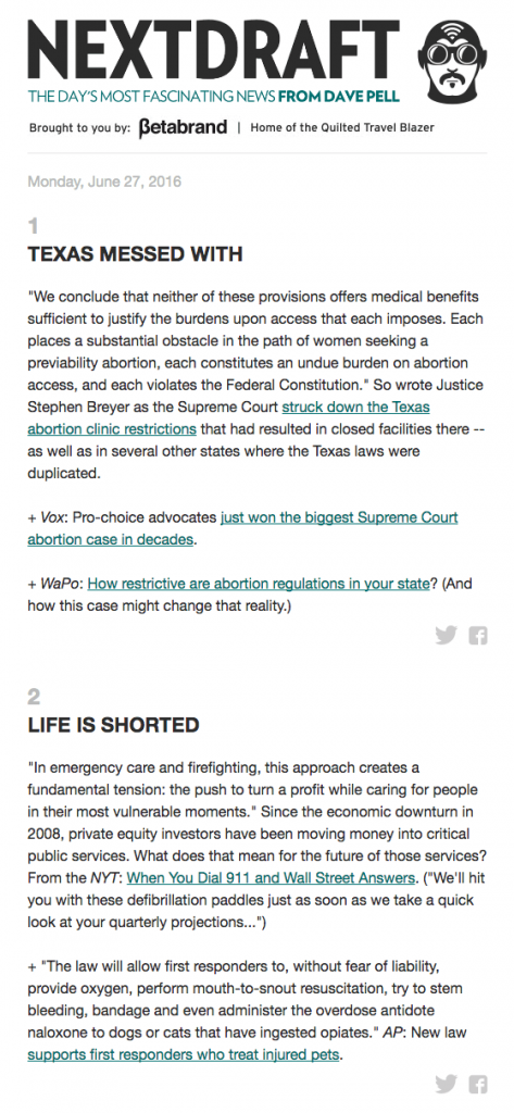
This daily newsletter starts with a clever one-liner subject line, "The day's most fascinating news from Dave Pell." The subject line increases the chances of the reader opening the email to get the top news of the day!
The other good thing about this email is that its body is descriptive, precise, and knowledgeable. After reading, the audience acquires detailed information, all from a single newsletter, as links redirect them to relevant information pages.
This design is fantastic as it prioritizes essential information, thus inspiring the reader to click on the links for more details.
Besides the obvious, organized, and understandable content delivery, adding a social share button below every story is an excellent idea.
Providing these multiple buttons is a better option than assuming that your audience will read through to the end to locate the social buttons. Every social share offers you the opportunity to attract new subscribers through social engagement.
2. Jins Ecommerce Newsletter
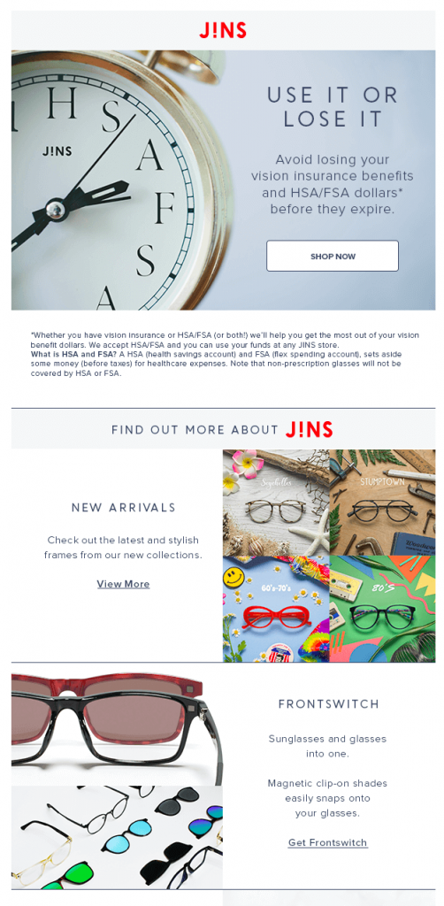
The company highlights its products in its newsletters and inspires customers to visit its store and shop.
The brand uses a hierarchical approach of adding CTAs to emphasize one primary goal and several other secondary ones to draw the audience's attention. As a result, increasing its conversion rates.
According to Jins, the main goal is to have the reader shop before the duty-free flexible spending account money expires. They also ask the audience to check out new arrivals, front switch, and new prescriptions as the subsidiary goals.
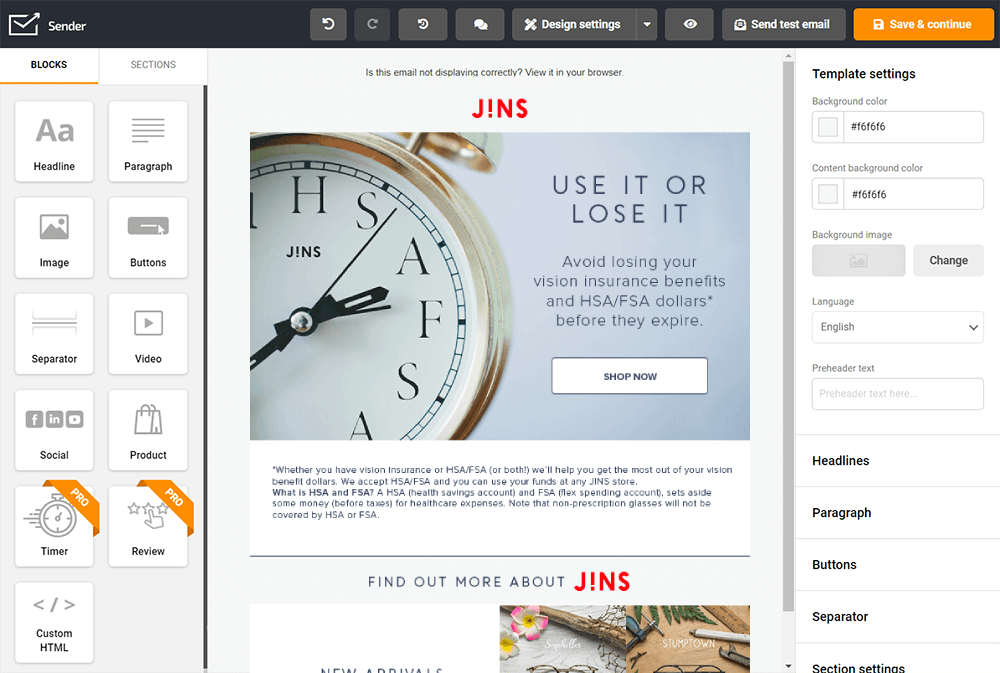
To create this type of email you need an email marketing tool, which has an email design builder. We recommend using Sender.net, which has all the features you need to create that kind of email newsletter.
Here is how it looks from the inside:
3. Bon Appétit Email Magazine
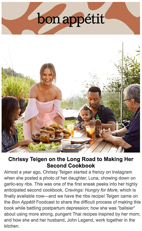
The newsletter comprises a variety of recipes that inspire the reader to have confidence in the kitchen and cook some tasty dishes.
The design is visually appealing, having a big feature image, a story at the top, and food photos with brief texts at the footer of the email.
The food pictures, accompanied by limited information, heighten the readers' desire to learn more. As a result, they click on the photos and land on the relevant business pages. The ease of reading improves the readers' experience.
Giving the reader the freedom to choose the content of their choice is a brilliant idea. The brand uses this tactic pretty well as the audience can click on their recipe of interest.
4. John Lewis Mother's Day Gift Newsletter
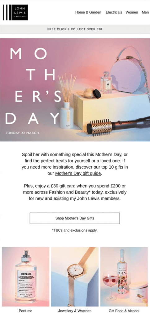
The worldwide celebration of Mother's Day offers a great opportunity for retail brands. Everyone is on the lookout for a perfect gift for their dear moms!
Therefore, you must create an awesome newsletter on this special day.
ALSO READ: How To Create A Stunning Collage On Instagram Story In 2022 (Using Artificial Intelligence)
John Lewis has a clear and concise Mother's Day message plus a link to the company's gift guide while the storytelling approach promotes the products.
For example, the newsletter gives its readers an idea of serving their mothers' breakfast in bed in her new John Lewis pajamas. After all, everyone wants to get the products with great stories behind them!
5. Fitbit Sales Promotion Newsletter
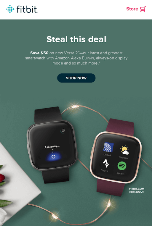
The brand sends this promotional newsletter to its subscribers, where it offers $50 as the price of the new product.
Offering your subscribers incentives from time to time improves customer engagement and also inspires the churned customers to return.
You could also encourage your audience to be your brand ambassadors by providing rewards like discounts and special offers.
6. National Wildlife Federation Educative Newsletter
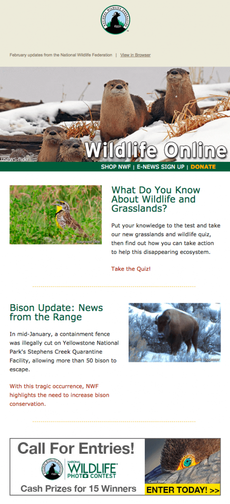
The organization uses its newsletters as an informative platform for educating its audience concerning major wildlife preservation goals.
In the middle of the email, the federation boosts the reader's engagement by introducing a contest they are hosting.
The organization uses its newsletters as an informative platform for educating its audience concerning major wildlife preservation goals.
In the middle of the email, the federation boosts the reader's engagement by introducing a contest they are hosting.
7. Nike Seasonal Newsletter Design
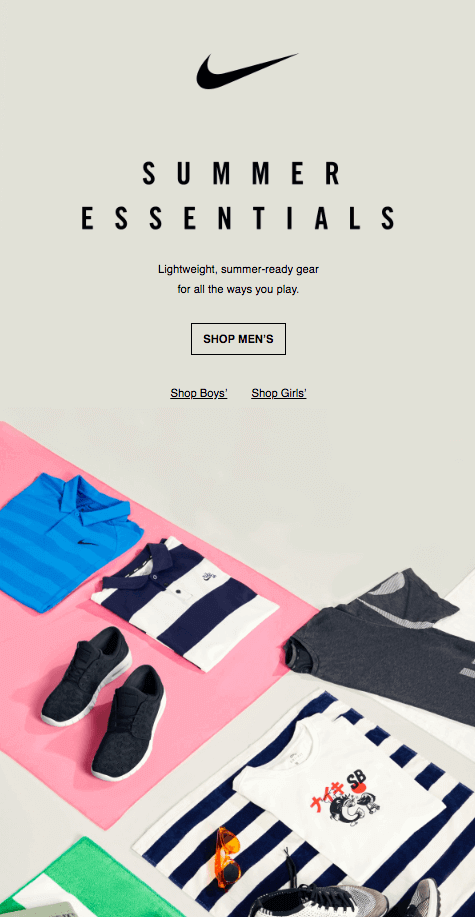
Nike sends this newsletter during the summer season. Simplicity, minimal copy, and conciseness are the characteristics of this email. The use of the image is also a big plus in encouraging the audience to read and take the necessary action.
READ: An Introduction To Using Grid Design Tool and Secret To Persuasive Graphic Design
Apart from the major CTA that prioritizes men's wear, you can also shop for your kids via the secondary CTAs provided.
Moreover, its sand-like background reflects beach imagery and creates a great brand impression to its customers.
8. J. Crew Product Launch Newsletter
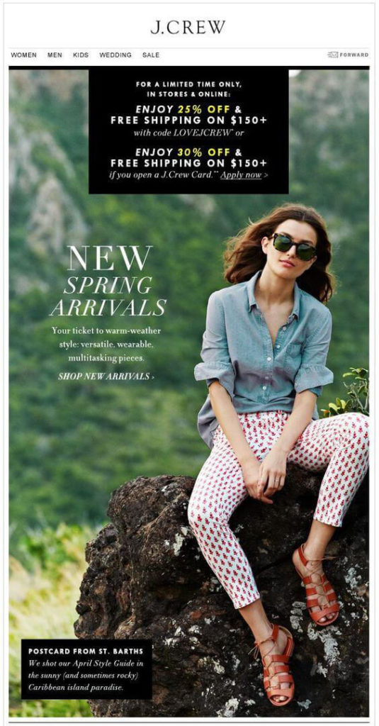
The image used in this newsletter is perfect. It sets a cheerful mood and tone of the email to the reader.
The brand showcases its new collection first thing at the top of the newsletter and suggests some options. In addition, it offers discounts depending on which option the customer chooses.
Borrowing from the example, you can combine several strategies for better results from your email marketing campaign(s). In this case, the brand creates the new product's awareness and offers special discounts to boost sales in a single newsletter!
9. Apple Product Promotion Newsletter
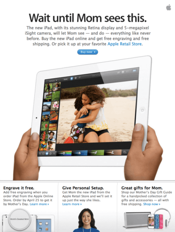
Apple uses its newsletter as an opportunity to build its brand identity. Even though there is no iPad picture in the email, the audience would still know the source of the newsletter due to its consistent classic design and layout.
If you want to build your brand identity across all social platforms, make your email newsletter design reflect your website and other channels. That way, your audience will recognize your brand with ease.
10. Tailor Brands Survey Newsletter
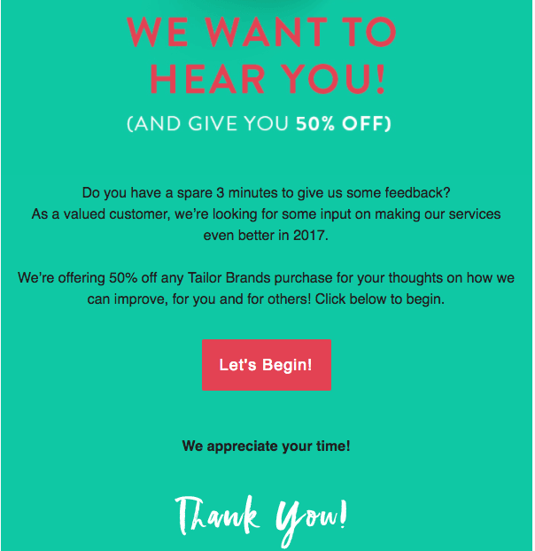
Tailor Brands deals with online branding and marketing. It goes adopts the incentive way to encourage subscribers to provide helpful feedback.
The newsletter design is incredibly simple and uses contrasting colors to draw the reader's attention to the important details.
The shade of green background is perfect for the contrasting white and red colors for titles and subtitles, whereas black is the email body color. The perfect blending of colors makes the design stand out.
11. Best Handmade Welcome Newsletter with Etsy Shop Promotion
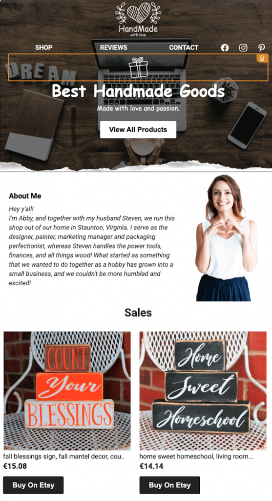
The newsletter's mood and tone are set perfectly well by the use of images. The sender's photo plus the introduction message (about me) creates a friendly tone for the new customer. The message also balances with the promotional content.
Moreover, the newsletter reflects the brand, and hence, the customers can easily recognize it on all social platforms.
When sending newsletters to your new customers for the first time, this is a perfect email newsletter design example to inspire you!
12. Moo Sales Promotion Newsletter
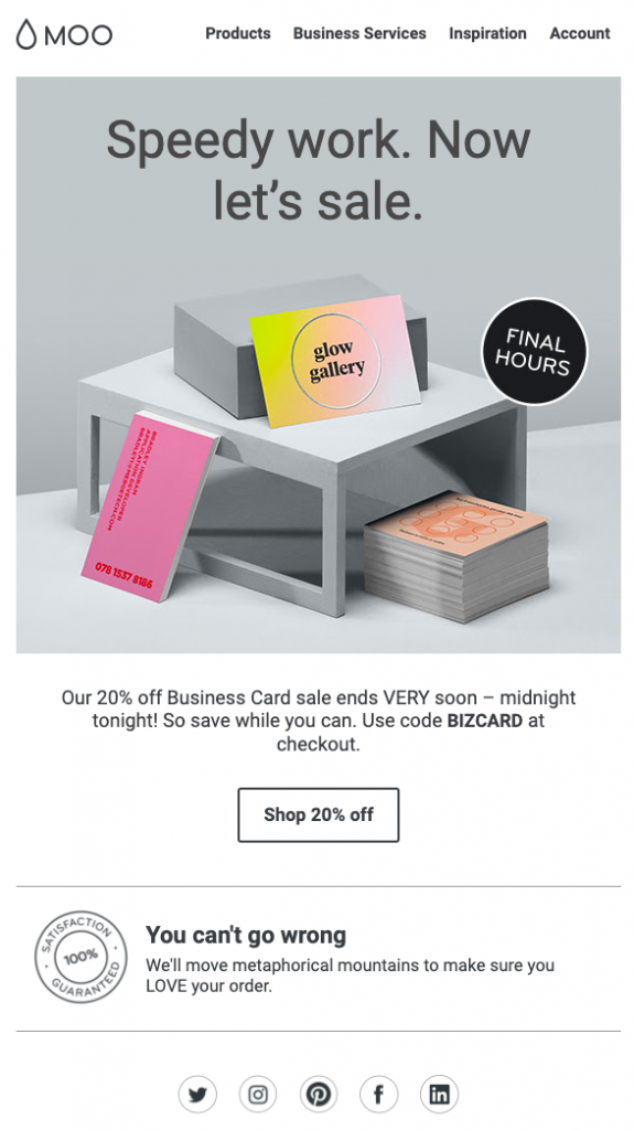
The image covers the biggest part of this newsletter, which is key to gaining the reader's attention.
The menu tabs at the top showcase all the brand's services that the customer can access without distraction.
This newsletter is brief and straightforward and makes it easy for the reader to scan through and extract the essential details.
It offers a discount that encourages customers to make purchases while the offer expiry prompt creates a sense of urgency.
Wrapping Up
In the world of e-commerce today, email marketing plays a key role in creating healthy relationships with your existing and potential customers. It's also a great opportunity to speak directly to your clients through their email accounts.
With the dynamic customer needs and the rising email marketing trends, it's essential to adapt quickly and stand out from your competitors. And with the right email newsletter templates and by adopting the best practices discussed in this article, you can drive the desired results.
AUTHOR BIO:
Words and their magic drive Luka. It's her biggest passion and natural habitat. So she lives by the motto - the mind is clearer when you write down what's inside it. Oh! And Luka also manages the content for Sender.net, ensuring that everything is on point.
ADDITIONAL READING:


