Contents
13 Easy Ways to Create Engaging Visuals for Your Social Media Posts
Follow the classic 3E thumb rule
Incorporate visuals into your brand identity
Customize visual ideas based on social media
Use more original photos compared to stock images
Put your logo where it is most impactful
Repurpose your old content to create engaging visuals
Tap on emotions with your visuals
Gain your audience's perspective
Gain your audience's perspective
Streamline your visuals and descriptions
Let's Create Engaging Visuals for your Social Media Posts Now!
How to Create Engaging Visuals for Your Social Media Posts - 13 Guaranteed Tips for Glory
Consider this stat for a moment - About 3.2 billion images and 720,000 hours of video are posted online daily.
Wouldn't it be a magical if you could predict which image or video could go viral? Sadly, no software can do that for you. So, let's get back to reality. 😋
However, what you can control is the ability to get the basics right. And, one of way doing it is by creating posts that stand out, with unique visuals such as memes (which can be created using a free online meme generator). Visuals that speak more than a thousand words. Visuals that engage, and are both technically and emotionally rich.
Besides, social media platforms love images. Here's what the numbers say:
- Users on Twitter tend to retweet images 128% more than videos
- LinkedIn image posts have a 98% higher comment rate
- Facebook's video posts attract an engagement rate of only 0.28%
- An Instagram account with 1M followers can have 1.97% of engagement rate
On top of it, visual images account for 80% of the content commonly used by social media marketers.
So, when everybody around you is pushing towards whacky visuals, you cannot use stock images with your company's logo. Instead, you need to level up your game. 💪
But how?
The answer to it lies in this blog. Read it to know how to create engaging social media visuals to drive organic traffic your way.
You can check whether the image provided by your designer is original or a stock one by using the photo search facility. This facility is also known as reverse image search, and it will analyze your uploaded picture and cross-check the web to figure out the sources where a similar image already exists.
13 Easy Ways to Create Engaging Visuals for Your Social Media Posts
Let us now look at 13 different ways you can get more visibility for your social media posts.
Follow the classic 3E thumb rule
Today, digital marketing trends are changing faster than we could come to grips with them. But some classic trends are evergreen. That is why, these three principles of creating engaging social media posts are irreplaceable — Educational, Entertaining, and Enlightening.
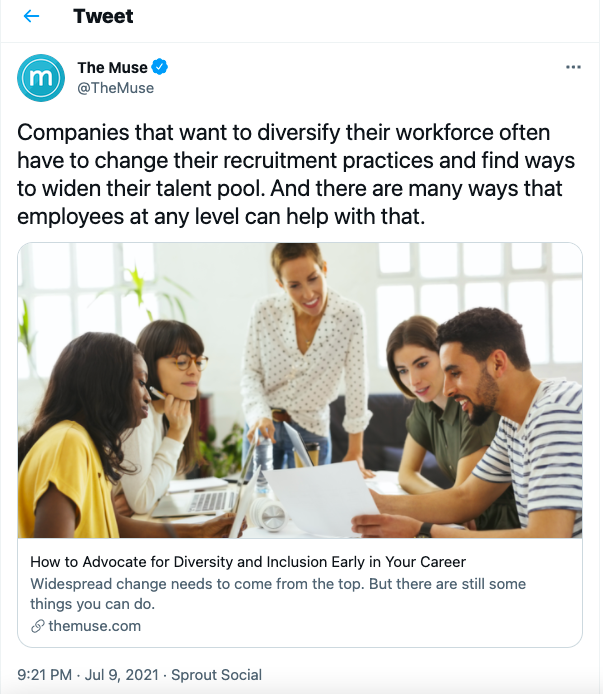
Educational social media posts are best for B2B and B2C businesses to walk prospects through their processes at a fast pace.
For example, here's a tweet from The Muse. Since its target audience mostly consists of job seekers, the company uses pictures with many people to educate them about the importance of team building and company culture.
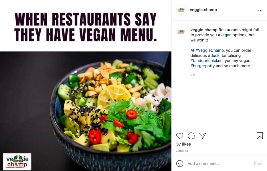
Entertaining posts are always a crowd-pleaser. Whether you create memes, comics, or gifs, they never fail to capture likes, shares, and comments on social media.
For example, B2C companies often create entertaining visuals engage with their customers. Here's how a plant-based meat brand VeggieChamp is creating memes to keep their customers engaged on their Instagram account.
Enlightening posts not only highlight problems, but also show a way to solve them. This HubSpot tweet is a perfect example of an enlightening visual post. They used expert speakers' photos to promote their upcoming Seedcamp for startups. Even without reading, people can understand the intent of the tweet.

Incorporate visuals into your brand identity
Sometimes, people paste their brand logos or add website addresses on visuals. And Ta Da! They feel they've added enough personal touch to their visuals.
But, that's not true, peeps. 😏
To create engaging visuals for your social media posts, you need to sync your brand identity and visual language. For that, focus on the following steps:
- Research your audience and understand what kind of visuals they prefer
- Select a color palette and create your visuals around it
- Pick a theme to create uniform social media visual posts
- Use the right typography elements such as using white space and photo components
- Use hashtags for Instagram, LinkedIn or Facebook to reach your target audience
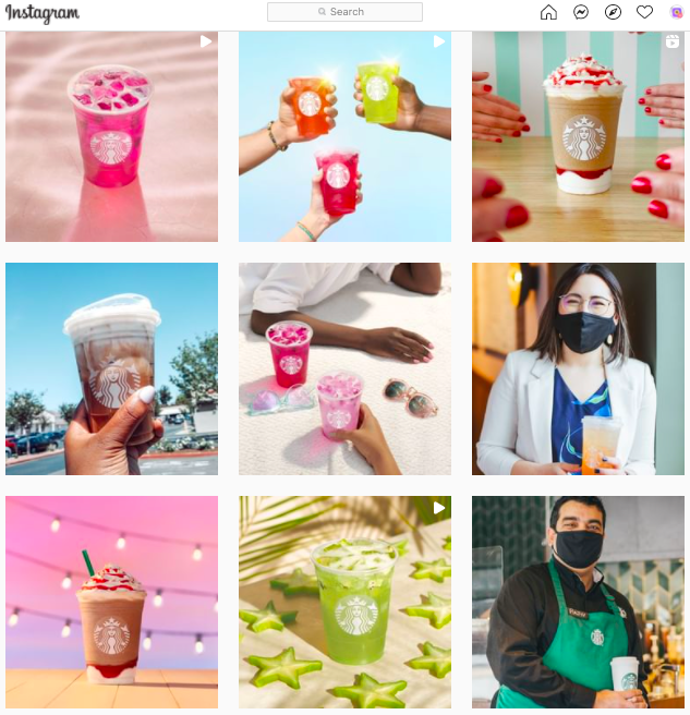
Starbucks' Instagram page is a great example of a visual branding strategy. Their audience identifies them by their cups. So, the company uses cups filled with different drinks to create visual content on Instagram that looks stunning.
Choose the correct image size
Whether it's a Facebook post, LinkedIn banner, or YouTube thumbnail, the correct image size is the backbone of your visuals. That's because every social media platform has a preset interface according to which they accept media size.
Moreover, the image size varies on every screen size. If your image is oversized or undersized, your social platform will automatically crop or stretch it.
Therefore, always design visuals for your social media posts based on the platform's image scale. Here are the image size dimensions for the popular social media platforms:
- Facebook cover size: 820 x 312 pixels (desktop) and 640 x 360 pixels (mobile)
- Facebook profile size: 180 x 180 pixels (desktop) and 140 x 140 pixels (mobile)
- Facebook banner size: 1200 x 630 pixels
- Twitter profile size: 400 x 400 pixels
- Twitter cover size: 1500 x 500 pixels
- Twitter post size: 900 x 450 pixels
- Linkedin profile size: 400 x 400 pixels
- LinkedIn cover size: 1584 x 396 pixels
- LinkedIn post size: 1350 x 440 pixels
- Instagram profile size: 110 x 110 pixels
- Instagram post size: 1080 x 1080 pixels
Confused after reading all these visual dimensions? Here's a quick checklist for your visuals on social media:
- Don't insert anything important on the top or bottom of your image lest the social media platform crops it out
- Stick to simple dimensions - Square, Landscape, and Portrait - for your visuals, and you can be rest assured that they will work on almost all platforms
- Place text in the middle
- Create stories in horizontal or vertical frame only
- Use tools to preview your image size before posting online, etc.
Customize visual ideas based on social media
Not only visual content dimensions vary from platform to platform, but visual ideas too. That means your Instagram post ideas won't work on LinkedIn or vice versa.
The reason behind this is that every social media platform has a different objective and audience profile. Therefore, in order to take full social networking leverage, you will need to customize your visuals according to platform requirements.
Let us now understand this a little better. Let us compare an Instagram Story with a LinkedIn Story. LinkedIn Stories are created to share the latest updates in the business, economy, and work circles. People engage with them for knowledge and educational purposes. It is used for professional networking too.
On the contrary, Instagram Stories help engage and retain followers. This is not to say that Instagram does not help in networking. It surely does, but Instagram's audience profile and their intent varies from that of LinkedIn. People do not send personal resumes on Instagram, whereas on LinkedIn, they do.
So, you see, folks, both Instagram and LinkedIn Stories might look the same at first, but they are wholly apart from each other. Therefore, pick visual content ideas based on your social media marketing platform.
Make visuals SEO-friendly
Wait, what? Don't scratch your head. 🙄 Visual SEO optimization is a thing, and a very important one too. Especially with the popularity of visual search tools like Pinterest Lens, Google Lens, and Amazon's StyleSnap. Make sure to follow additional search engine optimization guides to learn more about how you can optimize your website.
Similar to regular SEO, visual SEO has many rules that you can follow to grab search engines' attention. For instance, you can apply YouTube SEO by:
- Naming your video using targeted keywords
- Inserting keywords naturally in the video's title
- Optimizing your video description to meet all keywords and other readability standards
- Uploading custom YouTube video thumbnails
- Properly categorize your videos, etc.
Similarly, Pinterest has a different set of visual SEO optimization methods, such as:
- Create a Pinterest business account
- Keyword-specific username
- Optimize your profile and pins
- Add Pinterest tags, and a 'Save' button
Use more original photos compared to stock images
MDG Advertising states that 67% of shoppers consider high-quality image an important buying factor. That's because a detailed visual description helps to improve perceived ownership of the product.
So, when you include common stock images into your engaging social media visual posts, it won't persuade your users to take action. Whereas high-definition candid shots from your camera or even smartphone can tell your product story more authentically.
But, the reality is not everyone has a budget to hire professional photographers, photo editors, or models to click some raw shots. As a result, graphic designers have no choice but to rely on stock images to create visuals for their social media posts.
In a way, stock images aren't bad either. No, we aren't contradicting our point here from what we said above. We are just implying that if you use stock images smartly into your visuals, you can receive the same results as original photos.
Here're a few stock image best practices that might help you find the right visuals for your social media posts:
- First, steer clear of copyright issues
- Always give credit for the images you are using
- Use stock images that look natural and do not look like stock images
- Invest in paid stock images to get unique flavors and combinations
- Search for the right image that can align with your business message
- Lastly, look for a human touch in stock images
Put your logo where it is most impactful
Your business logo is one of the important parts of your visuals. A logo defines your unique visual identity and tells people what you stand for and what you represent.
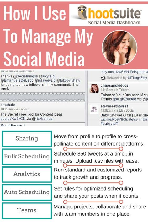
But, that doesn't mean you should throw a logo anywhere on your image or video. Add your logo where it is most visible without disturbing the other visual elements. For example, look at this Hootsuite Pinterest post.
The brand logo is seamlessly merged into the other elements of the post so that it does not look overpowering or underwhelming. The post gives out a lot of content, but you also know that the logo does its job too without spoiling the viewer's experience.
Repurpose your old content to create engaging visuals
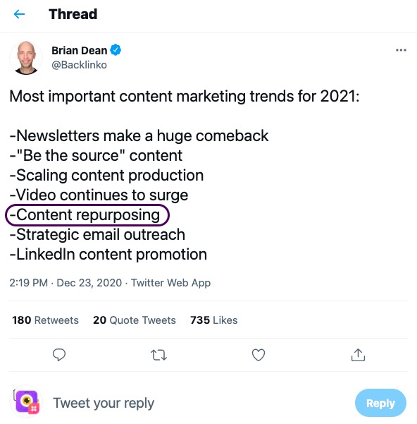
Content repurposing is the new and economical way to create engaging visuals for your social media posts. Even industry expert Brian Dean speaks about content repurposing in his 2021 content marketing trends prediction.
Besides saving your time and money, visual presentation of your old content can:
- Help you reach a new audience
- Reintroduce your message
- Boost organic visibility of your posts
Today, when you have so many different visual options available, repurposing content is literally a piece of cake. You can turn your blog post into infographics, podcasts, videos, memes, or speaking content for a webinar.
Talk about multi-purposing your content, eh?
Tap on emotions with your visuals
Visuals are like music; the more you infuse emotions in them, the better they will shine. Plus, emotional content has a long-lasting impact on your viewers' minds and can even encourage them to take action.
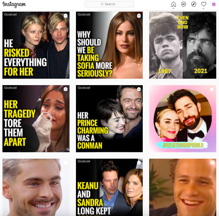
Here's Life Stories Instagram page by Goalcast. This page is an ideal example of how to create social media emotional visuals to get lots of likes and shares. Although most of these stories could be viewed as sensational and attention-grabbers, they do make a point.
They pick stories of celebrities and create video clips from thousands of documentaries, interviews, etc. to put together meaningful clips. They supplement these posts with visuals and copy that convey emotions from these stories. They know that their audience loves reading such stories, and they do a pretty darn good job at that!
Gain your audience's perspective
Before diving into a creative mode, try and gain your audience's perspective first. For that, ask these three questions of yourself:
- Is our audience gender-specific?
- Are we targeting mixed audiences?
- Do we want to promote our brand in a particular geographical area?
Once you know what your audience prefers, you can better channel your visual marketing strategy accordingly. You can use certain keywords, key phrases, and color contrasts to hit the nerves of your audience.
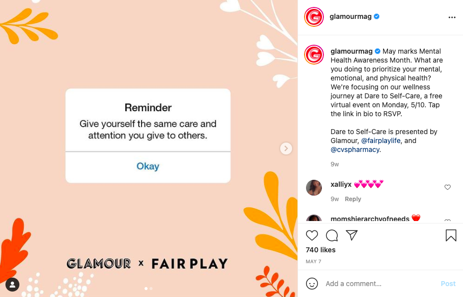
For example, Glamour Magazine's primarily targeted audience are women. So, they use visual colors and text tones that attract women more. Take a look at this soft pink and white colored Instagram post with powerful written copy.
Gain your audience's perspective
Cisco estimates that by 2022, 82% of the global Internet traffic would come from videos. That means to make crowd-friendly visuals for your social media posts, you have to use motion graphics or animations in them.
Today, you have a variety of animation options to choose from, such as 2D animations, 3D animations, Stop Motion, and more. So, make use of such animation components to create jaw-dropping social media visual posts.
A few quick tips for creating animated social media posts are:
- Use animations to tell your brand story
- Explain your process with GIFs and animations
- Preplan your animation structure before selecting the templates
- Don't use too many animated graphics
- Play with your brand-related colors
- Manipulate white space in your favor
- Get inspired by various social media animations, but be unique in your approach
Streamline your visuals and descriptions
All social media platforms give the opportunity to write catchy descriptions that complement your visuals. Some platforms like Twitter might give a lesser spaces to write captions, but there's still scope to write an engaging tweet.
With the description, you can better present your message as visuals are word-restricted mostly. Plus, not everyone can understand your visual posts. Therefore, for this audience, having a compact description that highlights your key message can work wonders. Moreover, from an SEO perspective, a site description is always highly recommended.
You can write a great description for a social post by:
- Creating easy to read content
- Using headers, bullets, and lists wherever possible
- Keeping your sentences short
- Using short phrases such TLDR, FYI, ROFL, etc.
- More importantly, your visuals and caption should look, sound, and feel the same throughout the post
Get the right tool
Last, but the most important tip to create engaging visuals for your social media posts is selecting the right tool. To try all the above-mentioned visual ideas, you need a professional tool that is budget-friendly and doesn't have a long learning curve.
Luckily, today the graphic design software industry is evolving fast. And, you have quite a few visual designing options available, such as:
- Picmaker
- Procreate
- MyFonts
- Clip Studio Paint
- Ron's Brush, etc.
Let's Create Engaging Visuals for your Social Media Posts Now!
It doesn't end here! There are various other methods and techniques available that often change with the passing digital marketing trends.
But one thing never changes - your creativity.
Forget about all those vanity metrics - likes, shares, or comments. After all, nobody ever earned a proper dime out of them. Instead, focus on your creativity, and the rest will automatically fall into the right place.
So, whether you have a graphic designing business or just create visuals for your brand awareness, strive to be creative and unique in your approach.
Now, over to you, go ahead and create your social media visual posts and share your experience with us in the comments below.
This blog was contributed by Janki Sharma, Head of Operations, at N2N Digital. She has over 5+ years of experience working in the marketing and sales domain. She loves to write on a wide range of topics around digital marketing and technology. Her work has been featured in multiple publications, including Business2Community, Vocal.media, and Datafloq.
Loved our tips on visuals for social media? Alrighty! Now, if you're looking for templates and inspiration, don't forget to check out how to create awesome Instagram Stories for your business with Picmaker's Instagram Story Maker.
Besides, if you're looking to create stories that don't look like a flock of sheep, try our Instagram Post Maker.


