7 Reasons Why You Should Choose Picmaker Over Canva (Including the World’s First AI-enhanced Design Feature You’ll Go MAD About)
TL;DR
Create unique designs with non-unique templates in Picmaker.
Didn’t get it? Read below for more details ;)
Why did we write this blog?
On 2 August 2021, we launched Picmaker 2.0 on Product Hunt. Although we received a resounding response from the Product Hunt community, we received a few queries about how we were different from Canva.
Now, it is obvious that such questions will crop up, because we are taking a refreshing new approach to how anybody can use online graphic design software.
So, we knew that a simple landing page about Canva Alternatives would not do enough justice to those seeking detailed answers. That’s why we wrote this blog to help you understand what we’re trying to achieve.
P.S. We appreciate what Canva has done to make graphic design easy and accessible for everybody. So, this blog is not meant to undermine their efforts thus far.
However, we feel there are a few genuine design-related issues that need to be addressed. No user may ever bring this to Canva’s notice, so there’s very little chance that Canva would know these issues exist. But, we’ve researched enough and we’re confident that if we do not try to solve it innovatively, it may go unnoticed.
Introduction
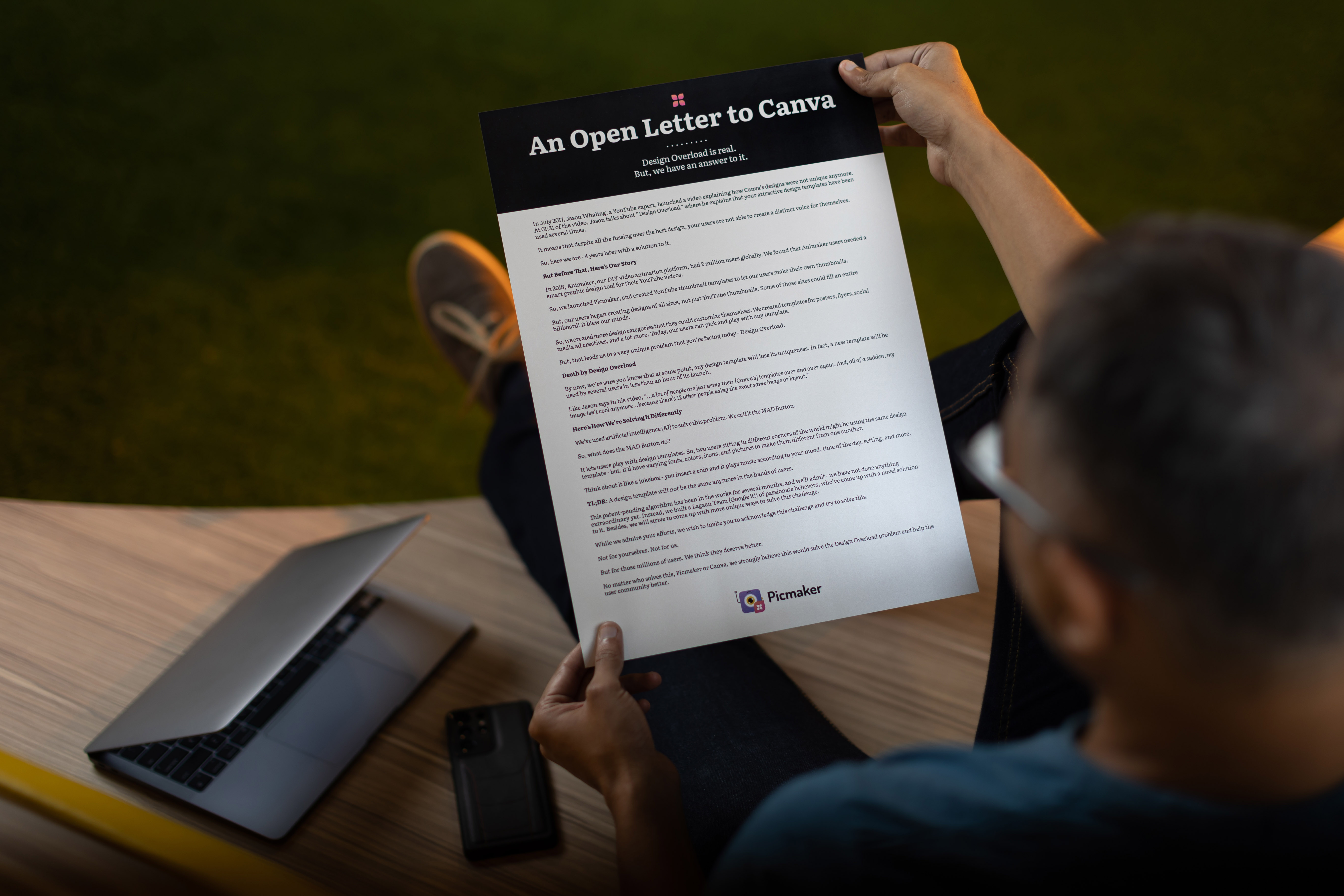
In July 2017, Jason Whaling, Chief Marketing Officer at ACT Marketing, published a YouTube video. This was no ordinary video - we’re saying this because he’d brought up very valid arguments about Canva’s design templates.
(Truth be told, this video deserved a lot more attention from the design community than what it received. Nevertheless, we will try to address it with this blog).
Here's his video to drive our point home:
At 1:31 of the video, Jason talks about ‘Design Overload’. He explains that design templates are becoming a little overused. He says if one were to go through Instagram or Facebook, one can easily know which platform they’re coming from.
What Jason meant was that these templates were becoming more commonplace than any of us knew. So, the template that you just now used to post an Instagram story was already used by somebody sitting thousands of miles away. (Although in reality, chances are that the template could have been your next-door neighbor). 👀
So, what is the problem here?
Well, the problem is you think you’re using unique designs. But, in reality, they aren’t - except for the text that you might have edited.
Makes sense?
Let Us Explain It Even More Clearly
Imagine you’ve been planning to buy a new car for yourself. You’ve been saving up to buy it for years, and then one day you finally get to live your dream. You drive your swanky new car home.
Your hands tremble as you hand over the keys to your dad. It’s a flood of emotions because it is your first car. You even take him for a spin in the vehicle. He admires how the car reaches from zero to sixty in a matter of seconds.
Everything seems well for a few days. Until you notice something startling. You notice a similar car parked in your neighbor’s parking lot. You wave it off thinking it must belong to a visiting relative.
A few weeks later, whilst you’re walking down the road, your neighbor steps down from the car and tells you how proud he is of his new acquisition. You smile at it, and congratulate him for that.
But, deep inside, you feel like disappearing in a big hole in front of you.
That’s what happens when you use design templates from Canva. It is highly possible that most of Canva’s templates have been used more than once by different people.
But, the sad reality is that rarely do users know this.
So, in this blog, we will explain how we’re solving this problem of ‘Design Overload’ with a unique approach. By doing this, we’re also catering to the rather large SMB (Small & Medium Business) community with their design needs.
TL;DR - you will know how we are different from Canva.
Don’t forget to head back to this blog when you’ve finished reading.
Let's go over them one by one.
7 Ways Picmaker Is Different From Canva
1. The MAD Button
Our first approach to solving this problem of Design Overload is by breaking it down into simpler components.
How?
By asking questions of ourselves. Simple questions.
- Will our users like the same templates that somebody else is using?
- Do our users even know that all templates are used by somebody else?
- How will they react when they know this?
We asked the same questions to ourselves. Will we like it if we’re given a product that has been already used? Even though all our design templates are free?
Nah! We won’t even bother looking at those templates. It’s the same with our users. If they knew that their templates are not unique, they would not have the same enthusiasm to use it.
So, we brainstormed different ways to solve it and one method stood out - giving our users the power to change templates of their own.
But, how do we do it?
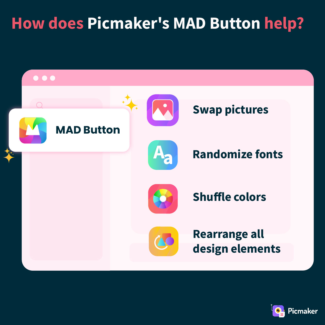
We decided that we will give them four different ways of randomising their designs so that no two users use the same design:
- Enable users to choose fonts
- Give them a choice for background and colors
- Enable users to choose images
- And, finally, enable them to turn the whole design upside down
But, we had to accommodate it within the artboard. How do we do it?
We invented the MAD button, which allows our users to do all of the above. The MAD Button uses artificial intelligence to comb through droves of elements like fonts, objects, pictures, etc. and suggest the best solution to our users.
The best part?
It works not just on our templates, but also works for any custom design that a user creates. Here’s a video of how the MAD button works for different use cases:
A Little History Lesson - Why Do We Call It The MAD Button?
Because we think it is a MAD solution. 😎
On a serious note, we wanted to make it sound a little different. Different from conventional features. Our intent was to make our users curious about it, and try it out for themselves.
Hence, the term MAD button was born.
Besides, for a product like Picmaker, every template is an invitation for users to click on it, use it, and download. But,
- How do we scale the number of templates so that we appeal to more users?
- Is putting out hundreds of thousands of templates the right way to go about it?
- More importantly, why would users care if those templates are not unique?
That’s exactly why we wanted to give the power in the hands of our users. Our MAD button helps users test out different variations of fonts, colors, images etc. And, then they can choose the ones that look perfect.
This way, any given template can have hundreds or even thousands of different avatars even as the core design theme remains intact.
Go on, take it for a spin, and let us know what you feel about it. 😍
2. Helping Small And Medium Businesses (SMBs) With Their Design Needs
If you look closely at Canva, you’ll know that they cater to everybody. They cater to designers, non-designers, marketers, social media enthusiasts, students, papas, mamas, and anybody else you can think of.
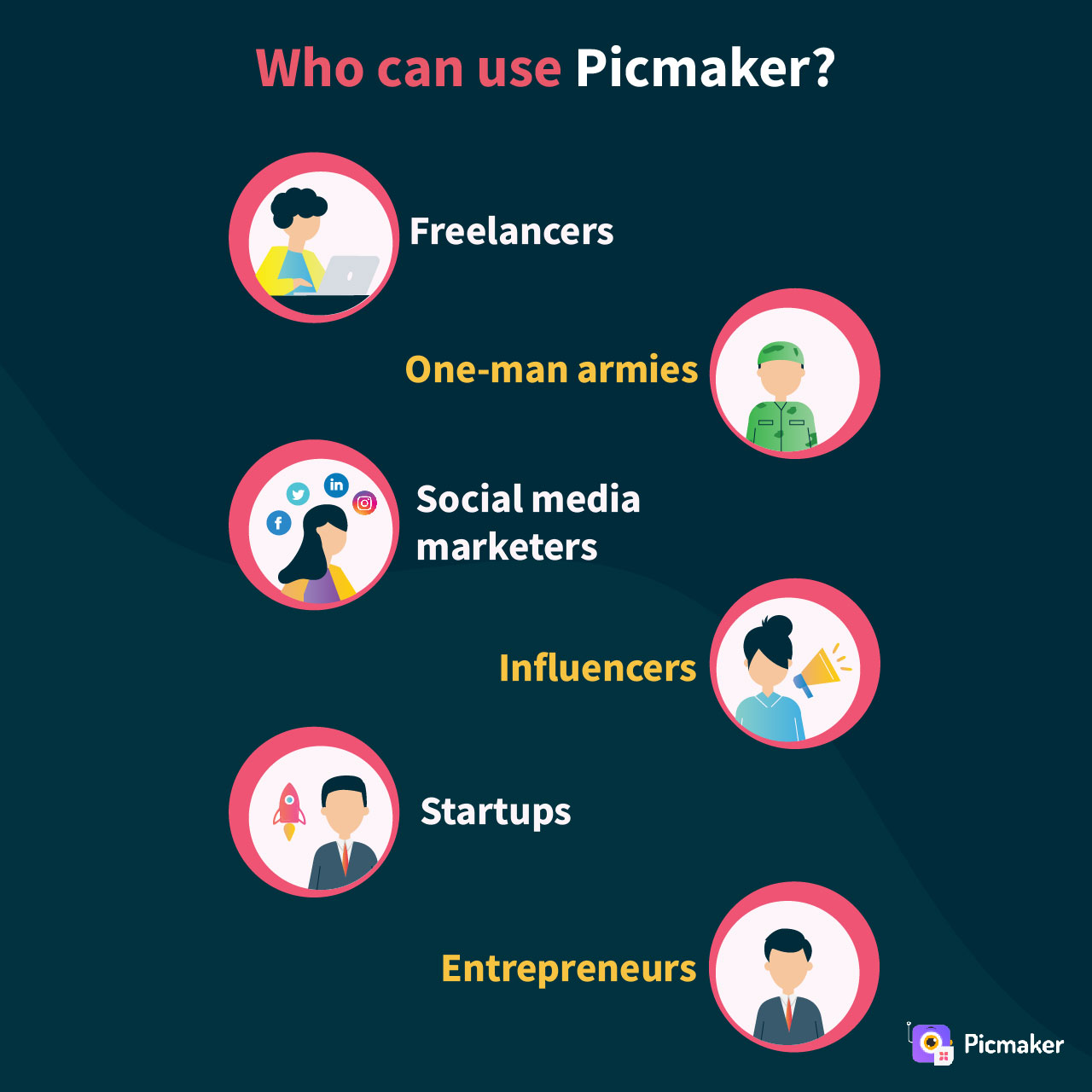
But, at Picmaker, we do not cater to everybody. As yet. We cater only to Small and Medium Businesses (SMBs). That includes:
- Freelancers
- One-man armies
- Social media marketers
- Influencers
- Startups
- Founders/Entrepreneurs
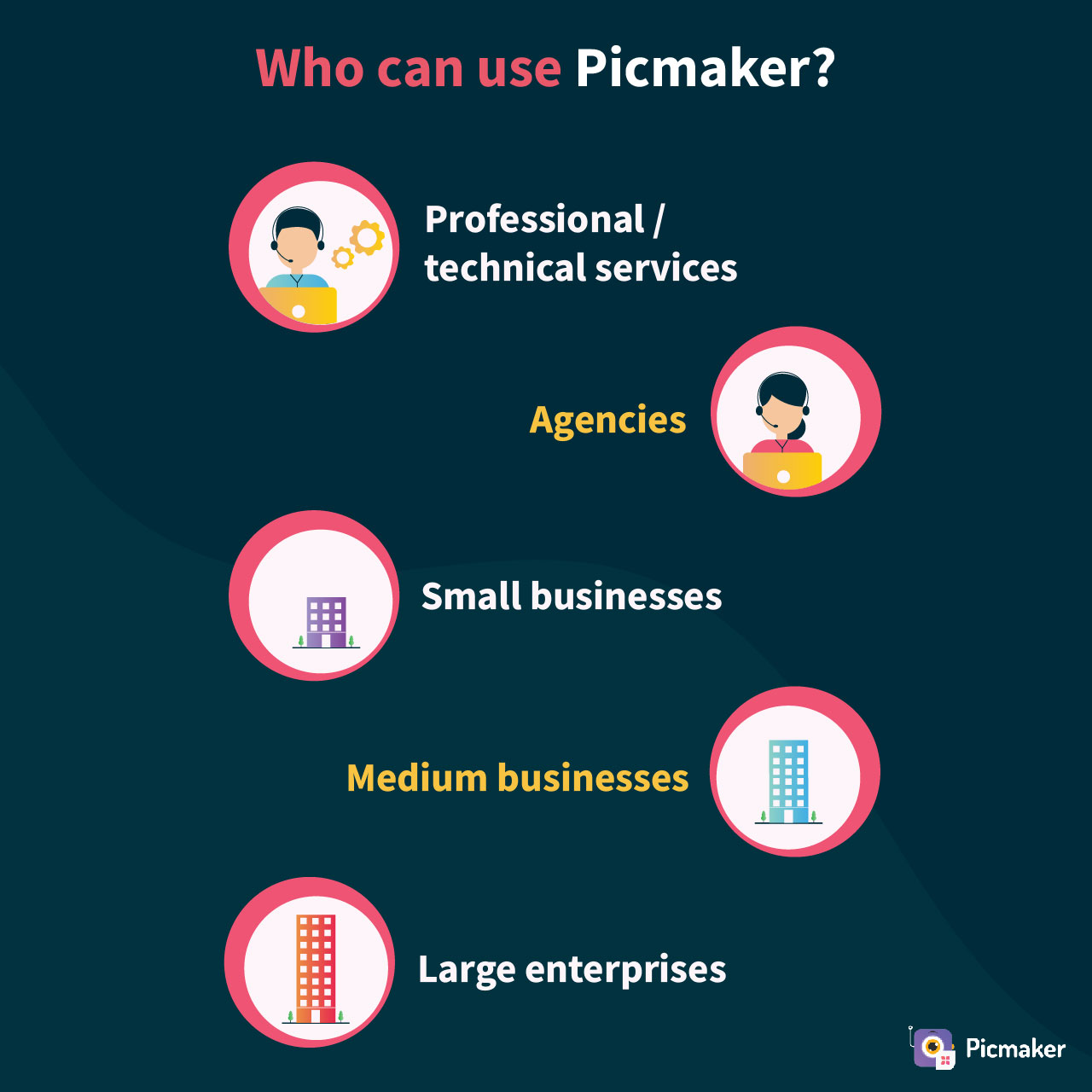
- Professional and technical services
- Agencies (Digital Marketing, Social, Advertising, etc.)
- Small business (upto 50 employees)
- Medium businesses (upto 1,000 employees)
- Large enterprises (more than 1,000 employees)
Typical examples of SMBs that we want to help include hair salons, gyms, bars restaurants, coffee shops, confectionaries, real estate agencies, law offices, dentists, grocery stores, etc.
Why do we wish to help these businesses?
Firstly, we’ve been there ourselves and we could have surely used a bit of help.
Secondly, we know that their budgets are small and they need to move fast. Some of them do not have the luxury of time and money to afford expensive designers. Our designs are easily customizable and our intuitive UI lets them become a professional designer in minutes!
Let us explain how we are catering only to SMBs.
A. Templates
We have more than 100 template categories spread across social media, digital, and physical groups. Each of these categories is further divided into subcategories such as Instagram posts, Email headers, digital ads, product labels, memes, etc.
We undertake extensive research to understand the need and demand across each category before creating design templates. That includes analysing usage patterns, market needs, filling existing gaps - basically, doing everything to help SMBs get their communication and designs out faster.
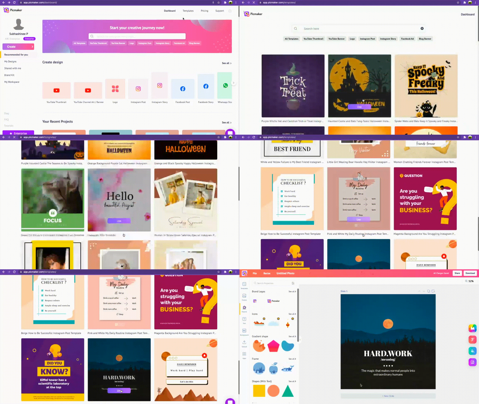
Most of these templates help SMBs more than enterprises. This is not to say that large enterprises may not use our product - just that SMBs will find more utility within our graphic design range.
B. 100 Million pictures and backgrounds
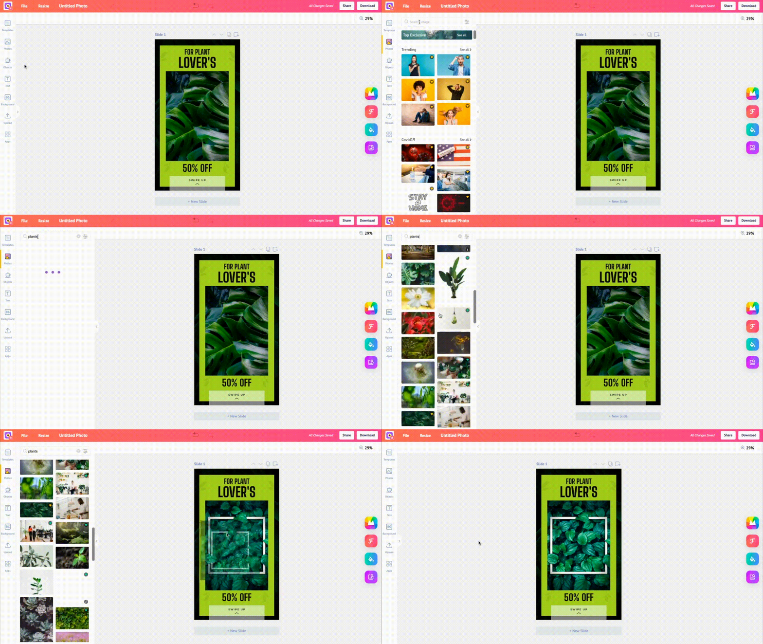
Yes, you read that right. We provide more than 100 million pictures across multiple categories - art, music, business, digital, professional, social media, educational, wildlife, and more. You think of the image keyword, type it into the search bar, and you get a collection of free, premium and elite stock images.
We have integrations with Getty, Pexels, Pixabay, Unsplash, and many more partners. This helps our users find pictures right within Picmaker’s artboard, and they needn’t go rummaging for it in other websites.
We used a simple guiding principle: Our SMB users do not have much time. So, why not let them discover the pictures they want right within Picmaker?
No other graphic design software provider offers the same.
C. Fonts
Picmaker gives SMBs access to hundreds of fonts and typefaces. So, instead of buying fonts, or spending tons of money to create new fonts, our users can choose fonts that suit their needs.
An Instagram Story template might need a casual font, while a new feature announcement email template would need a more formal font. So, our users can find the right font or even use the font presets to put out designs faster.
And the best part is that we continue to explore more font families and typefaces so that our users needn’t leave Picmaker to get what they want. If they’ve got their own fonts, we enable them to upload them via our brand kit.
Here’s how our brand kit works:
D. 100K Icons, Objects, Shapes, And Frames
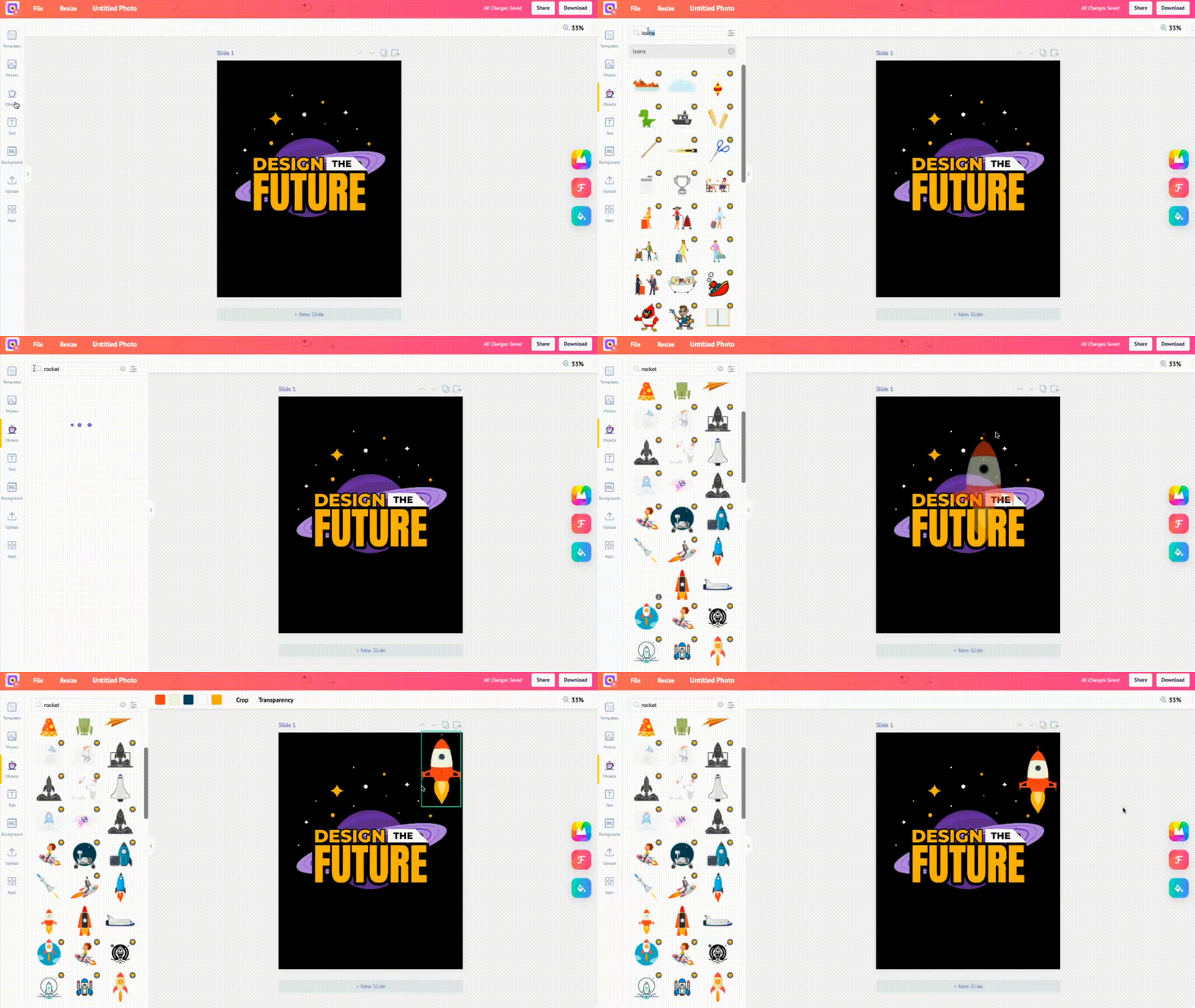
We have sourced the most sought after design objects that would make our users happy. The best part is that many of these objects were created by a variety of designers who know what their audiences want. Some of them have been imported from our wide library of illustrations that we’ve used for Animaker.
Again, the same guiding principle - why let users switch tabs to go searching for icons when they can do everything under one roof? So, we’re continuously exploring partnerships with icons and objects providers to increase our library.
Again, not many graphic design software providers offer such a wide variety of icons and design objects.
E. Colors And Gradients
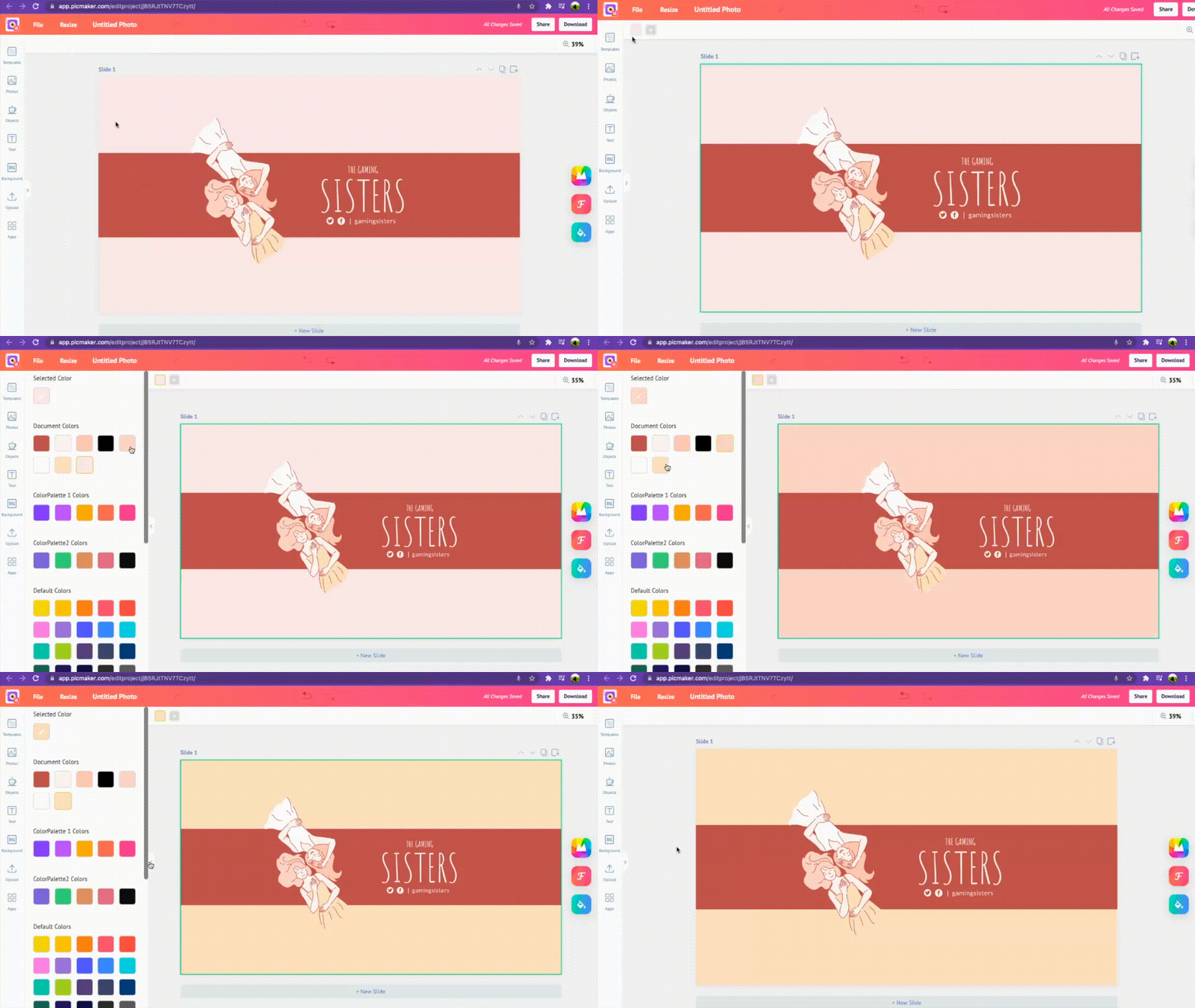
Our users can pick any color of their choice from our vast color library. Today, it’s a no-brainer that graphic design software providers must let users choose colors. But, what if we could present a collection of readymade color shades and gradients that help users quickly decide what they want.
So, all that our SMB users need is to know the HEX code/RGB code of their brand colors, and choose them from our color library.
Moreover, we enable our users to pick colors from pictures and apply them over objects or the rest of the art board.
3. Lightning-fast Features That Are Better Than Canva But Lighter Than Adobe Photoshop
Until now, we’ve described the design assets we provide you so you can begin designing in minutes. But, unless you have the required features to use these design assets, you would not be able to create masterpieces.
So, in this section, let us look at the features we provide in Picmaker. These features are better than Canva, and easier to use than Adobe.
What does that mean?
It means designing on Canva is good, but designing on Picmaker is great.
Why?
Because Picmaker's UI has been developed after putting a lot of thought into it. We’ve looked at specific features that our competition provides and tried to improve or provide it as part of our Free plan.
For example, the Background Removal tool is offered as part of our free plan. All designers would know that background removal is a basic feature for any graphic design software. So, depriving our users of it didn’t make sense to us.
Here’s a quick video about how our BG removal tools works:
Moreover, we wanted to make sure our features are not as complex as Adobe. Learning to design on Adobe’s products can give you sleepless nights. Instead, we wanted to make sure our user experience is optimum so that people can design effortlessly.
We don’t claim to be better than for nothing.
4. Newer Features That Are Unrivaled
That is not all. We’re constantly thinking of ways to enhance our app. So, while the MAD Button was revolutionary in its evolution, we believe that there are many more ways to keep our users happy.
So, what are these features that we are working on?
- Integration - We will integrate with all sorts of storage and social media systems. This way you never have to leave your tab - either for retrieving something or to share your designs.
- Social calendar - Our social calendar will help you schedule your posts, and ship them out directly to your social accounts.
- Advanced editing - While we offer different types of image effects, we’re working on even more advanced image editing tools including SVG editor. This way, you can make your pictures even more expressive.
- Fonts - We will introduce even more fonts so you never run out of ideas to make your designs creative.
- Languages - We know that a large section of our audience comes from non-English speaking countries. That is why we will launch Picmaker in different languages so people can design in their native language.
- Picmaker Marketplace - We want our audience to get access to design templates not just by our designers, but even from freelance designers. This way, our users will have a wider variety of designs to choose from.
The above features are only a glimpse of what we’re planning to launch in the coming months. If you’ve got a specific request that you’d like us to implement, feel free to drop us a note, and we will make sure we evaluate it.
5. Customer Support
We pay a lot of attention to our customers. For us, our customers - paying or non-paying - are top priority. When a customer pings for support on our chat channels, we drop everything and we’re by their side.
Why?
Because we know happy customers mean more brownie points.
But, how are we able to support so many customers?
The answer to it lies in our deep experience of supporting Animaker customers over the years. Our customer support team has been working with more than 12 million Animaker customers over the years. So, they surely know a thing or two about supporting large swathes of customers.
To put things in perspective, here’s a table that shows the different levels of support that we provide as against our competition.
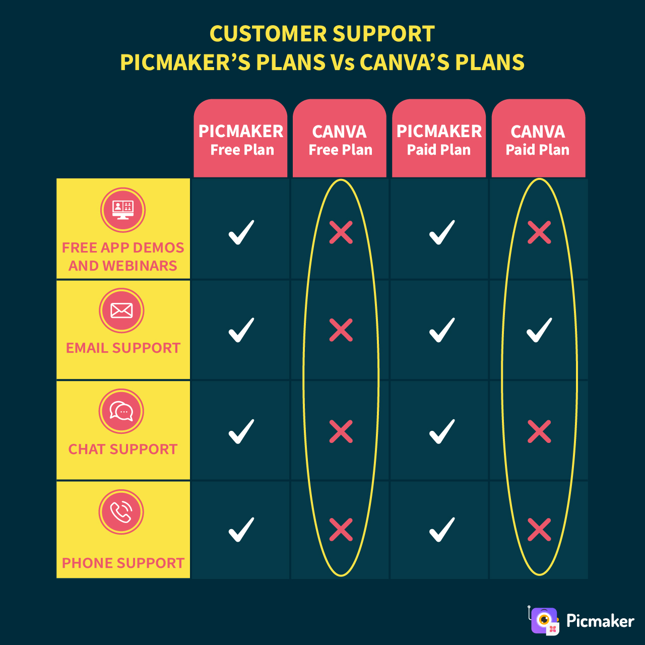
Our support teams are adept in taking responsibility over solving every issue/query. During instances when they do not have an immediate response, they immediately raise a support ticket seeking the help of different teams such as Development, Finance, Sales etc.
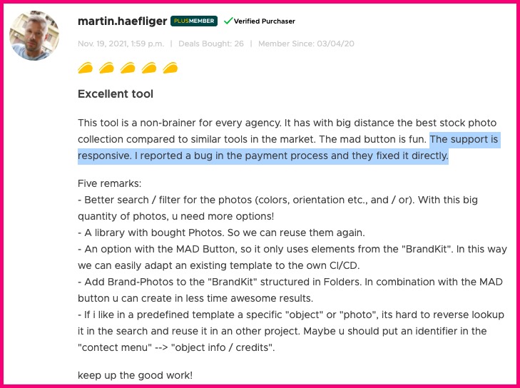
And, to put things in even better perspective, here’s what one of our users say:
6. Design Management System (DMS)
We provide our users with a folder structure to arrange their designs. We also enable our users to create folders within folders. This way users can arrange their designs according to different needs and projects.
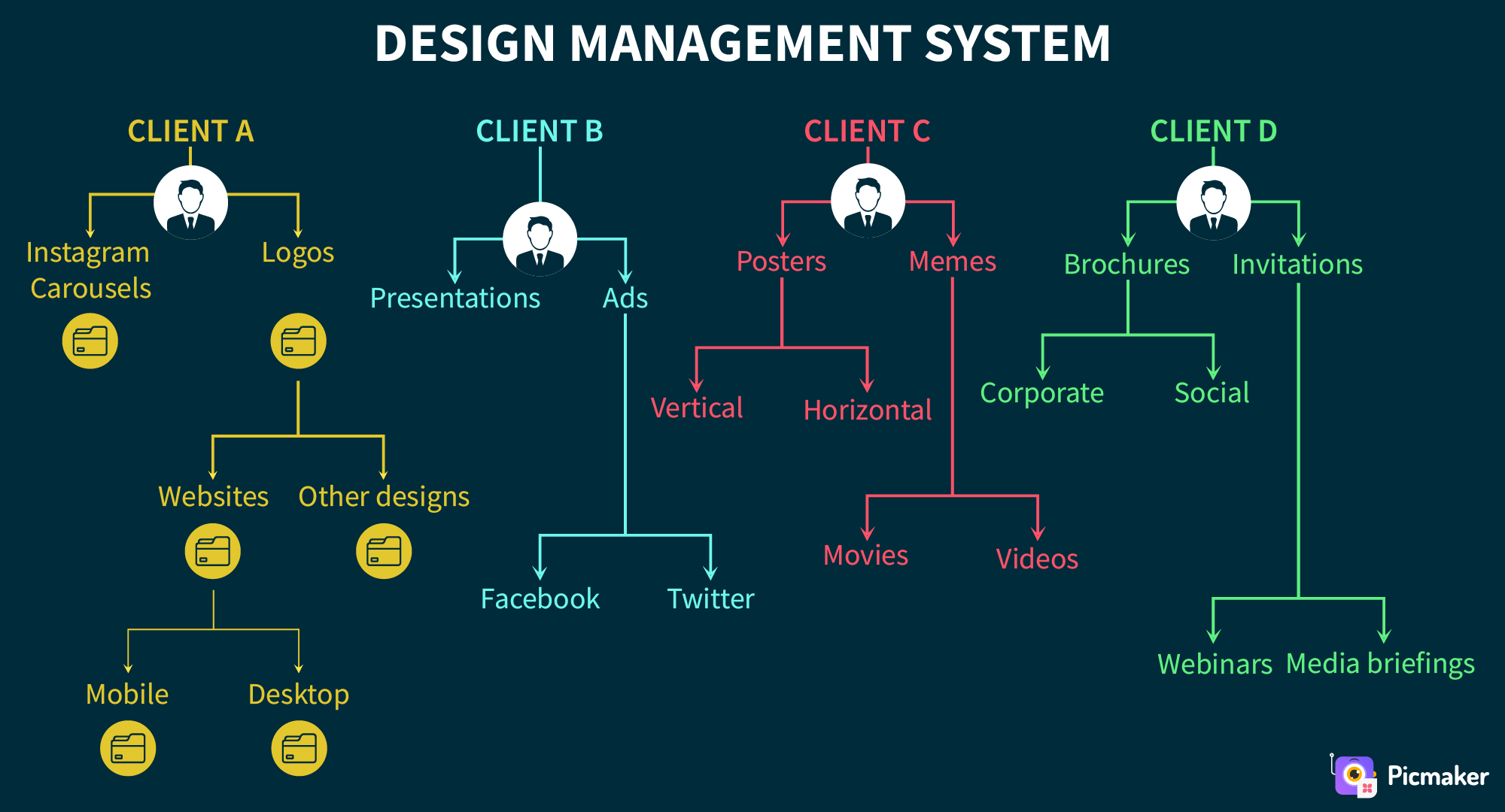
We call it “Design Management System.” It helps our users to organize their designs across different categories, genre, clients, etc.
For example, a digital marketing agency can create folders for different clients and even maintain separate folders for different projects for each of their clients.
Here’s a short video about how you can create folders in Picmaker.
The below diagram shows how a digital marketing agency can manage their designs in Picmaker. They can divvy up their work for different clients, and manage them within Picmaker itself instead of maintaining it elsewhere. An intuitive search bar in every folder allows users to search and locate their designs in a few seconds.
For the record, Canva allows its users to create simple, one-dimensional folders.
7. ‘All For One, One For All’ Is Not A Great Idea
We’ve seen it umpteen times. Trying to be the one-stop shop for everybody and every use case is not a great idea. It limits a product’s ability to go deeper into its core offerings.
Instead, having a specialized product for every use is our mantra. So, for example, Canva offers videos and audios as part of its package to Pro users.
But, our question is: Is that the right way to do it?
Why not offer specific products for different use cases?
That explains why our flagship product, Animaker helps users create animation videos in seconds - with no knowledge about animation. On the other hand, Vmaker allows users to record screen, webcams, or both with audio to create engaging video content.
More recently, we’ve launched Show that is a video first marketing platform that allows anybody to use videos and increase business revenues. Finally, we have Steve AI, a patented online video making software that helps anybody create videos in seconds.
Besides, we have several other products that are aimed at solving individual problems in the market. Our mission is to have dedicated people and resources for every use case we observe. Trying to cluster everything under one roof can lead to customer dissatisfaction.
Conclusion
If you’ve stuck by us until now, that’s awesome! It shows how much you care about the DIY Graphic Design industry.
We are continuously researching and innovating, and we admit that there is a lot more to be done. We have not even scratched the surface yet.
However, what we can assure you is that we will leave no stone unturned to make every user happy. Because we feel design is for everybody. Nobody should fret or feel overwhelmed to create a design. All it takes is a little bit of guidance, and anybody should get going in minutes.
That is why we called ourselves, ‘Picmaker - World’s shortest way to create a design.’
Additional Reading:


